Travel Agency Website Templates – What Do They Look Like?
We always had a passion for adventure. Nowadays one can visit literally every spot on the planet. So it goes without saying that travel agencies provide one of the best-selling services around the world. How can a travel agency draw more potential clients and raise its profit rate? In the new technology era, it definitely requires a unique and catchy website. So, welcome the category of travel agency website templates presented by MotoCMS!
Here you can find practices of travel website templates with appropriate design and logical structure. Discover how to take your travel agency on the completely new level in the web.
Travel Agency Website Templates
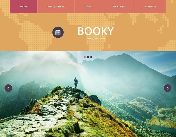
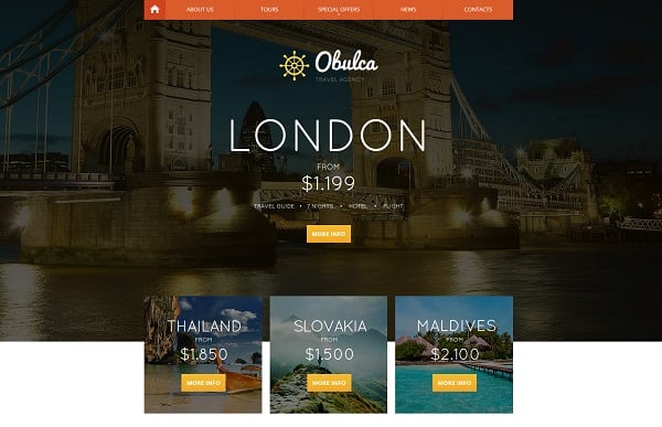
A visitor comes to your website to grab a ticket for positive emotions and memories. Choose vivid colors to make your travel agency website alive. When a person comes to your website for a visit, in order to book a travel tour, you have to attract your client somehow. Bright and fresh colors are the key for success.
Travel Business Web Template
Most of the travel agency website templates powered by tour operator website builder are decorated with a light color background. To emphasize the posted text like news, contacts and services, light background is a perfect match for your travel agency website.
Website Template for Traveling
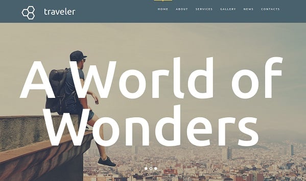
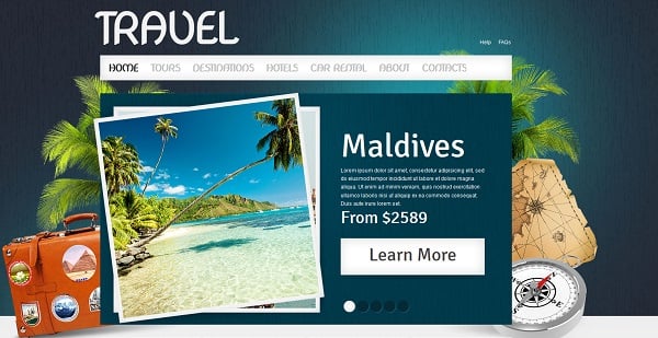
Talking about the text, call-to-action phrases work pretty well to engage a client. This is a great opportunity to describe what one gets while choosing one or another traveling tour. Pick an eyesome text font of a large size. Write an inspirational message. Combine it with fabulous photos of a resort. And upload them into a slider on the home page.
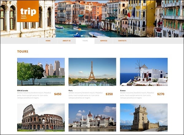
Trip Agency Website Design
Content Structure
No matter how stunning your website can be in terms of design, without logical structure it is literally doomed to failure. Proper website organization is even more important than its attractive appearance.
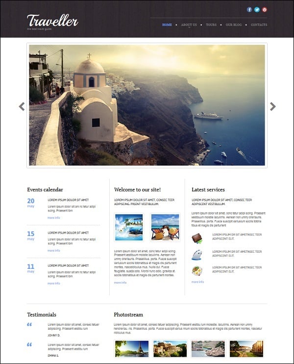
The first step to boost your travel agency website template will definitely be the valuable home page. This is what a website visitor sees first. The following elements are recommended to make the welcoming page of your website appealing:
- Top horizontal menu bar for comfortable navigation;
- Large slider with picturesque content to invite a client;
- Combined blocks of text and photos to represent services;
- Your contacts with actual address, email and social networks.
Travel Website Theme with Pure Background
Aside of the engaging home page, you may surprise your website visitors with the gallery. Introduce traveling tours via grid gallery. Let your customer experience the atmosphere of journey simply by clicking pictures.
Travel Agency Website Design with Header Image Slider
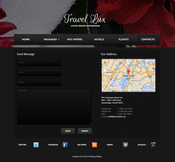
We already mentioned that you should post your contact information right on the website home page. But why not to remind people about your travel agency one more time? Create the additional page with advanced contact form. Simplify your travel agency location search for customers due to use Google Maps.
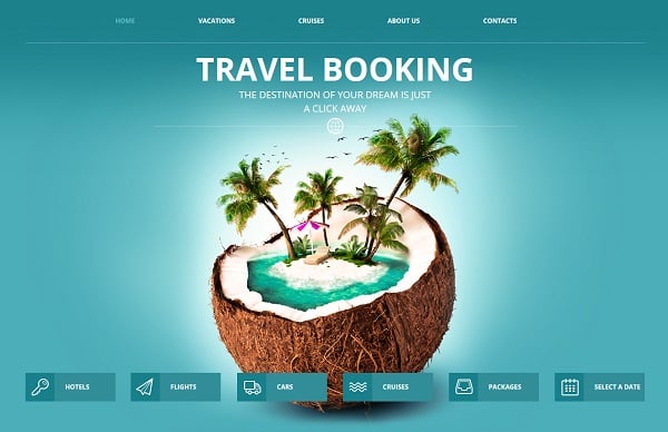
Resort Website Template with Background Gallery
Purchasing one of the travel website templates for a website designed by MotoCMS, you become not only the owner of an awesome website theme. You have the freedom of your website full transformation via the travel agency website builder from MotoCMS. Have a few extra ideas? Check out a few more design practices below that may uplift your travel agency website.



Leave a Reply