Looking back: Flash Website Design Trends – 2010
Well guys, 2011 is right around the corner, so today we invite you to make the end-of-year journey into Flash website design world and cover the most popular trends of the expiring 2010.
Despite many difficulties Flash experienced in 2010 (with the development of HTML5, Silverlight and other technologies, after all those discussions around Flash with iPad release), this technology keeps smiling and still gladdens our eye with interactivity, stunning visual effects and advanced opportunities. Today Flash is considered not as a rich technology for implementing the most unbelievable design ideas and bold concepts into reality only, but also as a strong advanced instrument that helps to create professional multifunctional websites for various web projects.
Of course, Flash CMS developers must take full credit for this – they opened many doors for Flash designers and Flash website owners that used to be closed for them. With Flash CMS it’s become possible to implement many designers’ ideas and create really stunning, modern and advanced Flash websites.
So, what trends, concepts and ideas have been most prominent during 2010 in Flash industry? We will find out right now.
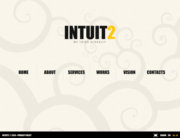
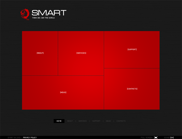
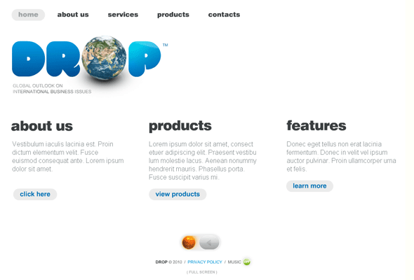
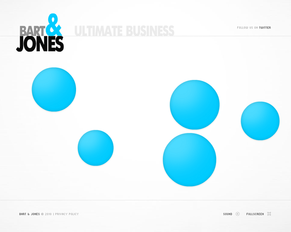
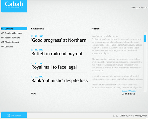
Clean Style and Grid
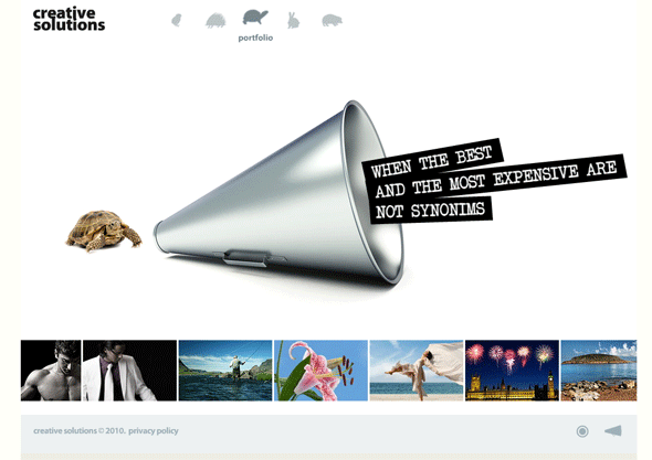
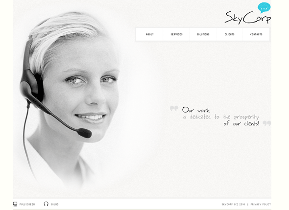
Clean style Flash designs have been on top of popularity during the ongoing year, and there is no wonder why. In order to achieve with Flash what can be achieved using traditional methods and at the same time create an impressive interactive effect, designers try to make the websites’ elements easier (white space, grid, subtle animation, minimizing content, wise use of colors, clear and easily readable typography, etc).
Take a look at the best Flash solutions performed in clean style.
***
Black and Red Flash CMS Design
***
Day & Night Flash CMS Template
***
Clean Style Business Flash Template
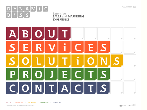
Rich Typography
With strong use of grid based designs, the tendency of embedding some typography richness to websites became very popular in 2010. Web safe fonts have moved aside, the days of Tahoma, Arial, Verdana are almost over. Of course, they are still here but rich typography has been trendy this year.
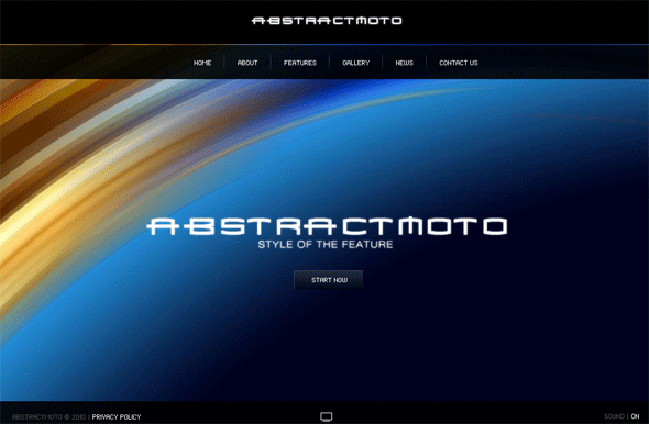
Particularly, Moto CMS gives the opportunity to use any font the developer wants. In addition to the fonts already embedded into the control panel, there is an ability to integrate any font into the System and implement it in the website design. Take a look at some Moto Flash templates performed with the use of rich unusual fonts:
***
Huge Vibrant Typography Flash Template
***
Business 3D Flash CMS Template
***
Stylish Business Flash Template
***
Abstract Moto Flash CMS Template
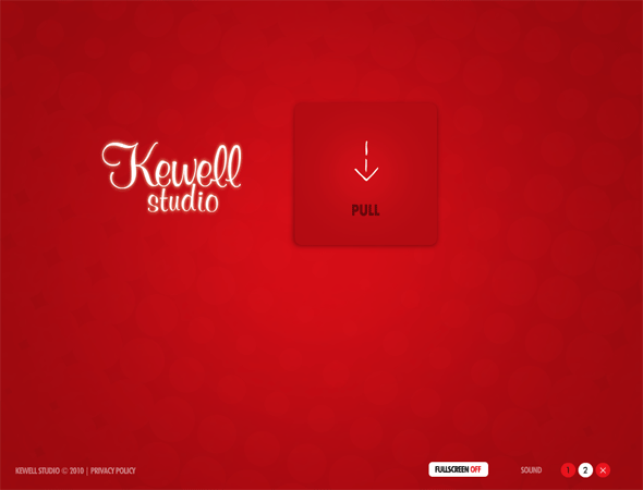
Large Graphics
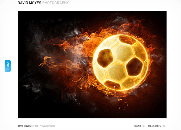
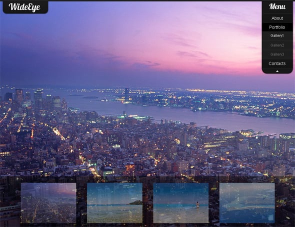
Large images in Flash designs are all the rage, since they grab the visitors’ attention in a split second and make a WOWing impression on them. It can be, for example, a single image on black or another color background, but if designed wisely, the page will have an effective and memorable look.
***
Universal Flash CMS Template
***
Universal Clean Style Flash Template
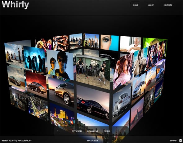
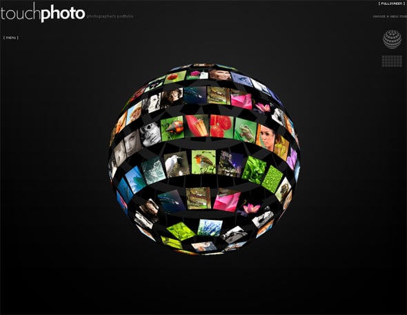
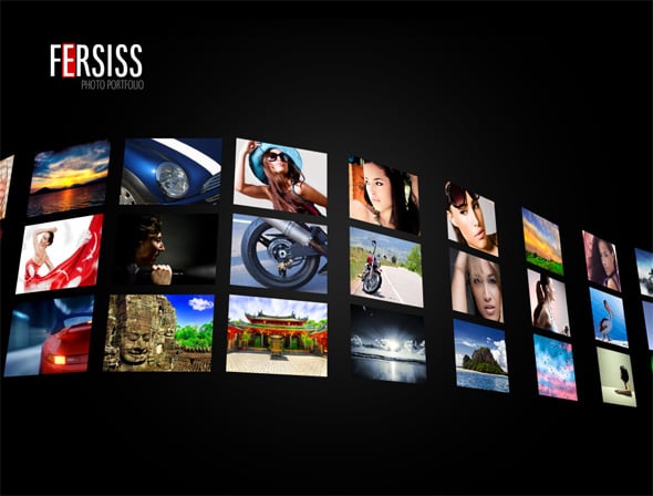
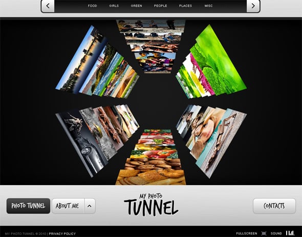
3D Galleries
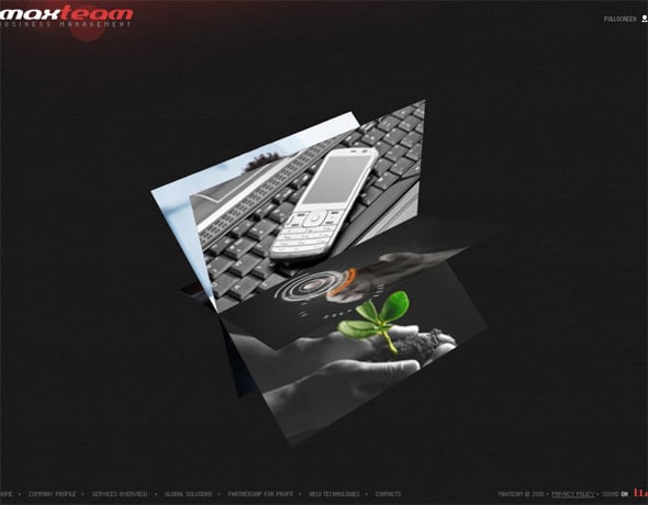
In 2010 Flash developers surpassed themselves in creativity when designing galleries for image portfolios: spheres, cubes, waves, tunnels, and other gallery forms and bold designers’ ideas were realized in order to make Flash websites impressive and present the artists’ works in the most beneficial way. Papervision 3D was used widely in 2010 and was extremely popular. Beside stunning visual effects, the galleries have become more functional, more feature rich therefore more attractive for both photographers/artists that present their works online and their websites’ visitors.
***
Cube-shaped Flash 3D Gallery
***
Flash 3D Sphere-shaped Gallery
***
Sinusoidal Flash 3D Gallery
Dark Background
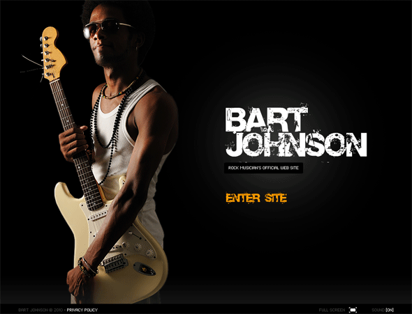
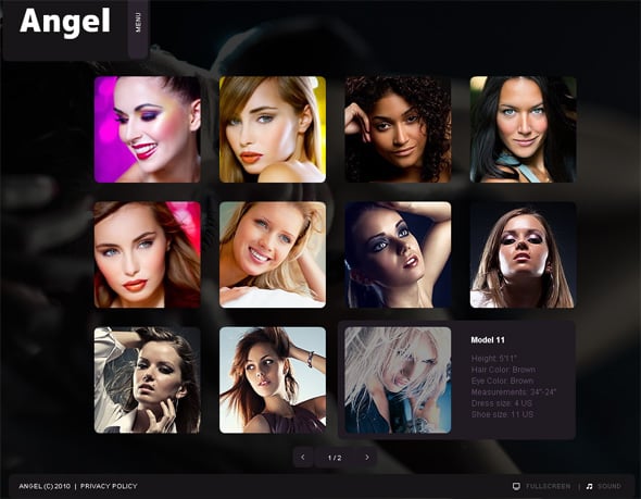
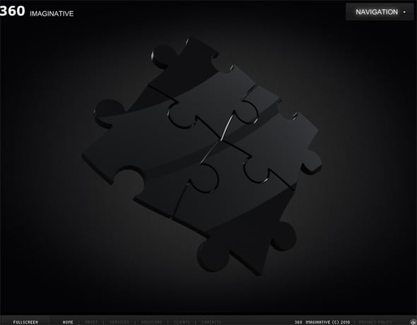
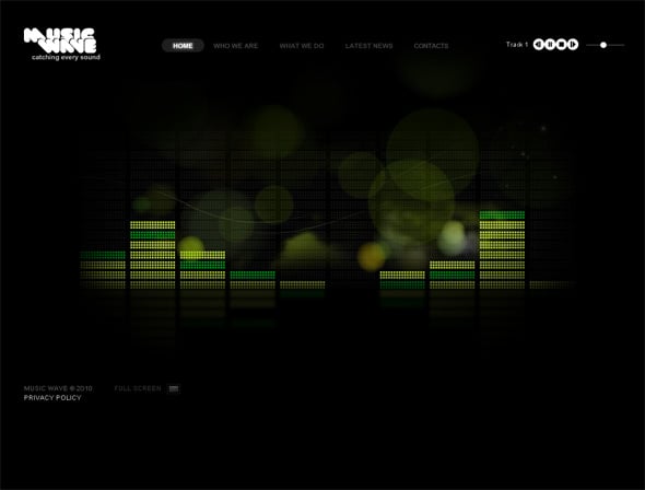
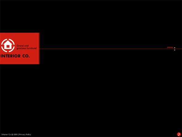
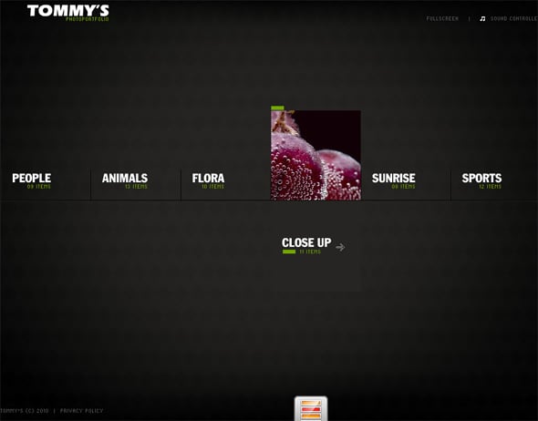
This trend came back in web design not long ago, and in 2010 it was on top of popularity. As for Flash, dark background works supremely well, because it can be perfectly combined with Flash content. It is unobtrusive and leaves the main focus on the website elements. It is used widely for Flash portfolios where the main idea is to grab the visitor’s attention by making them focus upon the artist’s/photographer’s works.
***
Flash CMS Gallery with Slideshow Effect
***
Stylish Business Flash CMS Template
***
Interior Flash CMS Solution
***
Business Flash Template With 3D Gallery
***
Dark Style Flash CMS Template
Accordion Style Menu
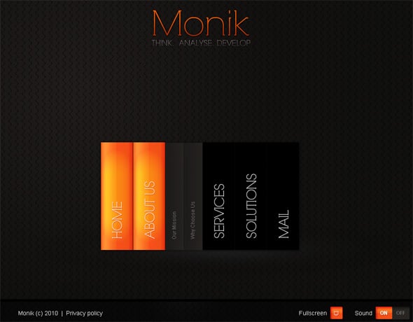
This trend has taken the fancy of many users for its attractiveness and ease of use. The intuitive navigation of accordion style menus is really convenient. If a Flash website is CMS based, its owner can easily create as many menu sections and sub-sections as he needs as well as add stunning effects within the control panel thereby making the menu even more impressive visually.
***
Business Template with Accordion Style Menu
Conclusion
The main tendency of Flash website design – 2010 was combining aesthetical issues and functional aspects in Flash website development. As for 2011 web design tendencies, of course, the year will definitely bring us new ideas, but the above mentioned trends of 2010 are going to stay popular during the upcoming year. Nobody can say for sure in what direction Flash industry will develop in 2011, but we believe some inherent trends are going to stick around for a while. We mean a solid stable trends that are the foundation of the design industry and can only change their faces, but not the basics.
Happy New Year, dear readers! May the New Year bring you much happiness, health and prosperity! May this year end on cheerful note and make way for a better year!
Stay with us!
Your Moto CMS Team.



nice post and nice designing:-)
Online Article…
[…]very few websites that happen to be detailed below, from our point of view are undoubtedly well worth checking out[…]…