Black and White Web Design: the Trend is Back in 2014

Creativity is evolutionary. But evolution always draws its elements from the old, fine-tuning the rawness and refining the lingering haziness. Web design and templates are no different. While the Black and White concept has possibly been the oldest design trend that history has witnessed, this trend is still kicking, all in a new style and flaunting a stark attitude. The last two decades have seen an upsurge in colors, patterns, fonts, innovative templates, explosive effects and a lot of ‘My eyes are stuck in what you have made!’ type of designs… Yet, the humble sharpness of ‘Black and White’ is rarely surpassed by any degree of innovation. There is no dishonesty at all in the ‘neutral is magic’ statement. As such, the magic of black and white never gets monotonous.
What factors make this ‘Good and Bad’ combination so immortal? Let’s find out.
Fit to Depict Every Identity
Elegance and sophistication are best expressed in shades of black and white and so are the roughness and rustiness. Grey and off-white give a misty look, darker and lighter shades of grey render a feeling of sensuality and plain white and black combos express purity and directness. There is a white for happiness, there is a white for purity, there is a white for love, there is a white for luxury and there is a white for poverty. And there is a black for all these human emotions and states. A wise use of these neutrals can help define various levels of emotions. The identity of a business can very well be communicated through the right choice of black and white themes.
Number of Shades Available
Good news! If you are planning to go for a black and white template, you are in the bright spot of choosing from a galaxy of shades. Black and white posess the largest number of shade attributes, compared to any other color known to human kind. The plus point is that no shade of black and white is too bright or too shallow. And each shade invariably speaks of something or the other. So deciding on perfect color scheme is never much of a problem.
Excellent Natural Contrast
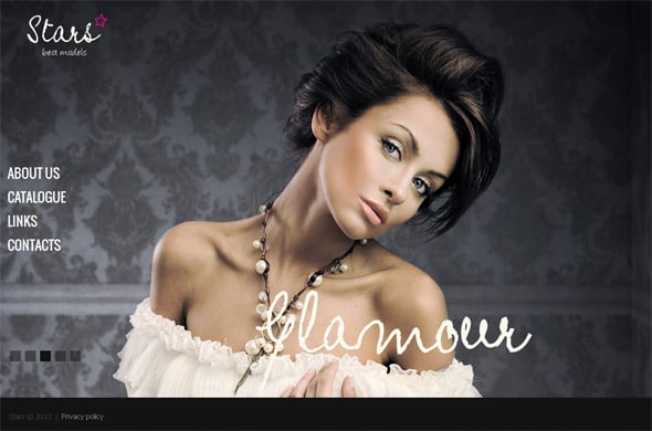
Black and white are naturally contrasting colors. So any person who does not have a very precise eye for color combinations could be hugely benefited. Almost any shade of black or grey looks just fantastic on a white background, as long as it is distinguishable to the eye. Similar is the case when black is used as the background color and white is used as the text color (although it remains less popular). Conventionally, white is used as the background shade since it is more subtle and does not have a piercing effect on the retina. The scenario however changes with what is being used – text or images. Images look equally good on both white and black backgrounds.
Clean Touch
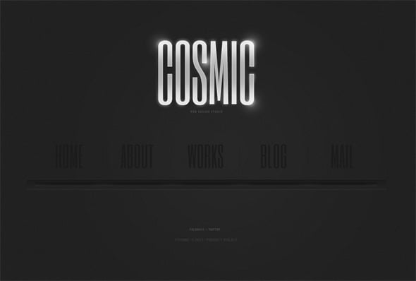
Black and white website templates look less cluttered compared to colorful templates. Fluorescence and brightness lend a filling impact on the empty spaces on a website. That does not happen with black and white templates, because there is no fluorescent white or fluorescent black. As such there is always an element of space when white and black templates are used. That is the reason most minimal templates use the black and white combination.
Naturally Soothing to Eyes
Human eyes are made to perceive various ranges of color shades and each color has a different effect in the psyche. Many people think that shades of black render a gloomy look to the scene. That is not always true. Black and white templates are retina-friendly. And the feeling that is conveyed through templates of these colors is a factor of which shade and what contrast is used, as well as kind of images are being utilized. A black and white template would never be harsh on eyes. It is a proven fact that people tend to spend more time on black and white templates rather than on the brightly colored ones.
The Final Word
2014 is supposed to be a year that would be more inclined towards simple designs, clean and expressive in nature. Black and white templates would serve as rulers in the web design scenario. Back to the good old days then – this all looks very promising!











Very impressive article.
Very nicely you have explained the trend of Black and White web design. I really appreciate it very much.
Good job for sharing this useful information.