Whoa Hotelier – Ultimate Guide to Creating the Best Hotel Website
“In with the new – out with old!’ This phrase is especially true for hotel website design. It is time to redesign standard hotel websites with a tour operator website builder today because the entire hospitality industry is changing as a whole to appeal to millennial travelers.
Many hoteliers do not quite understand the importance of their online presence. However, a hotel website should be the focal point of all marketing strategies for a hotelier. Hotels now include state of business halls, Wi-Fi services, and in-room conditions to plug in mobile devices to appeal to this advanced generation. The outdated hotel websites will probably negate any plans to entice a younger demographic. The first impression a hotel will make to Millennials is on the web, so using modern hospitality web design elements is important.
To be effective in today’s competitive online arena, your hotel website must be “clever”. In this guide, we would like to talk about the key factors a hotelier should take into account to create a hotel website that will be truly astounding.
Contents
- The Three-link Chain of Priorities…
- Visual Appeal
- Functionality
- Multilingual Accessibility
- Mobile Compatibility
- Socializing 24/7
- Search Engine Optimization
- 6 Hotel Website Design Crimes
- Conclusion
Three Major Priorities for Resort and Hotel Websites
The visitors that are coming to your website all have their own intentions and motivation. Some of them are planning business trips, others are thinking about leisure destinations. But what they all want is to stay at the most successfully located hotel with the best services, conditions, and rates. To create the best web experience for your website visitors, your primary task is to plan your hotel web design as much as clear and detailed as if you would work out the major overhaul of your apartment.
There is a chain of priorities for you to think over
- Attract – capture relevant traffic by developing a user- and SEO-friendly hotel website;
- Motivate – stimulate visitors to go deeper into the website by showing the hotel in the most favorable light;
- Convert – make the motivated visitors become clients and turn the engaged traffic into direct hotel revenues.
The hotel industry is a specific niche that requires an individual complex approach to the hotel website development. Your task is to find and tune up the proper balance between visual perception, traffic generation effectiveness and wise conversion techniques for your hotel website.
Hotel Website Should Be Visually Appealing
Appearances have an enormous influence on many visitors. Specifically, 60% of people are visual learners. Visual appeal is often the determining factor as to whether or not a visitor will remain on the website long enough to actually see the services your hotel provides. In the hotel industry, laconic but eye-catching design works the best.
Colors
For a hotel website, plain colors would be the best choice. The color-rich spectrum is not appropriate here. You can choose one dominant color and use its variations for highlights.
Generally, the auditory in the hotel industry differs, so the design for each target group will have some peculiarities that we need to take into account. If we are thinking out a website for a hostel or a mini hotel, we may use bright colors and implement some bolder ideas here. As to big hotels, here the design comes closer to classics: more stylish photos, calm colors and classical design combinations are appropriate here.
Also, please be aware that people from various countries are going to visit your website, and color perception may differ. To come up trumps, you can safely use calm tones and experiment with open or white spaces to create an uncluttered combination of images and text.
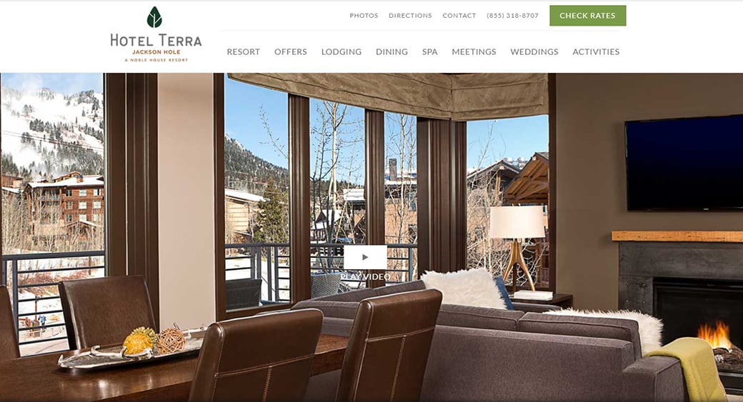
For the Hotel Terra Jackson Hole’s website, calm and sensual colors are used. They create an atmosphere of warmth and inspire the visitors with a comfortable homely feeling.
Images
The photos of stunning hotel rooms and conference halls, wedding facilities and the environment under different angles will paint a beautiful picture of the hotel place for your visitors and give them a better idea of what to expect from the hotel. Augment your website with large, high-resolution photos of the rooms and environment to give your visitors all they need in the most convenient form.
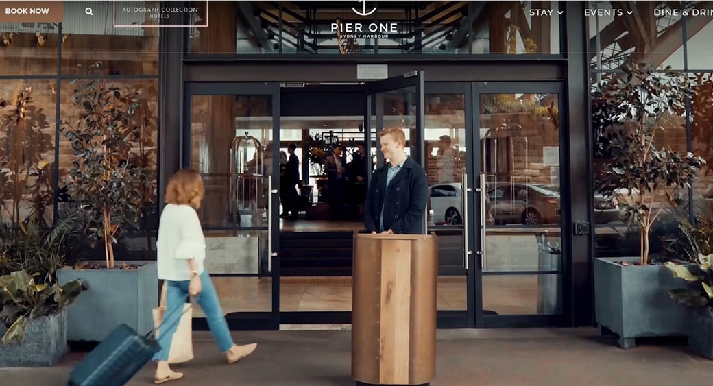
The Australian Pier One hotel ’s website has a convenient video/photo gallery due to which the visitors can go deep into the harbourside views and luxury rooms of the hotel.
Functionality
Have you ever visited a website trying to do something that you were supposed to be able to do but couldn’t? That was not a good website then. If your visitors don’t find what they need on your website, pretty design with its nice color schemes and pretty buttons will not make any sense. People will not stay on a website that is hard to use.
So, what does define a good hotel website?
Navigation
A hotel website should give answers to all questions the visitors might have, from the hotel location with clear descriptions on how to get there, the size of rooms, etc. to, for example, ski conditions (if your hotel is in the mountains). The visitors have a really wide set of questions depending on their own conditions. Some of them are going to travel as parents and want to know what your biggest room is, if you have door-to-door, etc. As to, let’s say, business travelers, most likely they’ll be interested in enough quantity of plugs to their stuff, the convenience of a desk in the suite, Wi-Fi opportunities, and so on.
Modern website design requires being more dynamic and needs us to route through instead of all these crazy navigation trees that have 1000s possible ways to go somewhere and frustrate visitors so much. Some hotel website designers think for some reason if they offer us 500 different things to click on, we might click one. Professional hotel web design now goes in a new direction by becoming more user-friendly and effective. Build your website navigation in such a way you would stay with the guest before, during and after their stay. Thus, visitors will receive what they really want.
Make the navigation as much possible clear and convenient, and the prospective customer will not leave your website without making a reservation.
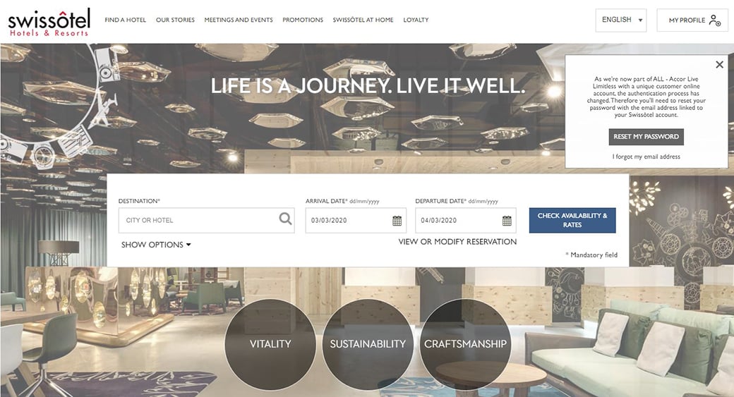
The Swissotel website demonstrates a really good example of neat and prominent navigation. It is easy to use, doesn’t confuse users with too many options and provides them with the information they really need.
Online booking system
Having an effective website where visitors have everything they need to book a hotel room online is the key factor of a successful hotel website that converts. Online bookings have become increasingly popular. If you cannot take online bookings, you are missing out on a significant slice of the business.
The current economic state appears for online bookings to become the go-to solution – both for travelers who go to the web in search of savings and for suppliers seeking more sales. But savings are not the only reason customers are turning online to book. It also eliminates the hassle for you and your customers because…
- It is self-service. Your service works 24/7, and that means visitors can browse, book and pay at the time which is the best convenient for them;
- Your expenses decrease since manual handling of bookings are minimized;
- There is the advantage of automating calculation – when a robot calculates instead of you, there is less room for error;
- Faster booking confirmation. Money goes straight to your account – you get paid on time, and the customer receives a confirmation e-mail with all the details of his booking.
This all leads to the fact that tour operators must adjust online booking capabilities for their websites in order not to lose out on bookings.
When enabling an online booking system or a WordPress appointment booking plugin, the key question for a tour operator is to launch the system that would truly work for his business.
There are some points applicable to the tour sector:
- Price – present your pricing in the simplest, obvious and eye-catching way;
- Functionality – your website navigation should save the visitors’ time (for example, saved searches);
- Description of services – use clear, easy-to-read information on your products;
- Extra charges – be very specific and clear with them;
- Website bugs – they are able to completely damage your business reputation.
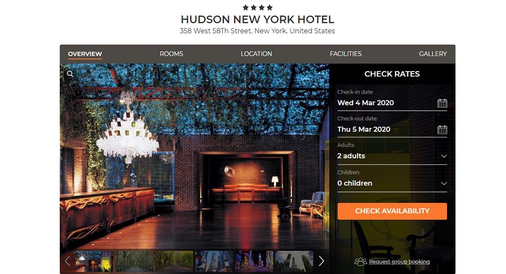
The Hudson New York hotel ’s website online booking system is performed in the easiest and most user-friendly way. You just select the dates of arrival and departure and get the list of all the rooms available with photos and pricing in one click. Then you will be offered to fill in the “contact details” form. Everything is simple and obvious.
Information architecture and maps
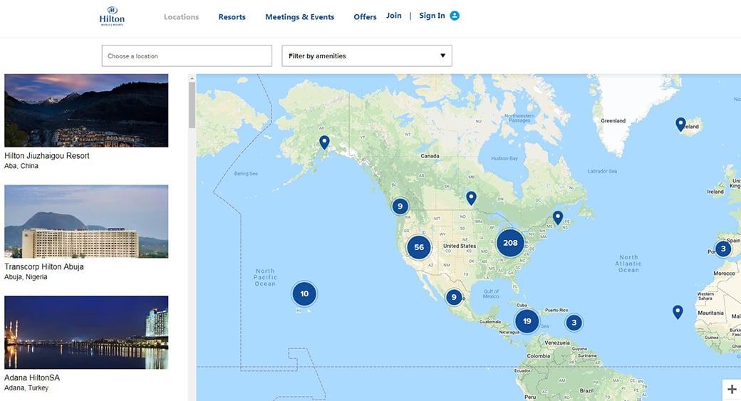
Prominent interactive maps will definitely deliver a better user experience to your visitors. Take advantage of the maps and use them as a focal point for the first time visitors in order to make their stay on your website useful and productive. When a potential customer visits your website, he expects to see the hotel from different angles: the detailed photos of rooms, locations, etc. Pinpoint local sights, shops, restaurants and other places to see and visit. Include driving and walking direction between the hotel and all the locations listed to give your guests even more comfort.
The website of the Hilton hotel is a great example of map maximization:
Web forms
Hotel web form design really matters. Giving up a form unaccomplished is one of the major concerns for many hoteliers. There are some easy techniques that can help you to take your web form from ineffective to brilliant.
- Do not force your visitors to register. Alternatively, you can offer guest registration to proceed with visitors’ bookings. After they finished filling in the form, you can offer optional registration by explaining the benefits.
- Do not ask for unnecessary information. Each extra question you ask can make guests rethink their intentions.
- Usability comes first. Better usability leads to more conversions. Make the form as simple and user-friendly as possible by removing all unnecessary fields and making it easy for guests to fill it out.
- Take care of the form’s security. If you are going to request personal information from your guests, get a security certificate for your website to make it more safe and trustworthy for visitors.
Perhaps, some of you know the story about `$300 Million Dollar Button`, when hoteliers changed mandatory registration on their website to option registration and got sales 45% up. So, by changing a single button in your registration form, you sometimes can achieve unbelievable results.
Multilingual Accessibility
Since hotels are intended to target the international market, your website content should be adapted to more than one language. The information displayed in different languages is often the same but can be tailored for different audiences. If the information provided in several languages without the necessity of leaving the website, that will greatly increase the chances that the customer will reserve with the hotel.
For multilingual optimization of your website, there are some important things to think about:
- Multilingual website translations. You will need to translate your website content into several languages. It is important for native speakers to translate the texts, as only native speakers can tap into their locality to use culture-specific cues to drive action.
- Multilingual SEO and PPC. You might need to take care of PPC ads and, of course, keywords for country-specific campaigns (again, a native speaker’s help will be priceless here). Also, it is important to optimize paid international search programs, which not always play by the same rules as Google or Bing.
- Foreign market search engine strategy. You will have to take care of optimizing for nation-specific engines, e.g. Yandex for Russian speaking countries, Baidu for China, etc. Each of the search engines differs in ranking algorithms.
- Understand local buying culture and mentality. User behaviors differ in various countries. Each country market has its own peculiarities, like cash (in Russia) or 1-800 call centers (in Israel). Understanding how customers are used to completing bookings can save a lot of frustration and missed opportunities.
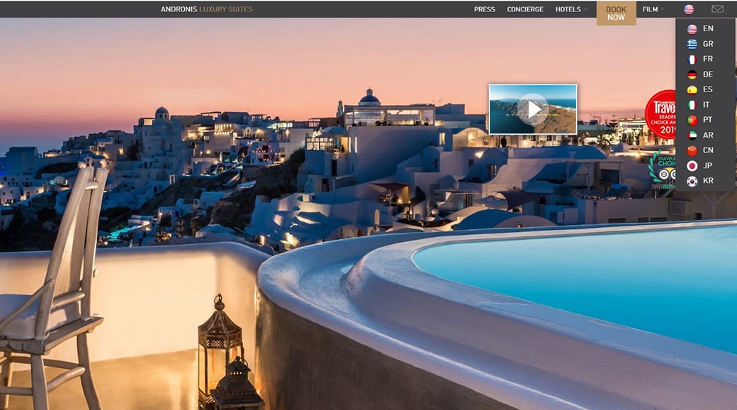
The Andronis Luxury Suites website is where the design allows visitors to choose languages without having to exit the website. We can set preferences for each country right from the homepage.

Mobile Compatibility and Loading Speed
More than ever, travelers are using their mobile devices to plan trips and book hotels on the go. According to Google reports, as early as 2013, more people will be booking from mobile devices rather than from PCs. Taking into account that about half of all travelers now start planning their trips with the help of a mobile device (and it will only become more so), hoteliers should take care of a mobile version for their websites.
So, which points should we concentrate on creating a mobile-friendly hotel website?
- Simple website architecture. The usability requirements for mobile devices are different than for PCs or laptops. When a mobile user visits a hotel website, he expects to get an easy-to-read content, intuitive links, and simple booking process.
- Page speed. Fast loading is essential for a mobile website because mobile users usually search for info in a hurry. Ideally, the website pages should be smaller than 20KB.
- Easy booking. With a good booking engine integrated into your hotel website, your guests will be able to easily book a room. To increase conversion rates, you can add multiple ways of booking, such as “click-to-call” and “request a room” options.
- Clean design. Get rid of clutter in your mobile website version by minimizing the use of images and videos and using white space wisely.
In MotoCMS hotel designs, there is an embedded mobile version that goes with each template and can be customized according to the owner’s wishes.
Social Networks
Social media is a potent tool to provide a unique value proposition to the customers. A well-built hotel social media brand and strategy could provide clarity to the unique aspects of the hotel products and a special approach to reach key customers. Also, social media has not only become a critical tool to interact with customers but is also a key element that has an impact on organic search results.
To create social media “chatter” around the hotel, target audience and stimulate hotel website visits and bookings that would be good to identify a number of Social Media channels and initiatives that generate buzz around the hotel for each particular destination. With an effective Social Media plan, a hotel brand can increase the ROI in their organic and paid search strategies.
Here is an approximate brief to-do list for your Social Media strategy:
- Facebook: Facebook Fan Pages, custom tabs, sweepstakes, interactive Facebook apps, etc.
- Twitter: optimization, customizing a background, content posting, taking care of the follower list growth;
- Flickr: setting-up, ongoing management, content posting;
- YouTube: video producing, hotel profile optimization, further video uploading;
- Google+: creating a page for the hotel, its optimization and running;
- Pinterest set-up;
- Foursquare: check-in specials set-up;
- Monitoring customer reviews on the web;
- Banner ads, sponsorship, web 2.0 search;
- Conversion from social media initiatives tracking and reporting.
SEO Optimization
Search engines bring the most targeted traffic to your hotel website that converts like fury. With proper on-page and off-page optimization, you will be able to conquer the most relevant audience. The statistics show that the top result on a search page gets clicked 42% of the time (compared to 3% for result #10); the top three results get clicked 79% of the total clicks; the top 5 get 88% of clicks.
The curious thing about search engine optimization is that it actually requires starting with the structure of the website itself. If a hotel website is designed improperly, applying SEO to such a website is like trying to get a car started with no fuel.
To name just a few key components of a well-designed website which is ranked well by search engines; thoroughly researched and well-thought-out meta tags, a simple website navigation theme, a good booking engine, well-written sales text, a good link strategy, use of low-density photography, and knowledge of how consumers choose hotels. It’s amazing how many websites violate one or more of these essentials. However, all these factors can influence search engine rankings.
Step by Step SEO Guide for Hotel Owners
So, how will you be optimizing your well-designed hotel website for search engines?
- Determine with keywords. Which words would people use when searching your hotel on the web? Think about the keywords that apply the best for your hotel. There are a number of methods to find the most appropriate keywords to target: clients’ suggestions, brainstorming, web analytic tools, social media accounts, competitor analysis, your own experience with similar industry websites.
- Optimize each page with one-two keywords. Each page of your website should be structured around a different set of related terms (ideally, each landing page on your website should be optimized for a different hotel-related keyword).
- On-page optimize your hotel website. As per best SEO practice, keywords should be naturally spread within the page code (that includes the title tags, description tags, and meta keywords, the URL, ALT tags, headings, body content, etc.).
- Create quality content focused on the customers’ needs. Your website should evoke an emotional response, answer the customers’ needs, provide a solution and finally encourage them to make a reservation. In other words, think about customers more than search engines.
- Build links. It’s time-intensive. Sometimes confusing… but unavoidable. Because all in all, it’s the trump card for higher rankings. The Google algorithm has become much more elegant and advanced, placing more emphasis on trusted links. By “trusted” means verified by elements like user data, domain age, and other relatively hard-to-spoof factors.
For a hotel website, quality and relevant links will be served up first on search engines. Some link building strategies include submitting your hotel website to quality local and hotel-related directories, running a company blog, writing guest posts for the hotel industry websites, commenting on hotel industry forums, article marketing, communicating with the community, industry organizations and local hotel associations (and asking them to link to your website), and so on.
Best Hotel Website Designs 2020
As a cherry on the pie, we have prepared a collection of a top-notch hotel, resort, and apartment rental websites. They have a visual website builder, so you won`t need a developer or a designer to create a hotel website. Just register a demo and start creating your website for free.
Small Hotel Website Design
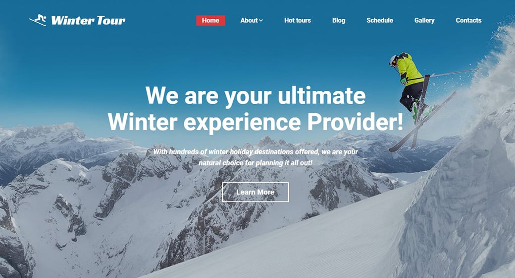
Ski Motel and Resort Website
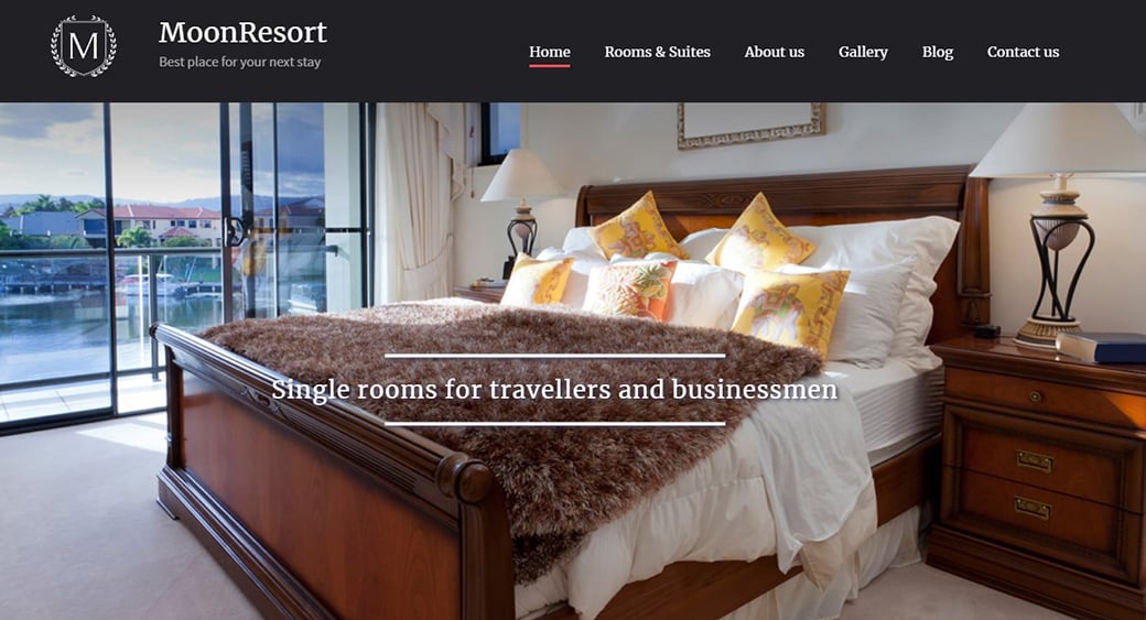
Simple Hotel Website Design
Seaside Hotel Website
Apartment Rental Website Design
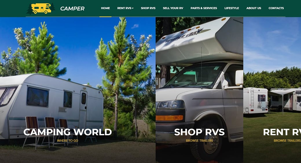
Camping Website Design
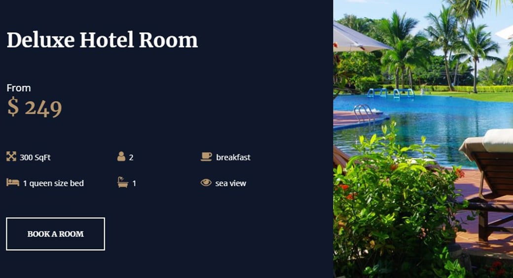
Luxury Hotel Website Design with Booking
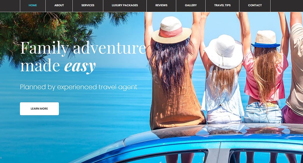
Family Tour and Hotel Website
Resort Website Design
Cruise Hotel Website
Landing Page for Guest House Website
5 Star Hotel Website Design
Mountain Hotel One-Page Design
Resort Website Design
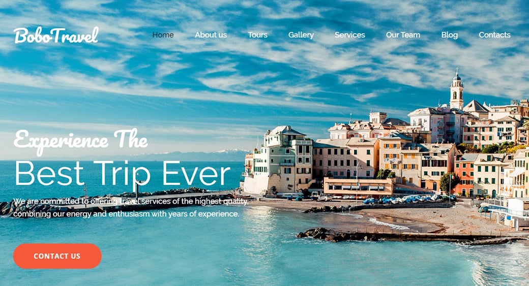
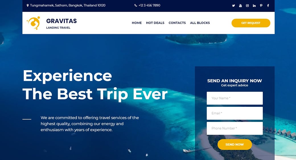
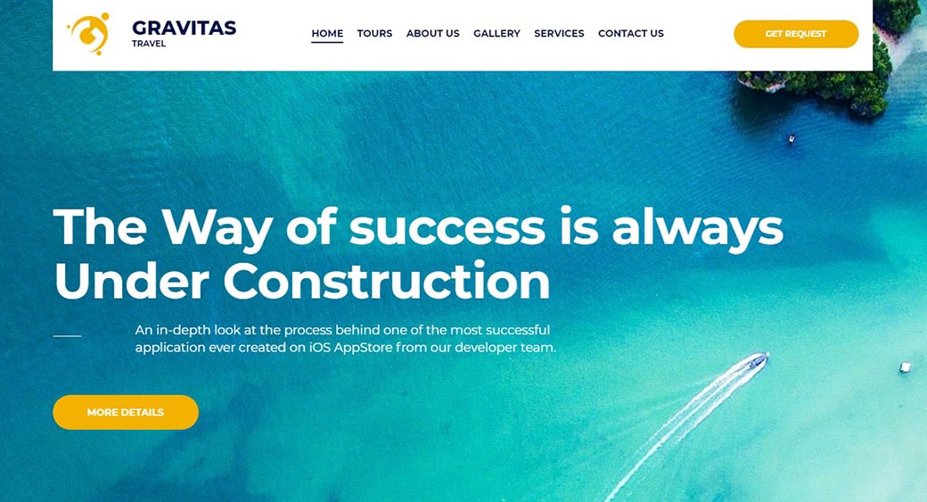
Tour and Travel Website Design
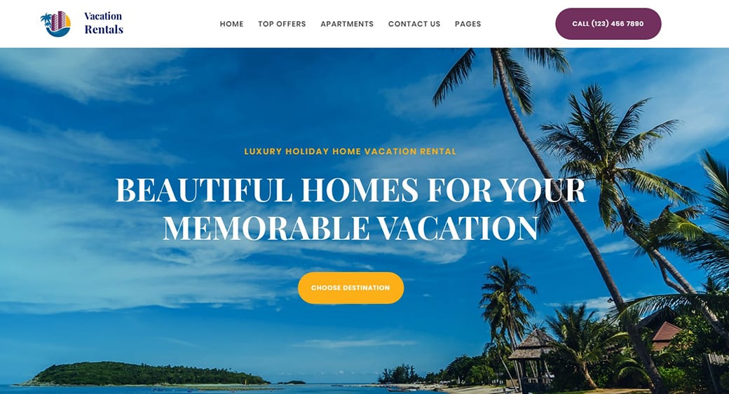
Apartment Rental Website Design
Villa Website Design
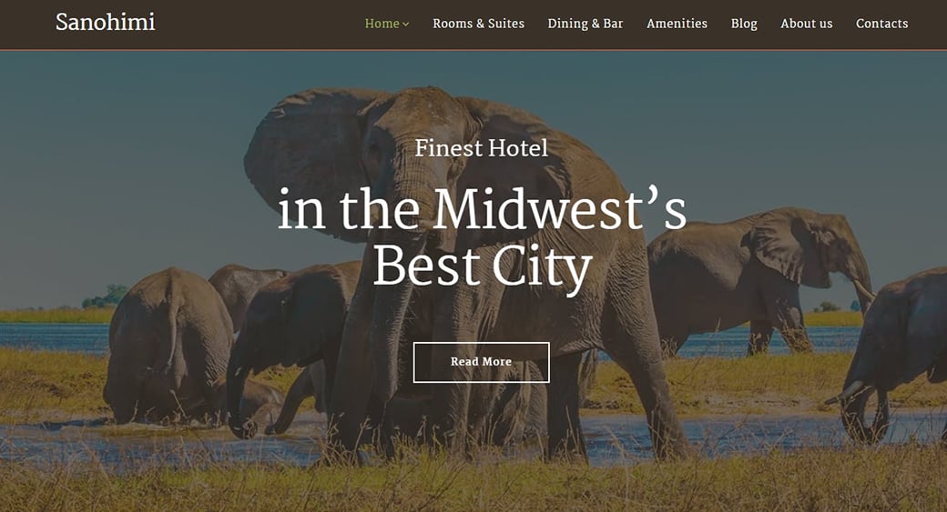
Safari Hotel Website Design
Vacation Inn Website Design
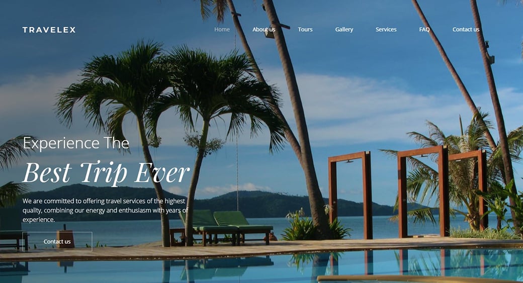
Tropical Resort Website Design
One-Page Design for a Resort
Website Design for Tropical Hotel
Tourism and Travel Website Template
One-Page Website for VIP Resort
Apartment Booking Website Design
Winter Hotel Site Design
In case you need quality hosting for your hotel website, take advantage of a special offer from our partner Bluehost.
6 Hotel Website Design Crimes You Should Never Commit
Your hotel website can become the most profitable sales channel working for you 24/7 by bringing you direct bookings. 2012 is the year hoteliers are re-evaluating the concepts of their brand websites. Some of them opt for a few improvements of existing websites, others go for a completely new website. Here I will outline the most “criminal” hotel website design attributes which you need to avoid.
Crime #1: Complicated booking process
The simpler the booking process is – the more bookings you will get. The reservation process should be as much more transparent and easy to follow as possible. The users like to know in advance how many steps there are in the process and where they are at each stage. To make the booking process truly effective, you must know the answer to the following questions: how long does your booking process take? How many visitors start the booking process and don’t finish it? On which stage of the booking process you do lose the customers?
Crime #2: No or difficult to find location and contact details
That’s amazing, but very often hoteliers either hide the location page among the tiny links on the home page footer or somewhere deep within the website. The clear concise contact details with an interactive map and clear info on how to get to the hotel (as well as transport links and maybe key attractions like city centers, shopping, etc) should be one click away from all pages of the website.
Crime #3: Bad quality, slow-loading images
Your hotel website visitors will always want to see what hotel looks like inside and out. Your website must contain a gallery of all images that would be easily accessible from any part of the website. Photos should be professionally taken, modern, wide-angle, and designed to show off your hotel and create a lasting impression on guests.
Crime #4: Busy pages with irrelevant or outdated info
Your potential visitors will look for specific, up-to-date information about your hotel. Do not clutter your website with all the info you can ever think of. Out of date info will not do any good to you either. Even worse, the old Christmas promo which is still visible on the website in March will surely have a bad impact on your business reputation.
Crime #5: Website that does not have a mobile version
As I already said here, mobile-friendly hotel websites (or websites with mobile versions) are the future. The use of mobile internet is increasing with sonic speed, so take care of your own solid mobile presence. In MotoCMS, each hotel website design has a ready mobile version that can be customized to the owner’s liking.
Crime #6: Poor navigation
You can be as creative as you wish when designing your hotel website, but the users will be expecting to have a deal with standard forms of navigation when browsing through your website. Place the links where people can logically find them. Generally, visitors are supposed to navigate three levels at the most before they find what they are looking for.
Best Hotel Website Design – Final Words
That’s about it, guys. Download and print your website, show it to friends and family to get their point of view. You will get completely different opinions when you look at it in print. Is the website up-to-date and neat? Is the text in priority order? Does the text sell?
Your website is one of the most important sales funnels for your hotel business, so make every pixel count. Try your best to make each element on your website working for converting traffic into real bookings. The devil is in the details, and your hotel website definitely deserves your attention.


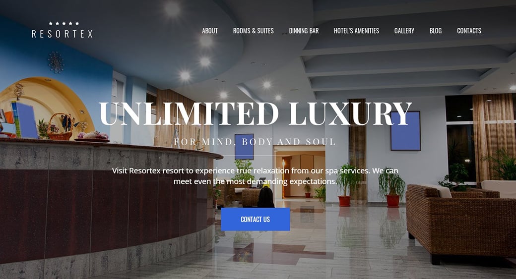

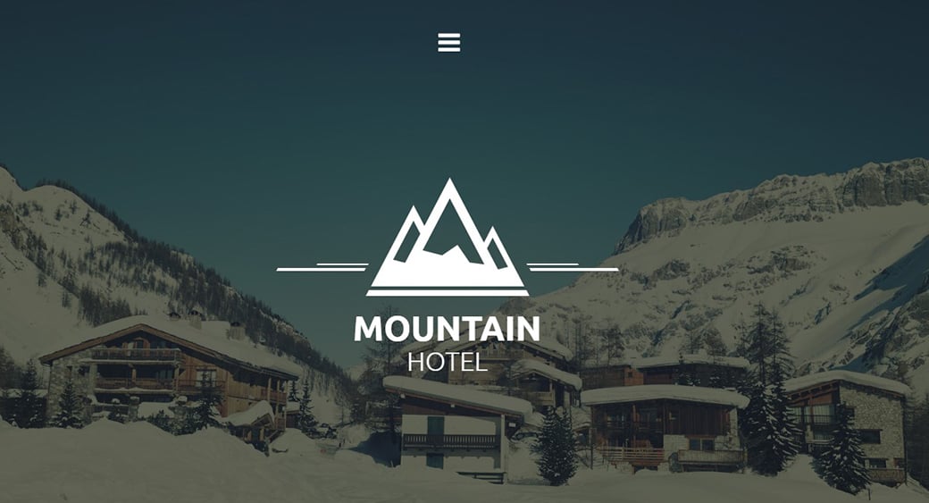
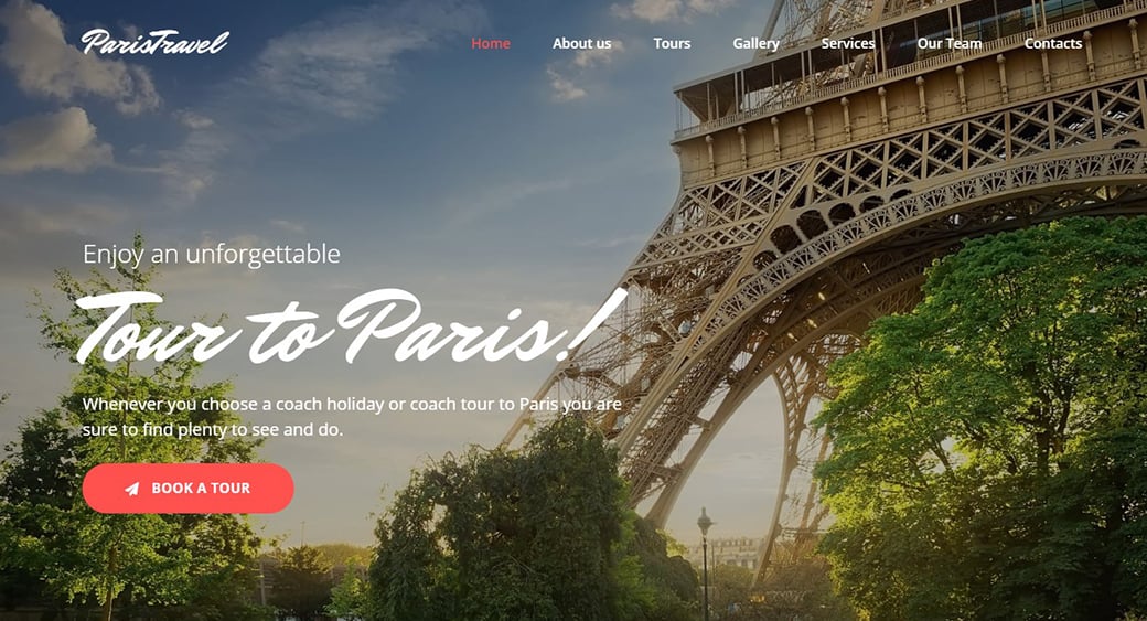
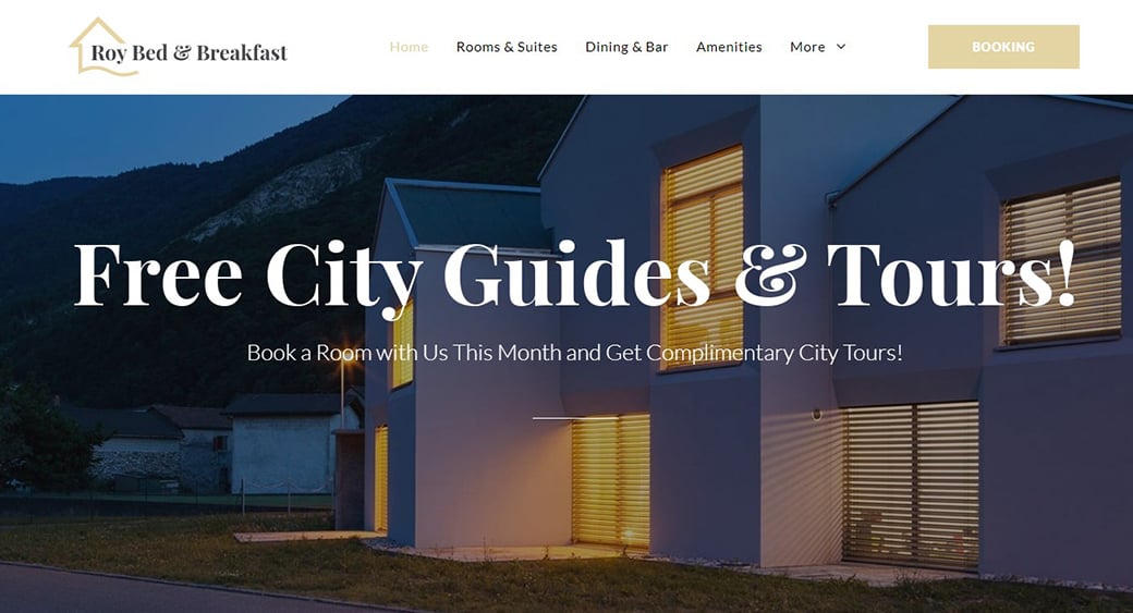

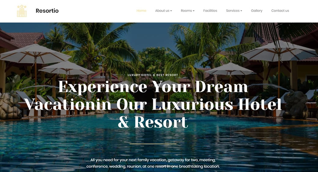

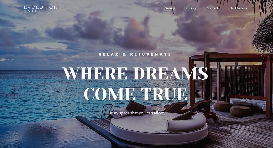
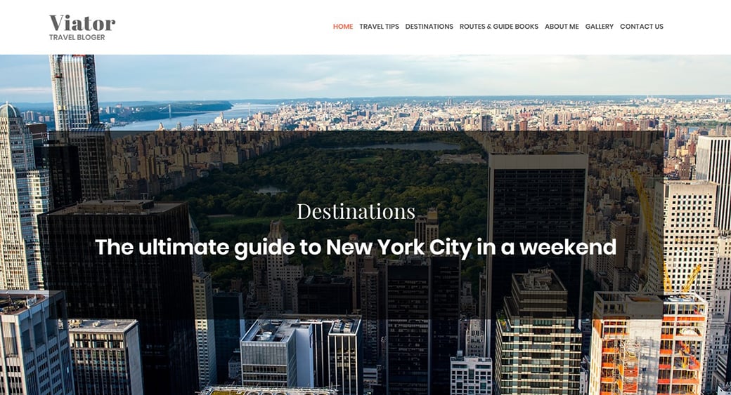
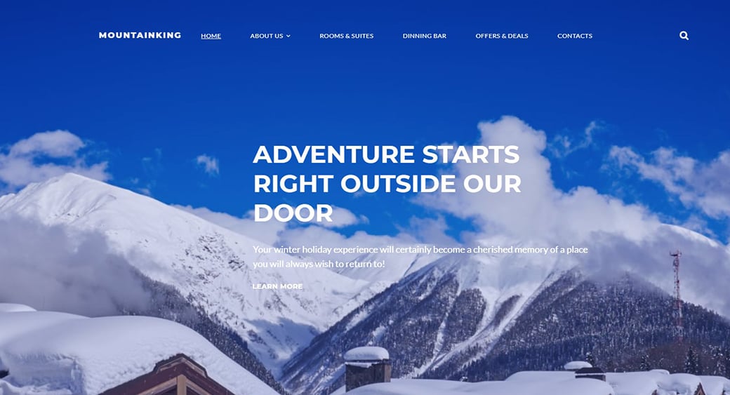


the websites mentioned above, are they made with motocms ?
Thank you for the question, Olivier. The website examples used in the article are not MotoCMS based (they are the websites which I found successful in those particular cases), but be sure – MotoCMS has all necessary functionality for a professional hotel website creation. And the process is going to be easy and exciting.
[…] on http://www.motocms.com Share this:TwitterFacebookLike this:LikeBe the first to like […]
[…] Whoa, Hotelier! The Ultimate Guide to Creating the Best Hotel Website Ever […]
[…] Whoa Hotelier! The Ultimate Guide to Creating the Best Hotel Website Ever | Motocms.com […]
[…] Whoa Hotelier! The Ultimate Guide to Creating the Best Hotel Website Ever | Motocms.com […]
Hallo, wo wolltest du dieses Jahr Urlaub machen?