11 Rousing UX Designer Portfolio Websites
We bet that every time you come across an article somehow related to web design, it definitely mentions UX at least twice. Crazy popularity of this term speaks for itself as we quietly observe how clean and user-friendly design win over busy flashy interfaces of the wild 1990s. What is UX and why is it so important for today’s world? Let’s figure it out before we dive into the more detailed topic and check the best UX designer portfolio websites, photo gallery templates, and portfolio templates.

UX (stands for User Experience) is the way a person feels while interacting with a system. Hence good UX is when a person using a web resource feels safe and confident as the interface enables them to navigate through the website easily and intuitively.

However, the influence of User Experience becomes even more important when considering it from the professional point of view. Whether you are a beginner UX designer or a seasoned industry veteran, you sure understand that being able to create a clean, understandable, user-centric UX designer portfolio is the indication of your competence and the cornerstone of a successful career.
Top UX Designer Portfolio Examples
With that in mind, we have selected and analyzed 11 beautiful UX designer portfolio websites so you could use their unique and perfectly figured user experience concepts for your personal inspiration. So here they are, in no particular order. Enjoy.
Tobias Ahlin – Simplicity and Forthrightness
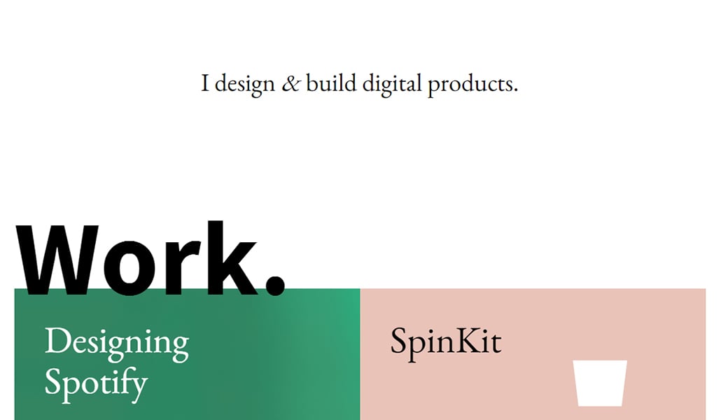
Great UX designer portfolio is all about making a web project direct and understandable to the target audience. Tobias Ahlin implemented this idea by getting straight to the point with his snow white header and a clear statement: “I design & build digital products”. Needless to say, that this tactic never fails to get the right clients.
Case studies are presented by huge tiles with a short description of every project and soft animations. Call-to-actions are meant to grab viewer’s attention so Tobias Ahlin presented them as the drop-downs activated when a visitor hovers the mouse on the project tile.
Gaelle Monin – Minimalist and Grid Style Layout
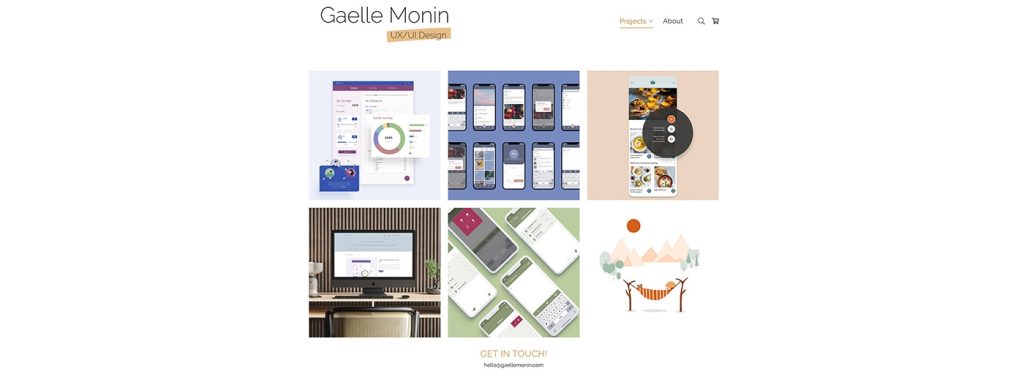
Gaelle Monin, a French UX/UI designer based in London, UK, seamlessly shifted from fine arts and printmaking to UX/UI design after the pandemic. With a photography and fine art publishing background, her minimalist design portfolio reflects calming reliability, while her user-focused approach delivers immersive experiences.
Joshua Taylor – Focus on Case Studies
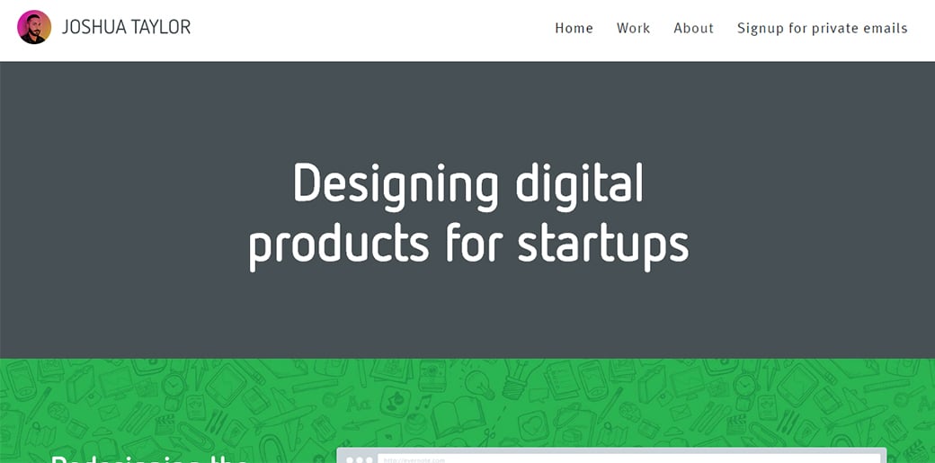
Evernote Design Director in the past, Joshua Taylor created a stunning UX portfolio website by focusing viewer’s attention at each case study in details.
He used a calm yet attractive color palette, highly visible navigation menu and well-organized call-to-actions – these three points guarantee an effective and clear user experience. Every case study provides comprehensive information on the project including design challenge, team’s actions, problems, and solutions. Such visual stories help a lot as they promote UX designer’s advanced experience and build trust for his work.
Kristian Tumangan – Detail-Oriented Approach
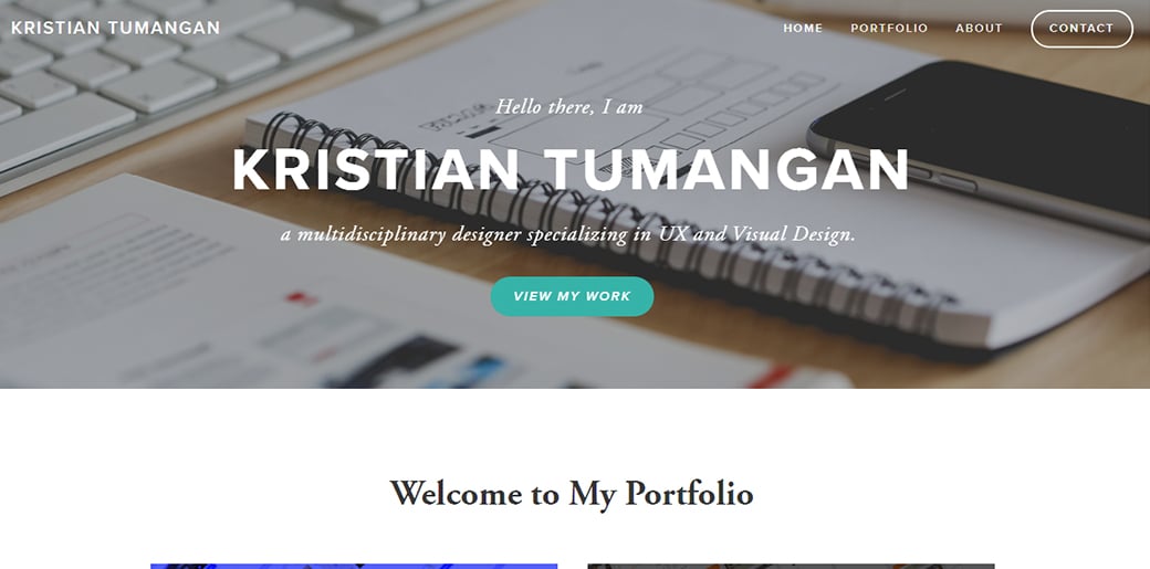
The simplicity of this UX designer portfolio is inspiring, but the way case studies are presented is what really needs to be mentioned. Kristian’s portfolio provides extensive information about every project he has worked on or somehow contributed to.
Anthony Anderson – Unique and Powerful Design

Anthony’s website might be a bit complex to navigate through for the first time but once you get used to bright colors and long scrolling homepage, you see that Anthony’s portfolio just perfectly represents his creative and extraordinary personality. The design process is well- organized and documented in details with user flow charts, sketching out ideas, working on wireframes and other important UX design stages.
Simon Evans – Elegance and Clarity
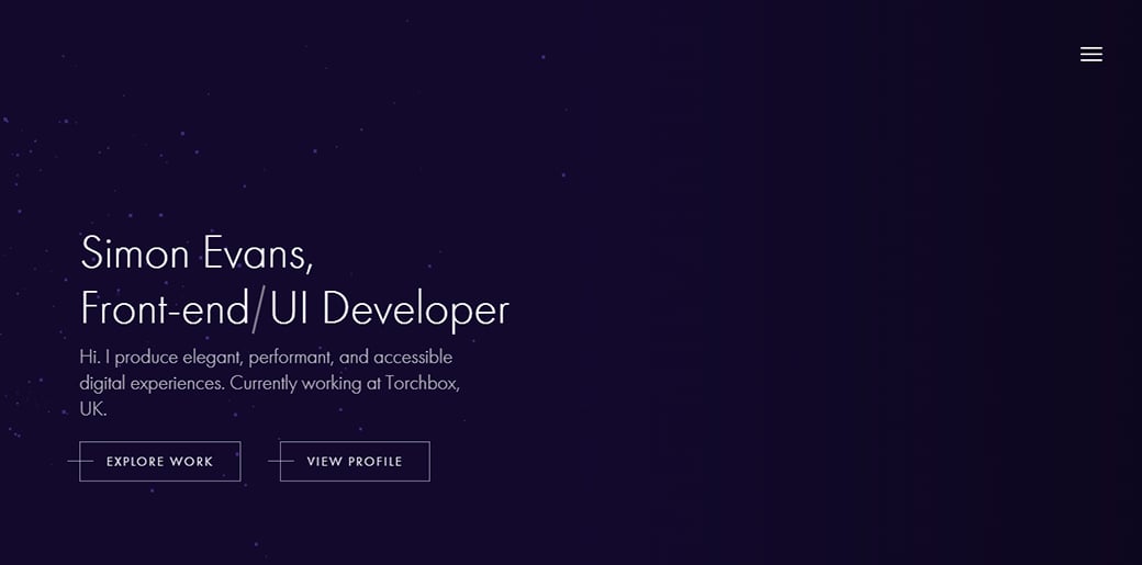
Simon has created an attractive website which combines both great UX and pleasing-to-the-eye layout. The non-scrollable homepage highlights all the important information about the author and draws attention to two call-to-actions offering to explore the work or view UXer’s profile. Detailed case studies of Simon’s projects well-communicate his experience and design skills.
Yitong Zhang – Clean Design and Great Communication
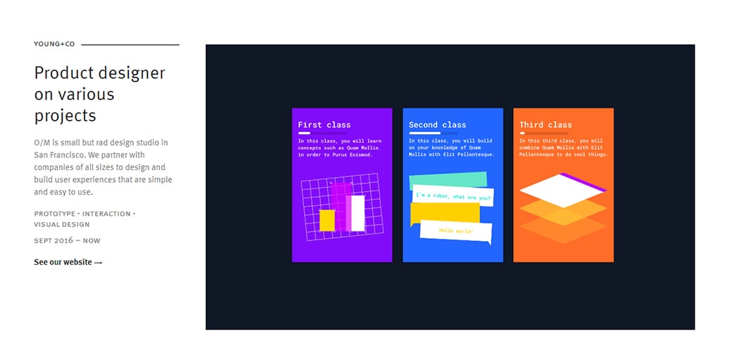
Yitong has produced a clean and professional interface for his UX design portfolio website. He used black and white as his main colors while bright yellow did a great job highlighting call-to-actions and other meaningful elements. Just like other great designers on this list, Yitong provided well-documented case studies and detailed design process.
John Ellison – Delicate and Informative Interface
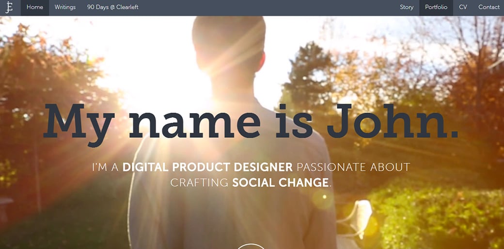
John did a great job of creating a visually appealing and powerful layout for his online portfolio. While he is among the minority of UX designers who put an introduction video on the home page, this decision only came in handy for him as it tells a comprehensive story about John and his career. Just as any other great UXer, John treated UX case studies as one of the most important sections on the website by describing a complex design process in every detail.
Gregor Kalfas – User-Centric Approach
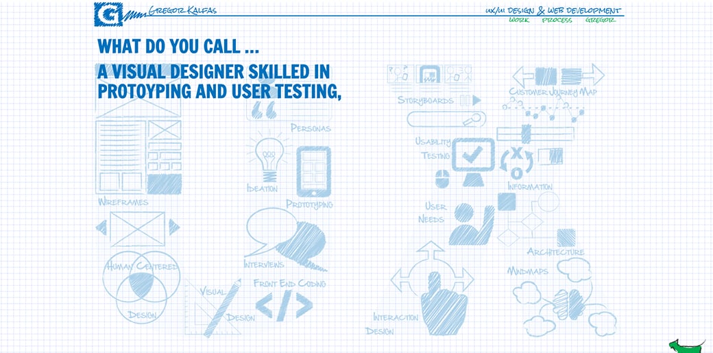
While this website is not all about modern visual concepts with lots of white space and elegant fonts, it is still worth to be mentioned as it represents one of the best examples of a multi-page website with zero loading time when switching between pages. Gregor did his best to achieve such a brilliant result and he deserves some kudos for that. Apart from an excellent functionality, this portfolio left no UX questions unanswered providing an extensive documentation for case studies and design process.
Luke James Tailor – Vibrant Colors and Clean Layout
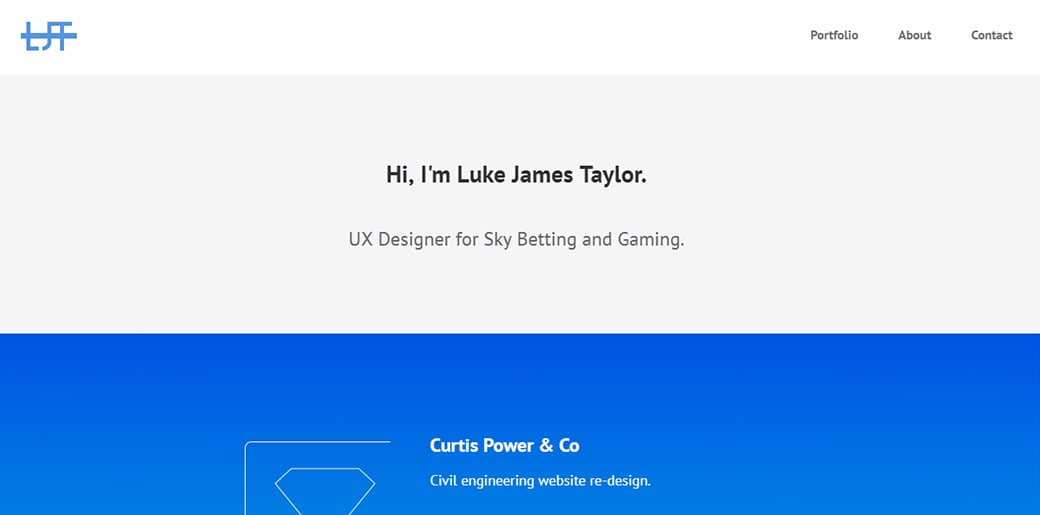
Luke uses a somewhat different approach in presenting his experience and skills. He prefers to redirect a website visitor to client’s work rather than describe the details of the project in long paragraphs. The concept of strong visual influence remains the same throughout the website as Luke uses bright color gradients and fancy animations to give his portfolio a personal touch.
Nan Wang – Fresh and User-Centric
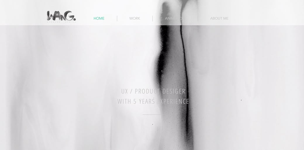
A UX Job Coaching Student, Nan Wang, created an attractive UX portfolio with a fresh design and user-centric functionality. She has built her website on the intersection of flawless user experience and strong visual effects like beautiful animations and background videos.
Zach Kuzmic – Responsive and Straight to the Point
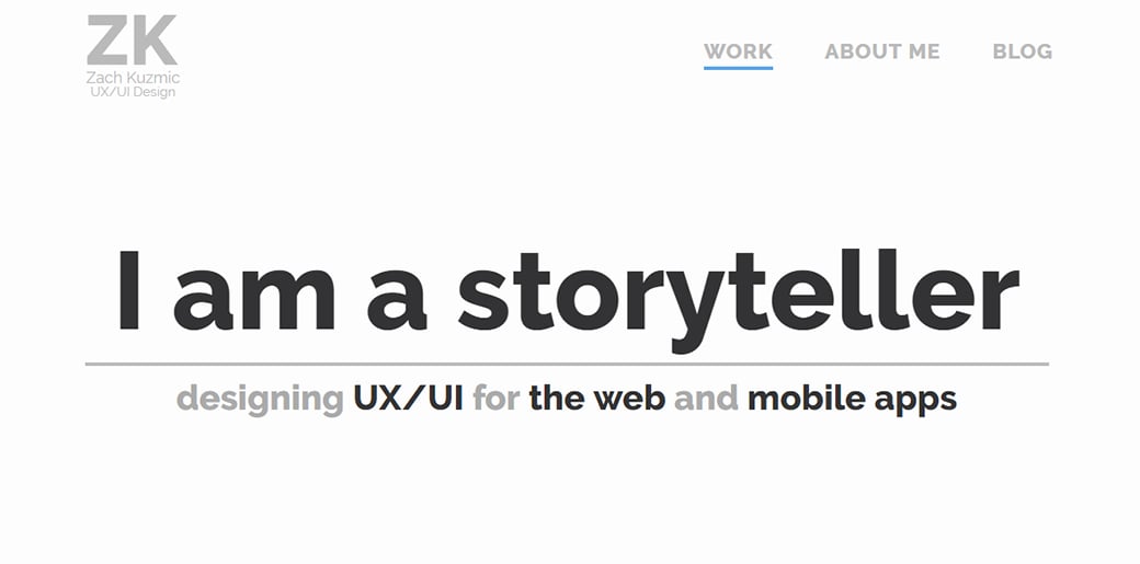
Zach Kuzmic believes that it’s very rarely enough just to include a link to a client’s live website so he focused on representing each of his four latest and biggest projects with as many details as possible. He explained the tasks, challenges and solutions for every case study and even provided links to external PDFs of a comprehensive design process. As for the visual part of his website, Zach decided on a minimal approach, using calm colors of gray and white for texts and background, and bright beautiful shades for highlighting case studies and call-to-actions.


Leave a Reply