Website Accessibility Guidelines and Standards to Use
Factually, The World Bank statistics show that 15% of the world’s population is living with a disability, which makes up 1 billion people in the world. These figures may seem to be exaggerating. However, it is a bitter truth that 1 billion people can’t access the internet properly as sites don’t follow the website accessibility guidelines. Sadly, around 150 million people are suffering from severe disability.

The internet has broken down many barriers for the 36 million people in the USA who live with a disability. Access to the web offers those with disabilities including visual impairments like blindness, hearing problems, motor issues and cognitive problems the same freedoms we enjoy.
They can only enjoy these, however, if websites are accessible – and sadly, not all of them are. Most of the above-mentioned people are unable to use most websites, and if some of them manage to visit, they are unable to understand and navigate, and this makes sites useless for them. Today, some of the sites are willing to change to improve accessibility. It is based on the attributes of inclusive designing for diversity, more than just meeting the standards. It’s all about humanity!
Ensuring that your website is accessible is important, it’s also becoming a legal requirement too with the American with Disabilities Act adding certain accessibility standards. In truth, these mostly affect state or Government-owned and managed websites, but the commitment to equality of access continues to grow.
Principles of Inclusive Design
Below are three principles of Microsoft Inclusive Design.
1. Recognize Exclusion
Mostly exclusion is the result of our own biases. We try to solve problems the way we want to. Thus, seeking out exclusions can bring more opportunities to create new ideas for inclusive designs.
2. Learn from Human Diversity
Humans are naturally adaptable to variety. Inclusive models put people in the spotlight that leads to an ultimate fresh and diverse perspective of process insight.
3. Solve for One, Extend to Many
Constraints are beautiful. Everyone has their own abilities, which have limits. Designing for people with disabilities will make your site more comfortable to use for universal people.
Disability Affects All of Us
“We all will have disabilities eventually unless we die first.” Gregg Vanderheiden
Disability is context-dependent. It is not just about a specific health condition or related to aging. There can be a situation where a person can be temporarily impaired. Such a situation can include an accident, surgery, or even having a newborn baby can make you do things single-handed. Similarly, if you are walking and using a website at the same time, you may like to get the advantage of site design optimized for partially sighted people.
Although, social inclusivity is an issue of empowering discriminated and marginalized people in our world. It means to leverage everyone with a helping hand who is going through any kind of mental or physical disability. Thus, making and utilizing assistive technologies better can help websites to include disabled people in web communities.
Why is Inclusive Design Important?
Website accessibility standards are achieved by designing it inclusively, including its browsers, tools, and applications. It is designed by keeping digital products minding temporarily and permanently disabled people. Moreover, it is creating a functional and easy-to-use just to fulfill the needs of as many people as possible.
When we talk about website accessibility guidelines with inclusive designs, it cannot be achieved by assuming a one size fit for all user experience approach. It aims to make it usable to a diverse range of people by accommodating a variety of experiences and interactive ways across the globe.
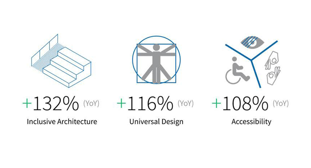
Since assistive technologies are made to remove obstacles for disable people, website accessibility standards strive to redesign sites so that barriers do not exist for anyone. Fortunately, today’s website developers and designers have started to pay attention to overcome this issue. Also, website accessibility guidelines have become a buzzword in the design community in recent years. However, it is not something that has been invented recently.
Let’s take an example of image alternative attributes (Alt text). It is considered as the description of an image that you have to fill in a box in the back-end of your CMS with what is visible on the image. It makes it more readable for search engines and serves as one of the fantastic SEO techniques for image optimization. However, this is not the actual purpose. Although it is used for SEO but its real goal is to textually describe a non-textual content on a website to make it more readable for readers.
Hence, visually impaired people can quickly know what is shown on an image. That is why it is recommended to keep Alt text as descriptive as possible and not just stuffed with keywords.
What Is Website Accessibility?
Accessibility is one of the main goals of providing the user with experience of ease. Making a website including a web app or an e-Commerce site accessible simply means to design every page by coding in a way to make it usable, understandable, approachable, and navigational to disable users of any kind of physical and mental issue.
Most of the sites on the web are developed with accessibility obstacles, which make tools difficult or even impossible to use for some people. Making websites accessible will not only going to benefit disabled people, but it will be going to facilitate overall individuals, businesses, and society as well.
From a number of physical and mental disabilities around the world, the most common disorders which affect access to the internet include neurological, physical, auditory, cognitive, visual, and speech.
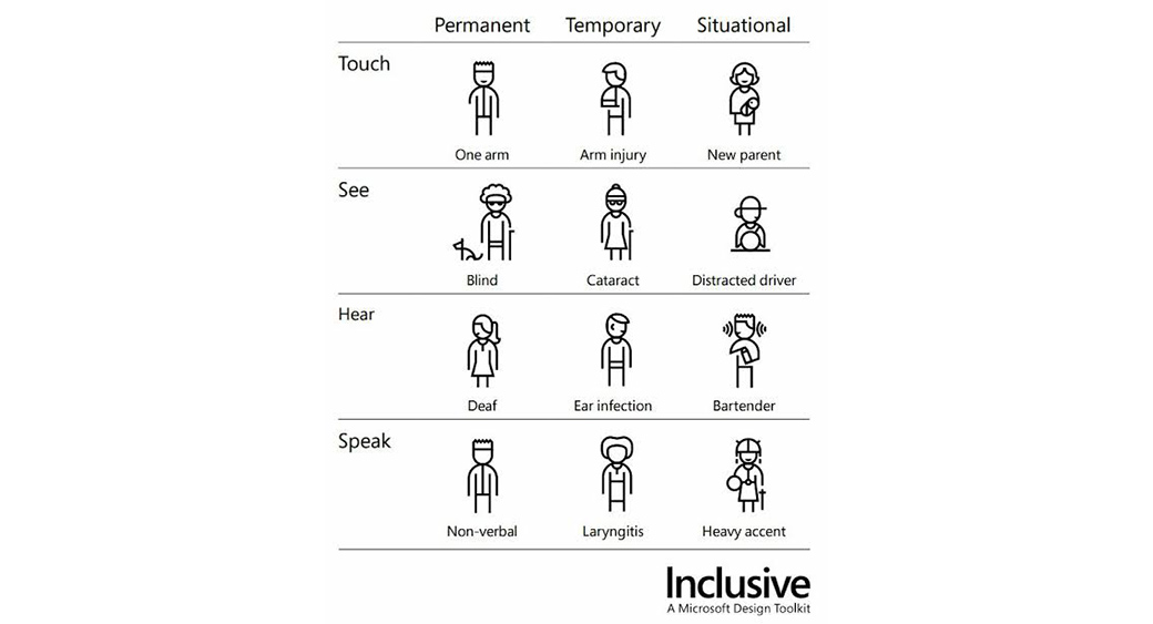
Besides permanently disabled individuals, improving and understanding what website accessibility is can also benefit people with situational or temporary benefits as well including;
- Individuals having a limited bandwidth or slow internet connection
- Individuals experiencing ability shift because of aging
- Individual with temporary disability including lost glasses or a broken arm
- Individuals using small screens including smartwatches
- Individuals with situational limitations to noisy environments or bright lights
Website Accessibility Guidelines: A World Wide Web Accessible to All
Website accessibility guidelines are not the invention of the digital era; they have been around since the invention of the web itself. The first website accessibility guidelines were compiled and released in January 1995 by Greg Vanderheiden. The speech of Tim Berners-Lee in the Second International Conference on the World Wide Web (WWW-II) in 1994 inspired this. He highlighted and mentioned disability access in his keynote speech first time in the history of the internet. A pre-conference workshop also inspired him on website accessibility requirements conducted by Mike Paciello.
Over the next few years, a large number of companies and organizations initiated to add and update those guidelines which were cumulated in the Unified Web Site Accessibility Guidelines. They were about to create a foundation for ‘Web Content Accessibility Guidelines 1.0’ or WCAG 1.0, published on 5th May 1995 by the World-Wide Web Consortium or W3C.
They are acting as an international authority which is responsible for setting global standards and best practices for website accessibility requirements. Their mission is to lead the web to its full potential for every individual in the world.
Things have improved markedly over recent years for disabled browsers, with sites now increasingly built with all users on the mind. Part of this has been pushed by the World Wide Web Consortium (W3C), a coalition formed and led by Web inventor Tim Berners Lee.
The Consortium has authored a set of Web Content Accessibility Guidelines to provide a relatively simple framework for web designers and builders to maximize the website accessibility nature, the majority of which are – thankfully – relatively easy for both amateur and professional developer to implement.
How to Make a Website Accessible to Everyone?
Designing for accessibility is not difficult as it seems to be. Also, if you don’t bother to make your website accessible, those above mentioned 1 billion people might not be able to visit your website if you don’t do it.
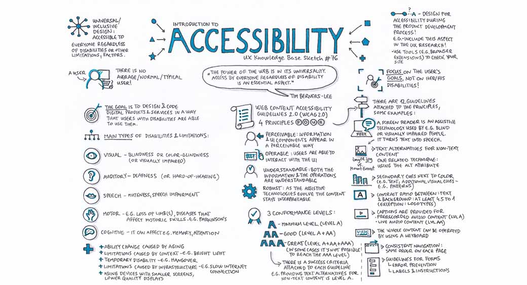
According to Web Content Accessibility Guidelines (WCAG) 2.0, there is a wide range of standards and guidelines to guide you with what is website accessibility for people with disabilities. They include learning disabilities, hearing loss, low vision, limited movement, cognitive limitations, photosensitivity, speech disabilities, and combinations of these.
Below is a summarized sketch of the standards for WCAG to help websites get clear guidance on how to make it more accessible.
Website Accessibility Standards to Use in 2020
Whatever reason you may have for building a website – whether it’s business or pleasure – you want the most people you can to enjoy it. We take a look at how you can achieve that and guarantee your site can be used and enjoyed by every visitor.
Improved Vision and Hearings as Website Accessibility Guidelines
Many disabled users access websites through assistive technologies, like screenreaders. Screenreaders use an array of innovative technologies to provide a spoken narrative or a Braille display to users who need them.
Screenreaders work through web pages in a linear fashion, which is very different from most web users who scan through pages. The good news is that adept users can skip through pages quickly and efficiently, tabbing between sections. There are some simple ways you can make your site better for screenreader technologies.
The first way to improve website accessibility is to ensure you use the correct title tags, with <h1> only used for the primary title of the page. Make sure you don’t skip between levels (moving from <h1> to <h4> for example) because the user’s screen reader may think something is missing.
Other things to consider are including proper alt text for alt images – without it, a screen reader won’t know what the image is. For the same reason, you’ll need to provide accurate descriptions of your links.
If your website contains forms, make sure that each field is appropriately named too.
In reality, most of these website accessibility guidelines, are just good web etiquette, and the core of a solid build. They also shouldn’t inhibit good quality web design and build.
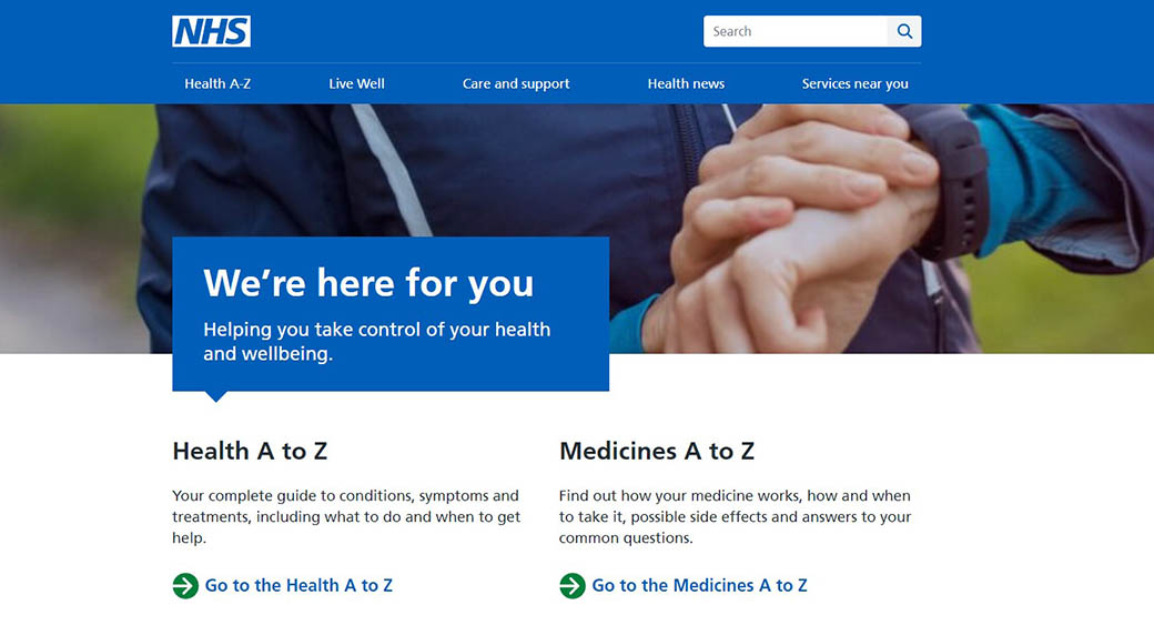
NHS Choices is one of the UK’s most visited health sites, dealing with over 2 million impressions every month. Moreover, the website meets the most exacting standards, functioning perfectly for screenreaders.
Clearly Visible Text
The trend of web minimalism is good news for those with visual impairments like short-sightedness, or color blindness. Many of those with visual impairments struggle with certain colors. So, a bold design with black text on a plain background is a solid option.
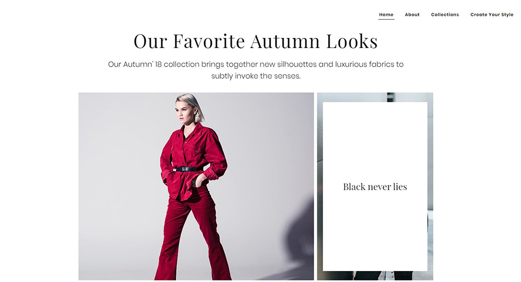
This fashion website template is a great example of a site that offers great readability for those with visual impairments. The simple and bold black lettering on a white background makes all text stand out clearly. It’s functional, but also highly stylish too.
Whilst black text on white backgrounds is an easy choice, you don’t need to be a slave to that. You can check the accessibility of your site’s colors using a variety of online tools, like these free tools from Sitepoint or Checkmycolours. These free tools can help show up any potential problems before you launch.
Bold Colors & Simple Navigation
As well as visual impairments, some visitors may have cognitive problems including learning difficulties or impairments, which could make reading and understanding your site difficult.
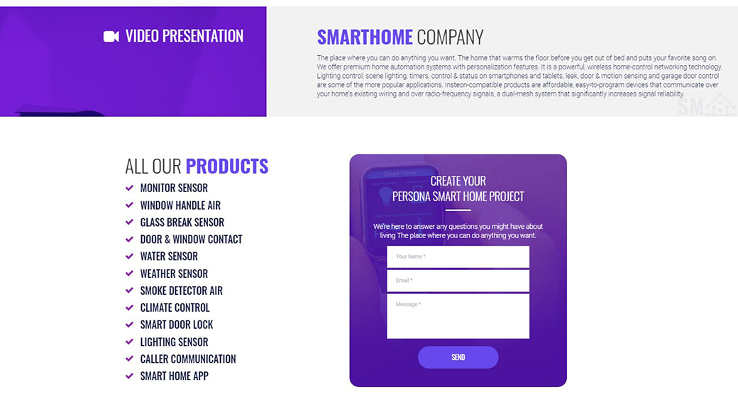
The usage of bold, contrasting colors with clear text in this business web template is a good example of a website that is easily navigable for all users – regardless of disability or impairment. The wording in the tabs is basic and straight to the point. Furthermore, there are icons offering an additional level of navigational reinforcement for the user.
When creating your site, be careful to include text overlaid onto images. It’s a lovely effect to use but can cause problems for those with visual impairments. A great way to highlight these bits of text is to include them as ghost buttons, with the outline making it more visible.
Interesting Icons
The usage of icons is a good practice across all parts of your site, for all users. Icons themselves perform a valuable function, as a sort of navigational short-hand. There’s a clear academic basis to this, but the logic behind it is clear, and it’s at the heart of most modern operating systems.
As an example, using Windows OS, we recognize the recycle bin through the image on the screen – we don’t necessarily need to read the text underneath to understand what it does. We do the same with calendar icons, mobile phone buttons and so on.
For those with learning difficulties or certain visual impairments, they may not be able to read or comprehend the text description, meaning the icons themselves in some cases become the only means to navigate your site.
In some cases, this could create a dull site. In the past – where clipart was the only option – it did. But nowadays, icons don’t need to be boring. In fact, they can be part of a really contemporary and sleek look.
There are hundreds of places online, like the Noun Project, where you can download them for free, adding them to your site to provide greater support for the user.
It may be that you want to go further and build your whole site in this way. This truly engaging website template uses strong, almost cartoon-like icons to make it clear to the users what each section does. It also shows that accessible sites don’t need to be boring.
Freedom to Choose
It’s understandable that we want to catapult our users straight into the web experience we imagine they might want. However, this may not always be what they would choose.
For those with certain disabilities, rapidly changing home-screen images, videos or audio that begins immediately and quickly scrolling photo bars can be confusing.
The good news is that this is simple to solve. When you insert videos directly from hosting sites like Vimeo and YouTube, specify in the permissions that these do not start automatically. In a site with changing images, consider just how long it might be for someone to take it in.
Accessibility is also an issue in non-HTML components of your pages. Whether it’s an Office Document or a PDF, consider if people need to access these as separate documents, or these elements might work better as HTML pages.
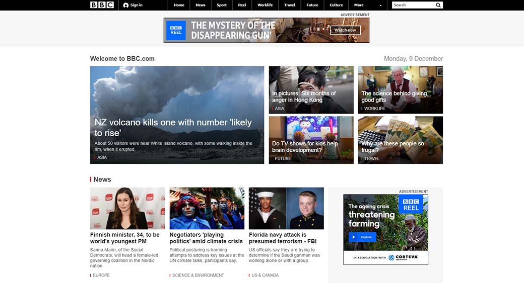
A page rich in content, but accessible and clear is one of the world’s most recognized brands: the BBC. Offering video, music, interactive content, icons, infographics and more, the site, at the same time, encapsulates all elements of accessibility.
Website Accessibility Guidelines – Try Walking in a User’s Shoe
Website designers and developers are regularly dealing with clients; there is a massive opportunity for them to include accessibility in their design.
Although a website of book publishers may not need to make their site accessible for dyslexic people as they are nothing to do with their site, and the company can ignore them as a potential prospect.
Similarly, a manufacturer of headphones may not bother to make his website accessible for auditory impaired individuals as they are not their targeted consumers.
The biggest dilemma is that manufacturers of assistive devices for blind people do not make their websites accessible for visually impaired individuals, not even a 24/7 voice chat support. Thus, comparing the above three situations, an ideal website developer can elaborate on what is website accessibility and the importance of inclusive designs to every kind of business owner.
Website Accessibility Guidelines – Designing for Accessibility Checklist
Below is the standard checklist to design and build websites accessible for everyone. The main goal of the list is to understand disabilities with their limitations. Also, it aims to include features to overcome those obstacles for individuals.
1) Website Accessibility Guidelines for Content
Firstly, make sure content is logically structured for users like assignment service to tab through the content in order to get it sensible. Secondly, ensure that each section has its own heading that stands out. After that, check your links. They should be front-loaded and make sense out of context.
Then, check the text. It should be a minimum of 16px of the font size. Moreover, the content should be resizable and has to remain legible when resized.
Additionally, test your descriptions and make sure screen readers can read out loud the elements.
2) Images
As mentioned in the above sections, differentiate well between informative and decorative images. Use ALT text for educational images while null ALT text for decorative images to help identify text for screen readers. Thus, don’t embed texts in images as it confuses the software. Make sure to add descriptions or captions to every time-based media, graphics, or data visualizations.
3) Website Accessibility Guidelines and Keyboard Access
Check if all users can reach your interactive elements by triggering them with an enter key, spacebar, or arrow key. Also, include a ‘Skip to the main menu’ link before the header on your site for keyboard users. Additionally, include a visible focus state to each interactive element, including intentional styles of hover, focus, active, and visited.
4) Forms
- Make sure to keep all sorts in a single column and have descriptive labels.
- Assign labels to each form of elements.
- Avoid pace holder texts and add a clear error state.
5) Touch Targets
- Place touch targets a minimum of 44px.
- For mobile users make touch targets at least 48px and separate by 8px with a doable left to right thumb action.
6) Links
As you remember, there was a time when websites used anchor texts for links as Click here. They are outdated for a reason. Today, it is better to mind screen readers by putting meaningful explanations of anchor text links. Thus keep it understandable and concise.
7) Screen
Keep the approach simple by following the motive “less is more.” Also, keep your design minimalistic by designing screen layout and product features simple. Additionally, make elements minimal and clearly visible without overcrowding the screen.
8) Captions for Video Content
Just like for ordinary people to watch a video, not in their mother tongue, subtitles are a must. Similarly, for the deaf, subtitles are a must. Furthermore, video captions are also vital for hearing-loss people to understand the context of a video. Here’s the golden rule for video: do not put the video on an autoplay mode.
9) Transcripts for Prerecorded Audio
For a website uploading lots of podcasts and audio content, please provide transcripts for every recording. Moreover, you can make a shorter summary and a full-sized version. Do not neglect the importance of text aligned with the speed of the audio.
Inclusive Design with Weblium Templates
Weblium’s website templates are built with inclusivity and accessibility in mind—ensuring your site can be used and enjoyed by as many people as possible. Following principles like Recognize Exclusion, Learn from Human Diversity, and Solve for One, Extend to Many, our designs remove barriers and create better experiences for everyone.
Accessibility is not just for people with permanent disabilities—it also helps those with temporary or situational limitations, such as using a phone in bright sunlight, recovering from surgery, or multitasking while walking. By integrating assistive technologies, clear navigation, readable typography, and descriptive alt text, Weblium templates make it easier for all users to access information and interact with your site.
Our templates align with Web Content Accessibility Guidelines (WCAG), offering:
Logical content structure and clear headings.
Alt text for informative images and captions for videos.
Keyboard-friendly navigation and visible focus states.
Minimalist layouts with high-contrast colors for readability.
Touch-friendly buttons and meaningful link descriptions.
Accessible design is simply good design—it improves usability, boosts SEO, and expands your reach. With Weblium, you can launch a stylish, functional, and inclusive site without extra coding, making your online presence welcoming to everyone.
Website Accessibility Guidelines – It All Comes Back to Empathy
Making a website accessible, we do not mean to remember that we are not the only user by expressing empathy for constraints of an existing degree of disability. This means to think about the diversity of users with a range of access needs. This makes sure that no one is excluded from using the internet and accessing tools, products, and services we create to serve them.
There is a range of assistive technologies for 2020 to facilitate individuals with disabilities. These include voice search controls for e-Commerce, screen readers, and switch devices by fulfilling website accessibility requirements. There are many government initiatives, including Empathy lab UK and Digital Services US, to let people test technologies to create awareness of the diversity of user’s needs.
Take-Home Messages about Website Accessibility Guidelines
Creating an accessible website doesn’t need to involve a huge deal of effort or investment of time. In fact, a lot of the principles involved in building accessible sites are the principles of good web build etiquette. Whether that’s simple and clear content, well-labeled links and media, or icons and clear buttons to aid navigation it’s all about empowering the user and putting them in control. If you’re considering a build, then consider your audience – all of them.


Leave a Reply