As a photographer, your portfolio is your most important asset. Ensuring your images are displayed professionally is essential, but how you do this is up to you. From ultra-minimalist sites, to quirky retro designs, we look at some of the coolest photo portfolio trends 2018, and how you can adopt them to create your own killer online portfolio.

Social Media Integration
Social media sharing is the name of the game, with photo galleries the king. The research of social media trends in 2014 showed that uploading pictures to Facebook is the most common activity for Facebook’s 1.2 billion monthly users and that pictures are twitted 361% more than videos.
When a website offers amazing built-in social media options, it encourages visitors to share content through Twitter, Facebook and Google +. The powerful integration between the site and social media is an increasingly important factor for portfolio sites.
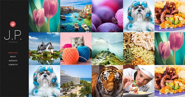
It’s also on-trend for 2015, with the fixed header and scrolling site with non-linear photo blocks a modern look that’s perfect for fashion portfolios. You can achieve this look simply and easily, letting your pictures do the talking with a solid selection of your images up front.
Non-linear Blocks with Navigation
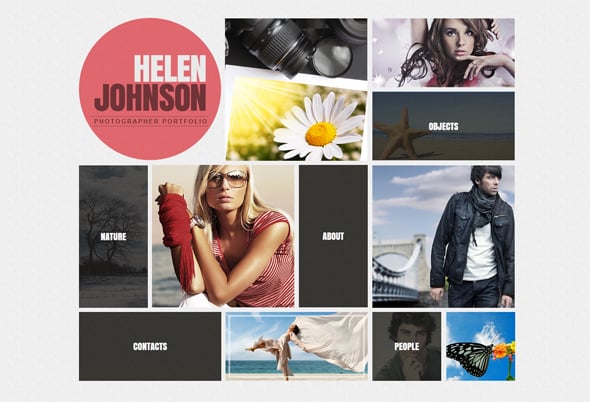
We don’t read webpages, we scan them. Modern sites are built with a non-linear approach to homepage design which is pleasing to the eye and breaks things up.
This well-balanced website design mixes up non-linear blocks with navigation buttons, hitting the right balance between form and function and working perfectly for webpage scanners. It’s an interesting change from hosting navigation buttons on a top bar, or left aligned.
Dynamic Scrolling Photo-reel
Dynamic websites where the user is in control are really contemporary, with this fashion-style portfolio site offering a horizontally scrolling photo-gallery. This simple site allows you to create different galleries seamlessly scrolling through your images.
In a world of vertically scrolling websites, the horizontal effect is striking, effective and simple to achieve with the easy-to-use template. However, if you prefer a vertical scrolling gallery, you can get that too.
Retro Cool
This year on the catwalks and on the web, retro is back. UK photographer Martin Parr owns a simple Flash-based site with a quirky icon-based navigation, and this approach is both contemporary and slightly retro – a trend that’s increasingly popular.
Balancing functionality with the aesthetic, the current preference is to channel that retro look with a more contemporary scrolling site. If you want to create your own site, you can match retro fonts to a classical look, for example.
Simple but Effective Scrolling Site
Infinite scrolling websites like Pinterest are still on-trend and rely on the strength of the image.
Unsplash.com is another slightly old-school site, channelling the vibe of Parr’s, with a 1980s style typewriter font and slightly quirky photo icon offering print-quality, royalty free images for online use. The site allows you to scroll through the entire catalogue of images, click on one and it’s automatically downloaded.The scrolling gallery site is a great option for photographers and that’s easy to achieve using a portfolio-based template.
Scrolling sites like this are responsive, working really well on mobiles and tablets – increasingly important in a world where 60% of web traffic in the UK and US is from these devices.
Minimalism from Mark Mawson
Google suggests that simple is better, when it comes to websites at least. Internationally renowned, award-winning photographer Mark Mawson puts his faith in the power of his images, with his ultra-minimalist homepage offering nothing but full-screen, hi-definition images.
It’s not really a trend, but one that continues to be popular. Enter into the site, and the simple Flash portfolios back up his initial ‘bold-is beautiful’ approach. Mark takes minimalism to the extreme, but the effect can be balanced with bold varicolored navigation menu tabs.
The new trends of 2015 are easy to achieve by picking and using a template. These are all able to power the sort of social media integration and sharing that’s now essential. They’re also created with inbuilt Paypal-based merchant software, meaning you can start earning from your portfolio straight away.
Whatever your style of photography or subject matter you cover, your website is your public face. Of course choosing the right template means understanding your audience and appealing to them, but it’s also about your own personality. Whether that’s bold, minimalist or retro; Flash or HTML, it needs to stand out.


