8 Web Design Trends 2017: What’s Coming Next?
The world of web design is a continually changing one. Some trends die out, others continue to develop, some of them undergo certain changes and new trends appear. It is necessary to take into consideration the fact that web design is influenced not only by the new technological achievements but also by fashion, current news and cultural events.
Web Design Trends 2017
It is quite difficult to make any accurate predictions of web design development, but at least we can make an attempt to single out the general tendencies. So let us start with the newest web design trends for the next year.
Layouts that emphasize content
The first fascinating tendency worse speaking about is the shift back toward the focus on content. Designers worldwide have realized that people visit websites first and foremost for their content so the design’s most important task is to present content in the most efficient way.
As a result, in the approaching year we will probably witness the shift away from elaborated design toward more visually comprehensive and impactful one. It is highly possible that the movements like minimalism and brutalism which came to the fore in 2016 will still be here in 2017.
Moreover, personalization of content has been an extremely popular trend for quite some time now. Next year extra attention will be given to the potential visitor of the website. Such significant aspects as the visitor’s background (age, where from, social group, professional or/and personal interests), the history of the visitor’s preferences and the tools the visitor tends to use are worth taking into consideration.
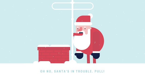
Hand-made pictures and cartoons
The use of hand-drawn pictures and cartoons in web design is not a completely new idea, but it has become quite popular lately and this popularity is likely to increase during the next year. Especially interesting variants that offer iconography – navigation made in this manner and style provides a pleasant effect.
Also, it seems to be a good idea to bring hand-drawn illustrations to life through animations. Hand-made micro-interactions, typically in the form of small, on-screen animations will play a vital role in web design in 2017. The obvious explanation of this is that they look great on mobile and smaller screen devices.
Unique layouts
Designers nowadays are sick and tired of traditional box-centric layouts one can see too often while surfing the web. So, at the moment there is a stable tendency of finding possible ways of breaking the pattern.
Different techniques are being used for avoiding this traditional approach. One of them is overlapping typographical and graphical elements accompanied by the experiments with bold colors.
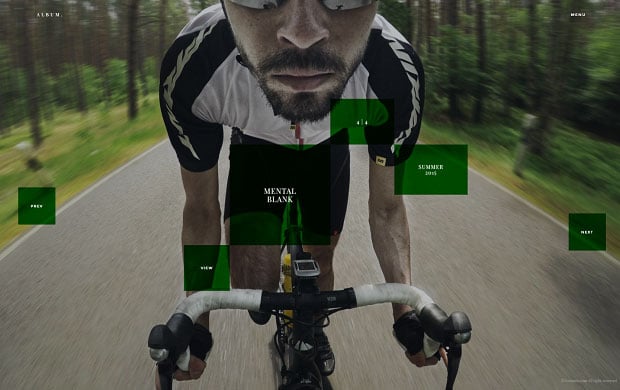
Seemingly random image and text placement is also an excellent way to go for those who seek for something new and fresh. And, probably, one of the most promising methods for breaking out of the “boxy” layouts is the broken grid. Certainly, we will see more variants to cope with this problem in the nearest future.
Experiments with typography
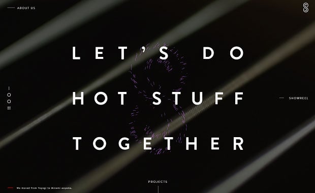
As during the previous year, a lot of attention will be given to the typography of the websites. But probably bold type will become more and more popular. Bold in this situation does not necessary mean “big” or “heavy”. It’s more about dedicating the screen to a single, simple yet all-encompassing statement about the product or service.
Brighter colors
Bright colors, bold gradients, unusual combination of striking hues – everything will be used in attempts to find new ways for bringing more personality into the design work. One more colorful tendency is creating of large colored shadows. We are sure to see more and more of them in 2017.
Focus on animation, cinemagraphs and visual effects
Animation has long played an important role in digital interfaces, and there’s no reason why it should be forgotten in 2017. To tell the truth, with designers who get more and more elaborated visual tools for creating animations, we will surely witness them becoming more and more refined.
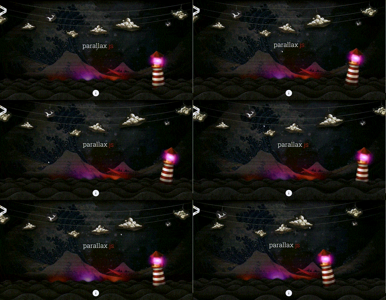
Elaborated visual effects will not be forgotten as well. Though some web designers predict the fall out of favor for parallax effects this prophecy is not likely to come true. Our prediction is that parallax effects will become even more popular. Some of the effects available in the web at the moment look extremely inspiring and breathtaking. Moreover, with the help of these specific elements it is possible to add some depth to the website.
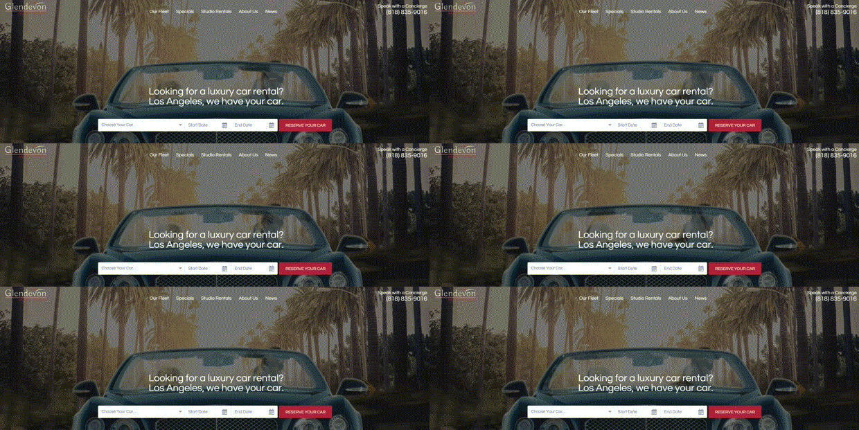
The same can be said about cinemagraphs. The popularity of these impressive visual effects will certainly increase as they help not only to put a site aside from the others and to add it an attractiveness but also work perfectly for communicating an important idea or concept, featuring a specific product or service and highlighting benefits of the company offers.
A mobile-first approach
This approach has been around for a few years now and it is quite logical with smartphones being the primary devices used for browsing the web. A lot of companies nowadays have realized the importance of having a site that effectively delivers content on a smaller screen.

The amount of content a visitor can easily view at once on the screen is limited so the brands are forced to do-away with the information which isn’t necessary. Still they allow them to add it in, along with the additional visual possibilities for users as they switch up to larger screened devices.
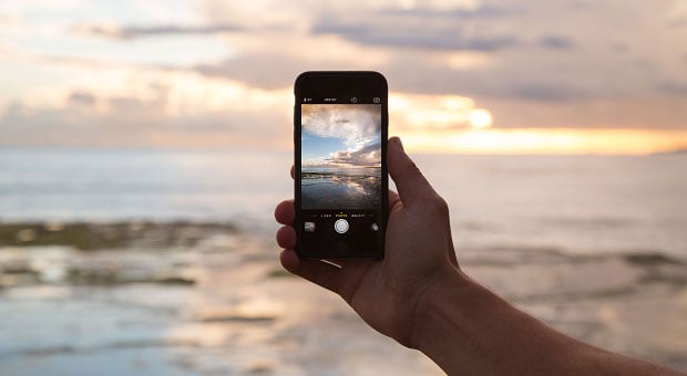
The popularity of smartphones explains why long scroll will still be quite popular among wed-designer in 2017 as well. Also, the trend of full-screen navigation design which improves greatly the user’s experience on mobile devices is going to continue.
No place for skeuomorphism anymore
The big digital trend known as skeuomorphism (for those who don’t remember the meaning of this totally frightening word – it is an attempt to imitate real life objects on digital interfaces) is not likely to be relevant in 2017. While cool and clear, it didn’t feel modern enough.

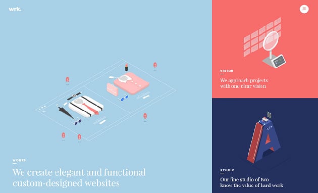
Instead, you are likely to notice more and more 3D geometric shapes in websites backgrounds and design support in general. And of course, material design is of current importance.
There are a lot of roads to choose in 2017, so take the one less travelled by and let it make the difference. Have a great year!




I really agree about “A mobile-first approach”, users today prefer using internet by phones rather than sitting with their computers. We make website and I run blog, I always check my website using my phone.
Good article, as always, is a pleasure to read. Greetings from Spain and http://visitalascatedrales.com