User experience (UX) is a key factor that determines the quality of graphic design. Even the smallest detail can make a big difference in this field because you need to combine various visual elements in a limited amount of space. But the industry has evolved drastically over the last few years, so augmented reality design has become a new standard in the business. As a relatively new trend augmented reality UX design is determined by technology and you need to apply a specific set of rules in order to achieve high-quality web augmented reality.

To make things perfectly clear, here is the definition: Augmented reality is the integration of digital information with the user’s environment in real time. Unlike virtual reality, which creates a totally artificial environment, augmented reality uses the existing environment and overlays new information on top of it. In this post, we will show you the best practices to use in augmented reality UX design. Let’s check it out!
Peculiarities of Augmented Reality UX Design
In case you have seen some augmented reality examples already, you must have noticed the dynamics and diversity of such models. It adds the extra dimension to augmented reality design and makes the process much more complex than traditional practices in this niche.

First of all, pioneers of augmented reality UX design have to take into account the number of users. The way you set the scene and add new layers of information is not the same on all occasions. On the contrary, augmented reality design is much simpler in case the device is tied to a single person than in the case of multiple users.
Mobility is the second factor that you must take into the calculation here. All of the augmented reality examples prove that it’s important to know whether you are dealing with a stationary device or a mobile gadget that can change the starting position.
The third component of augmented reality UX design is fidelity. John Fontanel, the IT specialist at Best Dissertation, recently noted: “Fidelity is probably the most significant aspect of web augmented reality. Every developer is trying to create a model that faithfully reflects the local ambiance, but the error rate can vary so much that we usually talk about high and low fidelity inputs”.
All three of these elements of web augmented reality contribute to the UX design and determine the way you can approach a specific project. This is particularly important for smartphone-based augmented reality because everything revolves around the limited display surface. How can you deal with this problem? Keep reading to find out!
Augmented Reality Inputs
Speaking of Augmented Reality, it is important to understand that the quality of the final product depends on the efficiency of inputs. The fidelity has to be as high as possible in order to avoid confusion and disorientation, especially in mobile-related augmented reality examples.
There are essentially five ways to improve fidelity and make augmented reality design more user-friendly:
- Mobile assistants: Artificial Intelligence can give users suggestions on how to behave and what to look for in the augmented reality environment. Apple’s Siri and similar assistants give us a good example and reveal the potential of AI in augmented reality UX design.
- Auto-complete features: This kind of tactic is well-known and easy to implement, so it can be a valuable addition to augmented reality practices.
- Software recognition: Computer vision can easily recognize details from a user’s viewpoint, which can be utilized to improve the overall experience of a consumer.
- Language processing: Another way to enhance augmented reality is to exploit natural language processing. That way, users could ask for more details in a language that is simple and theme-related.
- Predictive text: It’s an input technology in which one key or button replaces a whole string of letters. It eliminates the need for typing and makes UX design user-friendly.
Technical Aspects of Augmented Reality UX Design
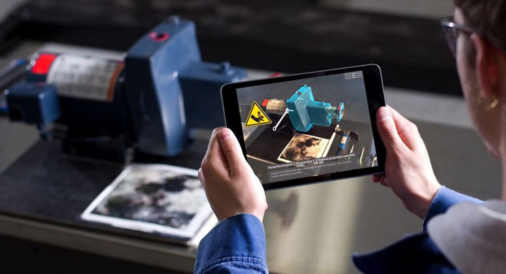
Augmented reality gives users the possibility to interact with the environment through the window of their devices – mobile phones, headsets, etc. It obviously depends on various technical aspects, so we want to explain the most important features of each component.
Visual Tricks
UX design is full of visual tricks that allow users to interact with local surroundings. A frequently used solution is to encourage moving and looking around through User Interface (UI). That way, users can get acquainted with the environment and find off-screen details.
At the same time, you can add hovering effects to the keypads and buttons as another means of inspiring users to turn around and investigate the 360-area. Of course, you can always add a small hint to make sure that users will follow your directions.
There is one more trick clever designers can take advantage of here. Adding different shades of light leaves an impression of depth and weight, which is a good way to impress and entertain your clients.
Colors
Colors are an integral part of UX design, with or without augmented reality additions. For this reason, you need to understand how color schemes function and apply the most suitable combinations to your design practices.
When thinking about colors, always bear in mind the broader social context, education, and cultural differences. For instance, traffic lights are the same everywhere you go – green means go, yellow means pay attention, while red means stop. However, colors can have opposite connotations in different cultures.
For instance, white symbolizes purity and innocence in the Western world, while countries such as China or Korea consider it to represent death and bad luck. To cut the long story short, be careful with colors especially if you are crafting a global augmented reality UX design product.
Audio Elements
UX design doesn’t have to be determined strictly by the visual component. On the contrary, you can use audio elements to ensure full immersion. For instance, sound effects can definitely make users turn their heads and look for new details.
Most people don’t really know how to take advantage of the 360 ambiances, so you have to give them the extra incentive. This is particularly important if you prepared some special surprises and don’t want them to go unnoticed!
Innovation
Since augmented reality is a new thing for most users, it must bring a few novelties to UX design. But you need to be careful – too many changes could make people confused and chase away users. If you want to add innovations to the product, you should do it in small doses.
For example, you don’t want to change well-known design elements too drastically. A user has to know that the button is the button. Stick to the widely accepted UI elements and you won’t make a mistake. Once you get everyone acquainted with augmented reality solution, then you can start changing things gradually.
6 Tips for a More Effective UX Design
Now that you’ve seen the most important technical aspects of augmented reality in UX design, you should learn a few more rules to round up the story. These six tips will help you to craft a more effective augmented reality design:
- Think about the viewpoint: Pay attention to the user’s viewpoint when playing with augmented reality. If you want to augment a museum experience, keep in mind that people will have to look up a lot, so don’t burden the audience with numerous design elements. Avoid clutters and let them enjoy the tour.
- Keep it realistic: Augmented reality is supposed to improve the user experience. This basically means you ought to keep it realistic so that artificial elements can fully integrate with the environment.
- Pay attention to comfort: Although useful, augmented reality is not a natural occurrence for an average user. Therefore, you need to pay attention to comfort and provide clients with occasional breaks, allowing them to take a rest.
- Introduce motion slowly: The best augmented reality products are not static, but you should be careful with motion effects. It’s not the most convenient solution for most people, so you need to introduce dynamic elements gradually. You can start with simple moves and then add new details one by one.
- Safety is an issue: Sometimes you will add layers of augmented reality to places where dozens of people reside or walk by. In such circumstances, safety becomes a big issue as you don’t want to see people bumping into each other and getting hurt.
- Make it amusing: As a professional, you definitely want to make an excellent UX design. However, you might as well make it amusing because augmented reality gives you a lot of opportunities to boost user engagement and let them have fun.
Conclusion
Augmented reality UX design is the latest industry trend that opens new possibilities for developers. However, it also asks some serious questions in terms of fidelity and design quality. The new technology opens a lot of fresh perspectives, so we used this post to show you the best practices in this field.
Have you ever used augmented reality techniques in your business? Do you have other interesting suggestions to share with our readers? Feel free to let us know in comments and we’ll be glad to discuss this topic with you!
