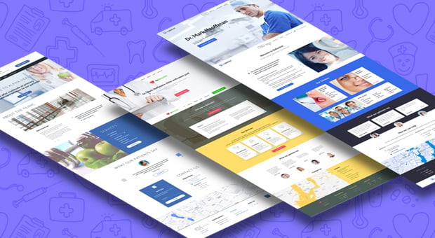
The World’s Health Day, that we celebrated a few weeks ago, and the upcoming Earth Day have inspired our team to create a set of unique medical website templates for doctors and other health care workers and institutions.

Of course, we never want to get sick, but when we do, getting the fastest and the most qualified aid is the major point. And a website of local clinic or a cool doctor can help us to solve many health issues:
- Meeting the team and learning about services;
- Finding the right and highly-skilled professional;
- Appointing a meeting or calling a doctor in;
- Finding info about first medical aid etc.
Medical and health websites are usually focused on providing services or information to their clients. They use clean design and light color scheme (mostly white, blue and green colors). This can be explained by many reasons: the pureness of white, the blue or green color of medical uniform, the overall psychological effect of these colors. You can read more about color scheme of clinic websites here.
The Newest MotoCMS Medical Website Themes 2016 implement traditional color schemes. With all that they make use of the latest trends in website design and employ the best UX techniques to satisfy visitors already on this stage. A GOOD medical website is nice looking and shows you all the necessary info. The GREAT medical or doctor’s website is as following:
- Has a clean and logically structured Home page. Its comprehensive navigation menu leads a visitor exactly where he or she needs;
- Includes the most urgent info on your clinic, like your working hours, your phone number and location on a map;
- Presents your staff members in a clear manner with a list of services they provide;
- Incorporates a Blog to provide customers with the latest info about services, first medical aid, medicines etc.;
- Is 100% responsive and lightning-fast what allows users to call a doctor from any place.
MotoCMS creates themes for medical websites and clinic pages with all those great features in mind. Let’s take a look at the short roundup of the latest and greatest templates for doctors’ pages.
Medical Clinic Web Template
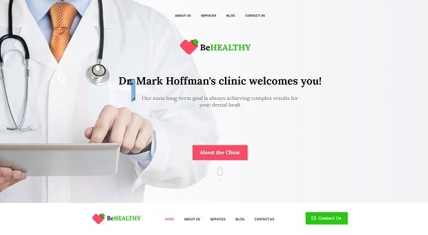
This template is a great representation of the best tendencies in medical websites design. It’s easy to browse due to sticky navigation menu that always stays on top when you scroll. All urgent info is perfectly structures on a Home page and customers in need don’t have to look for a phone number or location directions.
The theme includes a brief info about services that the clinic provides and a dedicated Services page with more detailed explanations. Contact page contains all the contacts including clickable phone number so a visitor can call the doctor right from the smartphone; and a contact form for contacting the clinic via email.
The most vital and useful info about contacts, working hours and social profiles is included in Footer and can be used from any website page.
Health Clinic Web Theme in Blude Shades
This responsive theme powered by a user-friendly medical office website builder can be used by doctors of various specializations as well as by local health clinics. Due to its clean design and white-and-blue color palette, it creates a calming feeling and establishes trusting relationships to the brand (yes, blue color can do this to your brand for free).
Testimonials section and the Team Gallery page improve this feeling and make your visitors more confident about your qualifications. Documentations page allows your team members uploading their certificates and other qualification docs to confirm their skills.
Header keeps the info about your contacts and working hours in front of the eyes of a user. A call-to-action button in the Header allows a visitor to appoint and meeting right away, without browsing a website.
Web Theme for Dentist
Powered by MotoCMS dental website builder, this theme is also created in a clean style with the use of light blue color palette and a lot of white space. It allows calling to the dentists’ on skype with the use of a Skype button in the Header. The hero image includes a CTA button that also makes scheduling a visit in a few clicks.
Creative use of a slider on the Home page allows you adding various info or news that you wish your users to get. Testimonials are aimed at creating the trust to a brand, like on other web themes.
Blog page is also clean and keeps the user’s focus on the content it shares. Post your latest offers here or add a useful info about teeth care with adults and children. Everything will help to create trust and adds a lot to SEO. By the way, all MotoCMS 3 website templates are SEO-friendly and can be set up really fast.
Here are a few more latest MotoCMS 3 medical templates for creating a cool website for your clinic or health center.
What’s your favorite design? Share in comments!

