Best Personal Blog Color Combination for Better Reader Engagement
Visual perception is based on many things like shapes and outlines of objects, texture, but most of all on color. Have you ever given a thought to why black or gray blog color combination makes you feel dull? Or why does orange or green look so vibrant and juicy? Color has the power to provoke emotion and generate attitude. The chain of color perception starts with our eyes. They are transcending the information about the color to the hypothalamus in our brain, which then forces our endocrine system to release hormones. The latter influence human emotions and behavior.
But what if the impact of a blog color combination is a bit overrated? It’s no secret that marketing is color dependent. Numerous studies have been held to find out how exactly color schemes impact. It is useful for branding purposes to examine what colors are preferred by both men and women etc. For instance, a research on “Influence of Colors on the Purchase Decision Making” has shown that 83% of female and 56% of male base their shopping preferences on color. Obviously, a great color combination can boost conversions. This is why you need to choose your blog’s color palette wisely.
Quick Insights On Color Psychology & Color Theory
Color psychology is a field of knowledge that studies ways in which colors affect human choices and behavior. Despite this fact, there is an understanding of the significance and meaning each color bears, there are still factors that influence color perception by different people. For instance, things like cultural differences, upbringing and preferences correlate with the effect a specific color has on a person. Studying color psychology doesn’t give a 100% guarantee that changing the palette or a blog color combination will instantly make it pop. Still, it can help you find optimum solutions about color.
Let’s turn to color theory to get a practical guide to best color combinations and mixing hues. Most likely, you’ve come across the notions of primary colors, secondary colors, and tertiary colors.
- Primary colors represent a set of colors that can be combined to generate all other colors a human eye can perceive. There are three commonly used color models RGB (red, green, blue), CMYK (cyan, magenta, yellow, black) and RYB (red, yellow, blue). They are used in printing, on electronic displays and painting.
- A secondary color is a color obtained as a result of mixing two primary colors within a specific color model.
- A tertiary color is a color obtained by mixing full saturation of one primary color with a half saturation of another primary color and none of a third primary color, within a given color model. There are 6 tertiary colors: red-orange, yellow-orange, yellow-green, blue-green, blue-violet, and red-violet.
If you wish to learn more on color theory, just take a look at the ultimate Color Combination Guide brought to you by MotoCMS.
Why Is Color Psychology Important For Bloggers?
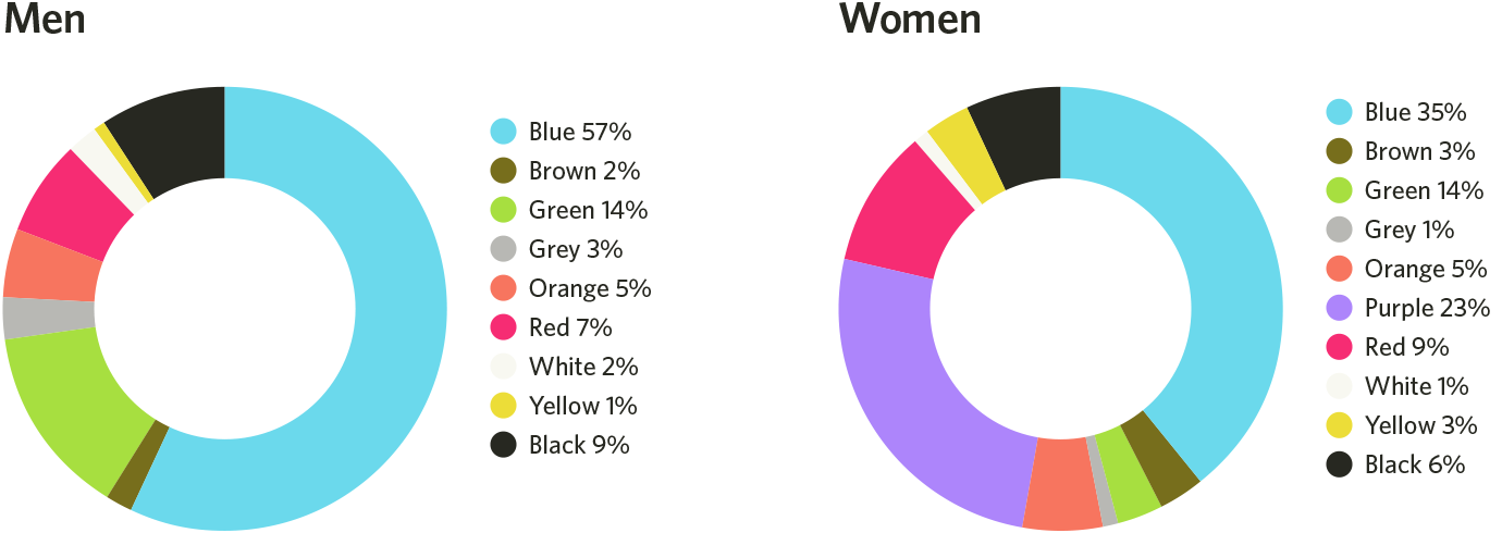
So, what does color theory have to do with blogging, really? It doesn’t matter if you’re an experienced blogger or a complete rookie, it all comes down to who your readers or viewers are. Checking a demographics of your blog will help you understand people’s color preferences depending on age, gender, and other factors. For instance, Joe Hallock created a chart of favorite color by gender.
According to his study, most favored colors by both men and women are as follows:
Source: HelpScout
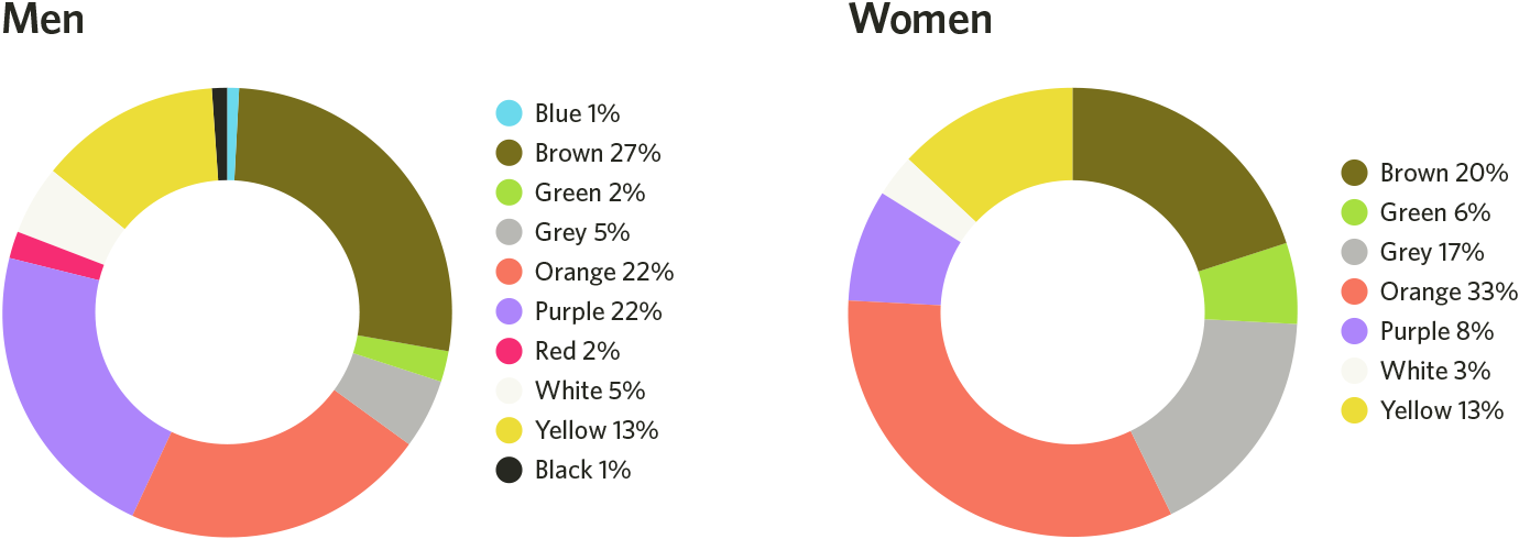
Meanwhile, the least favored colors are:
Source: HelpScout
Here’s a fast takeaway of these diagrams:
- both male and female respondents dislike orange and yellow colors.
- female respondents prefer yellow over orange.
- male respondents give their preference to orange over yellow.
Blog Color Combination Design Examples
There are other notable conclusions: male respondents prefer shades of gray or pure achromatic colors; female prefer tints.
Going back to blog demographics, content for men will benefit from green and shades of green. Have a look at the typical example of a car website for men. You’ll find more in the selection of Cars MotoCMS 3.0 Templates. The below design has shades of gray and dark green, vivid typography and catchy graphic elements. They can easily draw the male audience interested in cars and motorcycles.
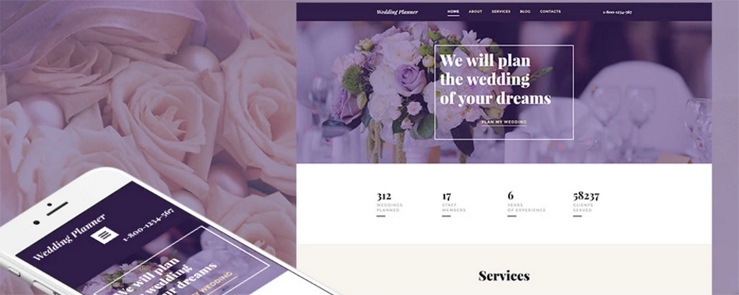
As for women, they typically prefer softer and lighter color schemes, so try playing around with softer shades, variations of purple or red. The below example of Wedding Planner MotoCMS 3.0 templates shows you how a seamless combination of purple and beige can benefit a website and make it stand out from similar sites on the web.
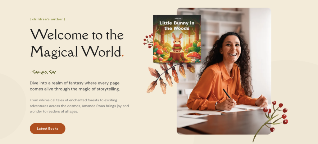
This modern author blog template on Weblium has a warm and cozy color palette: soft cream background creates lightness, calm olive adds harmony, and rich orange is used for accents, making the site attractive and playful, which is perfect for children’s themes.
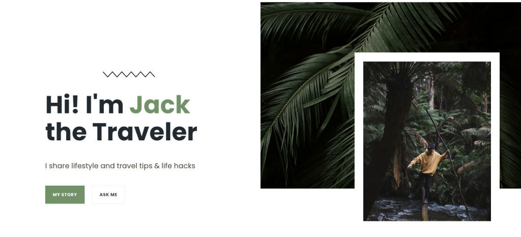
The travel blogger template on Weblium has a natural and stylish color palette: a light background creates lightness, soft green adds freshness and is associated with nature, and dark brown and gray shades add contrast and elegance, which is perfect for travel blogs.
Where Should You Use Color in a Blog?
Suppose, you’re creating a design for your new website or blog, or maybe you’ve considered giving a boost to the current one for some time. Now is the time to apply your newly gained knowledge in the field of web colors. Choosing the new color schemes won’t happen without a color palette generator. Take Adobe Color Wheel, for starters. The color wheel in Adobe Color CC can help you create a color palette of your own in an intuitive manner with the help of presets based on color theory rules.
Adobe Color Wheel offers 6 ready-made color combination modes. Moreover, it helps you put together colors that work well with each other, and 1 custom mode allows to make a selection of your own.
Once you’ve figured out the color scheme you’d like to use on your blog, it’s time to think of their application. Specifically, we’re talking about a blog or website color scheme. Namely, those are the color of hero graphics, headline typography, borders, background patterns and colors, buttons, and popups. Whether you’re using a custom design or one of MotoCMS personal website templates, it’s crucial to keep the balance of web design elements and colors.
Considering a ready-made website builder template is always a fast and handy option for both web designers and rookies. Thanks to the drag-and-drop nature of MotoCMS platform, you can create a unique design by placing the needed elements where you want them to be. If you want to see more examples of how color psychology works for specific websites, take a look at the overview of colors that work for medical websites design.
Summing up
As you can see, blog color combination can be a powerful tool to win over your target audience. Even if you’re not much of a web designer, it’s still good to know the basics of color theory. It will help to give points to your blog on the web. What’s the best color combination for your personal blog or website? Feel free to share your thoughts in comments below!




Hey guys, thank you for the post! It would be also cool if you add more useful color picking tools, will be waiting for it in your next posts 🙂
Thank for the comment, Jeremy! Follow the updates on our blog, and I promise that you will find that in one of the next posts 🙂
Fascinating article, most of my websites turn out to be blue because its supposed to imply trustworthiness.
Although my wife keeps on at me about this.
Thanks for sharing, Justin 🙂
That often happens in families, you know. I can say that the whole team is making jokes when see my pink desktop. Even though I don`t choose this color for web designs, nobody can prevent me from having that cute stuff around my working place.