Build Brand Strategy With Your Website in 8 Efficient Ways
It is not the product that you sell; rather, it is your brand that you are selling. Smart marketers know how important it is for a business to strengthen its brand image to reinforce its market position. Businesses spend with abandon on their marketing plans hoping to capture the attention of their targeted audience. However, there is no such need to go extreme to boost the brand of a business organization. By making some changes in the existing design and structure of the website, you can easily build brand strategy that works. If you are unsure how to do it right, address one of the top creative consulting firms for comprehensive guidance concerning brand strategy.
Brief Overview of Main Concepts

To build a strong brand, you should pay attention to these “elements of success”:
- the idea of your business(aims, benefits, strengths, vision and mission);
- a unique style that users keep in their memories(it combines all the essential concepts, it’s the line that provides the direction to products presentation, logo and website design, fonts, icons, buttons, text and visual content, everything you work on during website promotion and brand building);
- logo(it presents your company and site; logo makes you stand out from competitors and creates necessary associations with your brand);
- fonts(here the concept of your business is what matters; it’s obvious that bright colors fit kindergarten website but not the law firm web design so the fonts should match your business niche);
- color combination(each color causes certain emotions and associations. Thus, you can impact users’ decisions with the right combination of colors. Tip: read our post on medical website colors to learn what feelings they evoke and why they are usually used in the medical sphere).
Impressive About Us Page
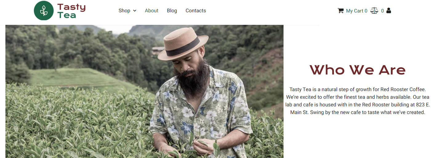
Most website designers believe their creativity starts with the Home page and ends with it. Business owners tend to neglect the About Us page of the website, but this can cost a brand immensely. People are in the habit of browsing the About Us page to learn more about the organization. Therefore, the About Us has to be as good as possible. As a designer, you must rise above mediocrity and create something creative for the About Us page. We are not asking you to reinvent the wheel. Rather, we are asking you to give some creative attention to the About Us page so that it can stand out on its own.
So it’s your chance to tell who you are, what’s important to you, how you work, and show that you strive to match clients’ preferences and interests. To succeed, please try the following steps:
- present unique offer;
- analyze competitors’ content;
- find out your audience’s needs;
- choose the appropriate style of communication(based on humor or terms for instance);
- show that you know how to solve visitors’ problems(prove your competence by certificates/reviews/statistics/successful projects/partnerships with famous companies or people);
- add real-quality photos and biographies of your team.
By the way, the About Us page of MailChimp looks cool. They have included a lot of information, and using large images while featuring its founders has added charm.
Use the Right Fonts to Build Brand Strategy
To support the amazing About Us page you’ll create with the help of our tips, please take care of the fonts on your site. It impacts the readability and perception of your site, so you should choose one style and follow it on all pages.
Value proposition
“A value proposition is a promise of value to be delivered” – says Wikipedia. Now, you might be wondering how this can be related to your effort to bolster your brand image. Well, it is highly likely that you are not the only businessman who is trying to sell his products/services desperately; there are other people targeting the same group audience. Therefore, the only way to make your service appear unique is by focusing more on the value your product/service offers.
Value Proposition can be anything like 24-hour Customer Service, Zero Question Return Policy, Free Home Delivery, 20% Discount, or anything else that reflects the uniqueness of your brand. You need to help the visitors make a decision; therefore, your business’s value proposition should be placed all over your website so that people notice it easily. It is another method to persuade users without pushing too hard.
Inflowapp propagates its value proposition clearly by using simple words – ‘Inflow is a simple web application to organize your project leads’, but the impact is palpable. Since it has used simple words to describe its value, it makes it easier for visitors to understand its meaning and make a quick decision.
The Uniqueness of Your Business
If your business has nothing unique about it, you should fake it. This might sound rude, but this is the hard cold reality. Just put on the shoes of a regular visitor, and then you will realize why you need to show the unique aspects of your brand on your website. If you fail to focus on uniqueness, you can’t think of bolstering your brand presence via your website.
Color Combination
Colors are not just what they appear to you and me. Proper color is more than aesthetics; it can build brand identity and evoke strong emotion. Different colors can affect people differently. For example, red is associated with vitality and energy, whereas black is associated with elegance and luxury. Read this Color Combination Guide to know more about different colors and their impact on visitors.
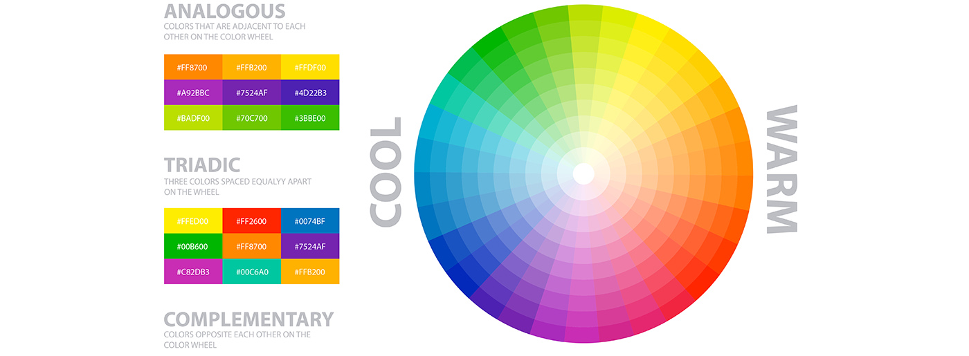
Moreover, there are some rules of thumb that you should be following carefully. If your business is related to the financial industry, you should predominantly use green color in the design. However, if you sell women’s beauty products, you should use pink throughout the website. However, it is you who will have to take the final call.
So, these are the few considerations that you need to keep in mind while trying to build brand strategy by harnessing the power of your website.
Logo Design
Logo design is directly related to your brand identity. It’s a simple symbol that makes users think of your business, not the competitor’s one, so please, approach the issue seriously, ask a designer for several examples of logo and make sure he takes into account your business concept to create an ideal combination of shape, color, font, and image.
Modern Web Design
To build brand strategy, it’s also vital to attract potential clients and some modern web design elements can easily help you. Let’s consider some 2021 trends:
- set of quality and eye-catching icons(look at sites for free icons);
- simple and minimalistic interface;
- use of shadows and gradients;
- 3D images and objects, animations;
- pastel colors;
- parallax effect.
Tip: please pay attention to our post considering how to use Web Design Elements to Increase Conversion Rates.
Use Compelling Images
Words are powerful; however, images are even more powerful. The use of evocative and unique images will help you build brand strategy immensely. You can even make people trust your brand by using high-quality images of your staff, product, or office. It helps you connect to your audience. Please for Christ’s sake don’t use cheesy stock photos; they are horrible [as these stock images are not unique and multiple website owners use them on a regular basis].
Remosmart uses images of the working process on its website’s home page and helps the website capture the audience’s attention easily. The use of big and bright images definitely works in its favor.
Consistency is the Key
Your offline and online presence should not clash. If your brand has some offline recognition already, your website should be an extension of that recognition. However, some designers do just the very opposite. They use different color combinations and font types or take a completely different approach when moving from online promotion to offline or vice versa. It makes sense to be consistent with your marketing approach otherwise there will always be a conflict of interests.
So there should be a perfect “branding balance” between online shopping vs in-store shopping. The essence of the business should be reflected on both its website and its offline counterparts like business card, envelop design, letter pad and other aspects of its corporate identity design. Logo forms take the central part of both online and offline designs.
Content Perception and Scrolling
Contrary to popular perception, people do read things online. But to make them read, the copy has to be exceptionally good. Just making texts grammatically perfect or structurally correct is not the end of the job. The write-up has to capture the users’ attention or imagination, otherwise, they will not stay on the website for long. Your website copy should correspond to your brand. Say for example, if you are selling tech products, a funky or informal approach is going to cut the ice. Whereas, if your brand has something to do with women’s beauty products, you need to make sure that the copy is graceful and has a feminine charm. Try not to offend anyone via your content. They are not just simple words; bad words can ruin your organization’s brand image forever. So be careful what you are putting on your website. Hire a professional to get it reviewed before making the copy go live.
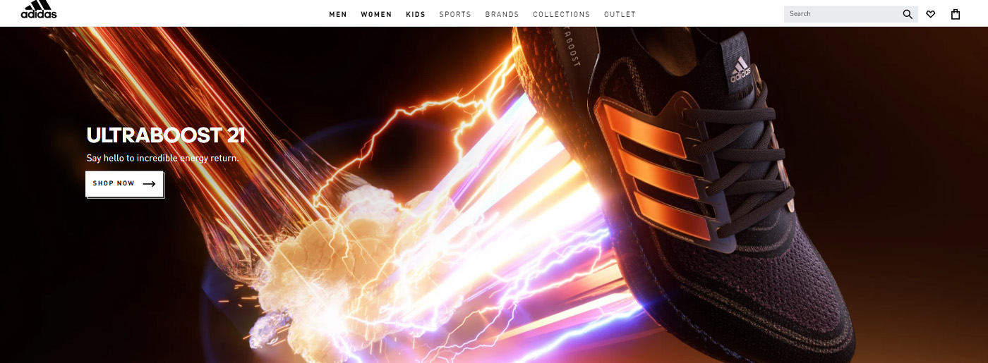
Big brands like Adidas always use copy that reflects their brand. It is genuinely crystal clear and crisp. It uses a unique teaser for every single page and this is what propels the brand on the web. The copy is friendly yet powerful, concise yet well-crafted.
Besides, you can try copywriting service from MotoCMS and allow a competent team of writers to help you launch a site with optimized and quality content.
Create a Mascot
Why not? It’s an exceptional strategy that doesn’t fit all businesses. Have you ever wondered why big tournaments like FIFA World Cup or Olympic always have a mascot? Yeah, you have got it right, it represents the tournament itself. The concept of a mascot is not limited to tournaments or events though; some big corporate brands have already embraced it to carve out a niche for their brand on the web. Now, please don’t confuse a mascot with a logo. Mascots are mostly characters that are made to represent their brand. It is like a representative of the business. It can be awkward, funny, etc. but make sure it is unique. You can even use an inanimate object as a mascot if you wish so, but you need to imbibe human characteristics in it to create an impact and to connect with the targeted audience.
Template Monster has done an incredible job by creating a mascot for its brand. This little monster with a kind smile illustrates the company’s name and so becomes a perfect tool to build brand strategy.
Some Good Examples of Brand Building
- Reebok: “Through sport, we have the power to change lives”.
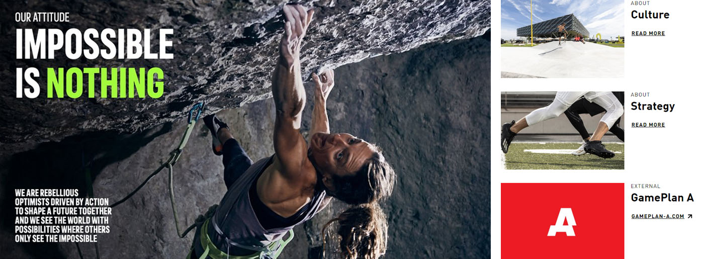
The company shares its purpose, mission, attitude and wants to help people become strong and confident with the help of sport and their products. Its brand image and business concept is clear due to bright colors, logo, website style, quality videos, bright and real images. Moreover, you feel the positive energy while scrolling it so that Reebok has made a great job for their business promotion and brand building. Regarding the content, it’s really nice, friendly, endearing in short.
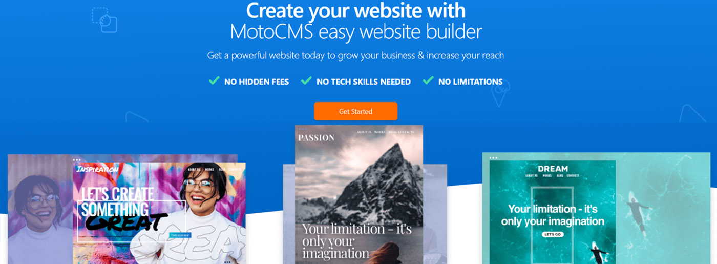
- MotoCMS: “Get a powerful website today to grow your business & increase your reach – NO HIDDEN FEES, NO TECH SKILLS NEEDED, NO LIMITATIONS”.
First, it impresses by a nice and kind logo in the form of a heart that endears it to most clients. Second, all the pages support the unique style and color combinations, namely white, blue, and orange. Third, we discussed the importance of texts and About us page. MotoCMS has coped with this task 100%. Moreover, for users’ convenience, we’ve created Why Choose us and Support pages, as well as a FAQs section. Considering the trust and reliability of services we provide, we added some statistics by Trustpilot, Sitejabber, and customer reviews. Also, our team has taken care of modern web trends: placed animations, quality videos, and images on site, made simple and minimalistic interface.
Conclusion on Brand Building
All in all, to build brand strategy and succeed, your site should:
- follow the unique style;
- present the philosophy of your company;
- share your values and create a particular image;
- show expert knowledge and quality services products.
In conclusion, a launch of a quality site is a perfect way to show the competence of your company on the market, get clients and sales accordingly. It’s not an easy task to keep all the details but you should strive to make every element on your site follow the style of your brand. If you want to update your online platform or start a new one, please have a look at MotoCMS website templates that will help you get desired results faster.



Great post Very helpful points