6 Unexpected Things to Build or Break Your Website Trustworthiness
Do site visitors trust you enough to spend some money and to come back again? If your website is trusted by customers and average web users you can be sure that success will follow you all the time.

Trust is a tricky thing that is hard to explain in simple words. Take a moment to think about why we consider some websites worth our trust and neglect other ones. Some explain it with design peculiarities, some with their personal mood, some with past people’s experiences. Every human is a unique personality that finds joy in browsing trusted websites and finding required information there. It’s a true pleasure to be online and to get what you desire from there.
Accordaning to Steve Krug, people enter websites with some stock of a goodwill. The ‘amount’ of the goodwill depends on their nature liability, expectations, previous experience and web pages appearance. You can never predict visitors’ mood but you’re able to look out for their interests and refill the level of favor of every single one. Thus we offer you to review 6 unexpected but crucial things that can either build or break your website trustworthiness.
Good Old Website Reviews

There is a simple practical finding that is however confirmed by numerous search queries and users experience. Quite often when searching for a company brand name, search results return links to their social media profiles at first instead of direct links to required websites. Have you noticed this strange fact?
Type ‘Yelp‘ (one of the most popular business review websites on the web) in Google search and you’ll surprisingly see several mentions of the network on other sites. To find out the original Yelp website you may need to scroll down the page or even refine keywords to clarify your query.
This simple example proves that we’re not always well-informed about our positions at the online market. It is even more crucial for local businesses running geo-centered websites. Chances are that when searching for your business on the web, users will see thoughts of influential members of popular website review communities.
Whether users are familiar with the web or not they always want to know your previous clients experience. Social media and free review websites are just those very places that people will visit to ask for good or bad references of you. Do you know what they will see there?
Too many negative marks as well as tons of positive emotional feedback will reduce your image in viewer’s eyes. People evaluate negative reviews according to their needs and requirements. Thus for some people an incorrect color rendering on your website won’t be a problem and others will need a strict match. That’s why you shouldn’t care too much about minor negative reviews of your business unless they relate to the products and services quality.
Here are some examples of free review websites. Some of them are so huge that they serve various needs of all sorts of users. Others are concentrated in one niche like TripAdvisor (it is highly popular among travelers and tourists). Look for more sites specific to your industry.
Personal Data Input. To What Extent Is It Needed?
When shopping on the web users obviously need to input some personal data. That’s a common requirement that nobody resists that as long as the required information seems to be suitable for disclosure. However, when users need to type physical address to download an online ebook it looks quite strange and they are more likely to reject the operation.
If you really need some sort of clients’ private information, try to clarify why exactly you need it and how it will be used. Even when you ask for a simple email address ensure your users that you won’t send spam messages and the email won’t be used by third-party advertisers.
Lengthy and Complex Registration and Checkout

There is a strong competition between online stores and services providers. At the same time over 10% of US shoppers will rather find another website to buy a thing than will fill in long forms or provide their personal information that they are not eager to share here and now.
Let’s be clear, it happens that site owners ask for too much information because of the best intentions – they want to know their customers and serve them better. In most cases their positive intentions turn out to be a failure that causes higher bounce rates. Web surfers do care about personal security and their time, so if you can minimize a list of questions or required fields to fill – do it without a doubt. After building a stable relationship you’ll be able to know more about each of your clients without a risk to be annoying and obtrusive.
For those of you who sell something on the web we can recommend to use one of the popular payment systems to manage clients transactions. Their biggest advantage is that they are already trusted by people and users don’t feel like they’re sharing personal info with you. Instead, their experience combines payment through their account while still staying at your website. Thus the checkout process won’t confuse your customers.
These services are highly trusted by people making purchases on the web. If once paying with a particular PSP (payment service provider) people will be eager to do it safely on your site too.
You can also enable social login for easier and faster checkout and account creation. It has become rather popular because it allows to login via Facebook, Twitter, Google, LinkedIn, Yahoo, WordPress and many more popular networks. Let’s face it – people trust big platforms more than they trust you, that’s not a bad thing – just take advantage of that and you’re fine. If you want to activate this feature on a WordPress-driven website use the Social Connect plugin.
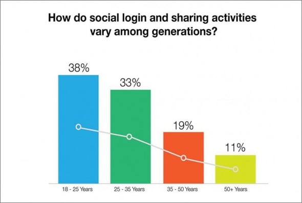
Take a quick look at the chart that reflects how social login influences the number of login sessions.
Of course not all web surfers are eager to use their social media accounts for the registration and further sign ins, however those who will enter your site regularly will appreciate such an opportunity.
What About Secure Connection?
Another aspect that influences website trustworthiness is secure connections. People want their financial and private information to be safe. Thus they look for secure connection indicators in a browser address bar before taking a decision about making payment.
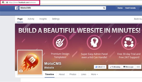
Taking into account global security requirements, websites that use accounts or deal with payments turn on HTTPS connection. Facebook as well as other popular social media networks uses HTTPS to save users personal data from unauthorized access. Find out how the encrypted connection looks by looking into your browser address bar on websites like Facebook or Gmail.
HTTPS (https:// www.) stands for ‘hyper text transfer protocol secure’ and is used to protect information being sent from a user to a website and back. If you want to make your browsing information super secure encrypt your whole experience by default by installing HTTPS Everywhere browser extension. It is available for Firefox, Chrome and Opera.
If you run a website with user accounts, it definitely makes sense to use HTTPS at least for the accounts section. On the web there are many instructions on how to do it the right way – just type “add HTTPS to my website” or “get HTTPS” into a search engine.
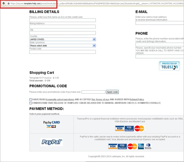
Here on motocms.com we establish secure connection on a checkout step when buyers need to enter their personal details. Thus we show our users that their personal data is protected and we do care about the web security.

The Right Tone of Writing
One of the ways to stay interesting for site visitors is to write content that they expect to see. That means no fancy phrases when you address scientists and business people, and more casual tone when your communicate with artists, musicians, teenagers, etc.
It is not a secret that websites of the last years become more and more user-friendly and content-oriented. Site owners do care about the convenience of their pages and users have already got used to such approach. Frankly speaking, nobody knows which of these issues was the first but the fact is that people care about their online comfort.
Experienced gurus of copywriting recommend to try to optimize all texts and headlines for search engines, but even more for people. The aspect is quite tricky because it’s really not easy to figure out a balance in a human-computer interaction.
We’ve found a diverting analyzing tool that seems to be quite effective and popular among professional writers. The Advanced Marketing Institute Headline Tool evaluates the emotional marketing value (EMV) based on the total number of EMV words it has in relation to the total number of words it contains (20 words max). The calculated score between 30% – 40% is considered acceptable for professional copywriters’ headlines, while 50% – 75% EMV score is inherent to highly shared and efficient content.
The tool classifies copies as intellectual (have the most general influence on people and are effective when appealing to education, law, medicine, research and politics engaged people), empathetic (evoke strong positive reactions of parents, women, care-givers, etc.) and spiritual (health, lifestyle, food related businesses are quick on the uptake).
We wouldn’t dare to recommend you a tool without any testing, so take a look at results we’ve got when checking Headlines from our site.
“Ever seen an admin panel THIS awesome? ” – EMV Score 28.57% that indicates the current headline appeals equally to people’s intellectual and empathetic spheres
“Save Up to 50 with Bulk Purchases ” – EMV Score 14.29% indicates the current headline as a predominantly spiritual appeal that has the strongest potential for the influence.
“Visual Content vs Text Content Epic Faceoff with Obvious Winner” – EMV Score 50% indicates the current headline as a predominantly empathetic appeal that brings strong positive emotional reactions in people
“Metro Design Style 2-Year Evolution Things Lost and Gained ” – EMV Score 22.22% appeals equally to people’s spiritual and intellectual spheres
We’ve tested both business pages headlines and blog posts titles. So whatever type of website you run you can add this tool to your armory.
Clean Up Suits!
We don’t force you to take care about your closing like a maniac… really. But what you should be careful about is the website design. Believe it or not, people don’t trust dirty and badly dressed strangers and that is also the case on the web. Designs that were created 10 years ago with complex navigation look frustrating, so that even your granny who’s actually far from being a pro on the web, will be puzzled with that.
There are some web design features that may destroy your website trustworthiness:
- Outdated design;
- Too vivid color scheme;
- Incomprehensible navigation;
- Inappropriate animation;
- Excessive and irrelevant advertising;
- Tangled pricing plans, payment features and delivery terms;
- Absence of contact details or site owner’s name;
- Badly readable texts;
- Repetitive popups;
- Autoplay in background music and sound effects.
That’s about it for today, now you know a lot more about the things to break or build your website trustworthiness. The most curious web surfers and web designers can share their feedback about these thoughts and features, we strongly encourage you to think of your own unique experience and to share some thoughts below the article.


Leave a Reply