How to Make an Interior Website for Your Design Agency [UPDATED]
Interior design is an art of giving people aesthetic pleasure combined with a sense of comfort and harmony. Local studios can evoke such feelings with their office design and personal contact with a visitor. But we live in a digital world and today most of the interactions are provided through the Internet. In this case, a website for interior design studio becomes the kind of office where a customer can see the company’s works and form an opinion about its style, design principles, etc. And here goes the process of choosing a perfect interior design website template.
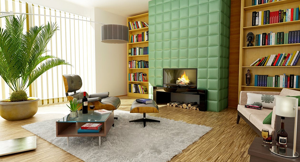
When learning how to make an interior website, you should set some basic requirements to achieve the design that will highlight your product. Website design for this kind of business is called up to support the content and put it in a favorable light for a customer. Thus, the design shouldn’t grab the biggest piece of the pie and distract attention from the content by its bells and whistles. Here are a few recommendations on how to create interior design website that will help you to promote your business online.
How to Make an Interior Website
There are many interior design-related businesses that may benefit from quality-made website. Among such companies are:
- Interior design studios;
- Home decor studios and stores;
- Furniture shops;
- Interior finish materials stores.
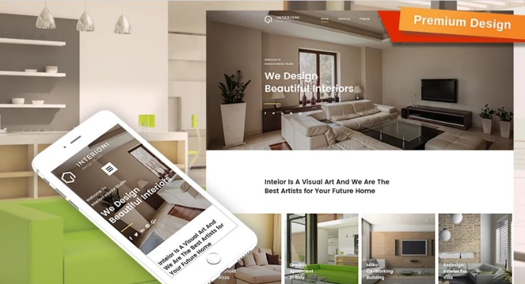
Interior Design Agency Website
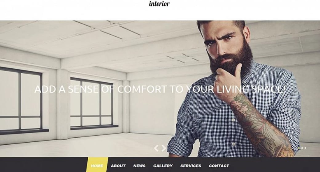
Interior Designer Personal Website Theme
Website Template for Painting Company
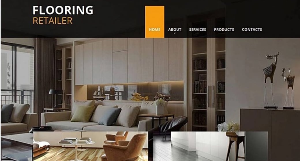
Flooring Company Website Template
In general all these companies have a lot in common and may use website builder with similar characteristics.
Choosing Colors for Interior and Decor Studios Site
As I said above, design for Interior studio website shouldn’t come front and outshine content. Thus, most templates for interior design websites make use of light, subtle colors and clean style. Minimalist style is one of the most popular ones for interior studio sites. It’s trendy, gives a lot of fresh air and doesn’t crowds space. The most used colors for this kind of websites are white, beige and grey.
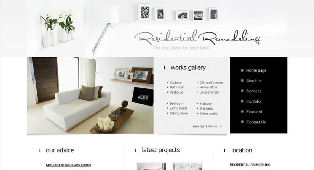
White is an all-purpose color that can be easily combined with all other tones. It provides a sense of purity and cleanness. White-colored interior websites made with a proper agency website builder look fresh and spacious. In addition, in white design, nothing distracts you from content and you may focus visitor’s attention on your works.
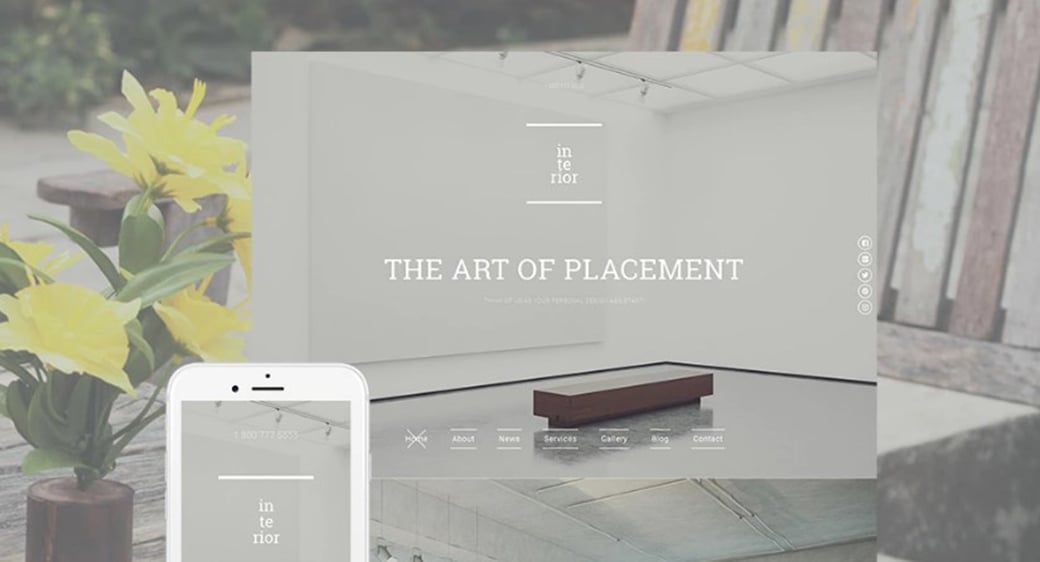
Pure Interior Design Web Template
Minimalist Website Template for Decor Studio
Grey is another good color for creating elegant designs that don’t distract user’s attention from website content and products. In art and fashion grey is considered as noble and sophisticated tone that perfectly highlights content and serves as a beautiful background for bright photos.
Interior Design Site Template
Interior Design Web Theme in Grey Color
Grey-Toned Interior Studio Website Template
Clean Web Template for Interior Design Studio
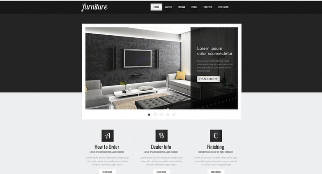
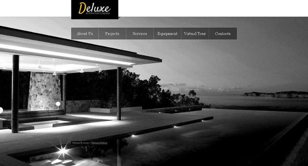
Some website owners choose a bold way and create interior website design in dark colors. It’s not a common practice, though it may pay off with a cool and chic look. Pure black, brown and dark-violet highlight the content and speak about high-class of interior designs services the studio offers.
Home Interior Website Design
Interior Website Template with Background Slider
Dark-Colored Interior Design Web Template
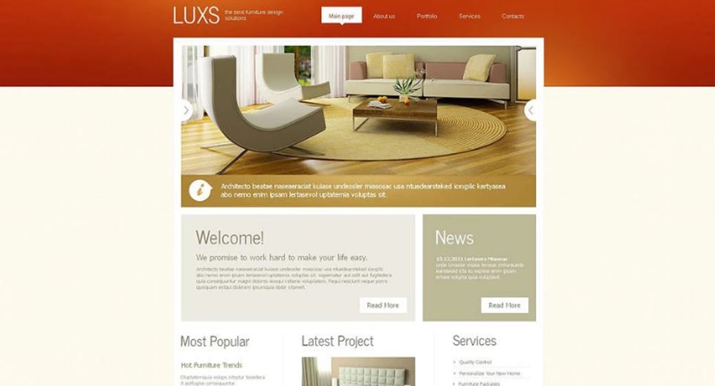
If we speak about a furniture company, it makes sense to create a background in warm natural tones to highlight the aesthetics of products. Colors of wood, cotton, linen, rattan, etc., help to establish calm and sunny ambiance where anyone will feel comfy and relaxed. And these two are the main characteristics people look for in high-quality furniture.
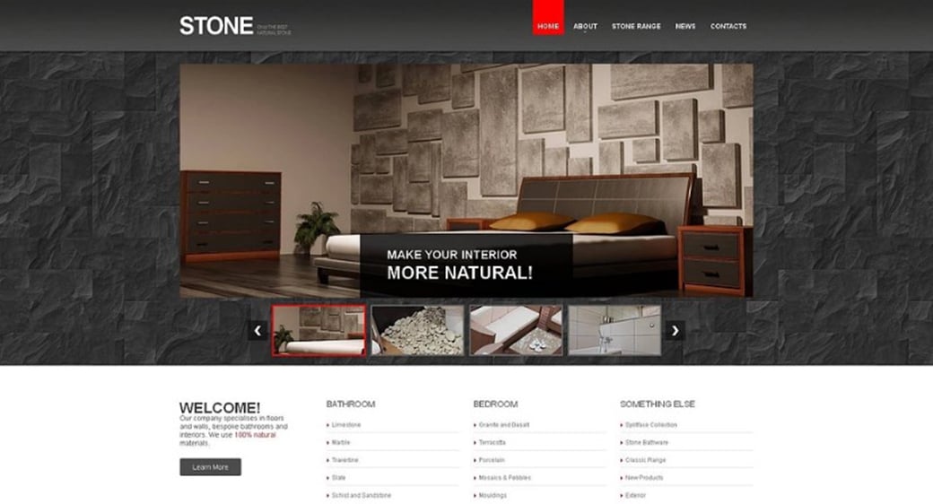
Flooring Company Web Template with Stone Background
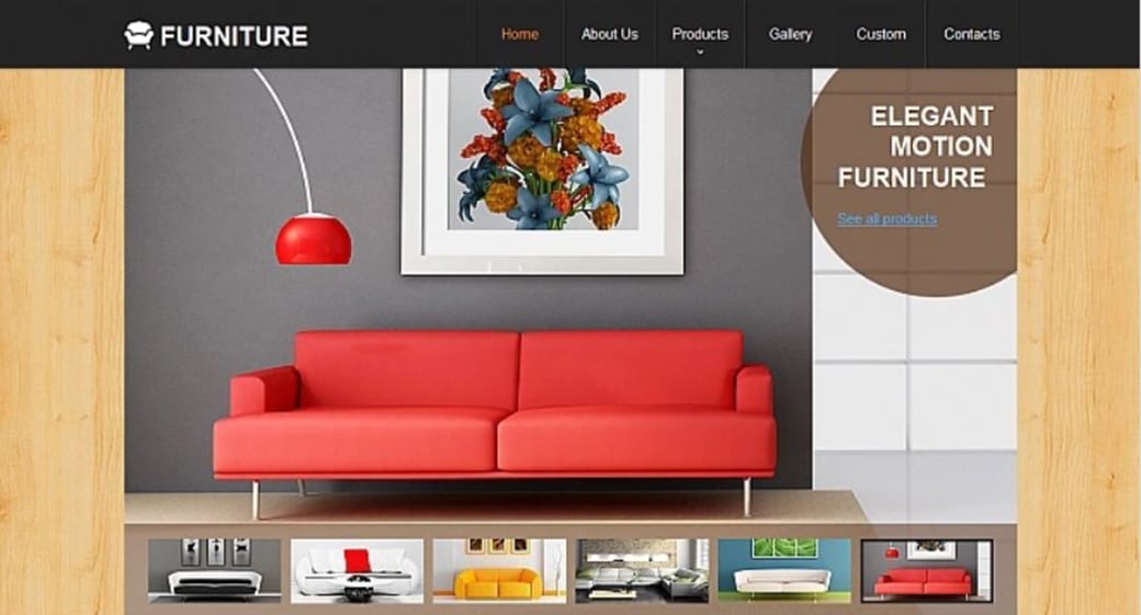
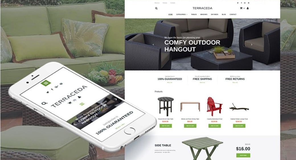
Website Template for Furniture Store
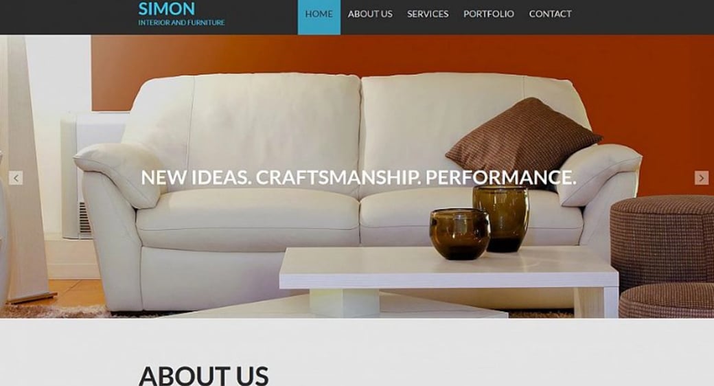
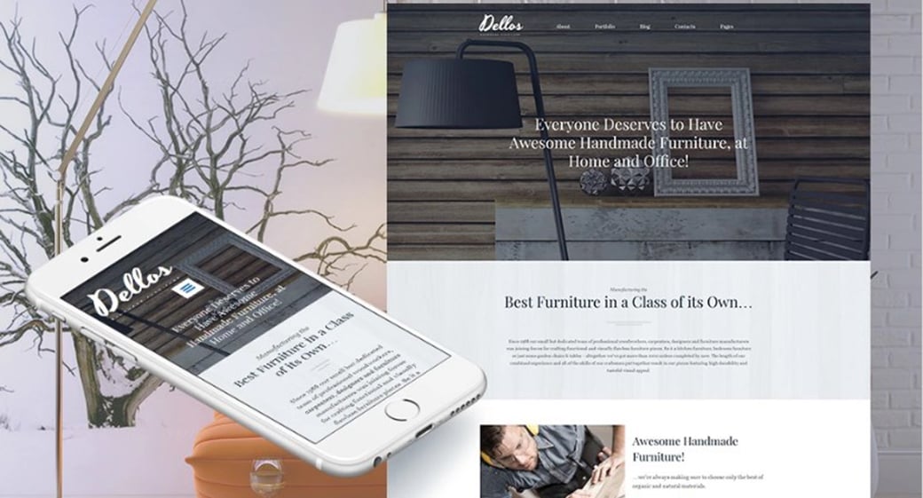
Furniture Company Website Template
In any case, interior company websites should follow a clean style and uncluttered design that makes use of enough white space to nicely embrace photos and other content.
Visuals Before All!
One of the top-priority tasks of an interior design website is to showcase the examples of the studio’s works. Therefore, bright crisp photos of the best company’s designs are vital for this kind of websites. Aside from design examples, those photos may show off the best products the company offers, decor elements like vases, rugs, lamps, etc. Finishing materials stores may display their offers of paint, wallpapers, decorative plaster and others.
There are several tricks of using photos and images on your interior studio website. And the major one is – don’t use stock images to display your works. In the long run, you create a website to show potential clients what you and your team can do in terms of interior design. In this light, the use of generic stock photos looks like a fraud and may have a negative impact on your brand.
Another reason for avoiding stock images for your gallery photos is that many people use photo stocks and you might be surprised one day by noticing the same pic on your rival’s website. Here are a few tips on how to implement stock photos and images to your business website wisely:
- Don’t be afraid of customizing stock photos according to your needs. You may simply add text to the pic, crop it the way it will display your goals the best, remove everything you don’t need, etc.;
- Choose photos that exactly answer your goals. Don’t add images just to add ones;
- Choose the most natural-looking photos to illustrate your business;
- Make use of Instagram and other social media photos. It’s fun and engaging.
In general, the Home page is used to show off some of the best and the most prominent works. It may be done with the help of a slider or a set of thumbnails under the header. Many website templates for interior design agencies use huge background sliders to let visitors see all interiors in full bloom.
Interior Design Studio Web Template
Furniture Store Web Template with Slider
Despite a huge amount of concerns about Home page sliders use, using it on your website Home Page makes sense. Thus, visitors may see the coolest works of the studio from the beginning of site browsing and while looking for some info on a Home page. Besides the best designs, you may use a slider to display the latest news of the company, best articles, and tutorials or special offers to your clients.
Gallery or Catalog page is another main platform of the site to showcase works and products photos. This separate page allows paying more attention to what you can offer your customers and display your services in the best way.
Interior Design Company Responsive Website
Interior Design and Decor Web Template
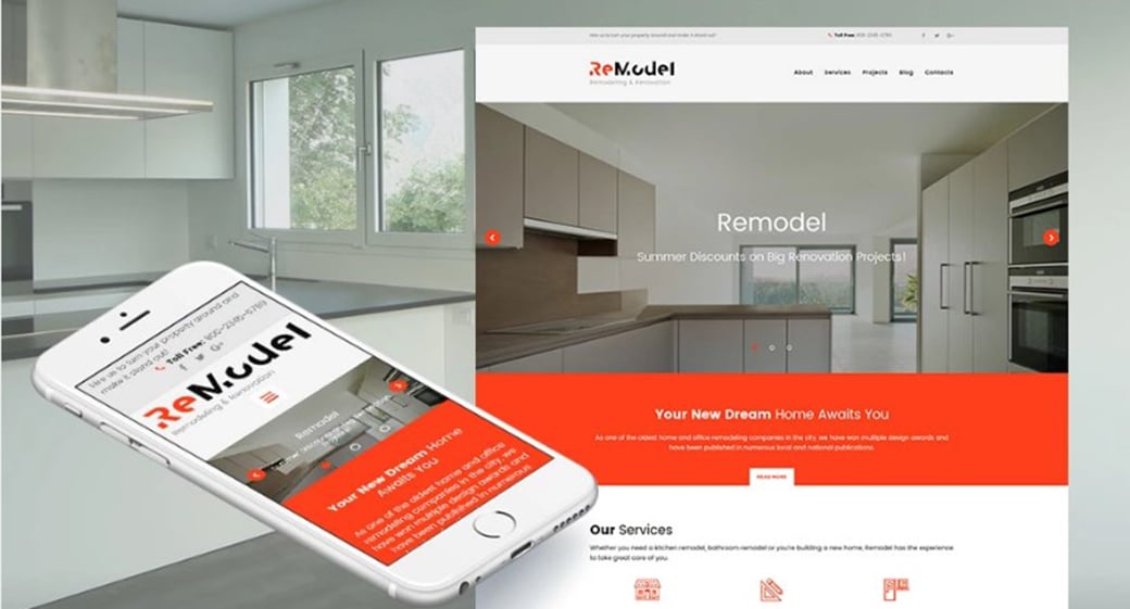
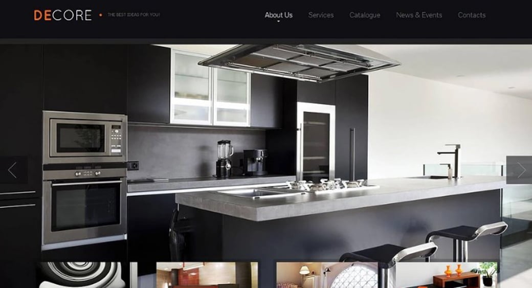
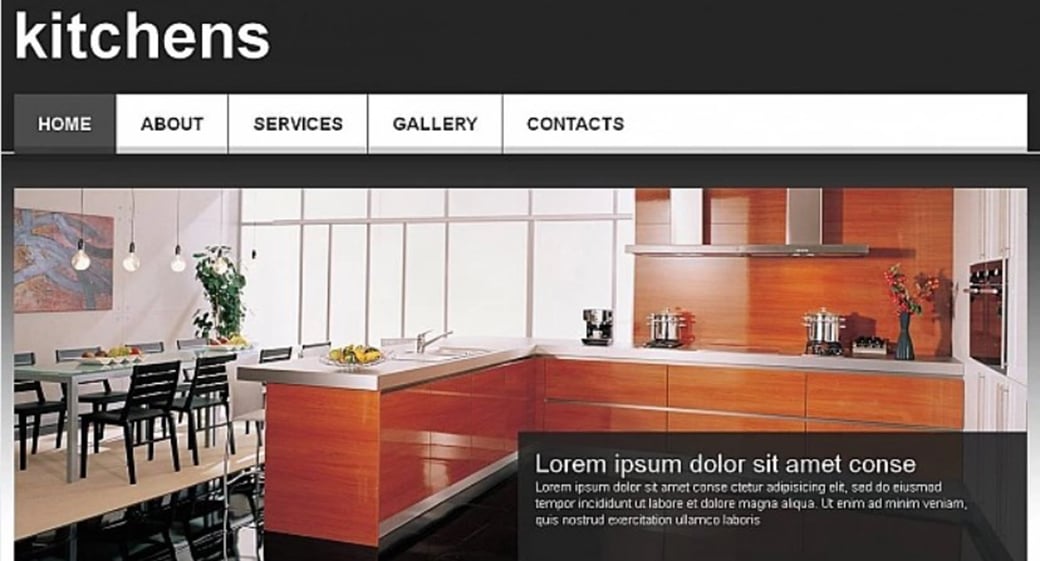
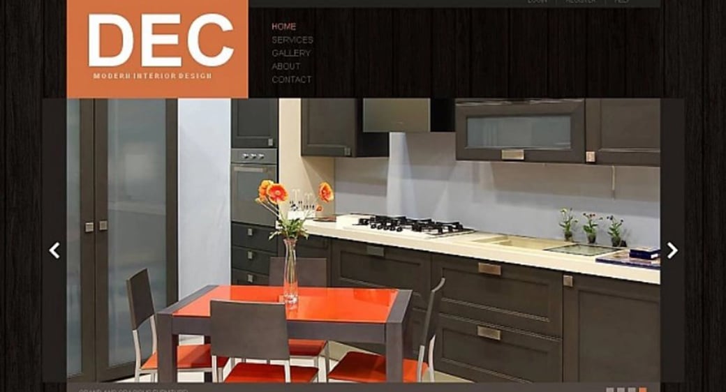
Kitchen Interior Design Web Template
Users can explore Gallery page in a comfortable pace and see the projects they liked in details. You can add subcategories to the gallery page to make navigation easier.
What Should Be Included in Layout
Interior design studios are mostly local businesses. Contact page is a section that should be definitely introduced to the design of Interior studio website. Your customers should have the best and easiest opportunities to connect with your brand, so this page should implement the best UX techniques. In this light, About and Contact pages are the main sections that help customers engage with the brand as well as allow the brand to increase search engine rankings.
About page of interior design studio website shouldn’t be another boring citation of the company’s achievements and services. Add a dash of creativity and present vital info about your design studio in a vivid, clear manner. Use the admin panel of MotoCMS furniture website builder to include a few words about people that work with you and create those beautiful projects. It’s beneficial to show users photos of your team and office environment to create a special friendly atmosphere.
Furniture Website Template with Bright Accents
You may include testimonials section to the About page. Feedback is absolutely essential for companies that offer various services to people. It helps in getting potential customers on the right side and showing them that you are real. Actually, you can include short versions of “Our Team” and “Testimonials” sections on a Home page to create an engaging atmosphere from the beginning.
White Website Template for Interior Studio
In many cases it’s good to add various call-to-action buttons as well as a PayPal widget. It helps to make your business website template more comfortable to use and adds a few points to UX.
If you run a Home Decor website or have a business connected with finishing materials, you may include a Tutorials page to your website. It may contain video or photo tutorials that will help your customers to properly apply decorative plaster or paint walls with no mistakes.
Establish Connection with Clients
Contact page is vital for any business website. However, local businesses have some specific aspects to include to their Contacts section.
Contact information should be presented in an easy-to-perceive manner. If you wish potential customers to connect with you in the nearest time, you should show and arrange contact info in the way it will be handy to use on any device.
Many companies include phone number on any page of the website. It’s really wise and helpful. What I recommend is making this phone number clickable so that smartphone users could make you a call right from their devices. The same idea is for email address and other contacts (like Skype or Fax). Such technique makes you more accessible for your customers and draws more potential clients to your studio. Some companies now add special buttons like “Call Us”,“Write Us” instead of a full phone number or email address. Though it’s not too beneficial for SEO, such technique will save you from spammy letters and abuse calls.
Clean Web Template for Interior Design Company
Map widget is essential today for almost any business website. Local-oriented business should include a map with indication of all your physical addresses. It definitely adds a lot to SEO and usability. List all your physical addresses next to the map so users could easily connect your locations on a map.
Contact form is usually placed on the same Contacts page. It shouldn’t be too complicated as it may repulse people from contacting you. In general, Contact form is enough to include a Name, Subject and Message fields. You can add a User Email (or Phone Number) field as well, if you wish to let your visitors know they will get a reply to their messages.
Interior Design Web Template with Parallax
And, of course, any business website today should have social buttons that lead to the company’s social accounts. Most website templates have those buttons in the footer. You should make sure they are large enough to be noticed. Sometimes brands add custom social buttons. In such case you should pay great attention to UX and make sure they unambiguously guide users to your social accounts.


Leave a Reply