Color Combination Guide – How to Unleash Your Page Superpowers
You don’t need to be a very experienced web designer or a color theory specialist to notice that the Internet is full of decent or poor color combinations. Also, there are many bad color schemes in print, including advertising products – it’s about the money mostly, so any mistake is equivalent to a smaller profit. Are designers so uninspired? Or are we this much subjective that we can’t be pleased with any color schemes?
The truth is somewhere in between. Many designers criticized the lack of inspiration when it’s about color choices of other people and it’s possible that we are in a way too hard to satisfy. We bet that any reader is already thinking: “how do designers select only decent color combinations when the number of colors is infinite?”. The answer is surprising and kinda funny: most of the colors don’t like each other! Yeah, the number of colors is almost limitless, but very few ones are actually “friends”! Plus, there are very few good color combinations comparing to the number of colors.
Primary Color Combinations
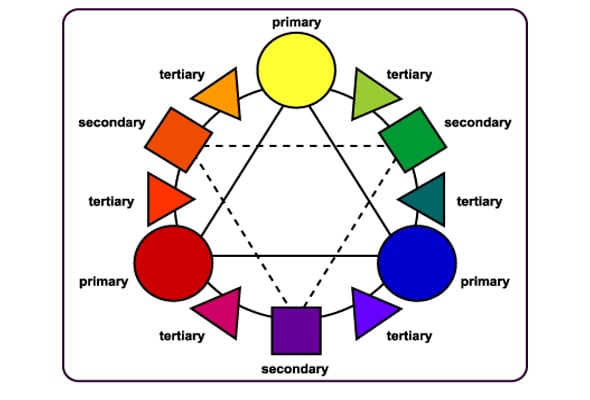
In order to create and use only good color combinations, it is essential to understand the nature and the features of each color. So please welcome a color combination guide that even professional designers would appreciate. Let’s get started. Red, blue and yellow are called primary colors because the rest of the combinations are formed from these ones. More pragmatically, you may call these “the parents” of colors. The secondary colors are created by combining the primary colors, in equal parts:
Blue + Yellow = Green
Blue + Red= Purple
Red + Yellow= Orange
Finally, we have the third-level colors that are formed by the combination of the primary-secondary or secondary–secondary colors – of course in equal parts. The results are the following:
Blue + Green = Aquamarine
Blue + Purple = Violet
Red + Orange = Vermilion
Red + Purple = Magenta
Yellow + Orange = Marigold
Yellow + Green = Chartreuse
Another fact that puts the designers in trouble is the worldwide meanings of colors. Maybe it sounds a little bit weird, but color may represent joy for people living on one continent and the same shade may be considered as a woeful one in another part of the world. In spite of these differences, each color has some particular meanings.
Meaning of the Most Used Colors Explained
It’s highly recommended to know the meanings by heart, but it’s no problem to bookmark this post and consult it when you should choose the colors for your project. Anyway, across time, by getting more experienced, a designer doesn’t need to know the meaning of the colors, he/she feels which color is better for his project. It is difficult to explain, but it is true!
Red
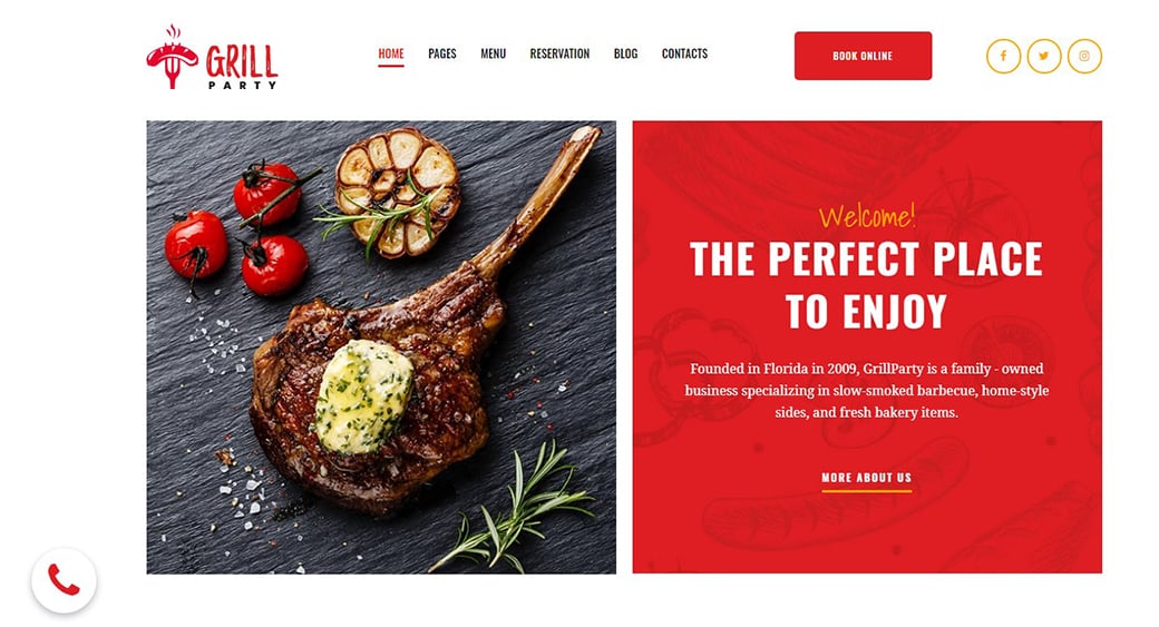
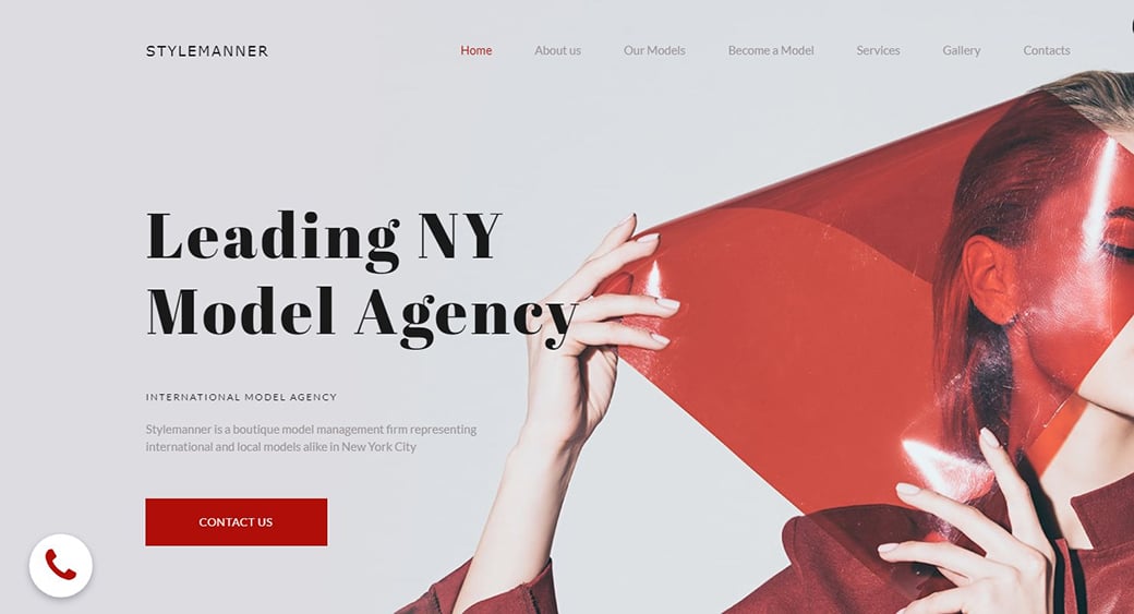
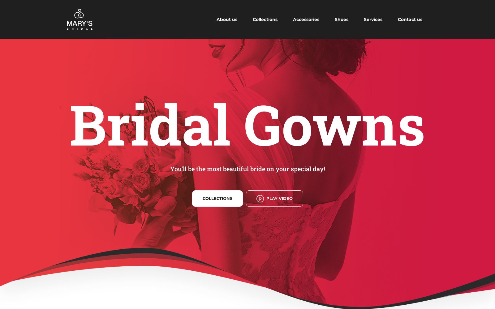
It’s associated with three main situations: love – the hearts are red, Valentine Day’s gifts contain at least a red nuance. Red provokes excitement – it’s the reason why many call-to-action buttons are red. Besides that, it raises blood pressure. Thirdly, red indicates danger – have you ever asked yourself why most of the traffic signs contain red? Now you have an explanation.
The next examples are relevant to show that red is very important and extremely useful in creating a wonderful and efficient layout.
Blue
Most of the designers would agree with the idea that when someone is not sure which color to use, then the best solution is blue. Being the color of water and sky, blue is everywhere and it gives a special feeling of comfort, calmness, and stability – this is the main reason why it is so common in financial related websites. Blue is associated with trust, intelligence, truth and in addition to its specific calming effect, it is highly recommended to use it as background.
These designs show how the theory is implemented in practice.


Yellow and Orange
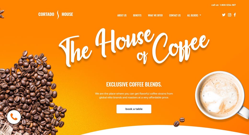
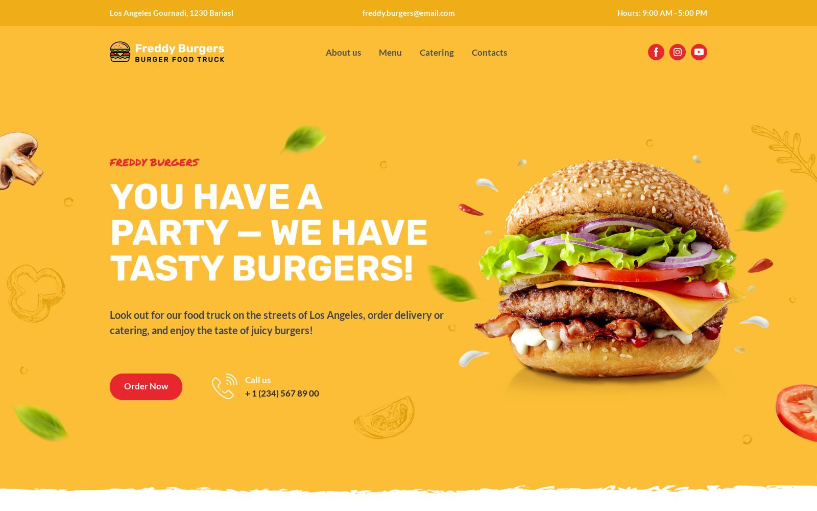
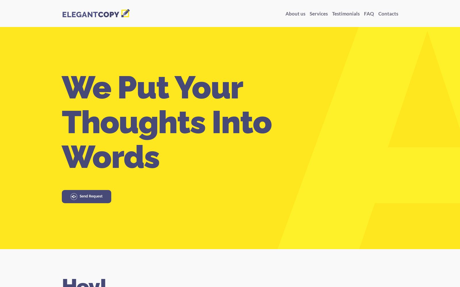
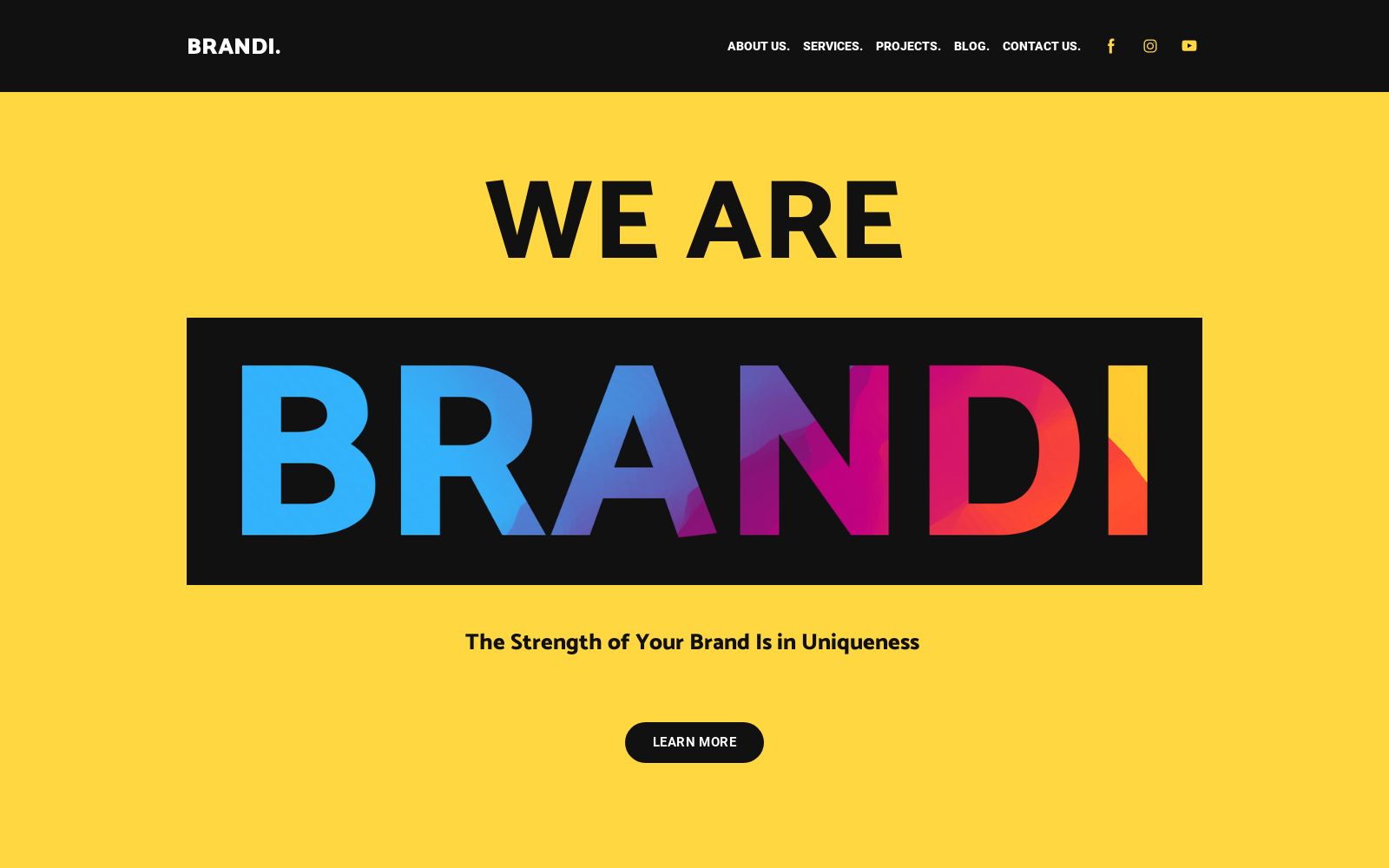
Yellow is a color that stimulates brain activity and is associated with energy and joy. Taking these into account, it becomes obvious why so many kids related items are yellow. It has the power to attract the attention of the viewers – the taxis are yellow because of this fact, and at the same time it works as an appetizer – McDonald’s logo is yellow-based, isn’t it?
See some yellow website designs in action.
Green
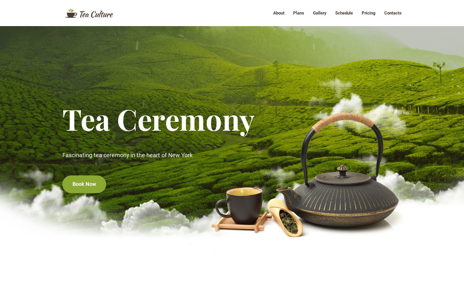
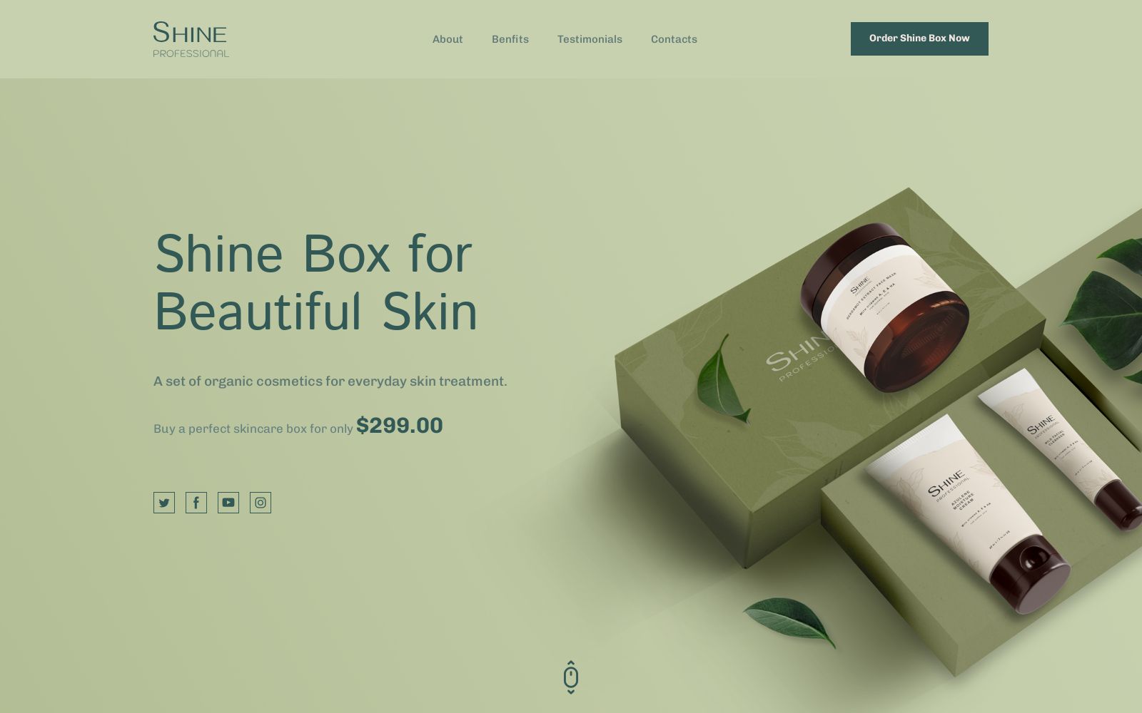
Nowadays, Eco-friendly movement and products that don’t pollute the environment are on-trend and of course, the demand for websites related to these is high. The conclusion is simple: green is for the environment. On the other hand, green is associated with freshness, youth, and money (the dollars are green).
We have here some amazing use of green in web design.
Color Combination Schemes and Types
We guess that none can name himself as a designer unless the color wheel is something common for him. Practically, it’s a graphic representation of the colors using the shape of a circle. This fact is very important because using a color wheel is simple to realize combinations between nuances. So, we are digging deeper to see how is recommended to create color combinations.
Monochromatic
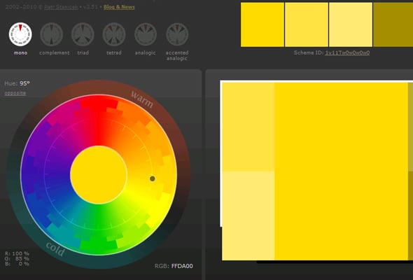
This color combination is realized by determining the main color and use variations of it. The variations are created from the main colors by adding black or white. The schema is efficient when it’s not required to have high contrast and it represents a good solution in the eventuality that is required a modern approach. Many Weblium website templates use monochromatic palettes to give a clean, minimalistic look while ensuring visual consistency.
Analogous
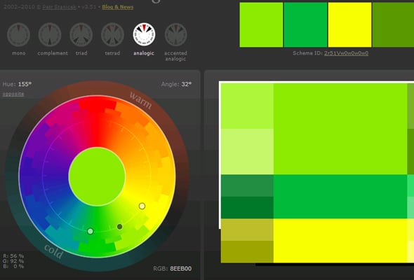
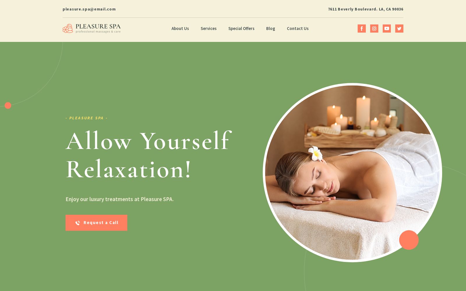
The Analogous color scheme is somehow similar to the previous one. At the same, the main color is chosen and it is combined with the neighbor colors. Usually, the neighbor colors are “friends” with each other. Using this solution, a designer may obtain a better contrast as the monochromatic combination, but less powerful than the next type of color combination. The best approach when choosing an analogous combination is to use the main color as much as possible – i.e., as background, the second color to sustain it and the third one just to highlight the most important items. You’ll often find this principle in Weblium templates for creative portfolios or wellness brands.
Complementary
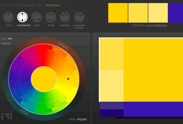
A complementary color combination is formed from two colors that are located in opposing positions on the color wheel. These colors aren’t close, therefore these are mostly “enemies”. As a result, the contrast is very powerful; any designer should pay tenfold attention not to create a visual tension that hurts the eyes of the viewers.
Triadic

This color combination is based on selecting colors that form a 120-degree angle between them. This is characterized by a very strong equilibrium, but at the same time, it offers a large palette of options.
Tetradic Color Combinations
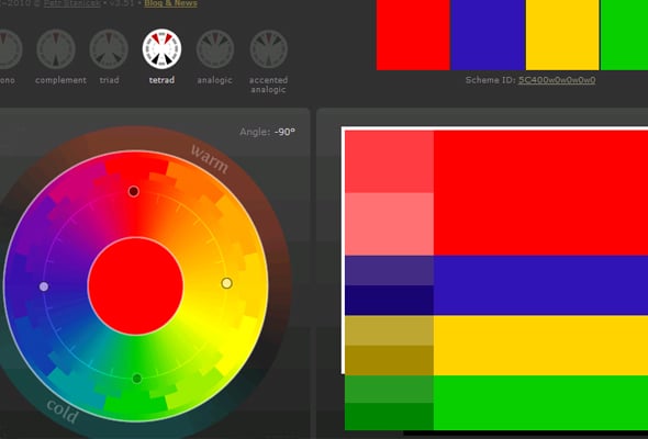
As the name is pretty much self-explanatory, in this case, we are talking about four colors. Two colors are adjacent to the color wheel, while the remaining ones are the opposite of these. It’s more difficult to achieve a scheme but the results are really impressive.
The most experienced web designers consider this post as a nice refreshing but the amateur ones will be overwhelmed by the numerous terms and the consistent information. The solution to becoming a master of colors is to keep calm and just learn stuff – step by step everything may be achieved. All the designers at their beginning weren’t sure which color is the best, therefore color theory may be learned, there is nothing special.
Online Color Tools
The good news is that nowadays the Internet is full of resources to master your skills in any web design field, including color theory. In addition to that, some web applications are wonderful tools that make much easier the process of selecting a color combination. Here are just some of my preferred ones, you may search for others, it’s about each one’s tastes.
#1 – Canva Color Wheel
It’s a wonderful application that has an amazing interface. It’s simple to use and very intuitive. Be sure, it’s worth giving it a try!
#2 – Adobe Color Wheel
It has pretty much the same features as the previous application, therefore if you don’t like using Canva, then this one might be a very reliable alternative. It lets you create various color combinations and see how the colors are matching among them.
#3 – Colors Co
It’s another impressive application and the main feature of it is an immediate representation of multiple color schemes. The interface is a little easy for an amateur. More than that, once you get familiarized with, it’s improbable to give up on it.
And if you want to see real-world examples of effective color combinations, browse through the Weblium template gallery. You’ll find tons of ready-made designs with perfectly matched palettes—great for inspiration or to use as a starting point.
That’s about it, guys. You have all the required resources to become a master of color theory. Be patient, confident and work hard!














Thanks very helpful.
Great article and thank you for the sites where you can mix and match. Was looking for something like this THX!
[…] red is associated with vitality and energy whereas black is associated with elegant and luxury. Read this Color Combination Guide to know more about different colors and their impact on […]
really useful article… thanx
I truly love your website. Pleasant colors & theme. Did you develop this site yourself? Please reply back as I’m attempting to create my very own website and want to learn where you got this from or what the theme is called. Thanks!