What good is a website if it fails to convert a single visitor? For good or bad, people in general are obsessed with the idea of converting more visitors into customers. They don’t care how immaculate the codes are, how beautiful the images are or how many hours of hard work have been invested into the design of the template. All they want to see is a higher conversion from a website. And of course, there is nothing wrong with this demand.
In this scenario designers have to deal with a dilemma. The dilemma of whether they should be focusing more on the aesthetic front or on the conversion aspect of the design. Striking a perfect balance between these two seemingly contradictory ideas is not an easy task by any means. But by following these 5 commandments of conversion oriented design, we strongly feel that you will be able to make a difference this time around.
Commandment 1 – Emotional Appeal
You know why most seasoned designers share a love/hate relationship with stock images? Because stock images do not have any emotional value that can help you connect to your targeted audience. They have been used widely by numerous other designers and therefore, the emotional bondage will be largely missing.
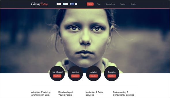
To get people involved and to make them take desired action, you need to use the right words and the right images. Take for example, the above Children Charity Website Template has included an image of a child in destitute. The use of this powerful image will force the visitors take note and maybe they will help these poor kids by making a small donation. Now, imagine the same impact while using a simple image from any of the popular stock photography sites. Can’t even imagine right?
Commandment 2 – Clear Value Proposition
Ask yourself first why on earth will people care for the service or product you are offering? There are zillions of other websites offering the same service and therefore, it is imperative for a website to stand out from the other designs.
This can be easily done by focusing on the USP [Unique Selling Proposition] of the product/service in the design. For example, if your product has a feature that makes it one of its kind, you need to make it prominent in the design.
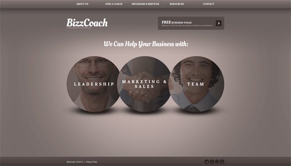
Take the Business Web Template With Circle Elements for example. The USP of the company is clearly represented via the following 6 words – ‘We Can Help Your Business With’. If you happen to choose this template, all you have to do is to change this phrase with something catchy and creative.
Commandment 3 – A Great Call to Action
You might have the best design in the world and your value proposition may be impressive too, but unless and until you add a great Call to Action to the design, all your efforts to convert more visitors by making innumerable tweaks in the design will fall flat to the ground. Now, people tend to believe that just slapping a Call to Action button will do that.
Well it is not that easy. There is a science behind it. You need to be specific about what the CTA button is all about otherwise the visitors might not be that interested about Clicking on it.
For example, a simple button with the following words – ‘Click here’ does not really make any sense at all. Why on earth he should be clicking on that button? What he will get if he clicks on it? A Cookie!!
Of course not! So, you need to make it abundantly clear what the Call to Action is all about. For example, if the Call to Action button will take them to the Pricing Page; just say it. Use a call to action text like – ‘Go to Pricing Page’. Simple and straightforward.
In the above example, there are two ‘Call to Action’ buttons but ‘Go To Services List’ button grabs all the attention because of the sly use of color variation. Moreover, the CTA button makes no bones about what purpose it serves.
Commandment 4 – Justify It Rationally
Buyers are not fools. You need to work hard to make them believe that your product/service is going to help them solve their problems. Now, this cannot be done by adding some cool images and a call to action. You need to justify the visitors rationally why they should be investing their hard earned money to your product. Maybe a video showing how good your product can be when put to use or perhaps a short animation showcasing the product in action can help the visitors realize the benefits of the product. Or maybe, you can just use simple texts with bulleted points to highlight the benefits of buying your product. In short, no matter what you put there in the design just make sure that it follows a rational sequence.
In the example of the Investment Consulting Website Template it is indicated how the process of capturing the attention of audience can be done. Four blocks are there to describe the benefits of your products or service in detail.
Commandment 5 – Above the Fold
There is a new trend in the market that involves use of big image covering almost all the ‘Above The Fold’ Section. Now, there is nothing wrong in this trend, but failure to feature the most important elements of the web page within the Above the Fold section just for the sake of making room for the big image can be disastrous. You simply cannot expect that people would scroll down to the bottom of the page and locate the Call to Action button. Don’t let them do the hard work.
Feature the most important elements of the design within the Above the Fold section. This will do the trick.
The above Minimal Business Investment Web Template flaunts a big image within the Above the Fold section but the template manages to make room for Call to Action and other important texts.
So, try to follow these commandments and hopefully you will be able to make a killer design.


