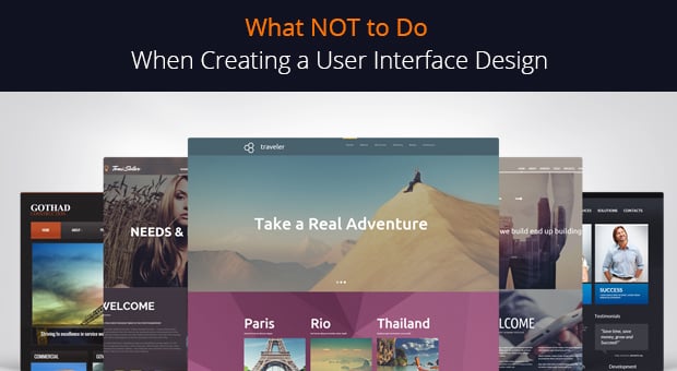
The way a user interacts with your website, especially if it’s a conversion-oriented site, is highly important. If you cannot draw the user to the most important aspects of a website or guide a visitor to perform the action you need, you must be missing something in your design. In this light, user interface design is the point where you should put the most of your attention.

User Interface Design vs. user Experience Design
Many novice designers and developers confuse terms user interface (UI) and user experience (UX). It’s partly because of the fact they have similar abbreviations. In general, these two terms are really close. Many website designers consider UI as a part of the user experience.
UI can be described as a website look, its “pleasingness” to the eye. UX is seen as a broader term that includes user interaction with interface – its clickable elements (links, buttons), navigation etc – as well as the overall experience of the website use.
[Tweet “UI appeals to the eyesight, UX – to the feel and manipulations.”]
Put simply, UI is a look, UX is a usage. UI appeals to the eyesight, UX – to the feel and manipulations. A good UI/UX designer shouldn’t focus only on one aspect. If your website looks pretty but is hard to manipulate – it has poor UX. If it looks ugly but functions perfectly – it offers a bad UI. Pretty simple. And as a designer you should focus both to achieve stunning results.
No secret that learning from mistakes of others is much more pleasing and wiser. It’s better to be aware of the most common UI design fails we can spot on other websites. Thus you will not only improve your skills but will be fully armed to answer your client’s requests that may lead to website design fails.
Too Complicated Design
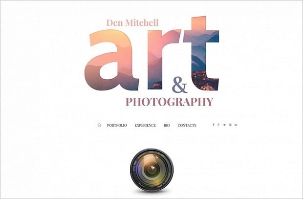
The Web has shifted towards simplicity greatly last days. Minimalist and clean designs are the top priority for most website owners who understand the principles of a good design. Complex, too “busy” designs affect usability greatly and lower the website traffic.
Website Template for Photo Album
Mobile-oriented users prefer light designs that are easy to perceive on smaller screens. Clean layout works the best here.
Inconsistency in Design
Consistency in design is another vital part of a good UI. It states that all elements of the same nature should look and perform the same. Users expect that elements that look like rectangles with rounded corners and have some text to act like buttons. If your visitors see navigation menu sections made in different style or with different fonts use – it might confuse them.
Control Driving School
Make sure your headlines use the same typeface and font size. If you use some decorations for clickable elements or call-to-actions, use them for all such elements across the entire website. It’s easy to do if you plan your design ahead. Make a list with all actions you are to use; divide them into logical sections with similar meaning and functionality. Then consider the look of a UI element for each section: its alignment, hover effects, styles, colors etc.
Wrong Colors
Website’s color palette can make your website stand out or ruin it, depending on how wisely it is used. Poor selection of colors for a website will turn your visitors off and even badly affect conversions. We know that color choice can be very subjective. So it’s really hard giving recommendations on this topic.
Accept Jesus
Learn the psychology of colors to choose the ones that suit your target audience and may impact their activity on your website. Choose wise color combinations to avoid bad look. Don’t forget about people with color-blindness and design the website with accessibility in mind.
A Lot of Text
People on Internet are not too much into reading. At least poorly structured long texts, with bad headlines will definitely leave them frustrated. Heavy texts without visual support (images, videos, infographics) may make users miss the message.
Openoffice
Use less text and make it readable on various devices. If your font looks tiny on smaller screen – no one will read it. use catchy headlines, subheadings to break your text into digestible chunks. Bullet lists are also a perfect way to say a lot in a few words.
Poor Navigation
While navigation may seem more of a UX issue, its style, look, and the overall presentation definitely concern the UI field. First, the menu bar don’t have to take the most of the screen area. Especially it frustrates mobile devices’ users.
Hamburger menu still spurs huge discussions upon its use, but there’s no doubt it looks much better than navigation menu bar on smaller screens. It’s aesthetically pleasing and much comfortable for users.
Restaurant Guide Atlanta
Another issue includes too complicated and detailed menu that confuses visitors from the first seconds and may make them leave your website without any other actions. Don’t overcomplicate. make a simple and nice menu with drop-down sections to save the screen area.
Too Many Distractions on One Page
By distractions I mean clickable elements mostly. If you wish your visitors to perform soma action on a page, you have to focus on one action per it. Don’t place too many clickable objects on one place. If you wish your users to subscribe – place a subscription form with a button and remove all the additional links or buttons that may take users away.
Match Office
Long and complicated chains of actions a user should take to get the result can also be frustrating and lead to unfinished action.
Conclusion
Good UI design is not just a nice look that pleases visitor’s eye. It attracts people to explore a website more, leads to conversions and makes users trust you. Check out your website is there any of these mistakes mentioned above and try to fix them. You should get great results very soon.

