How to Create a Charity Website – 9 Easy Steps and Designs
Honestly speaking, from the web designing perspective, there is not much difference between how to create a website for charity and a marketing website. The basic design principles remain the same: the website has to look good, impress the targeted audience, and convert as many people as possible.

But charity websites need more care and attention as they are not just another website to sell stuff. Unlike any other corporate websites that you have designed so far, charity templates are not selling any product or service. Rather, they are selling a Cause. Moreover, the people donating the money for a cause will not benefit directly from it.
How to Create a Charity Website
So, as a designer, you are responsible for convincing people that donating money to a cause is good and rewarding. Of course, it is not an easy job, but it is possible. Following some simple tactics, you can create a charity website design that encourages people to donate money for a good cause.
#1 Make The Purpose of Your Charity Website Design Obvious
Sometimes, it just happens that we bump into a website, and even after spending a minute or two on it, we fail to figure out the purpose of the website. Some sites are so vague in design and content that they make visitors feel clueless.
You should not take visitors for granted. Your job as a designer or website creator does not end with adding some random images of people doing charity. Rather, you must design a website to communicate the message precisely to its targeted audience.
You can help people understand the website’s purpose by adding a short mission statement on the home page. Or you can add a link to the ‘Why Donate’ page where users will get to know the organization’s purpose and its activities. In that case, the link to the About Us page should be prominent, and try to avoid promotional statements.
Stick to the basic details while writing content for the ‘Why Donate’ page: what the organization is about, how you are helping people, why visitors need to donate money for the cause, etc.
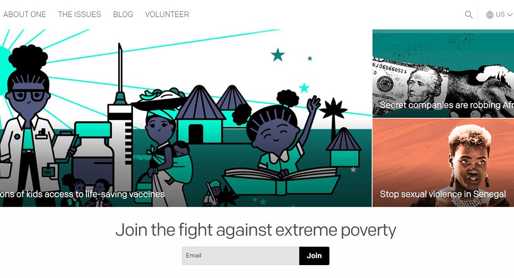
One website design is plain and minimal. Moreover, it uses a direct message asking people to join the fight against extreme poverty. The idea is very simple, and the presentation makes it easier for people to understand it. The text carousel above the ‘Act Now’ button gives the visitors an idea of why they should be a part of this cause. This is a perfect example of how a charity website design should look.
#2 Make it Easy for People to Donate
No matter how good your Charity website design is or how eloquently you have summed up the non-profit organization’s mission, all it boils down to is the volunteer donation at the end. Fundraising or donation from various sources is the most important part of a nonprofit organization, and therefore, as a designer, you should not ignore it at any cost.
Rather than making people go through an elaborate, confusing, and complicated payment process, you can save them the hassle by adding a simple and prominent ‘Donate’ button/link/banner on the home page. Try to place the ‘Donate’ button/link within the Above the Fold section of the website to help it grab the most attention.
In short, all your efforts should be geared towards making the website friendly for donors. If they struggle to find the payment button or won’t feel good about the website, they will face insurmountable difficulties in gathering money for your mission.
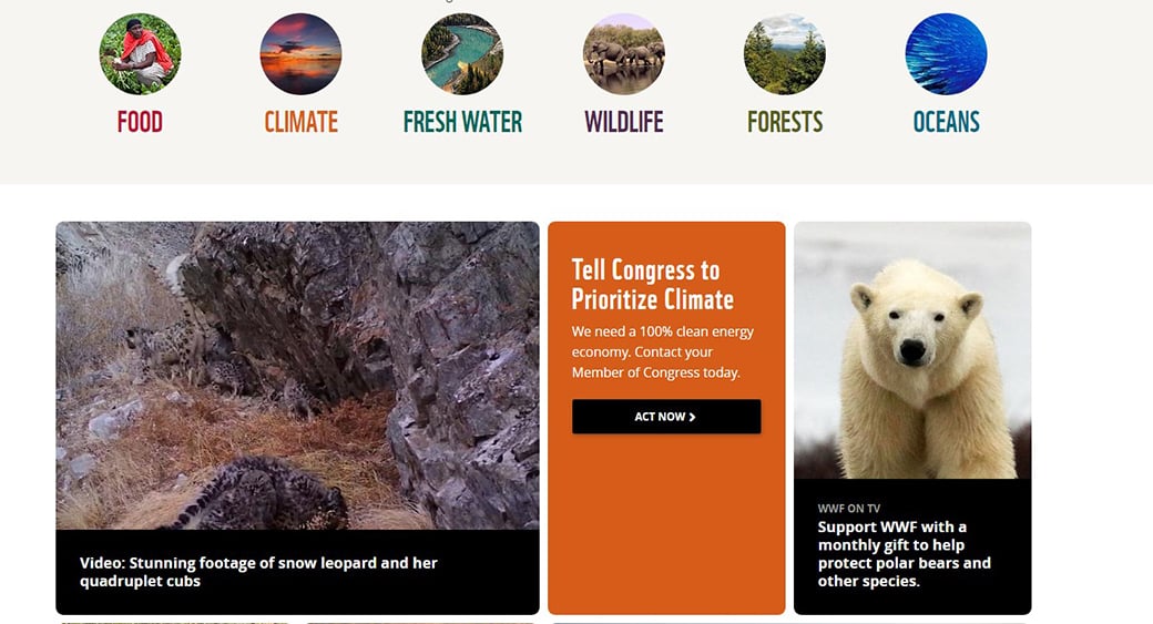
WorldWildLife website has all the ingredients of a perfect non-profit website. The ‘Donate’ button is placed prominently on the top navigation bar and the use of bright color helps it to attract maximum attention. The donation process is not complicated, thankfully.
#3 Use Image Of Real People For Real Impact
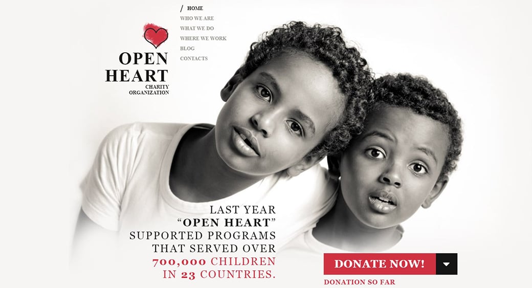
When people are about to donate money, they have a right to know where their money will go. Words are not enough to convince the donors; you need to use real images to reassure them that their donation will change many lives.
Please don’t use popular stock images for this purpose because they look fake. To make your organization and website look genuine, you need to use images of real people who will benefit. Use a picture of individuals in distress on your homepage. You can always hire a professional photographer if you are not good at photography.
You can use images of your organization in action on the ‘About Us page. It makes sense not to put these pictures on the front page because most people like to see the benefactors of their donations on the home page. It also helps to clear their doubts about the charitable organization’s intention.
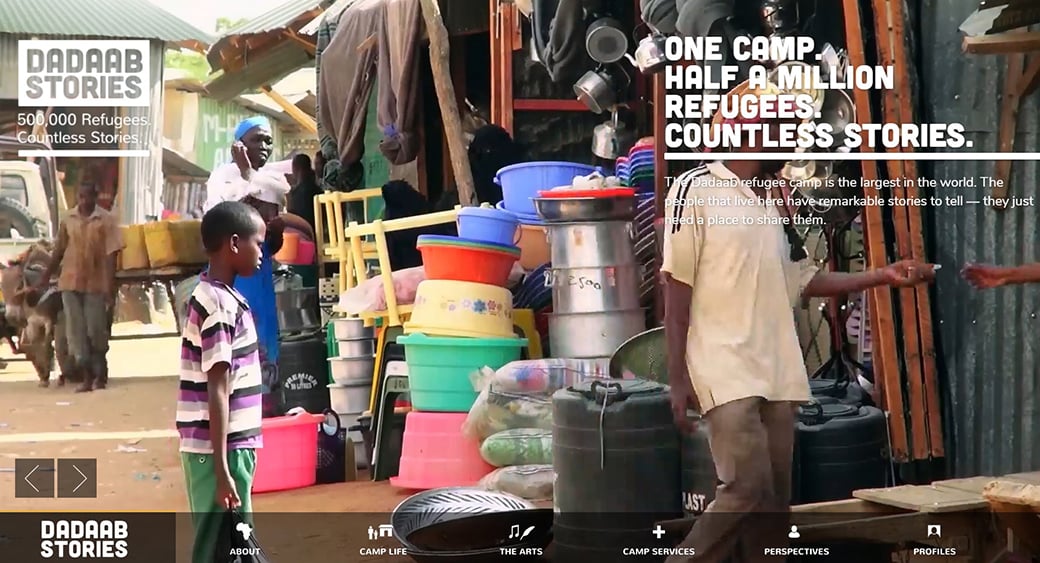
DadaabStories website does not use any stock images; rather, the designers have put their trust in the images of ordinary people of Dadaab who have some extraordinary stories to tell. The website contains images of people living in extreme, if not inhuman, circumstances. Each image tells its own story.
#4 Make Your Charity Website Design Volunteer-friendly
Money is not the only means to run a charitable organization. You also need people who want to be a part of the team. Moreover, some people don’t have enough money to donate but have time and good intentions to help others.
Therefore, besides adding a link to the ‘Donation’ page, you must also add a link to the ‘Volunteer’ page from the home page. Add some contact details like phone number, email address or physical address on that ‘Volunteer’ page so that interested people can get in touch with your organization easily. A quick contact form would be another great solution.
#5 Make It Press-friendly
Since this is a non-profit organization, the website’s aim should be to get as much media attention as possible. If your organization manages to grab some media attention, it will help you get more donations from various sources.
Make it easy for journalists to contact you. You should probably create a separate section for journalists and bloggers where they can download images of your organization, board of directors, etc. Make it clear that journalists can use the directors’ images or quotes available on the website without any hesitation. Also, mention that journalists or bloggers don’t need prior permission from your organization to write an article about you.
#6 Write Compelling Content
Since the website does not sell any product or service, you must go the extra mile to convince people to contribute. Therefore, your content should not be boring. Moreover, the design and structure of the website should revolve around the content and not the other way around.
The home page should describe why people should trust the organization. You need to use simple and short sentences to inform and educate people on why being a part of the initiative is important. You can also use teasers or powerful headlines to capture attention. Make sure other design elements are not overshadowing the content.
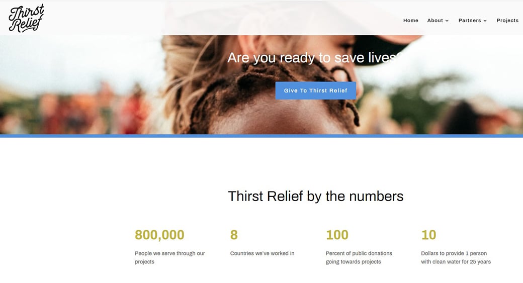
ThirstRelief uses a compelling headline against the backdrop of famine. The body content of this charity website design is simple. Using powerful words and phrases helps this website increase its conversion rate.
#7 Use Multimedia to Create a Charity Website
Sometimes words are not enough to convince people. This is probably why some non-profit organizations are falling back on multimedia to win the trust of the targeted audience. You can use a short, interactive video to describe how the organization is initiative will change the lives of many people in need.
Alternatively, you can use simple videos for the same. Embedding videos into the site’s design is not that complicated, and making them a part of the design by making some minor tweaks is easy. This is probably why videos are so popular among web designers.
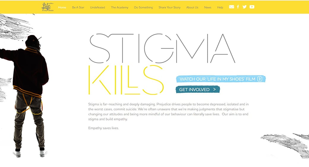
LifeinMyShoes uses YouTube videos on its homepage. However, it didn’t embed the video on the website; rather, it included a link to a YouTube page. This video is used to clearly understand the organization’s motto and encourages potential donors to be a part of this non-profit organization.
#8 Be A Storyteller
‘Once upon a time, there was a king and a queen’ – see how the mere mention of a story grabs your attention. People love listening to stories; we all hate boring research papers, documentaries, and likes.
So, rather than posting another boring document to make people aware of the achievement of your charitable organization, you can use the first-person narrative to describe how your organization’s initiatives are changing lives and fates. Using poignant stories of individuals is the killer ingredient that can help you convince people to join you.
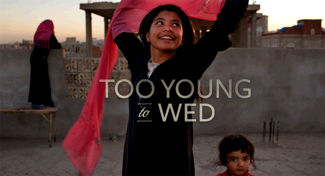
TooYoungtoWed is a collection of images and stories. The stories are short and are narrated in the first person. It is a montage of images of child brides and actually their horrible experiences.
#9 Have a News Section on Your Charity Website
Creating a news section or blog has become a norm as it helps engage and connect with the targeted audience. Updating it with fresh and insightful posts will give the readers enough reasons to return for more.
Keep a ‘Subscribe’ button on the News section so that people can easily subscribe to your regular updates. Moreover, from the search engine optimization point of view, you need to keep your website updated with interesting and informative articles.
Top 12 Charity Website Designs with Free Trial
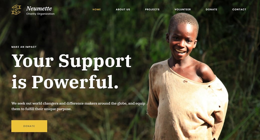
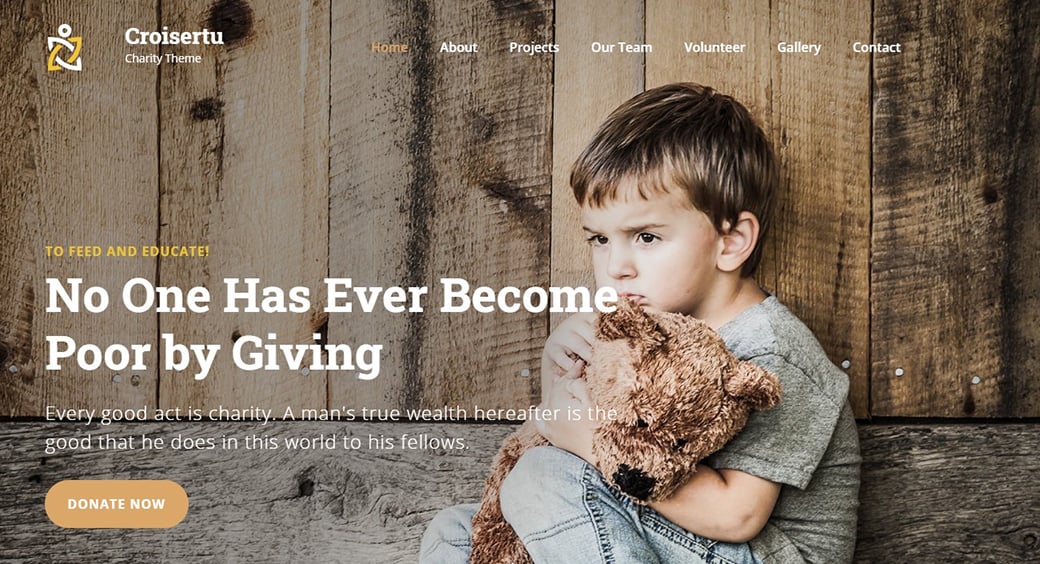
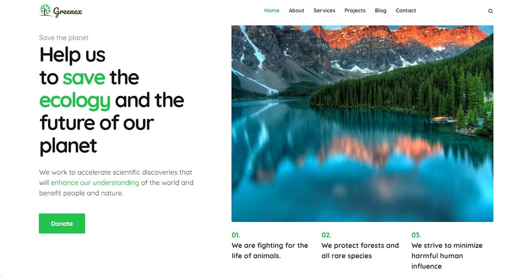
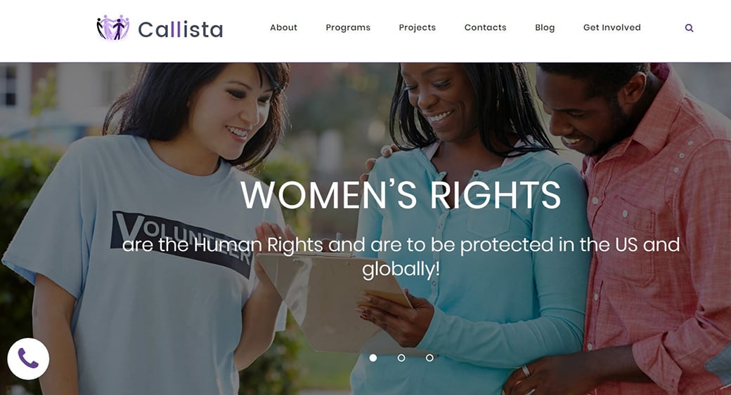
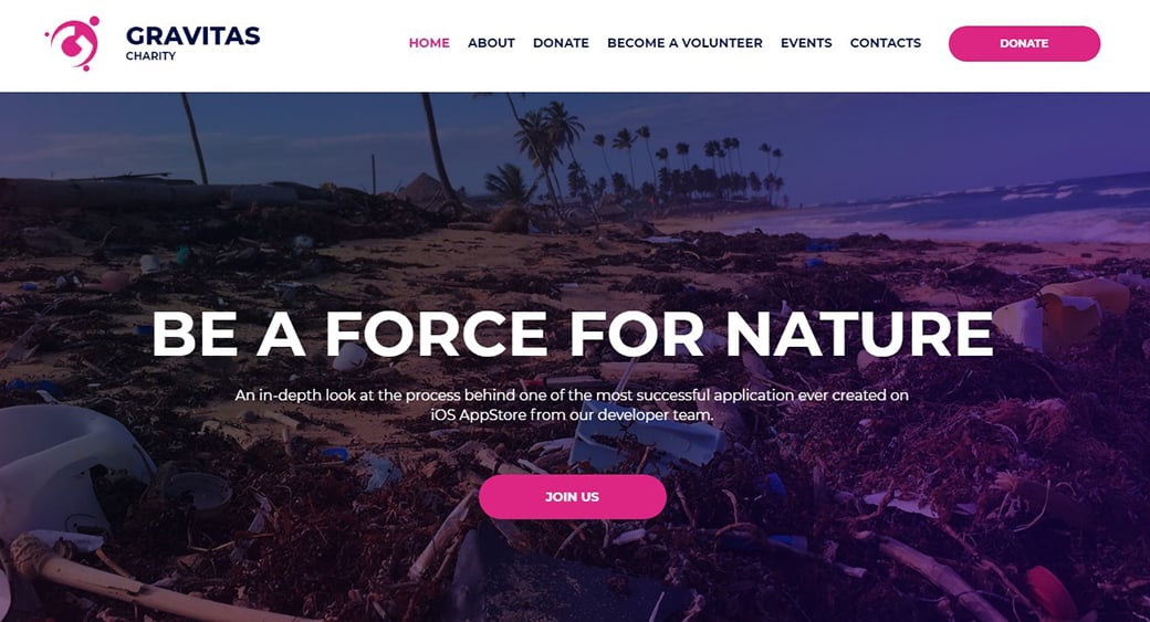
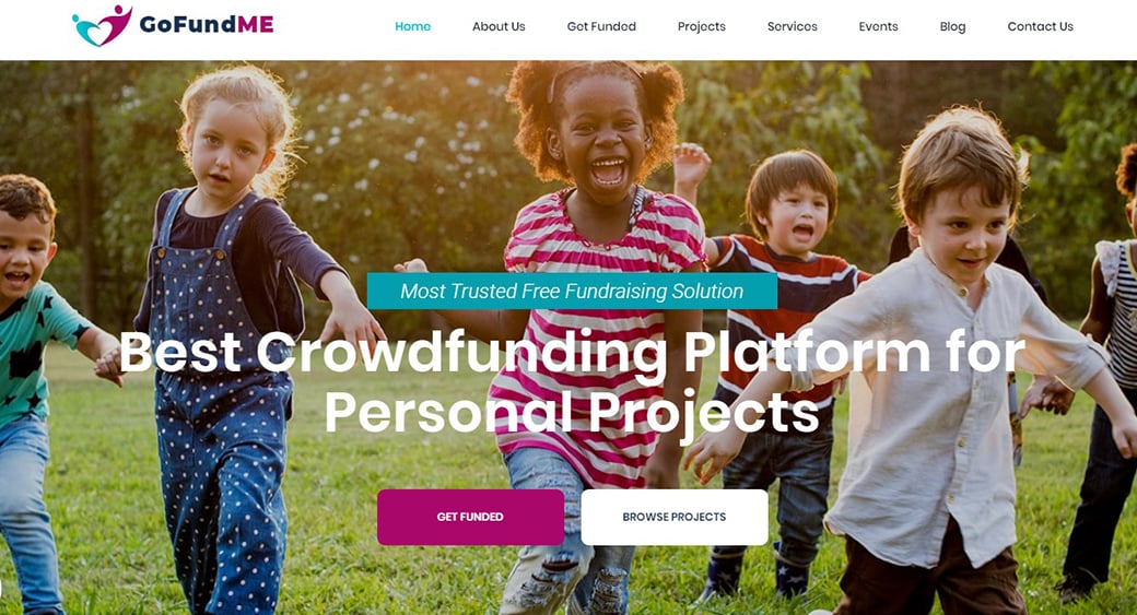
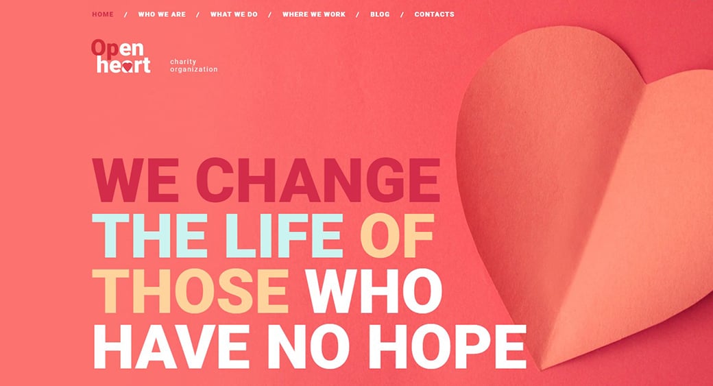
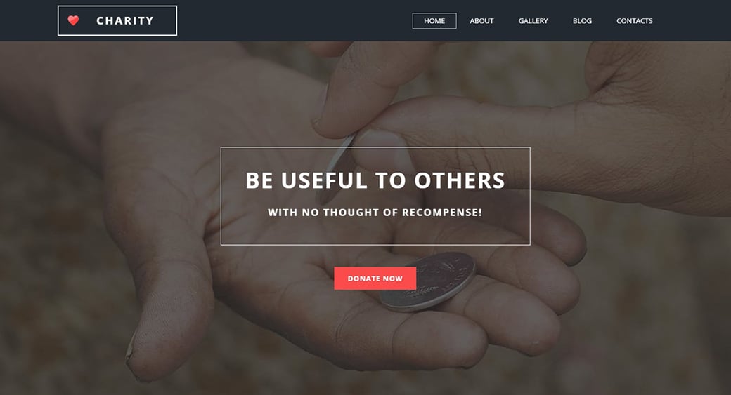
You need to perform these steps to create a charity website design. In its turn, MotoCMS has a bunch of charity website templates, which you can use for an easy start. Each template has its unique design with almost each of the aforementioned features. Along with this, the designs are flexible. This means you do not have to stick to the original design – customize it according to your taste with the website builder from MotoCMS and the tips covered in this article. Take a glance at some of the best charity website templates.
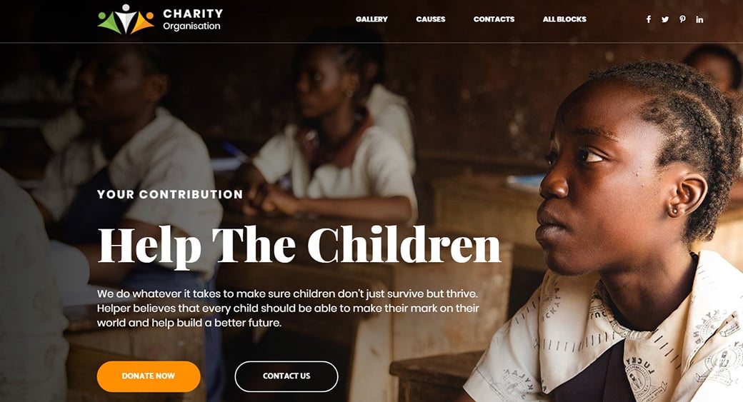
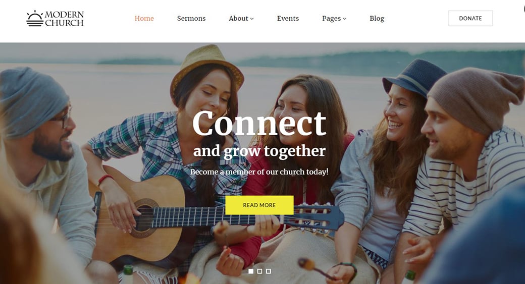



[…] Charity website design should be convincing, sincere and powerful. Follow these steps to engage more people to donate and help others. […]