Design and Emotions – Art of Emotional Design in Mobile Apps
Humans are emotional by nature; there is no debate about it! Happiness, love, anger, sadness. We go through a range of emotions day in day out! In fact, sometimes I strongly feel that human behavior is complex and illogical at times. So, your feelings can often be challenging to understand. Basically, there’s always that element of the unknown. But have you ever thought of mobile apps design and emotions you experience? In this post, we’ll see how the design of mobile apps influences our emotions. Moreover, we’ll have a look at how mobile apps understand us.
Do Modern Technologies Use Emotional Design?
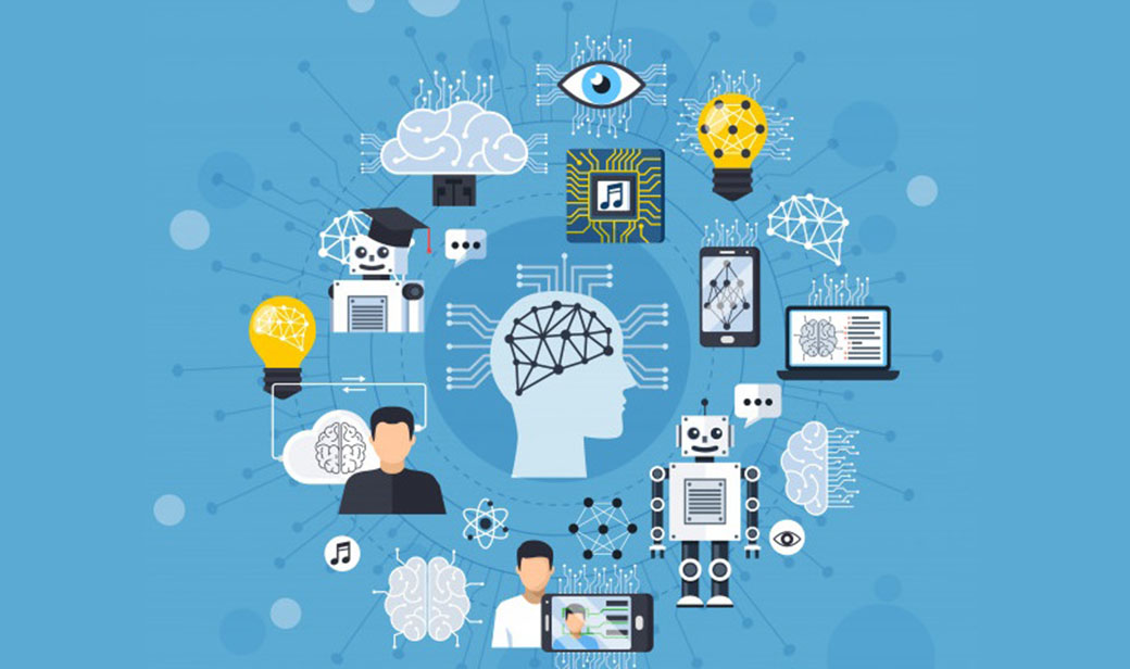
Speaking of the present features of technology, it seems like we have paid a lot of attention to the functional layer. Now, it’s time to focus on the emotional touch. All of us tend to carry a smartphone. More importantly, it is safe to say that we are dependent on them. We help us with multiple tasks, such as document management. We also use apps as driving assistance, dictionaries, workout tracking, brain puzzles, local weather, barcode scanners, etc., to name a few. This is all thanks to App stores such as Google Play.
Sit back, relax, and think for a while. Name at least five apps and the reason you have chosen them over their competitors. What’s so fascinating about them? Are these the features or anything else? All I am saying is that emotions apply to almost everything we do. Design and emotions are important everywhere, from ordering a taxi to interacting with people we love. Unfortunately, most of you may not realize how much impact emotions have on our decision-making.
Do you really think technology can rise an emotional reaction? Much to your astonishment, smart technologies across the globe are seen making significant steps towards human emotions recognition.
Why Do We Need Emotions?
Now we are getting to it. According to Charles Darwin, different emotions help humanity to survive. So, taking into account users’ emotions when creating an app can definitely bring a positive outcome. This is especially vital in today’s fierce competition in the market. And much to our surprise, smart technologies are making significant steps towards human emotions recognition, similarly to voice recognition.
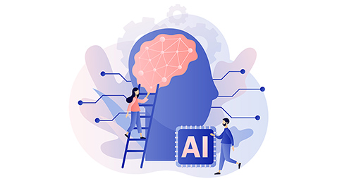
As per Google, emotional intelligence is the capacity to be aware of, control, and express one’s emotions. Also, it includes the ability to handle interpersonal relationships wisely and empathetically. Today, technology has made it possible to incorporate emotional recognition into mobile apps. As a result, Artificial Intelligence (AI) with emotionally-intelligent technology is shaping the mobile experience of the future. Sometimes you may find irrelevant or insignificant, at first glance, little details of visual design. You are sure the app will continue its work without them. However, this combination of design and emotions can often cause a greater response of users than the concept of an app as a whole.

For example, let’s think of a 404 page for a while. It is a good place to trigger the emotions of your site visitors. Why will users who reach the 404 error page try to leave it as soon as possible? In fact, a well-thought-out UX design of the 404 pages can provide visitors with links to relevant material. Moreover, it will spark their interest and encourage them to explore your page.

Apart from this, combining design and emotions also works great for educational apps. Such apps can create motivation. Moreover, they allow to attract the attention of students and make it easier to memorize educational material.
So, the expression of emotions is natural. Just imagine a situation when you are chatting online. We use emoticons and smileys to make others understand us. Every year, we see more and more emotional intelligence integrated into the mobile experience.
Why Are Emotions Important for Business?
Emotional intelligence is one of the most significant abilities that help us to communicate with each other. You probably won’t see it, yet we are applying it everywhere. People who we communicate with will be able to trace our emotions.
Principles of Design and Emotions
So, communication and emotions impact individuals. Particularly, this is true for businesses. Everyone working in marketing realizes that feeling sells. Thus, an emotion implemented in design can have a profound impact. It can make your mobile app stand out among others. Remember that we are structuring for people. Precisely, we are planning for the overall experience.
Emotional Design Elements
Design and emotions can change functional items into essential and enduring experiences. This normally shows through 4 features:
- Emotion-Memory Link. Emotionally charged occasions are kept in our memories beyond the product’s base practical worth. We recall things that make us feel a specific way.
- Aesthetic-Usability Effect. Aesthetically satisfying experiences enable the ease of use. Also, they enhance the user’s ability to learn and adjust.
- Persuasive Emotion (Gut Feeling). Emotions enable users to settle on quick choices. We use insight to understand and translate our reality. Yet, our emotions catalyze decision-making.
- Ownership Effect. Users place more an incentive in meetings where they have a feeling of customized ownership, as though the experience/item is a part of themselves.
It’s more like giving your apps the soul or what we sometimes call the personality, making it more engaging to the users. These interactions can come from any form or element. It could be the message of the content, the graphics or images used, an output action, or a simple animation.
What do Design and Emotions Bring to Users?
By Integrating Emotional Intelligence to UX Design, several psychological factors can induce positive emotions like:
- positivity;
- surprise;
- uniqueness;
- attention;
- attraction;
- anticipation;
- exclusivity;
- responsiveness.
Of course, emotions are essential for end-users, but have you thought about businesses? Do you really think emotions have a commercial value? Hell yeah! In fact, everyone working in a marketing or advertising company already knows that emotion sells. Emotions have an opportunity to create a long-term relationship with users.

Design and Emotions – How to Create Connections?
When technology changes happen so quickly, it is necessary to follow the latest graphic design trends to join design and emotions.
Natural Language Processing
Earlier, for better machine-human interaction, we used augmentation to communicate our wishes to the machine. Do you remember those punch cards? Then came the command line, and now – graphical user interfaces. Whatever the source was, we tried to communicate with the technology in a more natural way. With the recent increase in the natural language process, conversational interfaces have become a reality. As a result, we have two major types of interfaces available on the market — text chatbots and voice user interfaces. Both of them join conversation and emotion together.
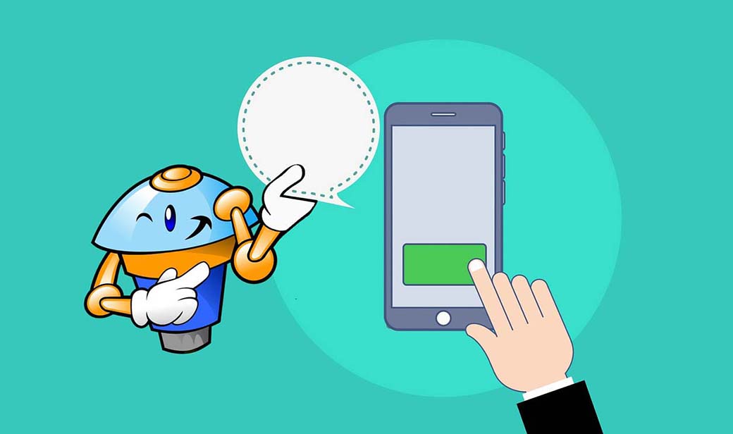
One great example of a chatbot, built using deep learning technology. The chatbot called Xiaoice uses sentiment analysis. Also, it can adapt its phrasing and responses based on positive or negative phrases from people. And these are certain things that make this chatbot stand out from the crowd. Actually, people don’t think of it as a machine, but rather as a friend or therapist. Moreover, voice analysis can help app creators understand how a user feels. Particularly, emotion-sensing technology can analyze a user’s vocal intonations and use it to understand their current mood.
Facial Expressions Recognition
Nowadays, facial expressions are getting a lot of attention. Of course, expressing and decoding emotions is something most of us love to do. The truth is, we can pass more data with our expressions than with our voice. Already being used by social networks, i.e., detecting your friends and family in photographs, facial recognition is now used in creating an emotional intelligent design.
For example, we all know that Facebook decided to extend the ‘Like’ option. Now, users share their emotions openly, especially in regards to laughter, surprise, anger, or sadness. Facebook isn’t alone in this trend. Snapchat and Apple now use facial recognition tools to allow users to express more emotions. Apart from this, During WWDC 2017, Apple demonstrated the iPhone X. Among its many features, it has one that was especially memorable for people: animoji. Lastly, designers will need to establish ethical design practices for this in the near future.
Design and Emotions – Analysis of Physical Signals
Interestingly, your body language says a lot about your emotions. With the help of emotion-sensing technology, we can detect signals that help us better understand what exactly is going on inside of us.
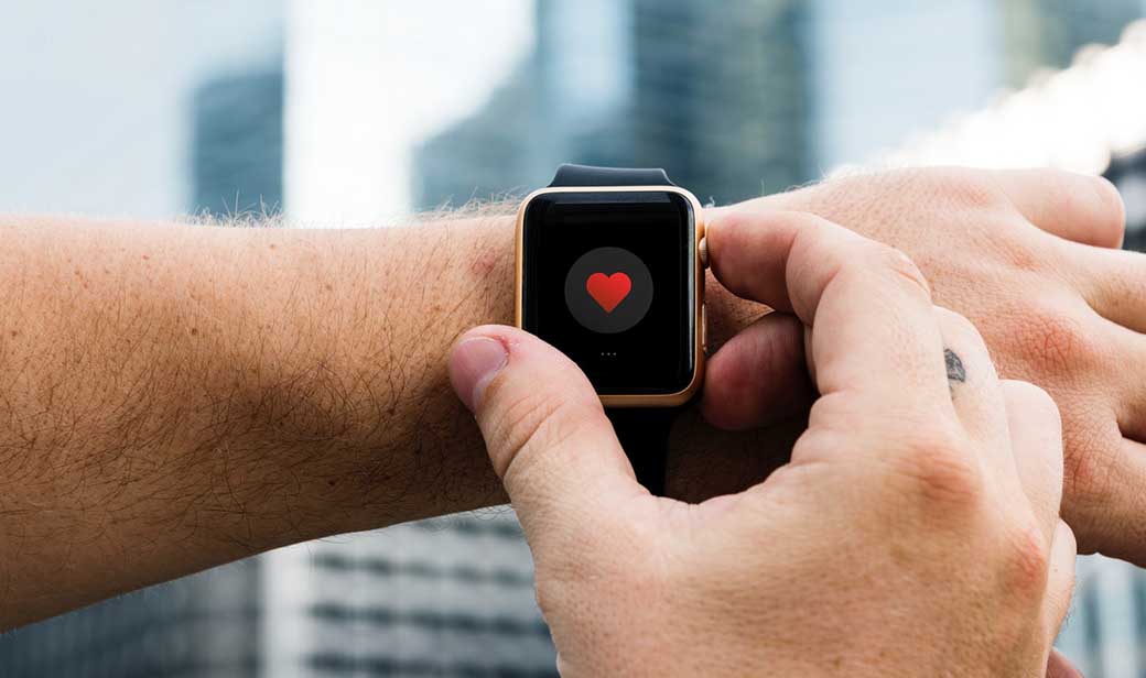
Speaking of the healthcare industry, there are devices that can track our heart rate or skin temperature. Also, such devices can recognize signals and understand emotions. Furthermore, devices can also provide real-time coaching to help users achieve emotional well-being. For example, when a device realizes that a person is stressed, it can provide information on how to cope.
Toward More Emotionally Intelligent Design of Technology
To effectively plan the Internet of Emotional Things, we should embrace new rehearses.
1. Rethink Easy
Nowadays, designers emphasize effortlessness. Reducing friction is a priority. The outcome, in any case, is that the experience should be about effectiveness first. When we think about emotion, designers may really need to make a little grating. An invisible experience isn’t constantly a passionate one. Get inspired by the examination at the Affective Computing Lab at MIT to see how invisible design and structure that expressly connects with feeling may meet up.
2. Design and Emotions For Pre-experience and Re-experience
Customer journeys sketch agony focuses and positive touchpoints, still for the most part for in-the-occasion, in-application experience. As design turns out to be all the more genuinely determined, getting expectation and memory will begin to request increasingly insightful consideration.
3. Build In Sensory Experience with Design and Emotions
Emotion-sensing technology depends on something other than content, pictures, or even emoticons. It’s more than what shows up on a screen. It depends on articulation, signal, and voice to understand emotion. So, this means designers need to think beyond a visual experience. Take a trip to a local children’s museum to find designing for the senses.
4. Embrace Emotional Complexity
The Internet of Things becomes more genuinely receptive to us. Thus, designers should turn out to be progressively touchy to enthusiastic diversity. Not simply upbeat and tragic, torment or delight. Creating an enthusiastic complexity will be basic. Understanding contrasts between emotion, state of mind, and cognizance won’t be optional.
5. Do Empathy One Better
Empathy, as a design practice, will begin to depend on better approaches for ethnographic research and design thinking – from venturing into an experience utilizing computer-generated reality to going through a day in another person’s Facebook account. Empathy needs to move from concentrating just on genuine experience to the experience individuals have living with calculations and emotion sensing. The Design and Emotion Society’s accumulation of devices and procedures can kick you off.
Tips for Augmenting Emotional Impact

To make superb experiences, designers must develop suitable and positive emotions for each level. Here are a few hints for developing that inspiration:
- Personalization and Customization. Personalize the user experience so your users feel a sense of possession. Enable users to tailor the experience as an expansion and appearance of themselves.
- Expressive Imagery. Use images, illustrations, and animations that your users can identify with — the visuals, themselves, can exhibit feeling and help your users understand.
- Positive Surprise. Evoke positive passionate responses by amazing your users with enjoyment.
- Relatable Voice. Use a tone and voice that talks with your users in an increasingly human manner. Express feeling, sympathy, and consolation through conversational UI.
- Humor. Laughing and joy are extremely solid positive feelings that reduce dread and vulnerability. At the same time, they bring out a feeling of delight.
- Storytelling. It helps individuals comprehend the adventure of the experience, outline their associations, and review their encounters even in the wake of utilizing the item.
- Microinteractions. Subtle affordances and pointers make interfaces feel energetic and fun, which empowers communication.
Challenges in Design and Emotions
More information about our emotions doesn’t mean a superior technology experience. In our efforts to make a really decent inwardly keen plan, we will confront a lot of difficulties changing the manner in which we consider structure. Today designers are focused around the usefulness of the structure. Be that as it may, structuring for feelings requires an alternate methodology.
The innovation is moving to the moment that the item designers will grow much more noteworthy by and large affectability to emotion by gathering information, mapping it to emotions, and summoning emotions in different ways. That will cause makers to comprehend what individuals feel when utilizing their items. Furthermore, it makes them respect user emotions in design.
Design and Emotions – To Conclude
It’s all about to enable our products to understand users’ well-being, allowing them to interact with products on emotional levels. It’s time for a new, empathetic kind of interaction that involves emotional design. Are you ready?

Leave a Reply