Designing a Business Website – 7 Little Mistakes to Avoid
Developing a professional web resource is a comprehensive and multitasking job requiring maximum attention from developers and designers. Our experts often compare this to a massive Baroque era fresco of many small pieces. During work, it seems that the absence of one or another fragment will not significantly impact the overall picture, and upon completion, even small gaps can spoil the impression. Let’s fill them in together and discuss these tiny things that creators often forget when designing a business website.
Often Overlooked Examples of Web Design Mistakes
There is never too much advice on designing a business website because web resource development is a multitasking process involving many tools and details. It’s good when you are a creative person who enjoys the endless possibilities for ideas implementation. But it can also be destructive when functional diversity is confusing and distracting.
That’s why today, we decided to create another beacon’s map, illuminating a business website designer’s challenging and exciting journey in the boundless web ocean. However, this will be a guide to mistakes and missed trifles, the correction of which will strengthen your business reputation and help create the image of a reliable service supplier.
1. Changing Default Information
Have you ever paid attention to the informative filing of ready-made responsive website templates? If so, you must have wondered about the presence of strange theses like “selling fruits” on the main page of an IT portfolio, text repetitions, or even some gibberish like “Lorem ipsum” instead of standard text. These troubles are also typical in presentation layouts, word processing documents, and publishing products.
The creators of such oddities did not aim to play a joke on someone or do a lousy job. They used standard placeholder texts that would not distract you from studying the web design layout during the preview. Plus, it simplifies the work of the business website designer in the future:
- reminds us of content blocks that need to be changed;
- brings an idea of the layout of the fields and the amount of information;
- allows us to make changes to the design before creating SEO-optimized content that managers will add after;
- enable us to create multiple layouts for one web page so the customer can choose the best option.
However, developers can sometimes forget placeholder text presence, which might look unprofessional after the official web resource launch. It can be small content blocks with call-to-action elements, footers, or even entire tabs. It often happens when designing a business website based on a template with many pages presets.
Make sure that all pages of your web resource are filled out correctly. Test ALL interactive components and navigation links inside and outside the site. Start demonstrating your professionalism by creating a corporate website because it is the face of your business.
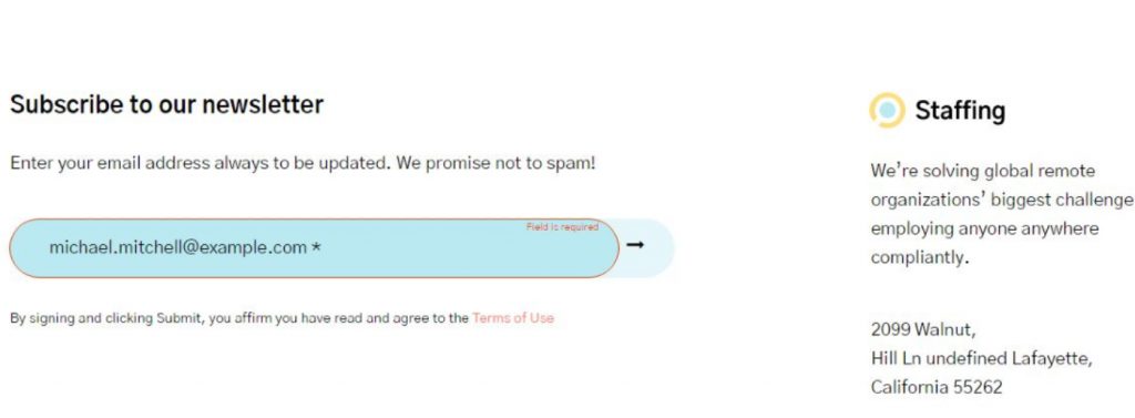
2. Empty Data Fields Filling
If at least once you have encountered the problem of verifying data in fields that you must fill in manually, you will be able to understand the essence of this problem. But what if there are many of these fields? And even the slightest mistake in one does not allow you to move on. This experience can not only spoil the impression of users from your web resource but also motivate them to leave.
Correct this shortcoming while designing a business website:
- Minimize as much as possible the number of fields for data entry. It will also positively impact establishing trusting relationships with users during registration and placing orders in online stores.
- Make sure each empty field has an explanatory description, such as “Your Name: …”, “Phone Number: …”, etc.
- Create some examples of filling in input fields directly or as a sign that pops up during filling.
- Establish clear rules for data verification and input so that third-party characters like ‘(, ), -, /’ or case switching don’t cause users a hassle.
Take care of creating default content, such as generating passwords, tips for free nicknames, and setting avatars. It will not only save your users time and nerves but also introduce you to them as a professional business website designer.
3. Using Web Design Icon to Display Site In Browser
The favicons or icons appearing on the site tab in the browser are other little things many beginners forget about. However, this detail emphasizes the uniqueness of your web resource and allows the user to quickly find it on the open site’s panel and in the web search history. The presence or absence of a favicon is especially noticeable when the user has many tabs open, minimizing the amount of text in the signature. If you don’t select a custom icon for web design, visitors will see the default one set by the browser – for example, a black and white planet in Google Chrome.
A brand logo or an image that raises brand awareness are the best choices when choosing an icon for web design for your site. You can generate one automatically or create your own by following the simple favicon guide.
4. Web Design Layout for System Pages and Notifications
Designing a business website involves creating not only standard tabs with information about the company and its offers but also system pages and notifications. 404 error page is the most popular and understandable example of this. You are unlikely to see a sample design during a test drive of a website template, but this can significantly affect the site impression of future users.

Failed download or search notifications are also great examples of web design for system pages that developers might forget. But in vain, creating a user-friendly space depends on these “little things” directly. Also, don’t forget to set up push notifications, cookies, and user agreements.
5. Images for Buttons and Bulleted Lists
Speaking of images for buttons, we mean call-to-action elements without a caption – links to social networks, other resources, the start of downloading files, etc. Not limited to standard text lists, list markers can also be icons in groupings. Many developers often forget about this when designing a business website, relying on ready-made solutions. However, these little things can affect the perception of your web resource and emphasize its individuality.
Many tips for logo design from expert articles talk about the benefits of custom websites design over default solutions. Listen to them and develop something new for your resource. It is not a critical requirement for personalizing the site’s appearance, but it perfectly demonstrates professionalism and concern for reputation.
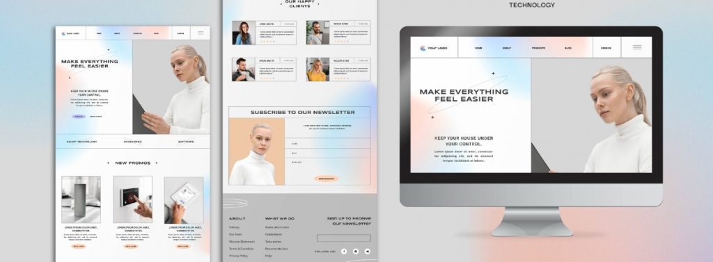
6. Welcome Email And Newsletter Design
As part of a marketing strategy, carefully crafted email designs are great for enhancing emotional branding. Along with this, it should cause users to associate with your business and web resource.
Think about the layout and content of your welcome email while designing a business website to keep the style consistent. In addition, newsletters often talk not only about the benefits of the product and the company but also about registration and functional benefits for authorized users. The business website designer knows this well and can help you create a positive image through email notifications.
7. The Loading State
The loading ID is an interactive element that shows the status of a running process. Most often, this is an animated icon; less often – a progress bar or a link that initiates an instant download directly in the browser.
You are unlikely to be puzzled by this nuance while designing a business website with an online builder since the developers have already taken care of the implementation of the loading state feature. However, many designers forget about this when creating mobile or web applications and embedding them on their resource pages.
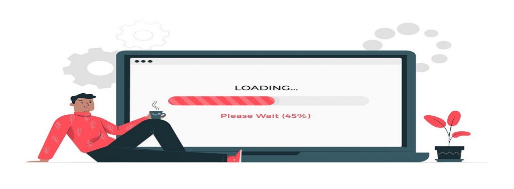
The loading state icon also helps reinforce the user-friendly experience of the web environment. It allows visitors to take control of the current situation and stay informed with visual feedback. Using animations is the best solution, but you can also use pop-up micro texts with encouraging messages like “Waiting for loading…” or “… left to …”.
How to Avoid Such Mistakes
No way, if you did not include it in the list of functional must-haves in advance. Otherwise, make visual or written lists, and this is no joke. Designing a business website is a multi-stage and responsible process, consisting of many micro and macro actions. You can easily forget some details during deadlines or when you are carried away by other, more exciting tasks.
The best recommendation would be a simple algorithm that you can follow:
- Start creating a custom websites design with an introduction to the functionality of website development software or applications.
- Explore ready-made templates to select and test options and features you would like to implement on your site.
- Read user manuals and theories with expert advice, such as how to make a website for a business.
In the MotoCMS Tutorials section of the blog, we often publish a lot of valuable tips on creating websites for various business niches with specific examples of web design.
- Prepare content for your future website – texts, images, videos, links to external resources, and internal databases that you can connect to the eCommerce plugin.
These do not have to be materials ready for immediate publication but samples of relevant content that you can “wear” a web design layout.
- Get down to designing a business website directly. You can do it yourself or involve your colleagues, friends, or partners.
Moto 4 builder offers a co-editing option, which is especially useful for developing corporate web resources. Unfortunately, preview versions of the editor cannot boast of this feature, but you can always entrust the development from scratch to the best MotoCMS experts.
What If Your Website Has Already Been Created?
Most modern web solutions are created with visual editors, even if we are talking about professional development. It is not a deception of unsuspecting customers or an attempt to save money. It’s just that website builders dramatically speed up website-making processes and allow specialists to focus on other, more critical, and attention-demanding things. Along with this, popular tools for custom websites design offer great personalization and adjustment options, allowing you to make changes to the project at any time without compromising the overall picture.
Thus, you can always make changes to your design at any stage of its creation.
Another question is if each web design layout was created manually and attempts to change it require intervention in the code. It will be much more difficult because even minimal edits can cost you a lot of time and money. In this case, of course, it is better to take care of all the nuances in advance and pay more attention to the design and approval of the details. Also, take care of the independence of interconnected elements. Ensure that further editing of one or more sections does not cost you to stop the entire website mechanism.
Don’t Be Harsh In Your Judgments
Remember also that even the most experienced business website designer is an ordinary person who can forget something or miss some detail. It is an OK situation that should not affect your opinion of someone else’s professionalism. It’s great if the specialists themself notice their mistakes and correct them. It is good if the specialists take note of the comments about their mistakes and listen to them.
In any case, designing a business website is a long process that does not stop after its launch. And its quality should be measured not in the number of implemented features but the availability of future customization and support for updates.
Nice bonus. Permanent access to the visual editor is one of the main features of MotoCMS products. Moreover, we encourage improvement interventions by offering free access to the latest online builder updates.
In Conclusion – There is No Limit to Perfection
Web trends are as changeable as high fashion, evolving along with information technology and modern society. What was relevant in 2020 may not match examples of web design in 2022, and that’s okay. Therefore, maintaining and customizing your web resource is the only correct way to keep it up to date. It applies both to updating the text and media content and the appearance – for example, changing the main web design icon or developing a new logo or fonts.
Feel free to look for examples of inspirational website design elsewhere, try new tools, or follow the advice of experts during and after designing a business website. Your users will surely appreciate your desire to improve your product and support you in any endeavor.




Leave a Reply