It’s no more a secret that women perceive colors differently than men. Well, women perceive designs a bit differently too. Keeping in mind the vitality of the female population to the present day, it is essential for online marketers brands to choose their web designs wisely.
While some businesses are targeted just towards women, others choose to go unisex. Accordingly, web designers are coming up with web templates that either satiate the female taste or those that serve well for both genders. Designing to suit well to the female eyes is tactical. Here are a few things to remember while designing a website partially or fully directed to the female population.
Corners and Contours:
Every web template is based on grid style. Even responsive designs have a liquid grid structure. When a design is layered on these grids, it is important to notice the corners. Sharp corners would not be a good choice. The female brain sub-consciously sorts out things that look sharp. So if you have rectangular sliders or square text boxes, just make sure they do not have perfectly pointed corners. Even a slight smoothing would do the job. However, at the same time perfect circles or ellipses are a strict no-no.
Color Tone:
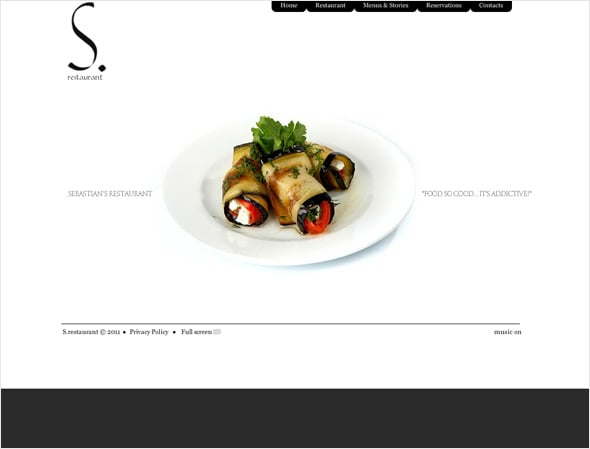
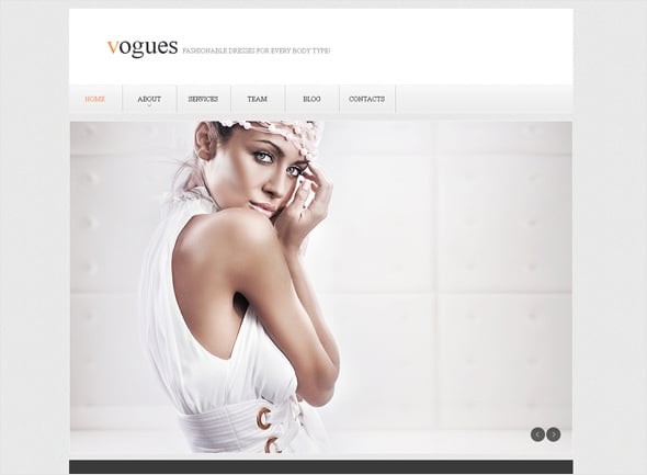
If you thought a pink website would make women stay longer on your website, be careful! You might be severely wrong. Remember, pink is a girl’s color, not a woman’s color. Pink and shades of pink remind us of the fairy land and the Barbie world. And similar is the case with purple. Decide on the color, depending on what you are trying to promote or sell. If it is an e-commerce business, white could be the best primary color you would be using. If it is baby product, a balanced blend of white and baby pink should do the magic. If it is a salon or spa or anything related to fashion, red, grey and white should be your favorite shades.
The important thing to notice here is that 80% of man’s products are chosen by women. A wife would typically shop for her husband. As such, if it is man’s apparel website that we are talking about, or perfumes and deodorants, shades of grey does the best magic. We recommend you not to use shades of blue unless it is a cruise trip that you are trying to sell. Use neutral colors. That way you would be able to look appealing to both the male as well as the female cadre.
White Space:
Have you ever thought about why women are great homemakers? Why is it the woman of the house who takes up the cleaning work? Let’s address the question to women whose husbands cook for them. What does the kitchen look like after your hubby has waged the cuisine magic? We are sure the answer would be a grim face! Women like things to be clean and tidy. That’s in their nature inherently. The same applies to websites. Keep your website as neat as you can. No cluttering images, no clumsy text, no pop-ups that desperately beg for attention. Just a clean website, with crisp messages in the form of text and graphics.
White space is extremely important. It gives a sense of reliability and security to females. Make every image stand out with a thick white 3D border. Just make sure your visitor is not burdened with loads of confusing data. Show what she expects to see in the sequence she wants to see it.
The Myth of Flowers, Babies, Pups and Other Women:
Whenever it is about creating a website targeting women, the first things we can think of are ‘everything that looks cute’. An interesting fact here is that “cuteness” is a female terminology. The female brain perceives those things as cute which it thinks are worth protecting and nurturing. That is the reason flowers, pets and babies look cute. About images of women, well, a female connects well with other females. It is called breed gravity. So when a woman sees another woman in a yoga posture on a fitness websites, she connects well with it. So yes, cute things and other women are good candidates for a successful woman-oriented website.
But overdoing it is a turn-off. For example, a woman going through a fitness website would expect to see both men and women, combined with images of health food items. If you are filling the whole website with images of woman, your visitor would shut you down.
Another thing to be kept in mind is, the modern woman has become more research centric. Your website must provide enough information, along with beautiful images. A template that bears a balance of text portions and images is a perfect fit.
Navigation:
Easy navigation takes the vote. Understand the lifestyle of a woman. Not all working ladies with a home to take care of get time to surf online. Surfing for professional purpose is a different story. Here we are talking about interest-oriented surfing.
Research shows that working women surf the internet for making purchases either during their lunch breaks or during weekends when they have free time. Housewives are a tougher nut to crack. Most of them work from home, while simultaneously taking care of the household and kids. So you see you have lost that ‘lunch break’ too in this case.
As such, if you have a complicated navigation on your website, that is confusing and leads to wrong page locations, you are digging your grave. A web template meant for females should feature a simple and easy to understand navigation. A lesser number of buttons and easy pathways described by crisp words are good.
Keep navigational arrows and buttons highlighted and easy to spot on the page. Use colors, contrast to the page color for navigational tools. Do anything you want but just make it stand out.
Typography:
Women love visually thoughtful websites, and typography is an integral part of visual elements that add spark to any website. Use mixed typography. Use fonts depending on your product. Avoid purely running fonts since they are difficult to understand. Avoid choosing fonts that look corporate. Those are not meant for the female eye. Just keep in mind that whichever font you are using, it should be adding to the calm feeling of the website.
Women Speak: The present day a woman has evolved a lot as far as online design choices are concerned. While designing a website for women, research well about the feminine choice demography-wise. Use the elements of designing wisely. Women are not very different from men. Yet there are differences enough that could lead a designer to his dome if not recognized properly. After all, it is difficult to understand a woman completely! Is that not what men say?


