Who Said Flash isn’t Good for e-Commerce Design!?
The end of April was marked by another wave of polemics and heated disputes around Flash. This controversy has been primarily caused by “Thoughts on Flash” by Steve Jobs. And again Flash supporters defend this technology praising its advantages and possibilities, whereas their opponents find more and more its weak points.
People tend to associate Flash content with two things: video and games. But it’s far from being right, as Flash has a great potential and provides a bunch of opportunities to create appealing portfolios, commercial and promotional websites, educational websites and even online stores. And today we want to focus your attention on e-Commerce websites based on Flash.
Who said that Flash is inappropriate for online shops?! We will prove you the opposite by selecting the most striking and powerful Flash e-Commerce designs.
* * *
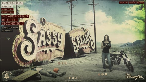
The Wrangler Collection
Blue Bell, a company remarkable for manufacturing quality denim, launched a creative Flash website for the Wrangler brand. The website tells a story in three chapters about the Wrangler Spring/Summer 2010 Collection.
* * *
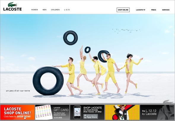
Lacoste
Lacoste, one of the most popular trademaks, also made its choice for benefit of Flash. The website is bright and vivid, dynamic and interactive.
* * *
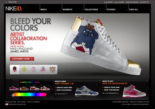
NikeID
NikedID is a project of Nike aimed towards those who want to customize their look and performance. You may also browse different Men’s and Women’s Collections by choosing the specific category. The website is well thought out and impresses by its sleek functionality.
* * *
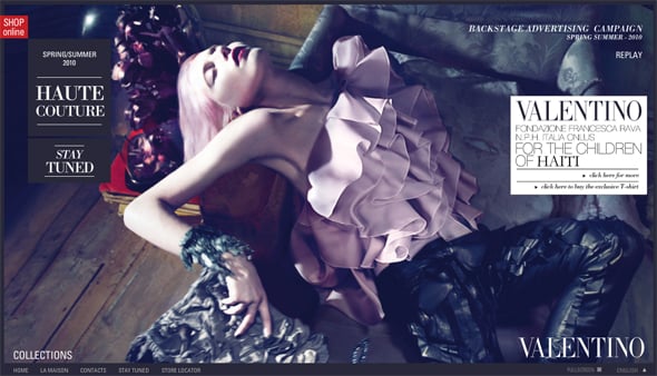
Valentino
Valentino website speaks for itself: striking, passionate and laconic.
* * *
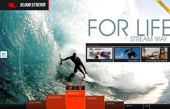
Blood Stream
Here is the Blood Steam’s website that impresses with its 3D concertina background.
* * *
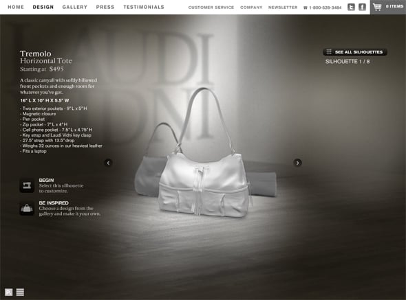
Laudi Vidni
This website belongs to two popular handbag designers, Grace Tsao-Wu and Laura Kofoid, and their brand – Laudi Vidni. The website is created in calm dark colors where white is used as an accent color.
* * *
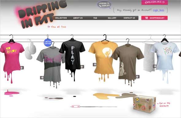
Dripping in Fat
Drippinginfat’s website impresses by its creative navigation menu and stylish original look.
* * *
1020 Trickery Lane
The website is done in a very extraordinary way. There are no usual product categories and navigation, etc. While browsing this website you face with different situations and click on any item you like for more details or purchase.
* * *
Prada
Here is the website of Prada, famouse Itallian corporation. Striking images, attractive photo galleries, convenient navigation – these are the key features that distingush this website from the range of others.
* * *
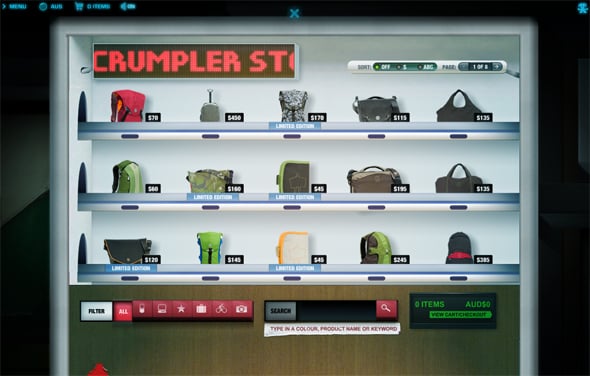
Crumpler
Here is a website of global bag manufacturer Crumpler. Its visual look is based on a Japanese vending machine design.
* * *
Wrangler
Here is another website for Wrangler Collection (Brazilian version).
* * *
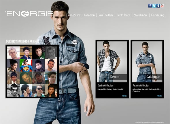
Energie
Energie online store is remarkable for its sociality. On the Home page you can see different social networks icons, as well as their facebook friends.
* * *
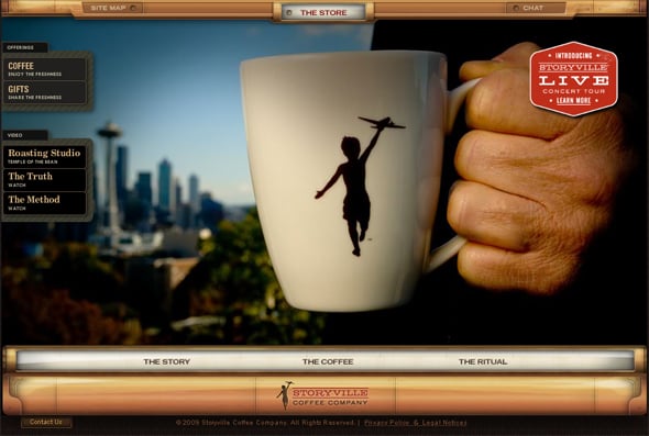
Storyville Coffee
This interactive experience brings together a new way to discover pleasant music and purchase the best coffee in the world.
* * *
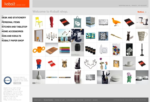
Kobalt
It’s a Korean online shop that features different products in the unusual creative way.
* * *
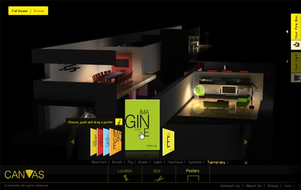
Canv-as.com
Canv-as is an innovative poster shopping website, where you can interactively create your own unique customized posters that express your lifestyle and leave your expectations.
* * *
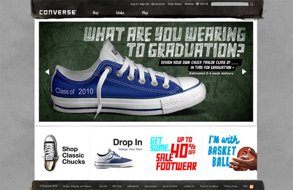
Converse.com, the brand shoe company.
* * *
Levi’s
Levi’s website is remarkable for a stunning photo gallery. Amazing high quality photography, flawless functionality – everything speaks for itself and creates a professional web presence worth your attention.
* * *
Sourcebits
* * *
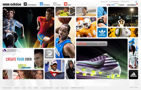
Adidas







[…] This post was mentioned on Twitter by FlashMoto CMS, Site2You. Site2You said: RT @FlashMoto Who Said Flash isn’t Good for e-Commerce Design!? http://bit.ly/9Zu1V7 […]
You can also add http://www.cartier.com/
Flash sucks.
@ Mem’s
Thanks for another great example of Flash eCommerce design!
Don’t forget Nikestore.com
@superbunny …
dont hate! i bet you CANT show us an html cart that has BETTER USER EXPERIENCE. … and oh try it…i dare ya
Most of them are not pure e-comemrce site, just display, and even that, what make them good isn’t the look and feel, it’s the conversion rates. I don’t care how good they look if they are not able to produce a sale. And forced music on a website should be BANNED.
I mean Who said ?
[…] Visit Source. […]
This japanese ec-site too:
https://www.qbic-ec.com/
Where’s the website of Converse???
Oh, sorry! I missed it
Nice list of Flash E-commerce sites
Depends how you build the site. Here are my common problems with flash:
– Too many moving parts on the page and distracting.
– More emphasis on presentation than contents.
– Slower than HTML.
– back button does not reload instantly (no caching, I guess)
These are all glorified brochures.
Man, you forgot http://www.dubli.com!
You should also include Diesel in the list
[…] Who Said Flash isn’t Good for e-Commerce Design!?flashmoto.com […]
How would you feel, if every time you walked in to the Grocery store, someone stopped you before you entered to show you some pretty pictures for a 60 seconds? Personally, I would want them to get the hell out of my way so I can get to the task at hand, finding that bottle of super lubricated lotion, or picking up a 4 gallon jar of elephant lard.
Sure these sites look great, but at what cost? 10 seconds just to load the Wrangler site, another 30 seconds to figure out what to do? Then you’re redirected to another Flash site that takes 15 seconds?
Flash has it’s place, and that place isn’t to make marketing guys feel good about how “sexy” their spinning this or that looks. It should be used to enhance the experience, not control the whole damn thing.
Just my 2¢
You can also add george-gina-lucy.com or gwynedds.com
[…] Who Said Flash isn’t Good for e-Commerce Design!? […]
Most impulse buyers will close a website if it has a preloader.
Nice list of Flash E-commerce sites
Most impulse buyers will close a website if it has a preloader.
[…] This post was Twitted by Nesysahdn […]
[…] This post was Twitted by MabeSmiuhh […]
Developers, please keep your “slower than html” and the like comments out of here. What do consumers think of Flash?
Exactly! People always say SEO, blah blah blah. There is absolutely nothing wrong with a Flash based e-commerce solution. I think the key is to have an actual html website with an embeddable flash based cart, that way you have the best of both worlds.
I really like the Lacoste approach Love the list. Also, I think readers should know about Dreamlinestudio, they have flash based e-commerce shopping carts, superb list I use on clients.
http://www.dreamlinestudio.com/flash-shopping-cart.php
Thx for this article.
Most commerce site is all already well known . How about those unwellknown website? Will flash bring opposite feeling to customers and opposite effect and lead too high bounce rate?
nice work dude.