Email Marketing: Coolest Tips, Tools and Resources
There were concerns a few years ago that email marketing part will reduce and be ineffective. These concerns were based on the fast rise of social media and mobile device use. People used emails for communication more and more rarely. However, such pessimistic forecasts never came true, and email today is one of the most popular and effective marketing means.
Modern email design is not plain and boring text as it used to be a few years ago. Today emails are created similarly to that of web pages, making them highly appealing. But several differences add unique features to email design.
Basic Email Types
There are different types of emails for different purposes. Choosing the right type for your audience and the content you wish to share with them is essential for a perfect marketing campaign. Please select the email type that fits your intentions and design it to highlight your message the best. Among the most known email types are:
Notifications. You can spot the most common type of email in your box daily. If you have a Facebook or Twitter account, you usually get notifications when someone follows you or tags you in a photo.
Notification emails can play the role of announcements for small businesses. Usually, such emails are sent when a customer subscribes to the Company newsletter for the first time or creates an account on the online store website. Such notification emails can trigger users to perform further actions such as confirming their subscription data, filling the profile or registering a demo account, etc.
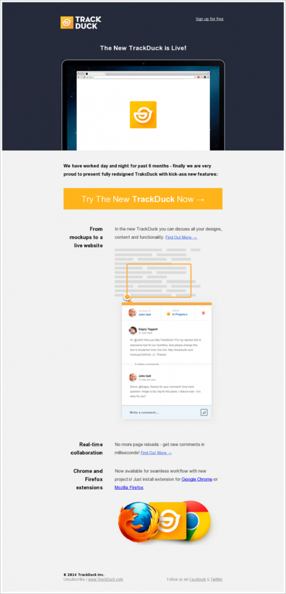
TrackDuck Launch
Notification emails are usually pretty short and feature a prominent call-to-action.
Newsletters. Another prevalent email type is usually filled with various kinds of content, including longer articles, new product presentations, links for website content, and CTAs. However, to ensure optimal engagement and readability, it’s essential to find the ideal email newsletter size that resonates with your audience.
Warby Parker
Newsletter emails are the closest in design to web pages. It can be quite a challenge for web designers to create newsletters that follow the main website style and contain essential data without overwhelming users with tons of unnecessary information. The best way to achieve good results with newsletter design is to create a perfect sense of hierarchy with one story as the main type of content and a few less important ones.
Transaction Emails. They may act similarly to notification emails, but for a strong CTA inside that requires a user’s reaction, such as an order confirmation email, You can mostly spot such emails when you abandon your shopping cart without finishing your order transaction or in case you registered a trial account, and it’s time to decide whether you need full service. Transactional emails are powerful tools for triggering user actions such as order confirmations or trial subscriptions. Like a well-constructed transactional email, Maileroo offers meticulous delivery, ensuring your key communications reach users promptly and reliably.
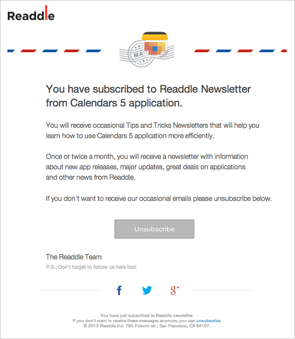
Readdle
Marketing Emails. This email is a straight business proposal to a customer with a bold call to action. This can be a notification of a discount on some selected products or about special or seasonal offers.
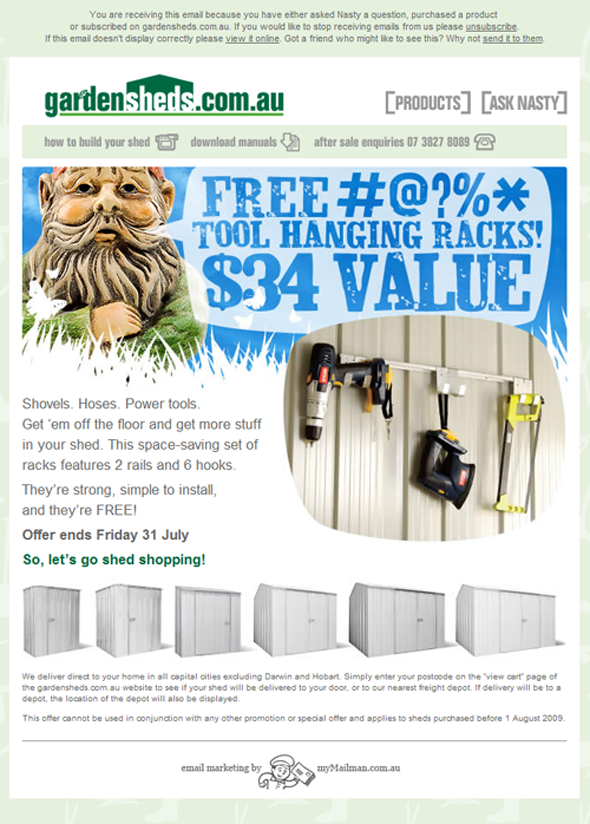
Bonus Tool Hanging Rack
These emails, similarly to notifications, are usually short and straight to the point.
Email Marketing Key Features and Killer Tips
People get tons of emails every day, so it would help if you made your email stand out from the crowd and draw attention. Here are the best practices and coolest tips on achieving these goals.
Responsiveness above All
Email design should be responsive or die like the entire web content today. Most people use mobile devices for work even more often than for pleasure. Thus, it would help if you thought of creating an email that will look great on a small screen in the first place.
Responsive design is still the best way to get your email on your customers’ devices. However, there are some considerations about the design and typography. Emails are mostly meant to be read, so you should make them easy to perceive on smaller displays. Responsive emails are easily resizable and can fit any screen resolution, but they work best with pretty simple designs.
Karma
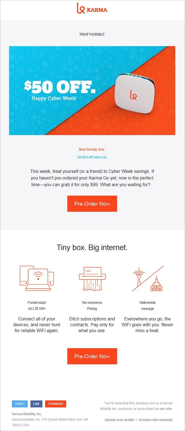
Here are a few tips on how to create an awesome responsive email with no hassle:
- Choose a narrow layout. About 600 pixels will be enough for your email to look great on desktop and mobile without significant rearrangements in the content;
- Make your imagery resizable and go for SVG pics and animation;
- Go for bold, large, and easy-to-read typography. Don’t go below the minimum size typography for the different OS, but avoid using a huge type that will look clumsy on smaller screens;
- Make your CTAs and links easy to tap. Thus, your buttons should be large enough and arranged at some distance from other call-to-actions to make them easily tapped on the first try;
- Use the display: none in HTML editor to hide all the unnecessary content from mobile email. It’s better not to clutter restricted space with clumsy visuals.
Content Considerations
Unlike web pages people visit intentionally, emails are sent mostly unexpectedly (unless they are for your subscribers). One of the main challenges for email marketing is making people click and open your email. It would help if you caught a person’s attention before going to the next message in the box. The best way to do this today is to be personal and useful for your reader.
Keep your content short and to the point. Remember: this is not a web page where you can offer plenty of visuals and various information to read. Emails are mostly meant to draw users’ attention and guide them to your website for more information.
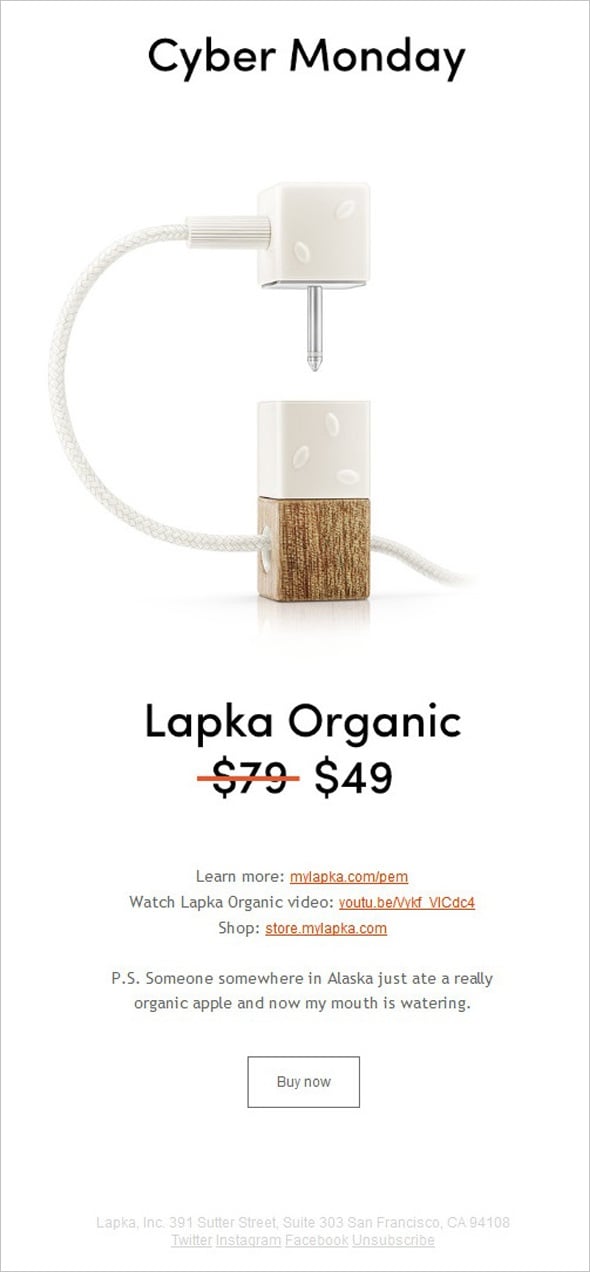
Lapka
Adding social buttons may be a good idea for creating an engaging email. Make those buttons prominent but do not suppress other vital elements of the email, like call-to-action buttons.
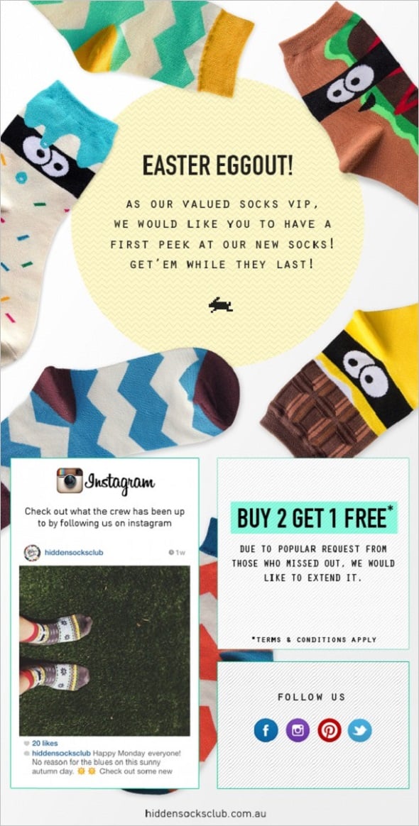
Easter Socks Eggstravaganza!
Most users have settings that prevent email imagery from loading initially, so typography may be the only thing they will see from your email. Thus, you should make your typography look and read the best. Use bold and engaging headlines to draw attention and lead your customers through the email content. Please make sure they are clear and have a prominent message.
Call-to-Action Email Practices
Calls-to-action is pretty much the main thing in the email content. No matter what type of email you send to your users, you mostly perform some action. Thus, calls-to-action in your email should be prominent and easy to perceive.
There are two main types of CTA elements for email layout: links and buttons. You can read here an in-detail guide on common practices for calls-to-action. In most cases, they are perfectly applicable for email CTA design. Here are a few recommendations specific to email call-to-action creation:
- Don’t try to fit your links into the email content. It’s better to make the headlines clickable. Thus, you kill two birds with one stone: make your headlines and subheadings more prominent and draw users’ attention to the essential info of your email;
- Buttons are meant to be clicked. And, as I already mentioned above, you should make them easy to tap, too. Thus, they should be large enough and alienated from other clickable elements;
- Don’t put your CTA elements too far down the email content. There is not enough chance users will scroll your email heavily, so it’s better to catch their attention as early as possible.
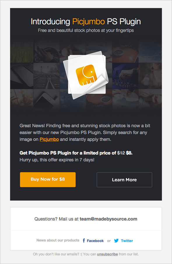
Picjumbo
A Few More Tips
When it comes to the email design, it’s better to choose minimalism and make it as simple and clear as possible. It makes your email more mobile-friendly and increases the chances it will be opened and read.
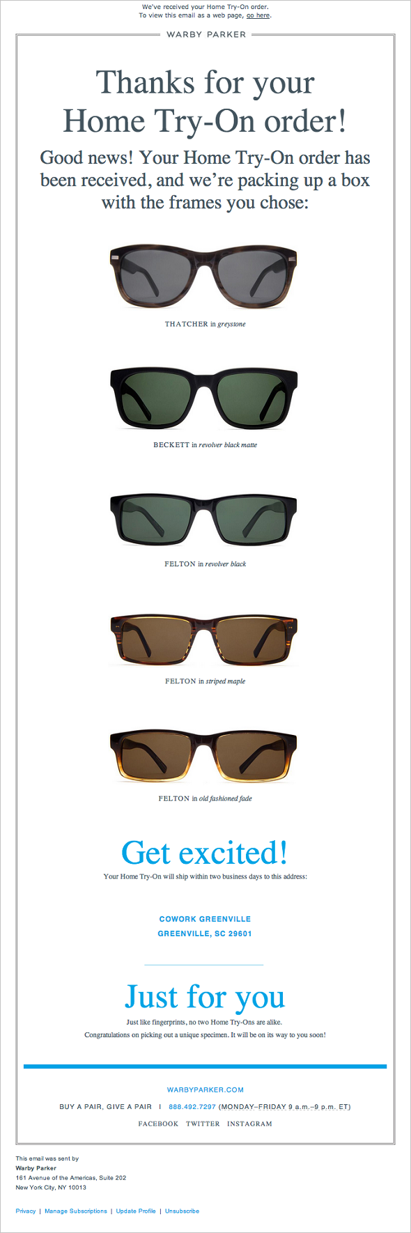
Warby Parker – Thanks for Your Order
Remember to test your email frequently and remove all bugs and errors. Test it on as many devices as possible to ensure it looks perfect on any user’s smartphone or tablet. Besides, with early testing, you will better see what framework and template suit your needs and have more chances to choose the coolest framework.
Frameworks for Email Design
There are many free or low-budget tools, services, and resources that will help you create a cool email design with ease. You have to choose one that suits your needs and intentions the best. Of course, you can code an HTML template yourself. But you can also use frameworks and boilerplates that will give you the best results and save much of your precious time.
SendX
SendX is an intuitive, affordable, and feature-rich email marketing software for marketers & business owners. SendX provides unlimited email sends, powerful automation tools, and great email deliverability.
Starts with 14 days free trial. Pricing starts at $7.49/month.
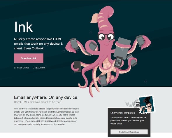
Ink
The ink of Zurb Foundation allows the creation of responsive emails that are claimed to work on any device and with any email client. There are a few basic templates, including a hero-image one and sidebar layouts. Ink is easy to start and easy to use.
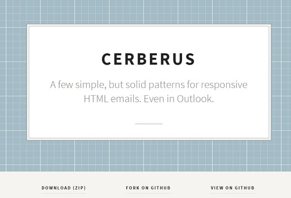
Cerberus
Cerberus is another trendy framework that offers you a set of basic templates to fill with the content you want. This “three-headed dog” of email templates allows for the creation of fully responsive templates that work with any mobile, desktop client, Outlook, Android, and mobile Gmail.
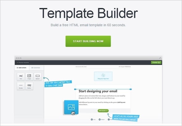
Free Template Builder
This Free Template Builder of CampaignMonitor allows you to create a cool-looking and absolutely unique email template from scratch within its WYSIWYG template editor. Add images and articles from your computer, customize the receiver’s name, and add links and social buttons. You can register with CampaignMonitor to use its email services for as little as $9/per month. Or download the created email to your computer to use it in another email client.
Additionally, you may wish to browse some of the premade email templates and use them in your marketing campaign after making a few changes.
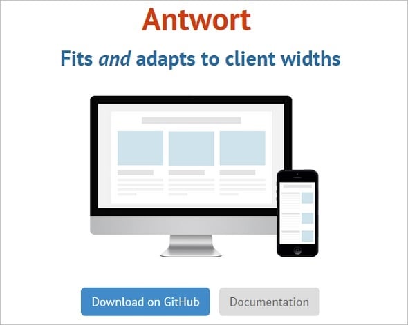
Antwort
Antwort is another free email builder that offers a set of templates that will work with any client, including Outlook and Gmail. Its responsive structure allows building emails for almost all screen widths.
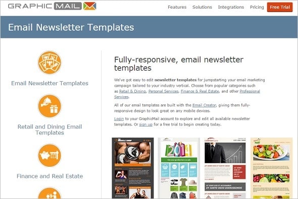
Graphic Mail Newsletter Templates
Graphic Mail offers many responsive email templates that you can customize according to your specific needs. You can sign up for a free trial to try its services or log in for an account starting from $9.95 a month.
Free Email Tools and Plugins
Various email tools help to create design elements like buttons and calls to action. They also provide testing and check out your email on bugs and errors.
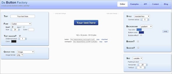
Da Button Factory
This easy-to-use tool allows the creation of cool-looking CSS buttons. Since not all clients are set automatically to display images, this may become a problem for your pic-style calls-to-action. Use Da Button Factory to avoid this issue and make your CTA button prominent in your email.
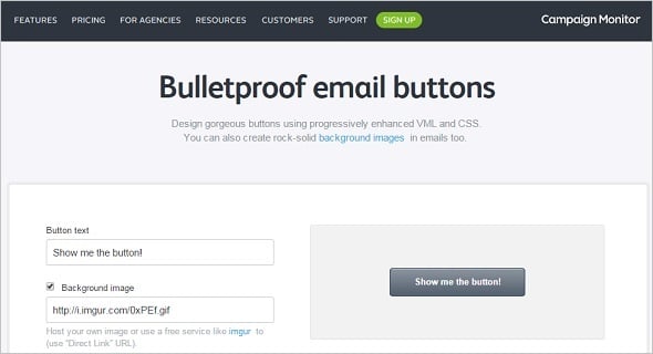
Bulletproof Email Buttons
Another service allows you to create enhanced VML or CSS buttons with the help of a visual or CSS editor. Choose among three preset buttons, change the color, background image, and text, add a link, and you’re done!
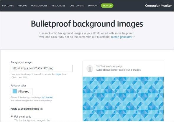
Bulletproof Background Images
In addition to Bulletproof Email Buttons, you can use this tool from CampaignMonitor. Bulletproof Background Images offers you a pretty simple interface to create a stunning-looking responsive background for your email.
Email on Acid
This service is a great testing tool that allows you to check out your email’s look on various platforms and devices. It examines your email for bugs and broken links. You can start a free 7-day trial to check out all its options.
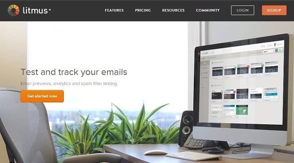
Litmus
Pretty similar testing service that also has a 7-day free trial. You can check the email look on different clients, track the email analytics and test its performance on various devices.
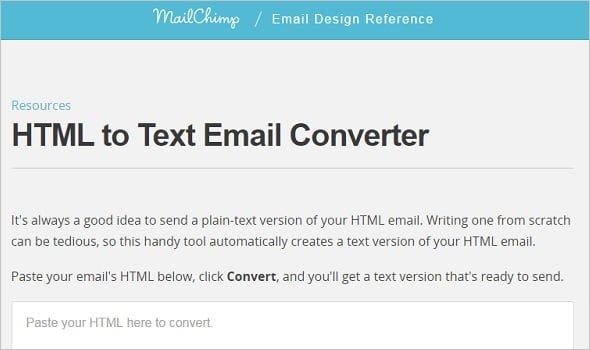
HTML to Text Email Converter
This tool from MailChimp allows you to get a clean text version of your HTML email. Paste the HTML code into the window and get its text version immediately.
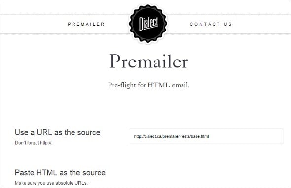
Dialect
Premailer’s Dialect helps to remove broken links or HTML tags from your email. It turns your messy HTML into a beautiful and clean CSS-style email.
Best Free Email Services
Email services help you with your emails, from creating a template to managing its delivery to the clients.
MailChimp
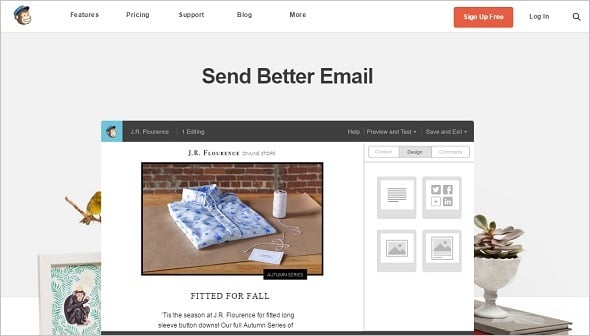
One of the most popular services that offers a free plan of 12,000 emails to 2,000 subscribers. You can also create an email within its editor and track the analytics on your email performance.
MailKitchen
MailKitchen also offers a free plan for those who need not more than 15,000 emails to 5,000 contacts per month. As with many other services, you can choose a free template or add your own. Analytics tracking is also available.
ReachMail
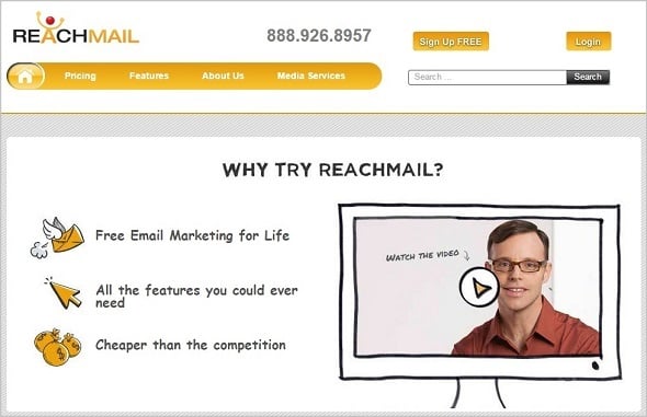
This service is similar to MailKitchen. The free plan includes 15,000 emails per month to 5,000 contacts. Paid plans start at as little as $10 a month.
Amazon SES
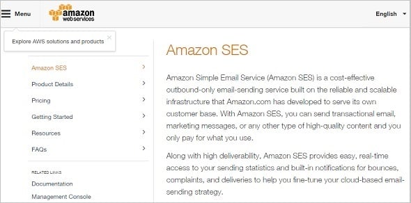
Amazon Simple Email Service (SES) is a cool option for small businesses that use Amazon. It’s free for Amazon EC2 users and allows them to send up to 2,000 emails daily. If you need more, you will have to pay a fee of as little as $.10 per one thousand emails.
Thus, you now can see that the email is not dead. This vital marketing tool can bring your business many customers if created and used wisely.





Leave a Reply