Emojis in Design – Great Way to Become Closer to Your Clients
The MotoCMS blog is a unique space that allows us not only to share helpful information about our products and services but also to review the latest news in web technologies, marketing, and SEO. That’s why we just couldn’t get past an interesting post from a popular UX/UI agency about using emojis in design. We often don’t notice smiling icons or take them for granted. However, it can be a fantastic tool to increase CTRs, views, and sales dramatically.
So, enough walking around, let’s get started 😎.
Table of Contents
- Emoji As a Web Design Element
- Using Emoji for Website – Pros and Cons
- Some Practical Ideas for Using Emojis in Design
- Emoji for Site Promotion and Traffic Increasing
- How to Add Emoji to Text – Useful Tips
Emoji As a Web Design Element
The concept of emoji appeared relatively recently, although symbols that convey emotions have been familiar to many of us for many years. However, unlike the good old “:)” and Unicode icons, emoji provides a broader set of graphic symbols. Their variety and multitude help express emotions more accurately, bringing a particular meaning and mood to the context. Statista even says the global emoji count could grow to 3,460 in 2022!
One day, Internet marketers noticed the growing popularity of emojis and decided to try to use them for their own purposes. Thus, emoji designs have become an integral part of the content of web resources, design, contextual advertising, and SEO.
Using Emoji for Website – Pros and Cons
Before looking at specific ideas and examples of using emojis in design and marketing, I would like to discuss their appropriateness. You have probably noticed how emoticons and symbols can transform text intonation. They make it more understandable and attractive or demonstrate absolute incompetence. The possibilities of the modern world are blurring the boundaries, opening up many ways for self-expression and creativity. However, there are specific rules that may affect your relationships with other people, the reputation of your personality or company. We recommend that everyone familiarize themselves with the peculiarities of using emojis in advance.
When You CAN EXACTLY Use This ✅
We always associate emojis with informality and friendly communication. These small images can fully describe our feelings and share them with others. However, we often lack this in virtual interaction when we do not see the interlocutors, hear their intonations, or feel their mood. Therefore, using emojis in design is a great trick from the psychology of online shopping to show your intentions.
Besides, modern emoji designs have two main advantages:
- Diversity, including the ability to choose skin tone, gender & character traits, ensuring user equality and tolerance.
- The fast transfer of emotions and sensations, descriptions of the situation, and characteristics of the subject save space for text.
So, you can DEFINITELY use emojis when you want to:
✅ create a relaxed atmosphere (if you need some rest in real offline life, try organic relaxing tea options);
✅ demonstrate a friendly attitude;
✅ show your willingness to do the best for your customers.
When You HAVE NOT to Use It ❌
Emoji are standard icons without fixed descriptions, leading to misunderstandings between you and your customers. It is especially true if you use non-standard characters to describe services or offers. Moreover, an emojis design that is understandable to a representative of one culture may be incomprehensible (or even offensive) to others. For example, the symbol 👋 in Europe and the USA means “goodbye.” At the same time, it means a way to end a relationship for Asian countries’ residents.
Different browsers, operating systems, software, and applications interpret and display emojis in design differently. It can also lead to problems conveying your idea and appropriateness of use. Inserting too many characters spoils the impression of the text and may affect the reputation.
Thus, we have compiled a list of situations when you should NOT use emojis:
❌ when transmitting a formal message with a “serious” context;
❌ when working with intercultural clients;
❌ when creating texts for multiplatform applications;
❌ when using custom icons and unusual author sets;
❌ where it is inappropriate, seems redundant, or does not fit the context.
Some Practical Ideas for Using Emojis in Design
One of the main features of using emojis is that, when used correctly and appropriately, they change the intonation of the text but remain invisible. How many similar situations can you remember right now? Indeed, you didn’t even think about many examples until you started looking for emojis purposefully. If so, you should note this and use it when adding picture characters to your text or design. Let’s look at the everyday and most relevant use cases for emojis in more detail.
Rating Experience
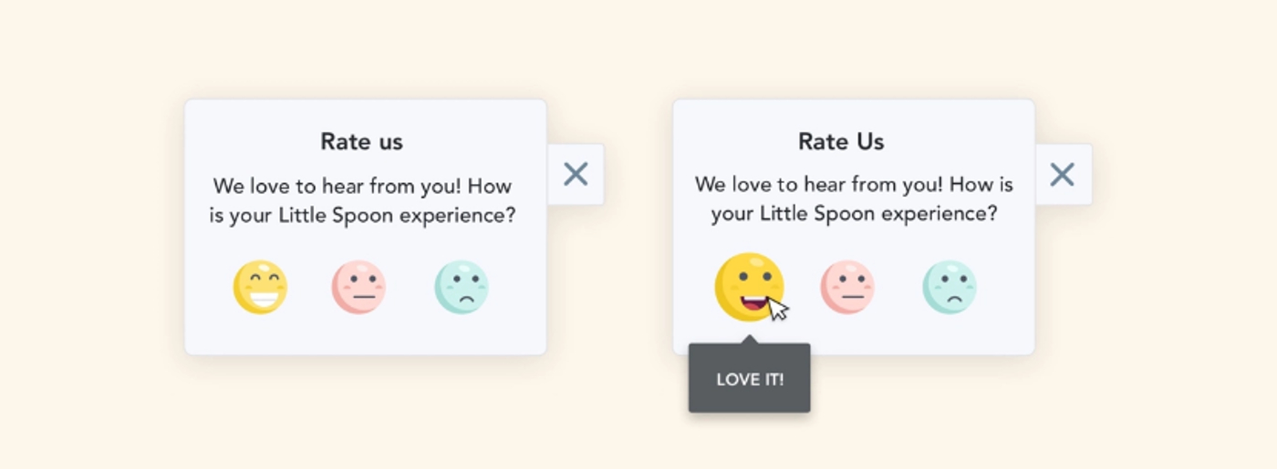
Perhaps this is the most successful solution since it allows you to seamlessly integrate emoji into a website without disturbing the overall composition. You can pick up the emojis design using pre-made ideas from graphic design packages or create something new by choosing a style, colors, size, and display method. It will bring the finishing touches to the web page’s appearance and suit any style. Moreover, the emoji for rating experience makes it easier to create a review and concretizes the customer’s emotions. If you also want more detailed commentary, you can add a text box next to the picture block.
Categories
It means that you can use emojis to diversify not only the menu or submenu but also use characters like:
- icons in bulleted lists;
- application, option, or service icons;
- avatars in personal accounts or user accounts;
- names of directories, wishlists, folders, etc.
Variations in the use of emoji in design are limited only by your imagination, so feel free to try it. This solution can save a lot of space, time, and even your nerves in some cases.
Notifications
Many site managers, marketers, and developers often use emojis in pop-up notifications. This way, you can interpret the message without reading the entire text. Advanced advertisers even know how to get customers interested in emojis design. The user sees an unusual symbol and takes targeted action to find out its meaning – for example, open emails or click on “Learn more.” Modern sets provide users with a wide variety of emojis so that everyone can find the right option for personal purposes.
Mood
Emojis to convey mood and feeling are often used for the same purposes as in rating experience and categories. However, you can try adding symbols to polls or topic scales to get a specific response. Many people find it easier to express feelings without words using emojis, and psychologists with sociologists know it. Take note of this application method as a tool for SEO audit or interacting with site visitors. For example, use the mood emoji for blog comments, comprehensive reviews, or filters to find the products/services you need.
If you’re using a platform like Weblium, their ready-to-go templates often include rating sections and visual elements that you can easily customize with emoji—bringing personality to your website without needing to start from scratch.
P.S. You can use the information received for targeting and ranking because this data is no less valuable than that obtained from your analysts.
Emoji for Site Promotion and Traffic Increasing
Unlike a discreet and inconspicuous emoji in design for a website, emojis in the promotion and advertising campaigns have fewer restrictions. The appearance of the pictures here is of less importance, giving the leading role to relevance. Be careful with this if you want to use emojis for marketing purposes. Studying verified statistics like emoji frequency will be a good solution for choosing suitable options.
Remember that an emoji is a powerful tool for managing user trust. Do not abuse this. Your message should match your abilities and demonstrate your sincerity.
Advertising & CTR
CTR (click-through-rate) is the most critical indicator in tracking online advertising effectiveness. The higher it is, the more people you manage to interest. According to Foresight Factory research, emojis can make advertising text more “alive” and “human,” often lacking in big business. Modern search engine algorithms easily recognize emoji symbols, so you can also safely use them in snippets.

Notably, some companies have already tested ads with and without emoji before us. A difference of 100% or more in CTR is a testament to the real effectiveness! This idea is not innovative, and many well-known brands regularly use emojis in advertising because it allows them to:
- competently use the space of text fields, reducing the descriptions of services or goods using emoji;
- demonstrate customers their openness and friendliness;
- to attract users’ attention to advertising, increasing the number of committed targeted actions;
- ensure mutual understanding with users who speak a different language.
Promotion Through Local SEO
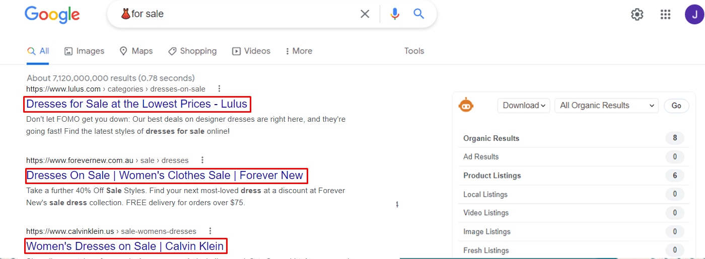
Using emoji on a website, SEO, or ad campaign for local businesses can be an extremely effective and innovative idea. As we mentioned above, search engines know how to recognize images, so you can safely use them in SEO metadata and snippets. Moreover, local SEO works so that when you search for emoji in a particular area, the Google map with the icons of the affiliated companies will appear in the first position of the issue.
For example, a coffee character ☕ in a search bar might give the user results with a list of coffee shops and coffee shops. A vegetable icon 🥦🍏🍋 + “buy” will most likely lead you to your local supermarket or vegetarian restaurant.
We have given some of the most understandable and accessible examples to explain the concept. Thus, the use of emojis is not limited to the restaurant niche. Try to apply it to other local businesses’ promotions like:
- beauty salons and barbershops 👳💅🏾💇🏻;
- car repair shops and gas stations 🔧🚙;
- children’s centers and educational institutions 🎨🧸;
- services and goods for animals 🐾😺;
- sports shops, clubs, and sections 🏊🏂🏾⛹🏻♂️;
- and much, much more.
The main limitation to using emojis in design is relevance to the content where you insert the symbols. In any other case, show imagination and creativity because most brilliant marketing ideas have always been someone else’s oddity.
How to Add Emoji to Text – Useful Tips
Despite its simplicity and popularity, using emojis in design can be challenging. We often paste it directly from the mobile keyboard or choose from an application set, so we do not think about the possible hassle. However, attempts to create emoji text using a desktop computer may fail. The way to copy icons from popular applications can also be an unsuccessful attempt.
Please note! Some popular emojis like 🙂 and 😉 can be converted to match the style of the application. Others, more sophisticated ones, will show up as empty squares if they are missing from the character range. 🔲🔲🔲
Always test the display of emoji across devices by embedding them in ad text and website notifications. If necessary, replace this with more straightforward characters, or try embedding them using Unicode. Here are some articles with helpful tips that can help:
In Conclusion
Proper use of emojis in design is a great way to stand out from the competition, grab your customers’ attention, and build trust with them. However, the use of this tool must be careful:
- use the minimum number of emoji designs so as not to overload the text, as abuse can only alienate potential customers;
- the ideal number of characters is 1-2 per snippet, but you should not use them in all site meta descriptions;
- each emoji must exactly match the content of the text or page where you use it;
- inserting emoji is more suitable for sites and social media accounts aimed at a young audience
but
- the appropriateness of using emojis for websites is critical.
Emoji are great at conveying mood, so they are entirely out of place on web resources with formal content, such as legal, medical, and b2b-oriented websites. No way, even on hidden metadata.
Many reputable corporations and marketers have analyzed the use of emoji for commercial and non-commercial web resources. It showed fantastic audience engagement, growth in popularity, and conversions in just a few weeks. However, few business owners decide to use this tool for promotion because of the many limitations and nuances. We tried to cover as much information as possible about how to use emojis design and possible errors so that you can add emojis without fear. Give it a try and take this great chance to advance and stand out from the competition.



Leave a Reply