Famous Logo Designers – 16 Most Popular Graphic Designers
Graphics are one of the most important components of everyday’s life. From education, politics, community, marketing, and even in the little details in our lives, graphics play a role whether it is big or small. They say that in every image, there is a story. In this post, I want to say that for every image, there is a graphic designer that has a story. That`s why we are going to share with you some of the most famous logo designers.
Most Famous Logo Designers
As far as the introduction is already done, let us introduce you to those stunning personalities. Here we have named some of the most famous logo designers and their success stories to show you how hard and rewarding the way to the top can be. Let`s start!
Carolyn Davidson
Who wouldn’t recognize the very distinct swoosh logo of Nike? The woman behind the simple yet distinct Nike mark is a graphic designer and one of the most famous logo designers Carolyn Davidson. Would you believe that she designed the logo in 1971 when she was still a student at Portland State University and was paid $35? Davidson met the Nike founder, Phil Knight, in an accounting class the latter was teaching.

The meek Nike logo was regarded as a positivity symbol. Not many people know that it was actually outlined from the wing of the Greek goddess of victory, Nike, whom obviously the brand was named after. In one interview, Davidson mentioned that it was very challenging to come up with a logo that delivers emotion.
When Nike became popular in the 1980s, Knight presented an undisclosed amount of Nike stocks, it is for sure that he made up for the minimal fee he paid for the logo.
Rob Janoff
Rob Janoff is the father of the Apple logo. A simple minimalist logo that left a mark on the consumers of technology and communication. Thanks to Janoff, Apple created a lasting impact on its market. In 1077, Rob Janoff was working with the ad agency Regis McKenna and he was the one who masterminded the logo of Apple. If there is a message that Janoff wants to send to his fellow graphic designers – it is longevity. The logo has been tweaked for several times but the form remained the same.

Janoff created an image of an apple because it’s a product that is named after a fruit but how do you make something that is food based on a technology-based concept? He sat for a couple of weeks and thought that a bite will do the trick. A bite is a computer term that will add the personality to the Apple logo that he wanted to create. The colors represent the features of Apple because it is the only computer that produces a colored image. Steve Jobs has a hippie personality as well so it is like hitting two birds with one stone.
Lindon Leader
A true leader by name and nature. He is one of the most famous logo designers of the craftiest logos in the market. He utilized the negative space in a different way to come up with the FedEx logo. It was in 1994 when he was working as a senior design director at Landor Associates that this breakthrough design was made. It gave him an unforgettable portfolio when the logo was applied to 30,000 land vehicles and 600 aircraft.

Leader originally came up with 200 designs for the logo before he shortlisted 10 to present to the FedEx brand manager. He recognized the impact of the FedEx logo on his life and career though he also worked on other big branding projects such as Hawaiian Airlines, Cigna Insurance, and Banco Baresco.
Paula Scher
Paula is not just a great graphic designer. She is also the first woman to ever sit in a major position at Pentagram. Pentagram is an acclaimed graphic design firm. In a world of men, Paula stood out and headed one of the most in-demand firms for graphic design services. Paula made a mark because of her impressive design. It shaped graphic design in many ways specifically her strategy in using type as a visual image. Her graphic design for New York City’s Public Theater painted an impression that lasted even in the era of modern design.

Chip Kidd
Chip Kidd is another notable graphic designer from New York City. He is among the most famous logo designers for his wonderfully made book jackets. Neil Gaiman, James Elroy, and Michael Crichton are only some of the famous writers that he worked with.
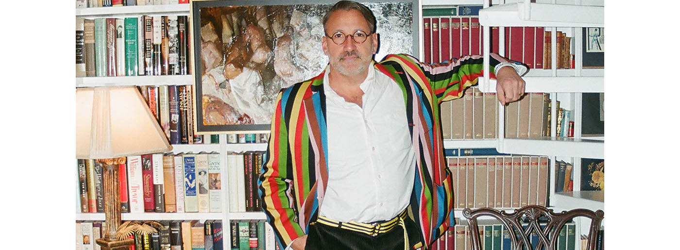
If you are wondering who created the famous Jurassic Park logo. Chip Kidd is the father of that notable design. In the year 1990s, the Jurassic Park logo became the most notable and recognizable logo. And through that, Kidd magnified that logo design should be just creative – it should leave a legacy – A MARK.
Kate Moross
Kate is the creative director of Studio Moross. She is a London-based graphic designer that made a mark in the year 2008 when she offered her taste for fun, fluid, and energetic style. Since then, Kate Moross had groomed typography as her trademark. Ever since Kate Moross has been tagged as one of the most sought-after UK logo designers. Her fluid drawing style is stunning and appealing and it will certainly capture the audience of the brand that she is working for.

One Direction is only one of the famous artists who have commissioned her work for album covers and magazine designs. And if you ever own a bus and tube pass holder in London, Moross is the culprit behind that stunning concept.
“I don’t think about things in terms of influence. I’m not at school anymore. I don’t look at a painting by van Gogh and go off and do a van Gogh drawing in my sketchbook. Also, I don’t read magazines, I don’t go to art galleries, and I don’t engage with the culture in a traditional way that perhaps a lot of people do. I think I get most of my ideas from everyday life – going to the shop or interacting with the bus driver or seeing something by accident. I’m not one for organized culture or anything like that, so I do try to let things happen naturally. I definitely think your influences are to do with your character, your life, your mood, and general culture like TV and film that you can’t really escape.” Katherine Moross said in an interview with Creative Blog in the year 2011.
Milton Glaser
He was born on June 26, 1929. Milton is one of the oldest and most brilliant graphic designers. He is the one who create the I Love NY logo and gave birth to other copycats from different places around the world. The story behind the I Love New York logo is very interesting. Did you know that it was created by Glaser because the crime rate in New York during that time is very high? The City is on the verge of bankruptcy. And tourism during that time is very low.
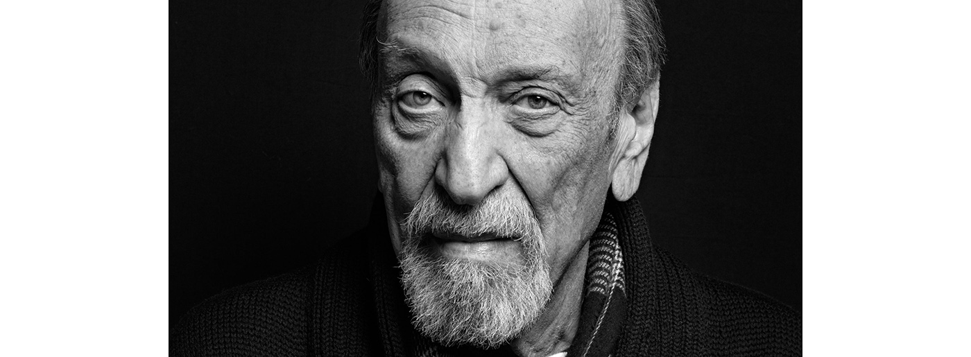
In an effort to revive and boost the morale of the city, they hired Glaser to work on a graphic that will revive the situation in New York. The logo I Love New York was conceptualized by Glaser while he was riding a taxi on the way to a meeting. This logo, believe it or not, was given for free by Glaser. It made New York earn $30 million each year and made him one of the most famous logo designers. During the September 11 Terrorism aftermath, Glaser recreated the logo and changed it to I Love New York More than Ever. It has a small dark spot to symbolize the attack.
Stefen Sagmeister
He is another New York-based designer. He is not just one of the world-famous logo designers, but a storyteller and typographer. Stefen is famous for album design covers that he made for Lou Reed, The Rolling Stones, Jay Z, and Aerosmith. Stefen began his graphic design career at the age of 15. He worked at Alphorn. It is an Austrian youth magazine that is named after the traditional Alpine musical instrument.
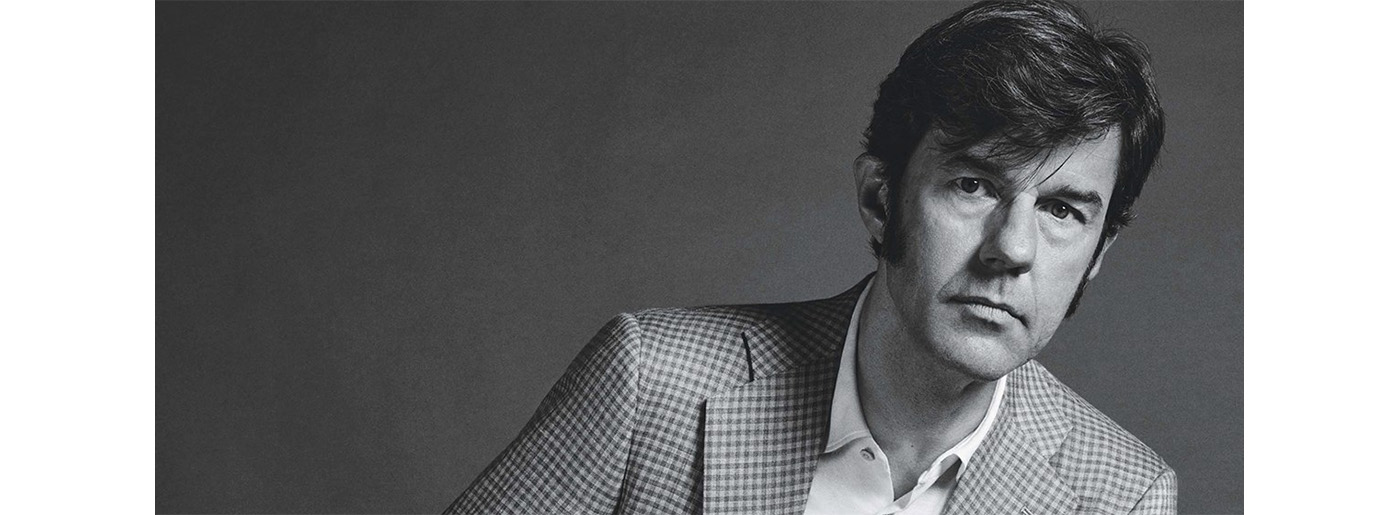
Stefan’s motto is “Design that needed guts from the creator and still carries the ghost of these guts in the final execution.” And truly, his guts can still be seen in the final execution of the design. Stefen is also famous because he can go for a 1-year sabbatical rest from work and commissions every seven years. He doesn’t take work from anyone else.
Stefen is not only famous for his work but is also subjected to controversy because of his lewd joke about animal fellatio in February 2017. He has made a joke about a manatee giving itself a blowjob and made repeated requirements for a sign language interpreter to be present during the talk. Later on, he apologized for the behavior in an Instagram post from his personal account.
Paul Rand
Rand is considered as one of the holy trinity of 20th-century logo design ideas along with Saul Bass and Milton Glaser. But many believed that Paul Rand is the most influential and therefore he stays among the most famous logo designers. Born to Jewish immigrants, he was raised and grew up in New York City. He was very artistic and took design courses at three different schools, though he regarded himself as self-taught.
People started noticing his works for magazine covers and soon got involved with logo designs. His earliest logo designs were in the year 1938 for Esquire magazine and Wallace Puppets.
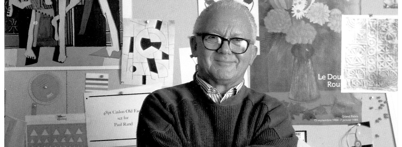
But meeting the Hungarian Bauhaus artist László Moholy-Nagy made way for Rand’s curiosity and appreciation of art criticism and philosophy. He philosophizes about his work – what logos are, what they are not, and what they can do.
Some of the popular logos designed by Paul Rand are the Westinghouse logo in 1960, the UPS logo in 1961, the logo of ABC in 1962, the 8-bar logo version of IBM in 1978, and the Logo for Yale University Press in 1985.
Saul Bass
The third man of graphic design’s holy trinity is Saul Bass. He is regarded as the man who changed graphic designing and could be the sole most accomplished designer all throughout history. Logo designing is not the only artistry that Bass is famous for. In fact, he has the most renowned career in graphic design.
Bass was born in 1920 in New York City. He has been very creative since his childhood as seen in his drawings. During college, he was part of the prominent György Kepes (master of functional Bauhaus aesthetic) night classes in Art Students League.
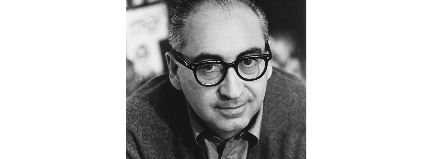
He transferred to California in 1940 and started working in advertising. But in 1954, he had his first major break. He designed the poster for the Carmen Jones film which was highly praised by the filmmakers. From then on, he became the designer of other films such as Vertigo in 1958 and Anatomy of Murder in 1959. His last film posters and title credits were Innocence (1993) and Casino (1995) which are both Martin Scorsese films. Bass’ sophisticated and unique minimal style has definitely made an entirely different role to films’ title credits.
It is very interesting to know that Saul Bass’ logo creations have an average lifespan of 34 years. His designs that are not yet replaced up to this day by other world-famous logo designers are the Kose Cosmetics (1959), Warner Communications (1972), Girl Scouts (1978, with a 2010 variation redesigned by OCD Agency), and Geffen Records (1980).
Bass’ works changed the game indeed for graphic designs with his iconic but clean, thoughtful, and minimal creations. Shreds of evidence of this are his AT&T and Kleenex logos.
Michael Bierut
Being one of the partners of the highly respected design agency Pentagram, Bierut is unquestionably an accomplished designer. As a designer, design critic, and educator, he started his career with Vignelli Associates and has been with Pentagram as a partner for 28 years.

His works at Pentagram consist of identity and branding for Benetton, the New York Jets, Walt Disney, and designs for the magazine Billboard. These brands can already be overwhelming but they only comprise a small chunk of his huge portfolio. He published his Monograph – How To in 2015. He is also part of the Yale School of Art as a graphic design senior critic.
Proof of his greatness in his field is the hundreds of awards he received for his works. His designs are also kept in different museums in New York, Washington D.C., Germany, and Montreal as permanent collections.
Massimo Vignelli
Leaving a legacy of some of the best iconic designs of the past 50 years, Massimo Vignelli died in the year 2014 at the age of 83. Vignelli was an Italian designer who was known for his designs made for IBM, Ford, Bloomingdale’s, American Airlines, and many others. Who can also forget that he had Michael Bierut as a protégé? His works still live among today’s generation as projected by the subway map and signage he designed for New York City.
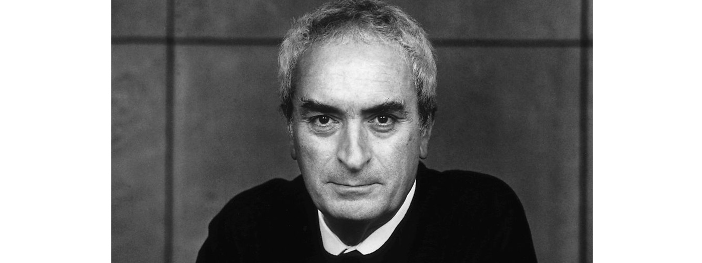
Package design, housewares, furniture design, and public signage are some of the many areas in which Vignelli worked on.
Vignelli’s firm belief was, “If you can design one thing, you can design everything.”
Many believed, including web designer Justin Reynolds, that Massimo Vignelli’s design principles, teachings, and works are fundamentally important to all designers. Michael Bierut also once wrote that being a member of the Vignelli Associates was being at the center of the universe as Vignelli’s designs, such as the subway signage, Bloomingdale’s shopping bags, and St. Peter Church’s pipe organ, were exhibited all throughout New York.
George Lois
The original rebel of magazine design is George Lois. For 10 years (1962 – 1972), he had the time of his life designing the most unique and talk-of-the-town covers of the US magazine Esquire. His works include the Muhammed Ali cover in the April 1968 issue.
In 2014, during an interview with Design Boom, Lois answered the question regarding his ability to surprise. He described his works as having the power to make the people step back in awe of the image’s strength and later realize the meaning of the content.

Apart from being a prominent magazine designer, Lois also worked and became known in the field of advertising. His big clients include MTV, VH1, ESPN, and Tommy Hilfiger.
Peter Saville
Known for record sleeve designs, Peter Saville was born in Manchester in 1955. He was exposed to the music industry after he met the journalist and broadcaster, Tony Wilson.
He designed record sleeves for Factory Records artists Joy Division and New Order (Unknown Pleasures, Transmission, and Blue Monday). Saville is considered as one of the most creative record designers whose sleeve works last five decades. Peter Saville became the creative director of the City of Manchester in 2004.

He also worked hand-in-hand not only with world-famous logo designers but also with fashion icons Jil Sander and Stella McCartney. One of his famous works also includes the England football home kit designed in 2010. He is still active in the market these days – the collaboration on the new Calvin Klein logo is his latest project.
Jonathan Barnbrook
A huge name in typography and one of the most famous logo designers, Jonathan Barnbrook, is from the United Kingdom and is also a graphic designer and filmmaker. He became prominent in recent times when he designed the cover artwork of David Bowie’s albums. The artwork of Blackstar, Bowie’s sign-off album, was also made by Barnbrook and was released to fans for free. But Barnbrook’s career is way larger than Heathen and Blackstar’s.
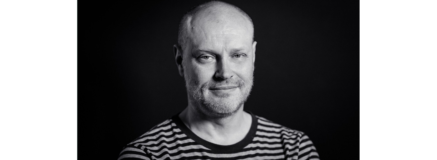
His most prominent work in typography is Exocet – an all-caps typeface and the most powerful type design which was immediately pirated after it was released in 1991. This font design was also applied in the FPS video game Diablo. Some of Barnbrook’s contemporary but controversial typefaces are Bastard and Tourette.
Ruth Kedar
She is well-known for the creation of the Google logo design in 1988. There were about 10 examples of logos before the one known to millions of users was created. It was considered to be an official logo till 2010.

Bonus Tip for Designers & Business Owners
If these stories inspired you to start your own design journey — or if you already have a logo and want to showcase it professionally — make sure your branding lives not only on paper but also online. You can easily bring your designs to life using ready-made website templates from Weblium.
Whether you’re a freelance logo designer, creative agency, or launching your own clothing brand — Weblium has customizable templates tailored for creatives. No coding skills required — just pick a template, upload your portfolio, and launch your site. Fast, stylish, and efficient — so you can focus on what you do best: designing.
Final Words
We hope that you will get inspired by the stories of the most famous logo designers and will come up with some fresh ideas. If you think that we have to add more information and some other bright personalities to the post – share the names of your favorite graphic design artists and we will definitely do that. Stay in touch and design with pleasure! And here are some articles that might be useful.
In case you need a logo for a business, MotoCMS can offer you a ready-made design for $19, just choose from our logo templates or get a custom design for $149.


Leave a Reply