FAQ Pages Best Practices and Examples – Design and Content Ideas
Before we start talking about FAQ pages best practices and examples, let’s ask a question: do you really need this page at your website?

What’s an FAQ page, anyway? It’s practically a page that features miscellaneous content, and the creators usually try to stuff it with tons of keywords. It’s the kind of page that almost all websites have, so you assume it’s a standard requirement.
These pages often feel like a fictive conversation between an inexperienced user and a wise expert, who knows what questions the customer has before they even contact them. Some content developers will argue that you don’t need such a thing. It’s true. You don’t need an FAQ web page if you don’t know how to do it well.
If you implement the best FAQ page design, however, you’ll definitely see some benefits out of it.
First of all, it’s a content page. It answers questions that people often ask on Google. “How much does X.com cost?” If they ask Google this question about your brand, you don’t want them to see the answer provided in a forum thread. You want them to land at your website, where you have tons of space to convince them that they pay an affordable price and get tons of value in return.
There are plenty of good FAQ examples across the web, so maybe we should take them as a guiding point. Are you ready to explore them?
FAQ Pages: Best Practices and Examples to Learn From
Make It Unique
Recently, there was a scandalous online discussion that involved three big brands: Alo, Cody, and Omstars. The discussion was not about the FAQ web page, but it was one of the things that the parties threw at each other.

We’ll take Cody’s page as one of the FAQ pages best practices and examples. The questions are realistic and the answers are straightforward. The other page, however, is almost an exact copy. Do you know what the excuse of the website owner was? It’s just the industry standard.
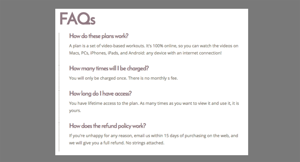
There’s something that all FAQ pages best practices and examples have in common: uniqueness. Remember: there is no such thing as the industry standard that says you’re supposed to set identical questions and offer similar answers at your website. Copying your competitors leads to plagiarism and that’s not a good thing if you ask Google.
If you have absolutely no idea how to create unique content, you can simply go to an Assignment Geek Service with your instructions. They will do it for you.
Find Real Questions to Answer
If you’re following an imaginary industry standard, you’ll copy the questions from other websites. We’ve seen this happen plenty of times before, and those are not FAQ pages best practices and examples.
Let’s take an online store as an example. The usual questions you’ll see are:
- How can I order?
- When will the order arrive?
- Do you accept returns?
Those questions are everywhere. They don’t make you unique. You have to be more specific than that. Check out Asos, one of the FAQ pages best practices and examples:
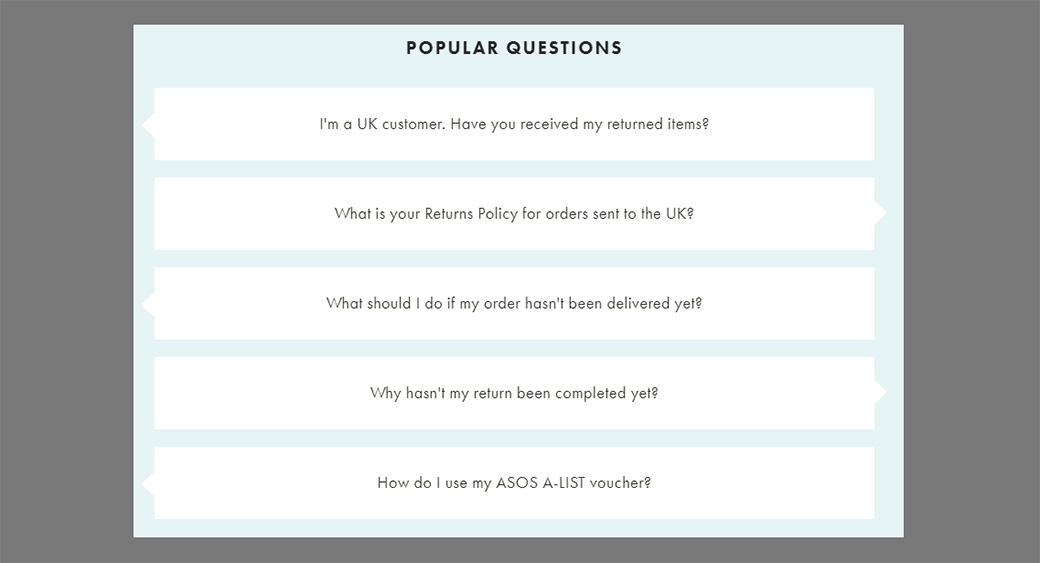
These are probably the actual questions the company gets via email and social media. That’s what makes the page so useful for future customers.
The Best FAQ Page Design Includes Contact Options
If you scroll down that Asos FAQ page, you’ll find something else:
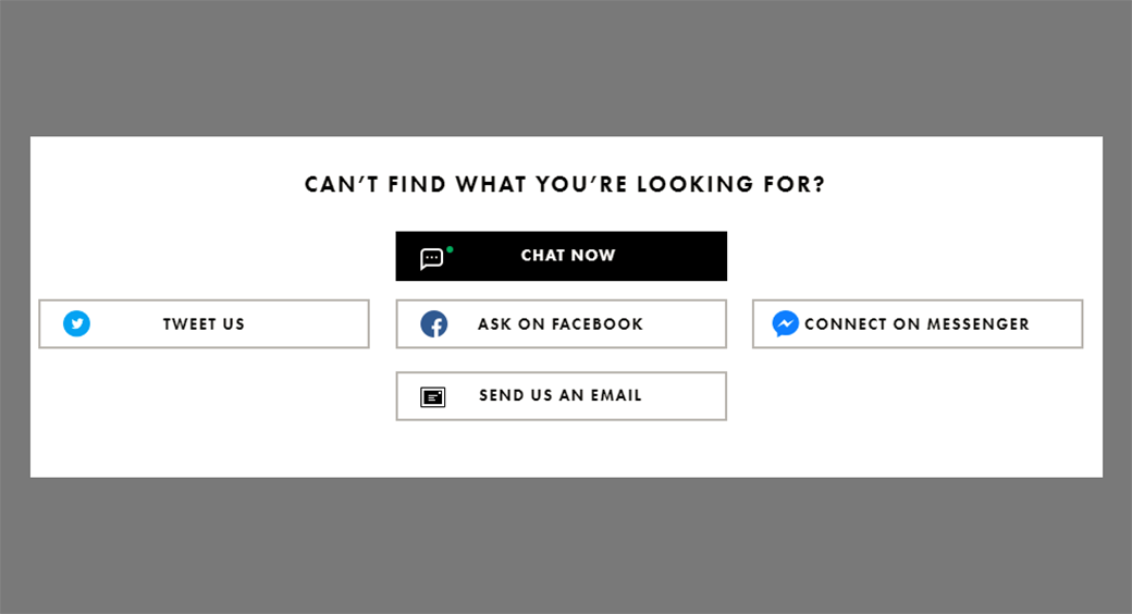
The FAQ pages best practices and examples don’t assume they answer every single question a customer could possibly have. After providing answers to the commonly asked questions, the most logical thing to do is offer an opportunity for the user to contact you if they didn’t find what they were looking for.
Asos does that in a pretty cool way. In addition to offering the usual way to contact them (via email), they also offer you to connect on Messenger, ask on their Facebook page, post a tweet, or chat with a customer service representative directly at the website.
That’s what good FAQ examples are all about – providing solutions in the easiest and fastest way.
Make the Page Searchable
Sometimes there are too many questions to answer, so the FAQ page gets busy. The user won’t have time to go through all those questions to find the answer they need, so they will scroll up and down in frustration. You don’t want that.
You still need to answer those questions, but you can make the FAQ page searchable. If you check out Payoneer, you’ll notice it has one of the FAQ pages best practices and examples because it offers a search function.
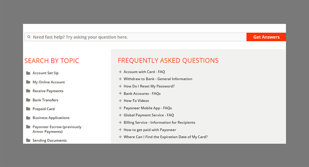
You’ll notice that the page categorizes the questions and lets you search by topic, but you can also type your question in the search bar, and it will give you the information you need. If there’s no such info in the database, you can contact the support via live chat.
That’s a lot of work for proper customer support, but it’s definitely worth the effort if you want to establish an authoritative brand. Payoneer is an online financial service, so it has to take things seriously. Fortunately, it’s one of the good FAQ examples.
Don’t Overwhelm the Visitors with Content
When there’s a lot of information to provide on the page, it will have a lot of content. From a visitor’s point of view, that means scrolling down the page to find what they are looking for, without being sure whether or not you’ll give them such details.
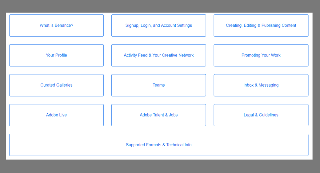
You can make it easier. In addition to Payoneer with its nice categorization, Behance is one of the FAQ pages best practices and examples to follow on that matter.
FAQ Pages Best Practices and Examples – Final Words
When it comes to FAQ pages, you have to move beyond cliches. Don’t do what everyone else is doing! Organize the page and answer the questions your audience actually has. That’s the recipe to success!
Once you need writing services, you may order and pay for essay here.



Leave a Reply