Creating a Focal Point in Web Design is Easier than You Think
Tell us what is the first thing that captures your attention whenever you bump on a website? Maybe it is the big header image or it is the stunning Call to Action button that seizes your attention at the very onset. It is quite normal that some elements of a website will have more attention compared to other elements as it goes with the plan. And the plan is to make people notice some sections of the website as soon as they land on it. For example, if you are selling baby products, it is obvious that you want people to look at the bestselling products featured at the mid-section of the website rather than wasting their precious time on reading some articles on baby food.

We need to get used to that people in general are fickle and they get distracted very easily. It means that a significant number of your targeted audience may leave your website without subscribing or without buying your products, unless you are putting some efforts into the design to make some elements look prominent. Now, nobody wants his customers to leave the website in order to watch some silly cat videos. As web designers, we need to do something so that the attention of the audience gets drawn to certain sections or certain elements of the website. So, basically, we need to figure out the focal point of the design in order to make our target audience notice it and then take desired action.
Here we are going to figure out how we can create a focal point in a web design project.
Single or Multiple Focal Point
It is a well-known and proved fact that a visitor does not take more than 5 seconds to decide whether to stay on the website or bounce back. Therefore, it is very important for the designers make it easier for the visitors to locate the information that they might be looking for. By creating a focal point in web design, this can be achieved easily.
Make sure that the focal point of the design appears prominent and stands out from the rest of designing elements in every sense of the term. Now the big question is whether to create a single focal point or creating multiple focal points for maximum impact. Remember that the policy of ‘the more the merrier’ does not hold true always. Sometimes a single focal point is enough to encourage the visitor to spend a few more seconds on the website.
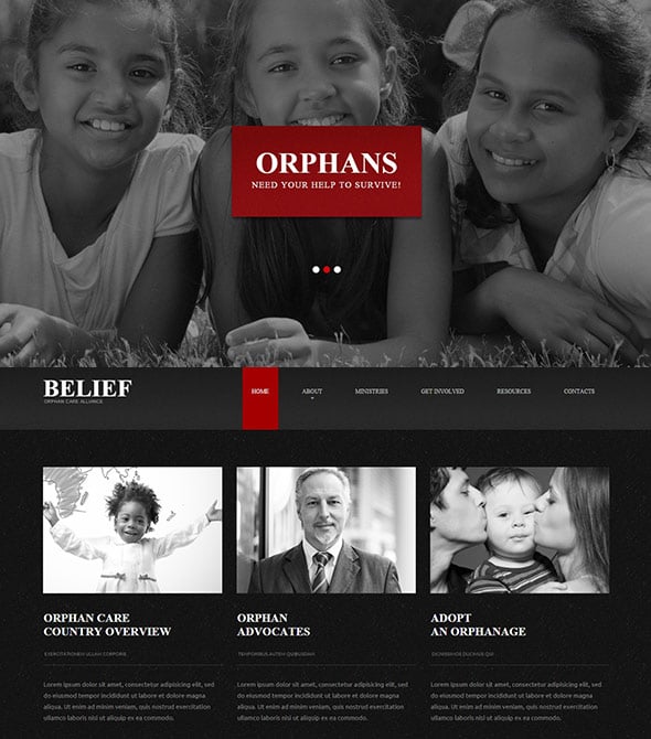
In the above Charity Website Template, the designer has done an incredible job by highlighting the text ‘Orphan’ and using contrasting red and white colors because they grab the attention of the target audience. This is a perfect example using a single focal point in web design.
Position of Focal Point in Web Design
The next big problem is where to place the focal point. To be honest, you can place it almost anywhere. However, it makes sense to place a focal point above the fold so that it can grab the attention of the visitors without requiring them to scroll down.
Home page is definitely the most important page where you need to make use of focal points; however it does not mean that you should ignore other internal pages. Landing pages should always have a focal point otherwise the visitors might feel confused as to where to concentrate. In fact, a focal point helps you guide your audience to areas that are of interest to them.
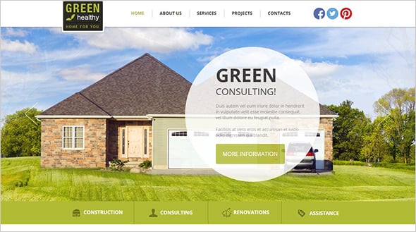
In the above Architecture Website Template, the focal point is undoubtedly a white and transparent circle and the texts on it. The focal point is conveniently placed on the Above the Fold section and it will be the first thing users see when open the website.
How to Create a Focal Point in Web Design
Creating a focal point in your website is easier said than done. Sometimes designers go overboard and focus around the wrong element. The process should start with identifying the areas that deserve more attention. Like if you are selling products, the attention should be on the products and not on articles or the FAQ section of the website. You can make the focal point work for the benefit of your website by making some minor changes in the design and structure of your website.
Use Button
If you desperately want to drive more conversion, then it makes sense to get some sight around the Call to Action button and other surrounding elements. Big and bright Call to Action can help you get some attention. However, you need to make sure that the button is not getting overshadowed by other design elements. The use of blurred image or less prominent details than Call to Action button is another way to put focus on the content you need.
In the above example, No-IP website has managed to get some focus on the Call to Action button. The button has a bright color and it is descriptive, too. The use of blurred background image has made it easier for visitor to notice the CTA button.
White space
The practice of using white space in design is probably as old as the hills. White space can be used to concentrate users’ attention on the most important part of the design.
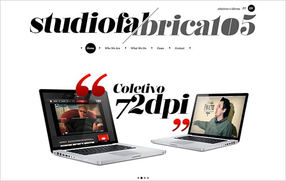
Studiofabrica105 website has done away with visual clutter on its home page. The remarkable use of white space accents on the products, and this is a simple yet powerful approach to make online project remarkable.
Typography
You can create focal point in your website just by using some textual elements. Astonishing as it might sound, textual elements if used wisely can help to grab a lot of attention. However, it is a fact that an average website uses loads of texts and therefore, you need to take some creative tweaks to emphasize those texts. This is easy to achieve by changing the typeface, size or the color of the texts.
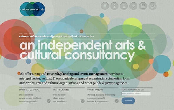
In the above example, Cultural Solutions UK has used typography to create focal point in web design. The design uses different fonts, colors and size of the text to create the desired impact.
High Quality Images
This is a common yet powerful way to create focal point in web design. There is no need to be creative with different design components, all you have to do is to identify a high quality image and get it placed above the fold.
In the above example, Greats has placed high quality images within the Above the Fold section to grab the attention and the impact is palpable.
Creating Focal Points with Weblium Templates
When you land on a website, what catches your eye first? Maybe it’s a striking header image or a bold Call-to-Action button. In great design, these moments are intentional—built to guide visitors toward the most important elements right away. Whether you want people to notice your bestselling products, join a club, or sign up for a course, your site’s focal points are what make that happen.
With Weblium’s templates, you can design pages that naturally direct attention where it matters most. By placing key elements above the fold, using contrast, and balancing white space, you can keep visitors engaged and lead them to take action—before they get distracted elsewhere.
Single vs. Multiple Focal Points
Visitors often decide in under 5 seconds whether to stay or leave your site. A clear, standout focal point—like a featured product, offer, or event—can make that decision easy. Sometimes one strong focal point works best; in other cases, strategic secondary points (like related offers or contact forms) help guide users deeper into your content. Weblium templates make it simple to test and refine either approach.
Techniques to Create Focal Points in Weblium
High-Contrast Buttons: Our pre-designed CTA styles ensure your buttons stand out with bright colors, clear text, and a focus-friendly background.
White Space: Built-in layout controls let you strip away clutter so important elements have room to shine.
Typography: Customize font styles, weights, and sizes to make key messages impossible to miss.
High-Quality Images: Showcase bold visuals above the fold to capture attention instantly.
With Weblium, you don’t need to be a design expert to use these techniques—our templates already follow best practices for focal points. Just add your content, and your site will be ready to grab attention, keep visitors engaged, and drive action.
So, these are some tips that you can give a try if you wish to create a strong focal point in your website. By doing so, you will be able to make people take quick decision.






Leave a Reply