Ghost Buttons Done Right – Simple Rules for Web Design
Ghost button is definitely a web design trend of 2014, and now we all know this. But have we heard anything about these unusual buttons a few months ago? Moreover, could we predict that so many designers would use these hollow buttons in their designs? Really, now we see tons of examples of using ghost buttons in web design, each and every is beautiful and looks different. Ghost button is something new for web designers and they are crazy about it. Within this post, I am going to make a research on ghost buttons in web design.
Ghost Button: What Does This Mean?
It is not the first time when transparent and shadowy elements appear in web design. This tendency has started together with flat style design. Choosing minimalist style for designs, web designers are always looking for more new features to use. Ghost button is this kind of element, and its popularity will probably grow more and more, as minimalism just strengthens as a wbe deisgn style.
The anatomy of ghost buttons is easy to outline:
- transparent button background;
- light font of call-to-action;
- thin button frame/outline;
Ghost buttons are trendy, but this doesn’t mean they are complex in terms of design. The very simple design of empty buttons allows even novices to use them for their projects. If to compare a few examples of ghost buttons design done by pros and beginners, you could hardly ever see the difference.
This simplicity of design appears to be both a benefit and a drawback. Why? Because someone may decide to use ghost buttons as a universal design element and put it everywhere on the design. The main principle with using ghost buttons is to understand the limits. This is important especially because of the buttons are efficient only in specified locations and when used with a right approach. While reading this article, you will find out some very essential usability terms of ghost buttons use.
Ghost Buttons: Find The Perfect Location
Home page is where ghost buttons are usually located. If to be more precise, these elements mostly appear at the center of the home page. This location gives the highest visibility to the buttons, and to certain extent it ensures visitors’ clicks. This location is caused by users’ behavior on websites – home page center is the main focus for users’ eyes in the first seconds of website browsing. Load the following websites and analyse where your eyes will move.
The large empty button looks well on every background the website uses. Though, here the button looks a bit larger then we used to see in other designs.
This website uses Ghost buttons designed in two colors – white and blue. There are buttons with blue background and white outlines and vice versa. A few buttons are located at the layout center – you will them if scroll down.
Ghost buttons play one very important function – they serve as calls to action. They look much better than casual CTA buttons because of a light 3D effect. The all-new design of calls to action won’t make your visitors click more or buy more often, but it will change the way users perceive these elements and your message in general.
Oftentimes it is not enough to make a website beautiful, because it should be supported by a good functionality and perfect usability. In this case, it may be a good idea to use a few ghost buttons on one web page. Use them for navigation menu tabs or only for calls to action.
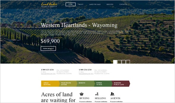
This website with an accurate grid layout features a hollow button at the top left corner of the front page. It is not at the center, as on the examples above, but this position works pretty well too, especially due to the website design style. The block with the button is the only one which doesn’t contain an image, so it stands out and attracts users. This design includes many other naked buttons located in different sections of the pages.
This website uses two ghost buttons with rather creative designs. Looking at them you may think they are different (in size and color) but the hover effect makes them the same.
Here the ghost button is put over the image gallery in the Header. This is a CTA button designed the same as navigation menu tabs.
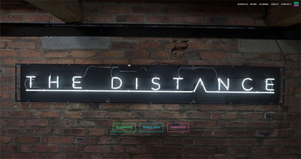
On this website with a large background image you can see three ghost buttons put in a line one by one. The only design feature that differs them is the color – three various bright colors are used for three buttons.
Ghost buttons break rules and stereotypes. How? The use of text over images and textures is a sign of bad taste and poor design experience. Actually, it was thought to be so earlier. Ghost buttons make it possible to combine text elements and blocks (like buttons) with images and textures. These buttons don’t worsen the website readability, they even have a better look when put over pics, slideshows and videos.
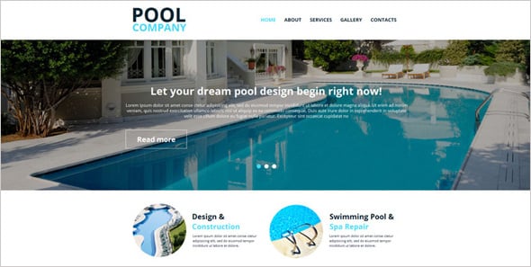
This example shows how to use ghost buttons within image sliders. Here the slider displays pictures in one color palette and the button design balances with it greatly. Can you see it well? Sure thing you can – and this is the most vital aspect of the design.
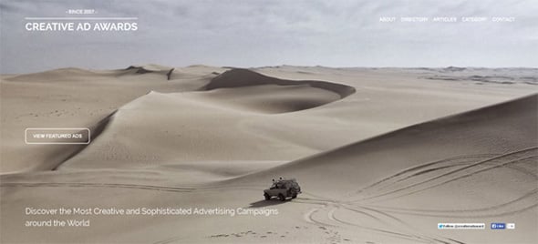
ghost button fits this design well. It is designed in an appropriate color not to interfere with the background image and at the same time be prominent to users.
Ghost Buttons: Awesome Functionality
When a new design trend appears, it seems you can use it everywhere and with any purpose in mind. But would this look stylish? The same with ghost buttons – they pointed as universal design elements, but you can hardly ever replace all your website buttons with these naked novelties. I suppose the best way to use empty buttons is to feature them on the home page. Here they may look the most beneficial. But would you use a ghost style for an “add to cart” button? Probably this would look too sophisticated. Right now we will find out what for ghost buttons serve the best.
Ghost Buttons for Business Website Designs
Business websites are the most popular designs, because the majority of people get online to sell something. Along with this business website design is the most restrained. Business site owners usually avoid trendy features and use common design techniques. What about ghost buttons? Can we find business website design using these modern buttons?
This website for printing company not only uses a trendy ghost button, but it features a creative button. The hover changes the button color.
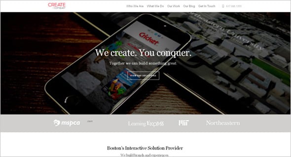
Doesn’t this button look unobtrusive and professional? And this is a ghost button used as CTA.
This creative website combines bright color palette and plain button design. All together it has a nice look.
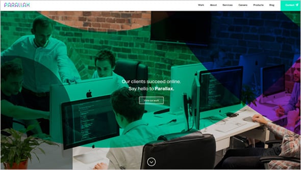
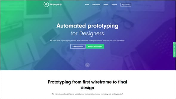
A simple ghost button is used on this website to engage users to sign up for product beta. The button is place on the above the fold section, where every visitor will see it.
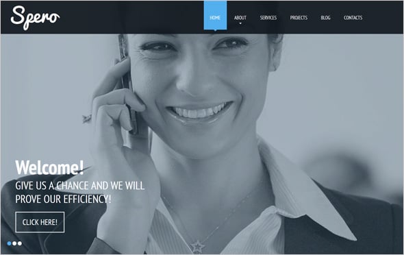
The use of large hero image is the first trendy feature used on this design. The button suits it rather well too.
Ghost Buttons for Creative Studios Websites
Creative design agencies are usually the first to adopt trends on their projects. Does this happen to ghost buttons too? Now we’ll see how creative persons use these trendy buttons.
This company makes a good use of ghost buttons for their website. The wbeiste color palette is black and white, the same are ghost buttons – some of them are white others black. The color of the button depends on the background style.
Interior design and furniture websites show a good approach of using ghost buttons. A button with white outline over the Header image has a nice look.
Ghost Buttons for Software Websites
Software companies make no exception as they add ghost buttons to their websites too. Looking at different software websites allows us to experience many creative solutions to use ghost buttons. There are website designs with one button and a few; a handful of designs uses varicolored buttons, and others tend more to traditional tones.
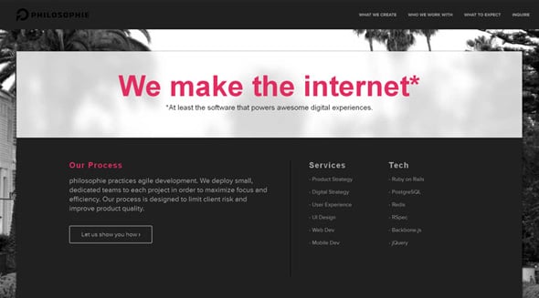
Here we see a contrasting design using a traditional black-and-white color palette mixed with an extraordinary pink tone. The buttons’ designs differ depending on the color used behind them.
This website uses empty buttons with white outline which turns into green with a hover. The menu tabs are design in the ‘ghost button’ style as well.
Ghost Buttons for Education Website Designs
Websites of educational institutions usually show a great use of latest design trends, because their prior aim is to interest the youth. That is why I think many education websites can’t avoid the ghost button trend.
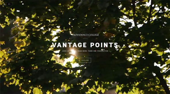
This website opens with a creative home page – it features a video and a ghost button over it. The other pages of the site include hollow buttons as well.
This website design is varicolored and cool, buttons are the same. There are buttons colored in orange, green and blue. Though the website uses both ghost buttons and simple ones.
Ghost Buttons for eCommerce Web Design
One more category of websites we analyzed is eCommerce – how do you think they use trendy buttons?
Walked & Worn
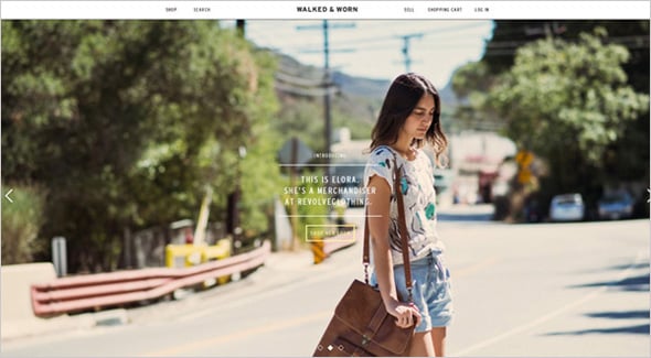
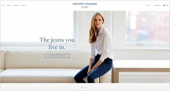
Ecommerce website design is content-rich, so ghost buttons have too be as much simple as thin as possible – like they are on this website.
This website picks the most beneficial color palette for its design – a classic mix of black and white. That is why ghost buttons suits it rather naturally.
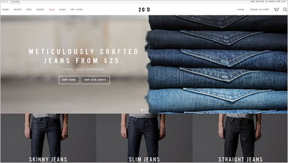
Ghost buttons with a double outline are looking great on this website design. Such design approach adds higher visibility to the buttons.
Now you know that ghost buttons became trendy enough to appear in every website design category from business to creative design studios to educational institutions, etc.
As we have noticed, many designers choose ghost button design style for the CTA elements. Who knows how this influence on conversion rates. You should try and then track – maybe these simple details will boost your sales?
Right now ghost button is a hot trend, so if you are launching your online business with a website builder like MotoCMS or planning to do it soon – consider making your buttons cool and creative!
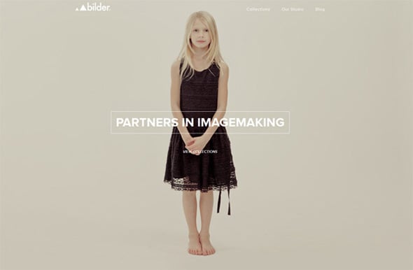
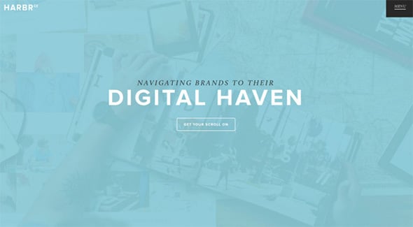







[…] Ghost buttons are used for each third website design today. But do designers use them in a way they like or they know the rules? […]