Web design is like any other form of art; it’s all about self expression. This ideology gave birth to a form of design that’s nonconformist and unconventional: grunge. Simply put, grunge is a style of web design that combines rough elements with regular images that most people would term as dirty or disheveled. This may include things like torn pieces of paper, shades of black, brown and beige as well as handwriting, dog-eared papers, metals, wood and worn out fabrics. This post is a continuation of the styles in web design series that’s been running on our blog for the past 2 weeks. Please take a look at earlier style posts so you can keep yourself up to date with regards to the styles we’ve covered to date:
How to Create a Wonderful Clean Website Design
An Introduction to Realistic Web Design
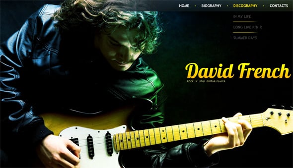
Grunge came shortly after Web 2.0 started petering out as a trend. The former was characterized by glossy images, soft palettes and digitalized and rigid elements that were futuristic and mainstream for a long time. Grunge was almost an antithesis of what people were used to, becoming a popular design staple for music and urban lifestyle websites the world over.
Most clients are afraid of grunge as a web design style perhaps due to the fact that it’s so different and is sometimes jarring to the senses. It takes an expert to balance grunge elements and content needs in order to have a site that is as functional as it is informative. Due to this, there are certain elements that an individual needs to take note of when creating such websites.
Here’s a short checklist of things to pay attention to in your quest for the ideal grunge website:
Irregular Elements
Make sure to break away from the mold of uniformity. This might mean playing around with broken border lines, an unbalanced home page where one side has more design elements and dirty edges that resemble worn out fabric or old books.
Colors
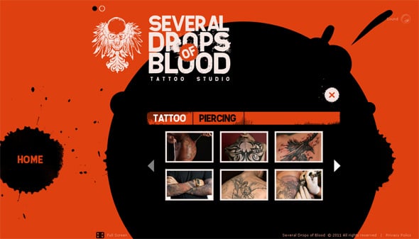
Grunge moves away from bright primary colors and focuses on shades of grey, brown, black and beige. These colors are synonymous with being unconventional as they’re used by social groups and demographics that can’t be boxed in. They also represent a street-wise attitude that may appeal to a younger or hipper audience. It’s therefore safe to say that grunge may not be the best choice for websites targeting a business or more mature clientele.
Texture
Grunge-oriented websites feature varying textures that give it a realistic and tactile feel. Examples include the rough feel of a sackcloth fabric, wood shavings strewn across a floor or walls that are pockmarked with rough bumps and flaking paint pieces. The idea here is to create an unfinished look that speaks of unbridled creativity and freedom in expression.
Varying Typefaces
Most web design styles usually stick to one typeface to create a uniform aesthetics when it comes to content. With grunge, you’re free to use a variety of typefaces to achieve the vision you’d like to accomplish. For example, a title could be in one font while the content text could be in cursive or even your own handwriting. This unpredictability is artistic and laid-back, and doesn’t take itself too seriously.
Sketchy and Realistic Images
Instead of using glossy, near-perfect images, grunge adopts personality and originality thanks to its use of stickers, Polaroids, post-it-notes, realistic paintings and photo montages. This adds a layer of authenticity, making it accessible to a wide variety of people due to the fact that it doesn’t take itself too seriously.
Imprints
Grunge also adopts a more realistic angle by the use of common imprints that we come across on a day-to-day basis. This may include things like coffee mug stains, tire tracks, mud-splattered walls and wine or lipstick stained fabrics. This makes the design have an air of laissez-faire, giving it a casual and fun edge.
As much as grunge may be an exciting and fresh design palette, it should be used moderately. Ensure that your design doesn’t take away from the content, isn’t too overwhelming to result in a higher bounce rate or isn’t too complex in terms of patterns to give it that overdesigned look that most people stay away from. Simplicity is key, and when in doubt, leave it out.


