How to Create Beautiful Mockups Using Fortnite Font
Have you heard the word ‘Mockup’ many times yet do not know what this term is used for? Don’t worry because today, we will break your curiosity by defining this term and its best font. The success of your mockup designs highly depends on the font choice you make. The more appropriate the font, the better design you will create.

Among many options, the one that I found perfect is Fortnite which you might have used before as well. This guide will discuss all the important factors regarding this font. Along with that, we will also talk about how you can design appealing mockups with this font.
What is a Mockup Design?
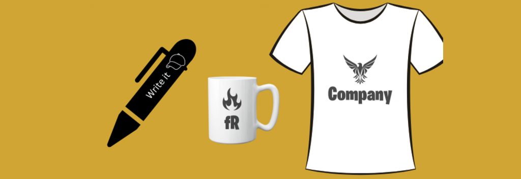
A mockup is a design that is not released yet but is just a sample to show how the final product will turn when it is shown to the public. How beautiful the mockup is depended on your expertise. You can design numerous mockups using different software accessible, including Photoshop or Adobe illustrator. The mockups can be created of a complete website, or they can be of a single page.
The best thing about them is that they give you a free hand to alter it wherever needed because once the site is live, there will be complications. You can also design them to get a public reaction before creating the final product. They are used in different fields, including software development, architecture, consumer goods, furniture, etc.
Using Fortnite Font for Mockups
If you are a game lover, you might have played the Fortnite game that got all the acclaim when it was released. In 2017, it was produced, and more than 100 million people were a part of that game. With this success, the font used in the game also obtained appreciation, and it became everyone’s demand. The logo font of this game has everyone’s eyes because it is appealing and has the power to capture everyone’s attention.
After research, we found that the font used on the logo of this game is none other than Burbank Big Condensed, created by Tal Leming many years ago. Moreover, it was specially created as a display font, which is well suited for this reason. It is a large family with many weights, styles, and characters, so it is good to be used in mockup designs in every sense.
Well, the question is still there how can you use this font in such designs that look catchy and attractive? The answer is given below.
1. Use it for Branding Projects
Suppose you are working on any particular brand and still muddled about which font would be most promising for mockup design. In that case, you can never get mistaken for Fortnite font because it is specifically used for this drive. It makes the brand stand out, and people won’t stop valuing your work. The elegant touch this font gives to your brand is also something to be admired for.

Hence, if you want to develop a mockup design that instantly captures the attention, I recommend you use the free version of fortnite font in your branding works and then wait for the magic. It is the best advice you will ever get in terms of typography.
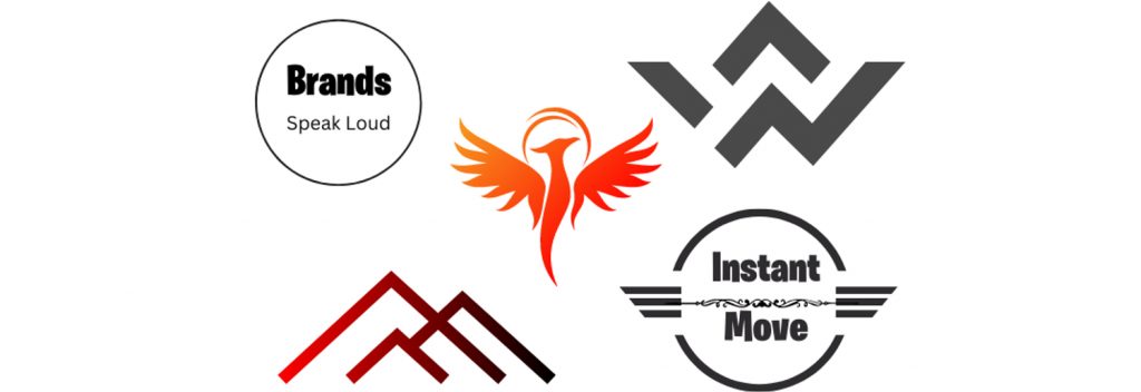
2. Use this font on Logos
We all know that Fortnite accumulated popularity after being used in the logo of the Fortnite video game. Hence, the soundest way to use this font is to save it for important points. You can keep it for titles, logos, or influential headings that need clarity. It is how you can make the finest use of this font. After the dismissal of this font, many designers took full advantage and used it in their designs, especially on logos.

Similarly, if your brand is all ready to be released and the only requirement is the logo font, go ahead with Fortnite, and you will surely appreciate your decision later. This san-serif font gives clear visibility and attracts the reader to your design. Using this font on the title or logos is another best way to utilize this font for mockup designs beautifully.
3. Best for Gaming Platform

This font is undoubtedly best for your gaming mockup designs because people got to learn about it after the Fornite game was emitted, and everyone went wild for it. If you have a gaming site, you should not think twice about whether this font would be flawless for the design. Go for it. Make the best use of this large font family so that results turn out in your favor.
4. Choose according to the design Mood
Choosing a font that is flawless for the design mood is momentous because if your font doesn’t complement the design, your mockup will be the biggest disappointment. As a designer, you must know which font is suitable for different kinds of designs, and with practice, you become a master of this skill. One of the leading qualities of Fortnite font is that it fits different moods; that’s why you do not need to think much before using it in different designs.
If you want to make your Mockup design successful, this point must be looked after so that the reader goes with the flow while checking your design.
5. Be Mindful of Pairing
Pairing is also consequential in a successful design, so ensure you do it well. In a single design, you need at least 2 or 3 fonts, so all of them should be well-suited so that they don’t look weird. The font used on the logo of this game is identical to Burbank Big font family that is extended, so you will surely get something like that.
Moreover, it is a san-serif font, so you can find some fonts other than this Fortnite font family as well. Do not overuse the fonts because it can decrease the quality, and the reader will surely be confused and least interested while checking the design. These little details about your Mockup designs should always be remembered to avoid any big trouble in the future.
6. Readability Score is Powerful
The readability score will always pop up whenever you talk about typography because both go hand in hand. Be assured that the reader will never have to debate the low readability scale of your design; otherwise, your design will be a waste. How big or small the design is, it should be acknowledged from top to bottom, and not a single point must be less visible in terms of understanding.
It is a pivotal factor in a successful site, and the designer who pays special engagement to this noteworthy point will never fail. This point should also not be overlooked. Fortnite is here to make your Mockup designs legible.
7. Consistency in Design
The design is not only about fonts, as many other elements make a difference. Each element and point should be suitably adjusted into the design so that nothing looks messy. There should be consistency among fonts, spacing, and alignment. The design will work out when you focus deeply on each point instead of shifting your emphasis to a single thing.
The other two fonts you choose must make everything consistent to look refreshing and appealing. It is how you can develop a site that attracts an audience.
8. Be Picky While Selecting Font
Various designers do not bother to search before choosing a font and employ standard fonts that they keep using in every design, including Helvetica font and Futura font. It is their biggest mistake because a designer must be picky while selecting any font for the designs.
Final Thoughts
Every designer knows the importance of Mockup designs. They might not be the original product, but it is a great way to know what your clients think about your site and how you can form an adorable design. In creating an adorable design, fonts help you a lot, so put some extra struggle into finding them so that the results are fair. The Fortnite font is the most promising choice if you are struggling to find one option that will suit your Mockup designs.
The details of this font are clearly told in this article so that you have an idea why this font has a huge significance and why it should be included in your next design project. Hope it is enough to convince you now the final decision is yours.


Leave a Reply