How to Create a Landing Page that Works: a Brief Guide
The web is developing very fast, and the Internet’s growing rhythm indeed impresses. Due to that, we now have almost unlimited capabilities in the online environment. Willing or not, bad or good, the Internet has become vital for business promotion. In the beginning, the Internet was a simple and obvious tool for exchanging information, but now it is a profitable industry field. Nowadays, entrepreneurs try to benefit in all possible ways, and websites are a new type of business. Needless to say that many people make a living only from online activities. Thus, after we’ve paid some attention to the commercial aspect of the Internet, we’d like to consider how to create a landing page that works. Why not a multi-page website? Because a one-page site is an ideal and quick solution for beginners and small business promotion, as well as a beneficial tool for successful companies.
What Is a Landing Page?
A landing page is designed to present a company, promote products, invite to a webinar , attract people, and convert their presence into a specific action, i.e., subscribing to a newsletter, downloading, or purchasing a product. Therefore, neglecting the concept of a one-page site is wrong, and any online entrepreneur should care about it to make a profit.
Under these circumstances, it’s logical for any website owner to try to improve his/her landing pages. Designing an efficient landing page is a challenging task, but with MotoCMS templates , you’ll create the perfect one without a doubt. Over the years, we’ve developed tons of websites, and of course, we dealt with client requirements about starting or improving a landing page. Today we would like to share our experience and present some tips helpful for those who want to know how to create a landing page that works.
1. How to Create a Landing Page? A Good Design is Essential
When reading articles like this, many visitors expect miraculous solutions, tips, and best practices. The awful truth is that many of them are disappointed – “design is essential” is a logical and common suggestion. Like it or not, it’s the apparent truth that the beauty of a quality design is worth its weight in gold!
MotoCMS squeeze page builder offers modern templates with a niche-oriented design corresponding to the latest trends in web development. Besides, our themes impress with their adaptability, making your design look fabulous on any device. Let’s look at some landing page design best practices that will make you understand why good design is so important.
Pay Attention to Visuals
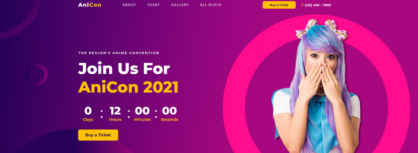
In addition to text, you will need pictures, videos, and photos to make a selling landing page. Where to buy images for website? You can choose from stock, professional, and DIY photos. When selecting photographs, check whether they adapt to the description of your product or service and attract customers. For example, in the exhibition website template , we observe various paintings that ideally match the atmosphere of a gallery.
2. Determine the Target Audience
Each website is created for a specific public target, and each business has its potential clients. A landing page should have a particular audience, and everything should be focused on its needs. Many designers don’t consider this aspect; the immediate consequence is the deficient result of converting Internet users into clients. Let’s suppose that the tutor needs to create an online course website . Of course, some exclusive features will be a must to find students. The landing page should contain brief information about classes, special offers, and teachers.
How to Define Your Audience
- analyze the reviews of your customers;
- study reviews and cases on competitors’ websites;
- view discussions on forums and in thematic groups on social networks.
While studying the reviews, pay attention to what customers liked the most, what they were unhappy with, what they doubted, and what was unclear. This information will help you write the perfect text for the future landing page.
3. The Message Should be Simple and Concise
Internet users have many opportunities, which is the basis of a simple algorithm of website judging. The typical user “scans” a webpage, and unless he finds the accurate information immediately, he will give up trying and leave the website. To avoid such a situation, a good landing page should be simple and to the point… nothing more, nothing less! For instance, in the snowboarding website template for school, all the information is presented clearly. This is what you should strive for.
Analyse Competitors
If a client comes to a landing page from contextual advertising or social networks, likely, he has already studied information about a product or service. You need to review your competitors’ strategies to stand out from other offers and explain to the visitor why your product is better.
How to do it? Look at what search engines offer in response to queries and check social media.
4. The Call to Action Button is the “Icing on the Cake”.
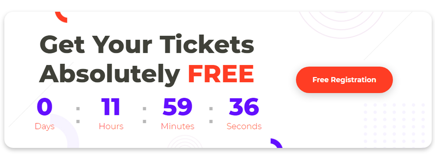
Nothing can be more annoying for a user than ending up at a dead end. Imagine you’re reading the content, interested in what the landing page describes, and then, in the end, you cannot find the call to action button. That sucks, doesn’t it? This button is crucial, and sometimes it is responsible for the success of a landing page. Undoubtedly, it should contrast with the background, be big, and be highlighted enough to be noticed easily but not so bold to fatigue the readers’ eyes. Moreover, as part of the webpage, it should also match the color and typography used.
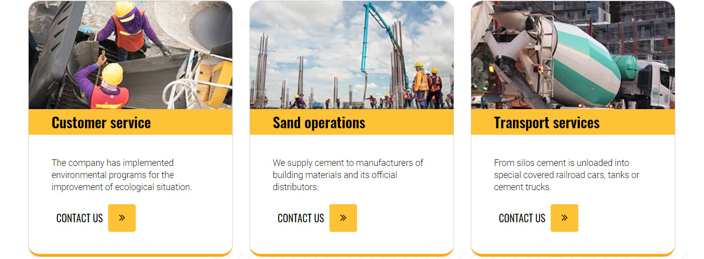
Once again, it’s necessary to emphasize that the call to action button should be designed depending on the targeted audience. For example, we see an orange-and-white design decision harmonically adapting to a building website.
5. How to Create a Landing Page? Guarantee Easy Website Navigation
Make searching for information on your site easy. Pay maximum attention to the structure of each block. 60% of the success of a one-page page depends on the literacy of the presentation of information. Simplify the consumer’s life, and supplement it with bullets, icons, lists, and video files. Do not post long, monotonous text that will lead the reader to sleep. Spread comprehensive information, but keep it as short as possible. Still, if necessary, it’s possible to design a killer long-form landing page successfully.
Many people who decide to create a landing page independently do not devote enough time to structuring, hierarchical arrangement of blocks, and displaying info content. As a result, the landing page is not getting high conversions. Try to find something between text and graphic files without oversaturation of the site with either one or the other.
6. Convince People That You are Reliable
We bet you receive at least one spam message informing you about an irresistible offer every day. It wouldn’t be something terrible if it were real. These daily emails convince people that sometimes the Internet cannot be safe enough and that behind everything, any opportunity is spam. This behavior affects the right and fair opportunities – therefore, a landing page should convince the readers that it’s not spam. The problem of trust is very delicate, so you should treat any details carefully.
Power of Testimonials
The use of testimonials page is an effective solution for assuring people about the reliability of your services. A client trusts another client – it’s an unwritten marketing rule. Reviews from customers in text format or video can act as social proof and help to form a positive impression on the consumer about the offer. Thus, you push visitors to action.
Describe Your Benefits
To increase product loyalty and interest, benefits play an essential role. Logically, the visitor should know what benefits of the company or product he receives. After all, various companies can present the same equipment, but with the rental equipment template , you can convey to the consumer that he needs the product you offer here and now. Speak about the benefits in an accessible and understandable way, and emphasize them with the help of lists so that they are easier to perceive by the eye.
6. Trust But Verify
Checking how your page works is another prevalent suggestion. With built-in Google Analytics integration, you can analyze statistics, provide customers with their requests, and raise the conversion rate. Overall, testing is significant, and you may constantly improve a landing page.
Any entrepreneur or website owner wants instant profit, and sometimes the expectations are too high. Having adequate expectations from a landing page is extremely important. There is no miracle in business, just hard work, and entrepreneurial spirit.
Altogether, the above tips are the essence of the most efficient landing pages, so you’d better treat them seriously.
How to Launch Your Page on MotoCMS – Practical Advice
We guarantee that you can start presenting your business online even without coding skills. Just customize it according to your needs and enjoy the benefits.
- First, choose a user-friendly theme to help you present yourself or your business niche at its best. A flexible layout will take care of the site’s look on various devices. Still, you can always use a preview option. In case there are some problems at an early stage, our support team can quickly help you make a step toward a profitable future.
- Purchase and get the template’s source files with a unique license key for other template installations.
- Upload MotoCMS Installation Wizard that helps to save a template on a server faster. Then you indicate your license key and get all the source files. Now you’re ready to change everything you want with a convenient admin panel.
- Fill your theme with relevant content. If you don’t have the desire or inspiration to do it alone, our SEO experts can create an optimized site for you.
- Tailor every design detail according to your requests – change colors, background, typography, etc. Don’t forget to save all the updates.
- Check how your site looks with the preview option and publish it. Add an advanced contact form , Google Maps, and necessary social media buttons.
How to Increase Conversions
Besides organic search and paid advertisements, there are three main ways to improve your rankings without additional help:
- email marketing;
- web push notifications;
- landing page SEO optimisation .
How to Create a Landing Page that Works – Explore Common Structures
The structure of most one-page pages is based on two classic formulas: AIDA and PMPHS. Focus on them, but do it carefully so the content does not look artificial.
AIDA
- attention (attention): the first screen with a unique offer;
- interest: a detailed description of the benefits;
- desire: discounts, gifts or a limited-time offer;
- action: button CTA.
PMPHS
- pain: attention to the problem (“Can’t find ideal clothes?”);
- more pain: a description of the consequences of an unresolved problem (“You will lose potential clients”);
- hope: a hint of an opportunity to get out of the situation (“You don’t have to spend a lot of money”);
- solution: Your product that solves the problem (“Download our Page Optimisation Guide – and improve your site’s rankings in ten easy steps”).
Tip: in the article Drag and Drop Landing Page for Business you can observe some examples of successful business decisions and figure out the key components of a one-page site and its tasks.
We hope we managed to describe all the benefits and present all the necessary tips and examples on creating a landing page that works. Please share your experience and impressions with us.
