How to Innovate Graphic Design for Digital Advertising in 2024 and Beyond
Attention spans are fleeting, and trends shift in the blink of an eye. At this point, every savvy graphic designer knows that the goal is to stand out. Innovation that once was a luxury has now become a necessity.
That means we have to say goodbye to stock vectors and mundane layouts just to capture the attention of digital consumers.
But in a landscape bombarded with endless online content, how can you break through the noise and stay relevant?
Let’s dive into some best practices to redefine the essence of graphic design for today’s digital advertising and a couple of years after.
Graphic Design for Digital Advertising: What’s New?

Photo by Tirza van Dijk on Unsplash
Before we delve into the nitty-gritty, let’s take a quick peek at what’s new in the world of graphic design for digital advertising. After all, it’s a fast-paced world out there, and to keep up, we need to know what’s hot and what’s not.
What’s new in the graphic design world is the incorporation of AI– pretty much just like any other industry. The technology has revolutionized the way we approach design by offering tools and capabilities that were once the stuff of science fiction.
Remember that graphic design in digital marketing and advertising means that you should prioritize creating visuals for brands to tell their story, make a lasting impression, and ultimately drive action.
It can be designed for social media graphics, email newsletters, or display ads. The goal remains the same: to captivate audiences and inspire them to develop more meaningful connections with the brand.
Dynamic Content
Gone are the days when static banners got all of the attention. Now we’re seeing more and more ad designs that change based on our location or even ads that respond well to our browsing history.
Interactive elements such as clickable buttons, sliders, or collapsible menus are now become popular. Their appeal encourages users to engage with the design and make the experience more immersive and memorable.
The addition of animations, GIFs, or animated videos to designs also make the content more interesting to look at. No matter if it’s subtle motion effects or full-blown animated sequences, adding dynamic interactivity to digital advertising content grabs the attention of more audiences.
Personalization
When it comes to personalization, graphic design should be so much more than mentioning the first name on an email design. Consumers demand more than just eye-catching visuals and only care about brands that care about them too.
That’s why they only want content that speaks directly to them, resonates with their interests, and adapts to their preferences in real-time. In short, they want to feel special. Even a simple birthday message can mean a lot to them.

So, the entire visual experience should feel like it’s tailor-made for each individual. From selecting the right fonts and colors to curating imagery that resonates with specific demographics, every element of the design plays a crucial role in creating a sense of more in-depth connection.
Emotional Design
Let’s be honest. We’re all tired of seeing a faceless brand doing the same same-old design and marketing messaging. Today’s consumers crave experiences that evoke emotion and meaning.
And to nail the emotional design, you need to understand the brand personality. Think of brands Dollar Shave Club, or Skittles, which are known for their quirky and humorous advertising campaigns.
Nike’s “Just Do It” campaign is also a prime example of inspirational advertising that encourages viewers to push beyond their limits and always strive for greatness.
Also, remember the classic Old Spice, which always showcases its personality in every campaign.

Social Media Integration
There are at least 4.5 billion social media users worldwide. This means that your designs should be social media-friendly and keep it updated with YouTube trends for video content. Use vibrant colors and compelling typography for headlines to capture users’ attention as they scroll through their feeds.
Remember that different social media platforms have unique design specifications. The square format of Instagram posts, the vertical orientation of TikTok videos, or the text-heavy nature of LinkedIn updates.
Cultural Relevance
Thanks to the internet and social media, more and more people are opening their eyes to the diverse array of cultures and perspectives present in the world. Now, there’s a growing appreciation for advertisements that reflect and celebrate this cultural diversity.
Since geographical boundaries are no longer established, brands can easily reach diverse audiences across cultures, languages, and demographics. To effectively engage with these audiences, graphic designers must be aware of cultural nuances, preferences, and sensitivities.
Be more mindful of cultural differences, taboos, and sensitivities to avoid inadvertently causing offense or misunderstanding. Designs that are culturally relevant and respectful are more likely to resonate positively with audiences and foster goodwill towards the brand.
Next-Level Graphic Design Strategies for Digital Ads
Now that we know what’s new in graphic design for digital advertising, let’s explore some strategies for innovation in this fast-paced field.
However, one thing to remember: innovation in graphic design isn’t just about following trends or adopting the latest tools. You need to think more about creatively pushing boundaries and capturing the audience’s attention.
Think Like the Customers
Begin by understanding your target audience’s preferences, behaviors, and expectations. Immerse yourself in a deep research to gain insights into what resonates with them visually.
This should definitely go beyond knowing basic demographics—instead, it should dive more into factors such as interests, pain points, aspirations, and media consumption habits.
You can also see how other brands with the same niche create their designs. Take note of what you can do better and how you do it.
Another way is to imagine yourself in your audience’s shoes. When you think like them and experience things like them, you can better empathize with their needs and create designs that resonate with them on a deeper level.
Let Them Join the Fun
It might be just a boring ad when customers can only become passive observers in front of their screens. But when you give them an interactive experience, they’re intrigued to engage in all the visuals.
Creating micro interactions gives them a chance to interact with the ad through clicks, swipes, or other gestures. This is how you can create a more immersive and memorable experience that stands out in endless static content. They form stronger associations with the brand when they actively participate in the ad experience.

Add the Tiny But Mighty Motion Graphics
Speaking of interactive elements, there is no better way to get audiences’ attention than through the use of motion graphics and videos. These visual types bring static designs to life and add a dynamic and engaging element. Even better, they turn those complex messages into smaller, snackable chunks and evoke powerful emotions.
Both also provide a powerful platform for storytelling and narrative-driven content. They allow designers and marketers to convey brand stories, product benefits, and key messages. No more dense jargon left unexplained, or stories left untold.
Not only that, though– both motion graphics and videos help reinforce brand personality and identity through visual elements such as colors, typography, and animation styles.
Aligning these visual elements with brand values and messaging can strengthen brand recall and recognition among their target audience.
Remember the Netflix “ta-dum” intro with the zoom-in to the yarn-like animation when a show is about to start? Or the bouncy Pixar lamp hops onto the screen before a movie begins? These iconic motion graphics have become synonymous with their brands, and we instantly remember their visuals.
Easy on the Eyes, No Matter the Screen Size
Great digital advertisements are those that can be clearly seen on all devices– desktops, mobiles, tablets, etc. It should seamlessly adapt to various digital platforms, screen sizes, and user experiences.
Adaptable design begins with responsive design principles, which involve designing layouts and graphics that can dynamically adjust and reflow based on the screen size and orientation of the device being used.
Also, mobile web video ad viewability worldwide is at a staggering 80%. This widespread adoption of mobile devices– including smartphones and tablets- makes prioritizing mobile optimization in graphic design for digital advertising is crucial.
Adaptable design techniques such as mobile-first design and fluid layouts ensure that your ads are optimized for smaller screens and touch interactions, delivering a seamless and user-friendly experience to mobile users.
The ads that you design should maintain visual coherence and readability across all screen sizes and give a consistent user experience regardless of the device. No matter what device the customer is using, they won’t miss anything from the design experience.
Let the Fonts Have Their Say
Typography might seem like a mere detail in graphic design, but it’s effective in shaping the visual identity, readability, and impact of digital advertising. Innovative typographic choices, such as expressive fonts, hand-lettered scripts, and dynamic typography animations, can help evoke the desired mood, tone, and atmosphere of the website. Thus, it’s essential to choose the perfect fonts for your web design.
Through typography innovation, designers can push the boundaries of traditional type design to create and show a unique personality. With a well-executed typography innovation, you can design a campaign that has a distinct personality that resonates with consumers and reinforces the brand’s positioning in the market.
For example, a digital advertising campaign for a luxury fashion brand might utilize custom-designed serif fonts with elegant, flowing curves to evoke a sense of sophistication and luxury. Or, a tech startup aiming to convey innovation and forward-thinking might opt for a sleek, minimalist sans-serif font with clean lines and geometric shapes.
Everyone Deserves a Clear View
Accessibility is rooted in the principle of inclusive design. By inclusive, it means the design experiences can be accessed and enjoyed by everyone– regardless of their abilities or limitations.
Be more aware of the colors that you choose since not everyone has a normal vision. The fonts you choose should also be accessible and readable for every audience.
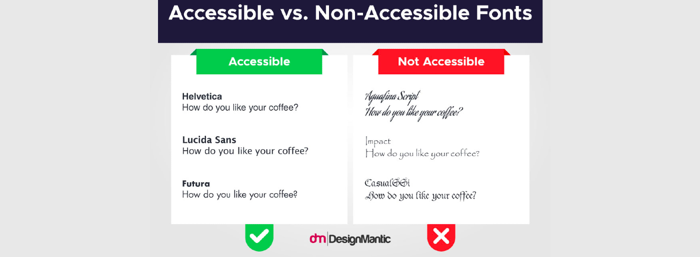
Here’s an example of accessible vs. non-accessible fonts. For people with poor vision, the second one could be a real struggle. They might not even recognize it as a font, let alone read it.

Accessibility is closely tied to usability and user experience. Designs that are accessible are often more user-friendly and intuitive for all users, not just those with disabilities.
Team Up and Mix It Up
One of the most overlooked things about graphic design for advertisement is the collaboration and communication between graphic designers themselves, copywriters, marketers, and other relevant stakeholders.
Sure. Each of them has different expertise, perspectives, and objectives. But, when they work together and understand each other’s perspective, it sure leads to more cohesive and effective advertising campaigns.
Graphics designers need copywriters to complement their visual elements with compelling messaging that resonates with the target audience. Meanwhile, copywriters might not have expertise in visual design principles or software tools, but they need graphic designers to bring their words to life.
The collaboration of the expertise of each team member makes it possible for brands to come up with captivating visuals and persuasive copy– and overall implement even more effective marketing strategies.
It’s Time to Round Up All the Eyes for Your Designs
The fancy and colorful design doesn’t always mean effective communication. Simplicity can often be more impactful than complexity. Therefore, the key to an effective design for digital advertising is creativity that grabs the audience’s attention at first glance.
There’s no doubt that well-crafted designs can result in an effective campaign and even overall business success. One thing to bear in mind here, though, is that it all depends on the audience you want to show the design to.
Tailoring your design to resonate with their preferences, interests, and needs makes sure that you get the maximum impact. Marrying creativity with a deep understanding of your audience, create designs that not only catch the eye but also make them remember it. At the end of the day, your design should be able to boost engagement and even conversion.


Leave a Reply