How to Make a Beauty Website: 5 Helpful Tips for a Good Start
They say beauty makes the world go round. It inspires poets and musicians, artists and sculptors to create masterpieces. Even if we are totally convinced that only the inner beauty matters, we can’t deny the fact that people have always been preoccupied with their appearance. And will always be. That’s why the beauty business will never bow out and the competition will never become less tough. In this article, you will learn how to make a beauty website that brings profit with ease.
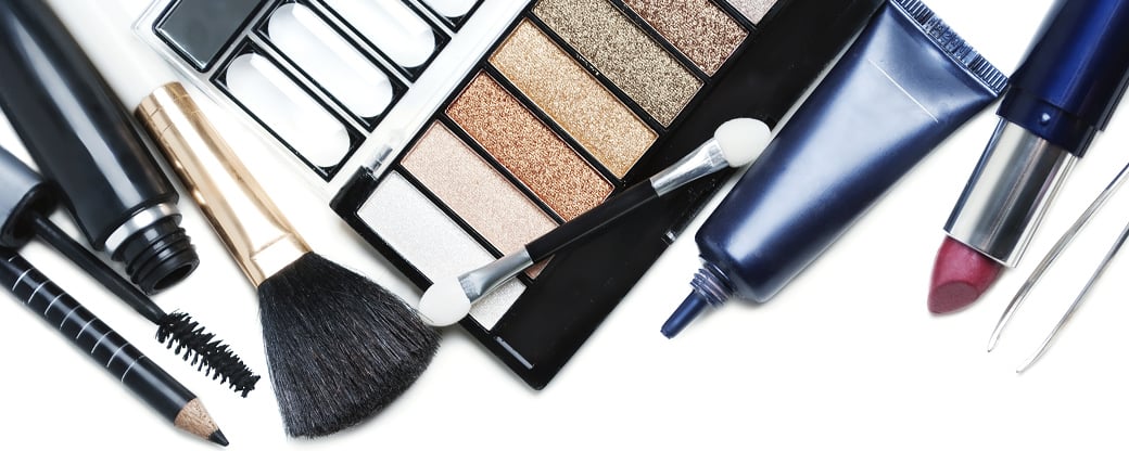
Being engaged in beauty business you’ve definitely already realized that you are to struggle for your customers constantly. Your website should become your main citadel and one of the main engines for your business growth and development.
How to Make a Beauty Website
Is it possible to make a beauty website that will provide you with new clients and increase your profits if you are not an IT geek? Thanks to the enormous collection of ready-made professionally designed beauty website templates, the admin panel of MotoCMS makeup artist website builder can become your starting point to success. No coding or technical skills are required. You are to choose a theme that appeals to you and enjoy the process of creation with a built-in user-friendly admin panel.
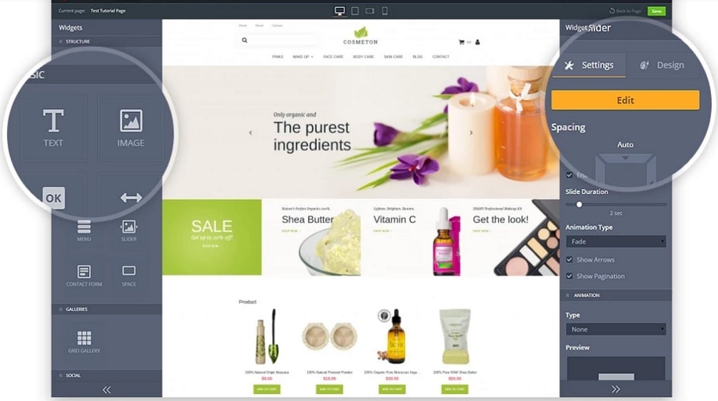
Whether you are a hairdresser or a barber, a stylist or a tattooist, whether you own a spa salon or a message center, sell cosmetics or jewelry here are several useful tips on how to make your beauty website stand out in the crowd and work for your benefit.
Make Responsiveness One of the Highest Priorities
According to the StatCounter’s statistics, in October 2016 Internet usage by mobile and tablet devices exceeded desktop worldwide. Mobile and tablet devices accounted for 51.3% of internet usage worldwide compared to 48.7% by the desktop. The conclusion to be made is obvious. Your website should be 100% responsive not to lose more than half of your potential customers.
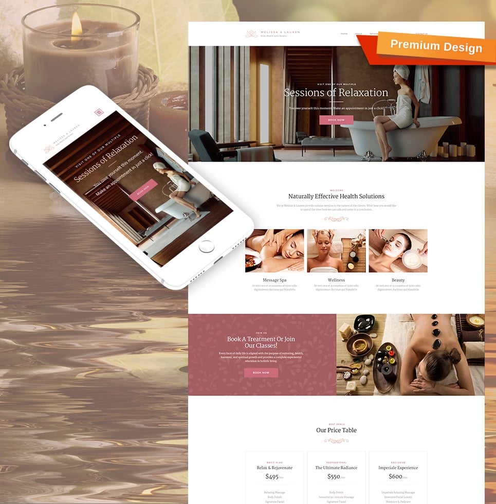
Responsive design makes your web page based on beauty salon website builder look good and work properly on all devices: desktops, tablets, and phones. Your customers will be saved from annoying zooming and side-scrolling in order to see the whole page. Responsive design enables your website to automatically respond to any user’s device thus providing a better user experience.
Increase Brand Recognition and Trust with a Proper Domain Name
Choosing a domain name resembles choosing a name for your child – it requires much thought and due consideration. Your domain name is the first impression of your business. It is your identity on the web. Moreover, your website domain name affects SEO. Consequently, the right choice can increase both your brand recognition and search rankings.
A domain name should be catchy and memorable. At the same time, it should be understandable and arouse trust. If your imagination refuses to help you, take advantage of a thesaurus to find interesting words that fit your brand. Try using keywords that describe your business and the services you offer. You can also include the name of your city or state if your business is local.
Choosing a domain name, keep it short and easy to spell and pronounce. Never use numbers and hyphens. If your domain name is too long and complex, your customers may mistype or misspell it. And you definitely don’t want them to visit another website instead of yours. Before making a final decision, check it using a so-called “radio test”. Ask your friends to spell it and find out how does it sound.
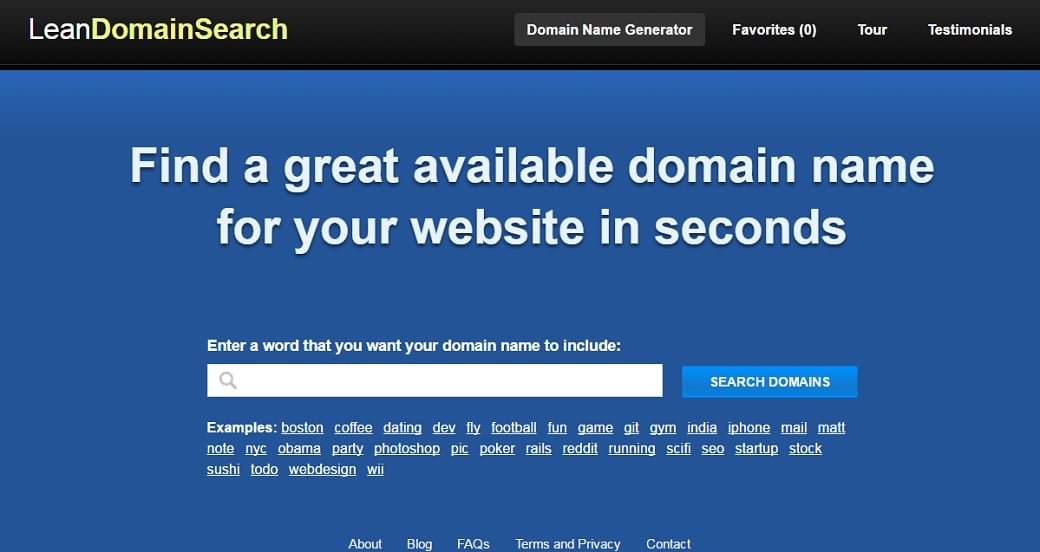
There are millions of registered domain names, so most single-word domains are already taken. Free domain name generators such as Lean Domain Search can become a solution to the problem. They can turn your ideas into fresh, available domain names in no time.
Grab Attention from The First Second
Your website homepage is the place where your visitors land to start their journey. That’s why its importance can’t be overvalued. Namely, your homepage defines your customers’ further actions – whether they will stay and study your offer or whether they will abandon your website and deal with your rivals.
So, the purpose of your homepage is to captivate your visitors, give them a clear idea of your products and services, and encourage for visiting other pages of your website. Your homepage should have both simple layout and navigation. Don’t overwhelm your visitors with an enormous amount of text, widgets, calls-to-action, links, and general clutter. Never make your visitors stumble upon the information they aren’t looking for.
Design a simple and clean homepage with an easy-to-read text, plenty of white space and clearly labeled sections that make navigation a breeze. Make sure that all of your most important content and images are kept above the fold (the part of the page that is visible without scrolling).
Pay great attention to the use of fonts and colors when getting started with hair salon website builder. Both of these design elements are known to have a psychological effect on website visitors. Your fonts should be easy to read. Avoid using too many different fonts and too decorative or small ones.
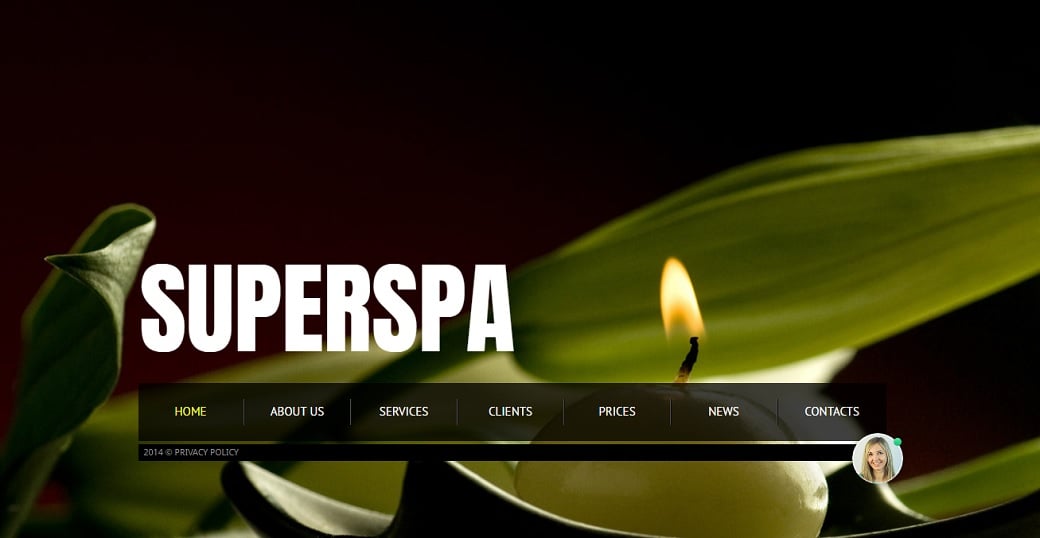
When it comes to massage website builder, pay attention to the color palette of your website. It shouldn’t be too complicated. When in doubt, just keep it neutral. Ensure that the color scheme and background work well together and set the proper tone for your page. Don’t choose a background that steals the focus from your main images and text.
Make Visuals an Essential Part of the Content
It goes without saying that a website is a highly visual medium. One image can be worth a hundred of words because our brain has a peculiarity of processing visuals 60,000 faster than text. Integrating visual content can significantly boost the amount of information your visitors absorb and remember. When it comes to the beauty business, the importance of visuals increases ten times.
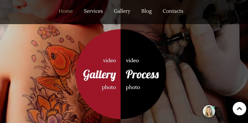
Use a background slider on your homepage to draw the attention of your visitors and convey the information without superfluous text. Add a touch of depth to your website with the trendy parallax effect to create a sense of presence.
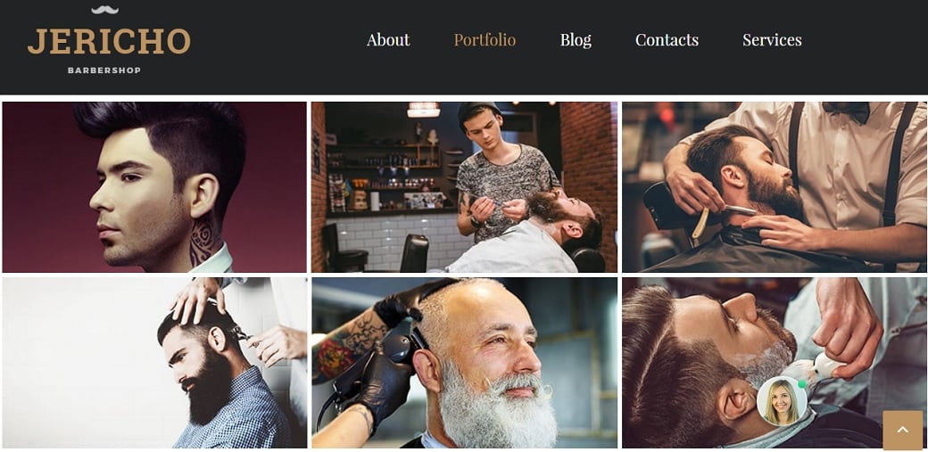
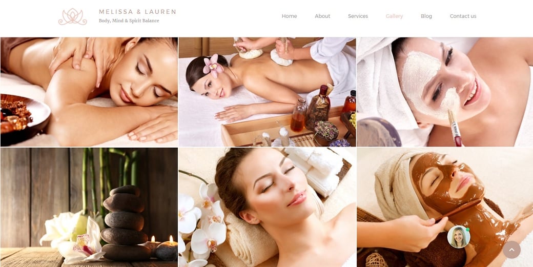
Showcase your products and services using a carousel slider, a slider with thumbnails or a grid gallery to highlight their quality and effectiveness.
Enliven your website with video content to engage your visitors and increase the time they spend on your website. Bear in mind that your visuals should always be unique and of high quality to achieve the desired result. Poor quality of visuals will not only leave your visitors indifferent but is more likely to frustrate them and make abandon your website.
Educate Your Customers
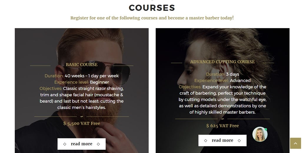
It’s a wise thought to show your customers that you take care of their interests and needs. Provide your visitors with a valuable content offer such as a free whitepaper or an eBook. Your visitors may also be grateful for a video course or a tutorial on your products. It’s also a good idea to ask them to sign up for your newsletter in exchange for this information.
We mentioned just a few tips that may be helpful for you as a beauty business owner. These recommendations may seem a drop in the bucket. But even the heaviest shower begins with a single drop and the deepest river originates in a tiny stream. So, don’t waste your time and start to make a beauty website right now by launching one of MotoCMS templates free of charge.



Wow! You’re a real beauty and marketing expert, you know! What about the technical part? Not every beauty blogger or beauty salon can afford to launch a website by themselves, be that due to the lack of time or technical skills. My recommendation is WPMatic, as they created websites for me (real professionals, I must admit) and are maintaining them from the very beginning. Btw, would you recommend a good hosting?