How to Make a Video Website: Simple Tips for Rookies
Video is taking content marketing by storm, – the researchers say. Videos create visibility of any brand and arouse customers’ interest. The value of videos is realized by all businesses. According to Cisco by 2017 video will account for 69% of all consumer internet traffic. Nielsen claims that 64% of marketers expect the video to dominate their strategies in the near future. Demand generates supply. Consequently, the number of companies suggesting their services is increasing day by day. If you are already in this business it’s needless to remind you that competition in your field is tough. That’s why you need to take some steps not to fall behind and occupy a leading position. Your business won’t become profitable nowadays until you make a video website and go online.

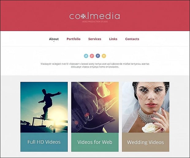
MotoCMS is eager to offer you a helpful hand in gaining success. You’ll definitely find the best solution with its gorgeous high-quality video website templates. You have a unique chance to make a video website for your video or film production company, movie studio, TV channel or news website in a flash.
How to Make a Video Website
Whether you’re just starting out in video production, or if you already have a rich experience the sense is the same. You need to take consistent action to make your video business flourish. In this article, we’ll try to give you some tips on how to make a video website more attractive for your visitors and provide it with traffic growth and conversions rise.
Make Your Customers Trust You
It goes without saying that building trust among your customers is extremely important. The scheme is as simple as ABC. No trust – no clients. No clients – no business. A research study titled “Trust and Mistrust of Online Sites” has shown that design elements are much more powerful than content, in terms of mistrust. Being asked to explain the reason for their mistrust, 94 percent of potential customers mentioned different web design elements.
To cut a long story short, trust decreases as usability declines. And vice versa, a professional well-engineered modern design helps to build trust and guides visitors to take action. Just keep in mind that a proper videographer website design is an excellent way to create a user-friendly environment. It will make your customers continuously return to your website and do business with your company.
Think out Your Home Page in Detail
You should always bear in mind that the key goal of your website is to satisfy your customer. Your homepage is the first thing your visitors come across. And even a kid knows that the first impression is the deepest one. Exactly this very impression will make your visitor decide whether to stay and take action or leave – it’s as simple as that.
Choose a template to make a video website that will fit your brand like a glove and stress your individuality. As usual, visitors expect to see your logo in the top left corner. Clicking on the logo should take them to the home page from every internal page.
Make sure the most important elements such as value proposition, some visual and call to action are visible without scrolling. Your visitor should see the answers to his most important questions right in front of him to realize that you are the company he is looking for.
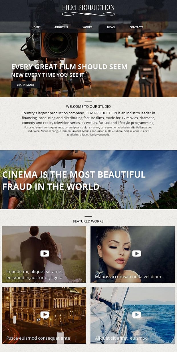
Use a hero image to catch your visitors’ attention and to create an unforgettable atmosphere of your website.
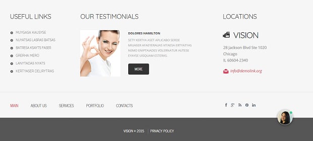
Don’t forget to place your contact information in the footer not to miss out your potential clients.
Choose the Right Proportion for Content and Space
By making your message short and to the point, you help the customer to memorize it easier. It should contain the clear answer to the main questions: what the website is about, what your client can do here, how useful it is exactly for him or her and why your client shouldn’t look for another one.
Empty space is also important. Don’t try to fill all the available space with information. Spacing is a good way to give balance, proportion, and contrast to your page. It really helps you to make things clearer.
Use Simple Navigation
Do you know that 35% of customers fail to complete simple tasks on the average website because of too much clicking and too much scrolling? Imagine that your grandmother is visiting your website. How long will she try before giving up? Good navigation should be so intuitive even your grandmother can understand it.
The navigation can make or kill any website. If it is difficult or frustrating, your potential customer will leave and try on another site – and that is your lost opportunity. Don’t try to innovate here. Use horizontal and vertical menus the majority of people got used to. Make sure that it is quite obvious how to navigate your website and move from section to section.
Call to Action
Call to action buttons are part and parcel on your website. These prompts tell the visitor to take some specified action. They make it clear which action to take next and encourage customers to continue interacting with the website. A website without a call to action is incomplete and ineffective.
A good call to action should be convincing and provocative. It should be more descriptive than “click here”. The use of command verbs will make it clear just what clicking a link or button will lead to. It’s also important to give your customers a reason why they should complete your call to action. Giving a call to action a sense of urgency can also help.
Exploit Creative Ways of Content Presentation
If customers come to a video website it’s evident that they expect to see your abilities with their own eyes. Skillfully written appeals are great, but your potential customer needs much more to choose you.
Showcase your creativeness and uniqueness with the help of your gallery. Use various sliders. Your gallery should become a special appeal for your visitors. It should make you stand out and persuade customers that you are the best solution for their problems.
Keep Your Customers Informed at Every Turn
A blog is a must-have thing on your website. It is an amazing opportunity for sharing the latest news of your company and keeping in touch with your customers. Try to make this page a bit of personal and emotional. Your personality is what will make people want to work with your again. Engage your customers by allowing them to vote and comment on your posts.
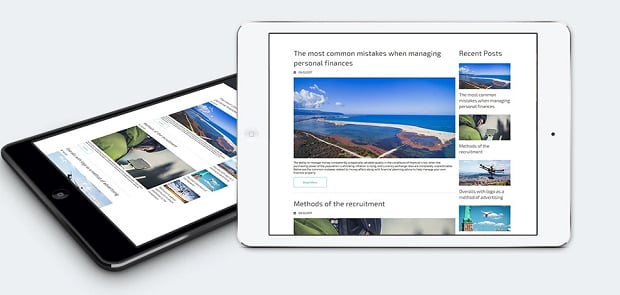
At the same time, a blog page is a wonderful chance to grow your traffic via creating SEO-friendly blog posts.
Make a Video Website for Free
Your future is in your own hands. Success is a real thing we can reach together. So, don’t waste your time. Choose a template and ride the wave with MotoCMS right now in just a few steps!
- Launch any theme from the collection of our templates;
- Start creating your video website free of charge;
- Do results fit your requirements? Buy out your theme with all modifications at the end of the 14-days trial period!
That’s it! To log in to the website creator, you need only your email or social media account and less than a minute of your time. Instead, you get priceless experience both literally and figuratively. Make a video website that rocks with MotoCMS!





Leave a Reply