How to Make a Web Design Website: 7 Hints for Effective Online Presence

Web design is obviously one of the most competitive business fields nowadays. Choosing it for your career, you were certainly aware of the enormous amount of effort you would have to make to occupy a reputable position among your competitors.
Unfortunately, all your talent and professional skills are not enough for achieving your aim. Today you should not only produce a high-quality product to succeed. You should be able to present it properly to your customers. And the fastest and easiest way to do this is to make a web design website.
MotoCMS with its rich collection of ready-made website templates is eager to offer you a helping hand. It won’t take you long to choose one of the amazing themes that will suit your business perfectly. Whether you are a graphic or web designer, work at a web design agency or prefer the career of a freelancer, you will be able to create your own stunning website in no time and without any line of coding.
How to Make a Web Design Website
If you are a web designer it would be ridiculous to teach you how to grab the attention of your visitors with the appropriate use of colors and shades. That’s why we’ll try to concentrate on several other things that are of vital importance when you go online and teach you how to make a web design website work for your reputation and prosperity.
Set Clear Goals
The thing you should start with is to clearly determine your goals. It’s impossible to make a website that will attract the entire humanity. That’s why it’s a good idea to think your expectations over to find the better ways of achieving your aim. Clear goals will help you measure the success or failure of your website and provide you with opportunity for improving if something gets out of hand.
You should concentrate on four essential questions:
- What is the main purpose of your website?
- Who are your customer personas?
- Why will people come to your website?
- What action do you expect them to take?
This knowledge will help you to focus on the proper content and design of your future website.
Don’t Overdo with Creativity
It goes without saying that if you are a designer you are an extremely creative person. Creativity is your lifestyle and the very thing that gives you an opportunity of standing out in the crowd in your business. But don’t let it play a bad joke with you while creating your website.

“Simplicity, simplicity, simplicity” as the classic said. This refers both to the website functionality and content. Always bear in mind that what is completely clear to you might not be the same to everyone who visits your website for the first time.
The simpler the structure of your website is, the easier it is for your visitors to navigate it. Each section of your website should tell a story: a reason and a final outcome for the visitor, for instance, a call to action button. Think of the simplest layout that will be enough to highlight the content and induce the visitor to take the desirable final action.
Focus on Readability
Pay a great attention to readability. There’s no use of even the most breathtaking content if it is difficult to perceive. Choose a font that is easy to read, clear and of comfortable size. Don’t use too decorative or too small fonts for your texts. Never forget about white spaces around them. Try not to use too professional language describing your services – speak the language of your customers if you want to be understood.
Call to Action
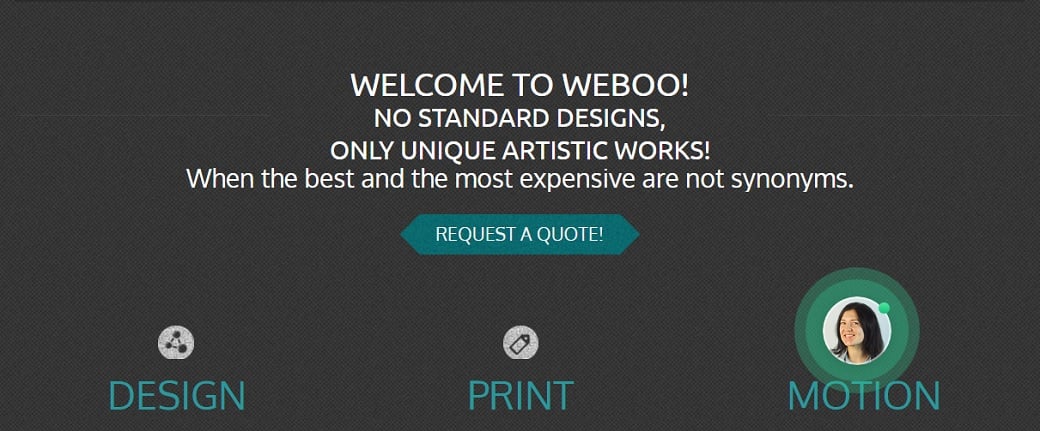
Call to action buttons should become the final chord of your customers’ visit. That’s why their place and design are of great importance. In fact, the quality of your call to action alone can largely determine your success online.
An effective call to action button should include not more than four – five words. Its text must be clear and action-oriented and, if possible, convey a sense of urgency. The text and images around the button should clearly explain to the customer what he will benefit from taking the action.
The color of a call to action button should match your entire website color scheme but at the same time show up prominently on the page. The text should be easy to read. It’s important to place the button very strategically. On the one hand, it should be situated high enough on your homepage so that your visitors won’t miss it. On the other hand, it shouldn’t appear unless you’ve successfully made your pitch.

When the visitor’s eyes land on this button he should already realize what your business is about and what he can benefit from dealing with you. Remember to leave some white space around your call to action to let it breathe and prevent your mobile visitors from accidental clicks.
Shout about Your Success
It’s a common knowledge that in good old days modesty was one of the main features a girl should possess to be accepted and appreciated by the society. There’s no place for shyness when it comes to your business promotion. In this case, you should be able to show off your success to be noticed.
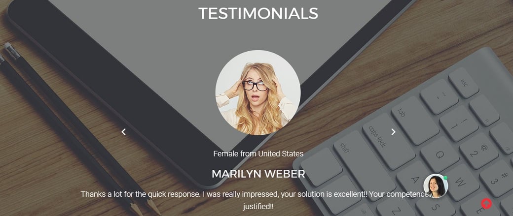
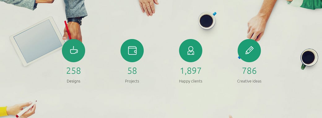
Use testimonials of your clientele to prove that your brand is worth attention. Direct quotes from your clients are the best reviews of your work. Showing off your clients’ testimonials, make sure that they are something that people can rely on. Add a name and a photo to give them more credibility.
Testimonials will help increase the level of trust among the potential clients by proving your experience and ability to produce top quality work. If you have any “success indicators” such as certificates or awards don’t let them dust in your office. Make use of them – put them on display. It will definitely support your image of an expert in your field and become an additional impetus for your visitors to do business with you.
Make Yourself Available
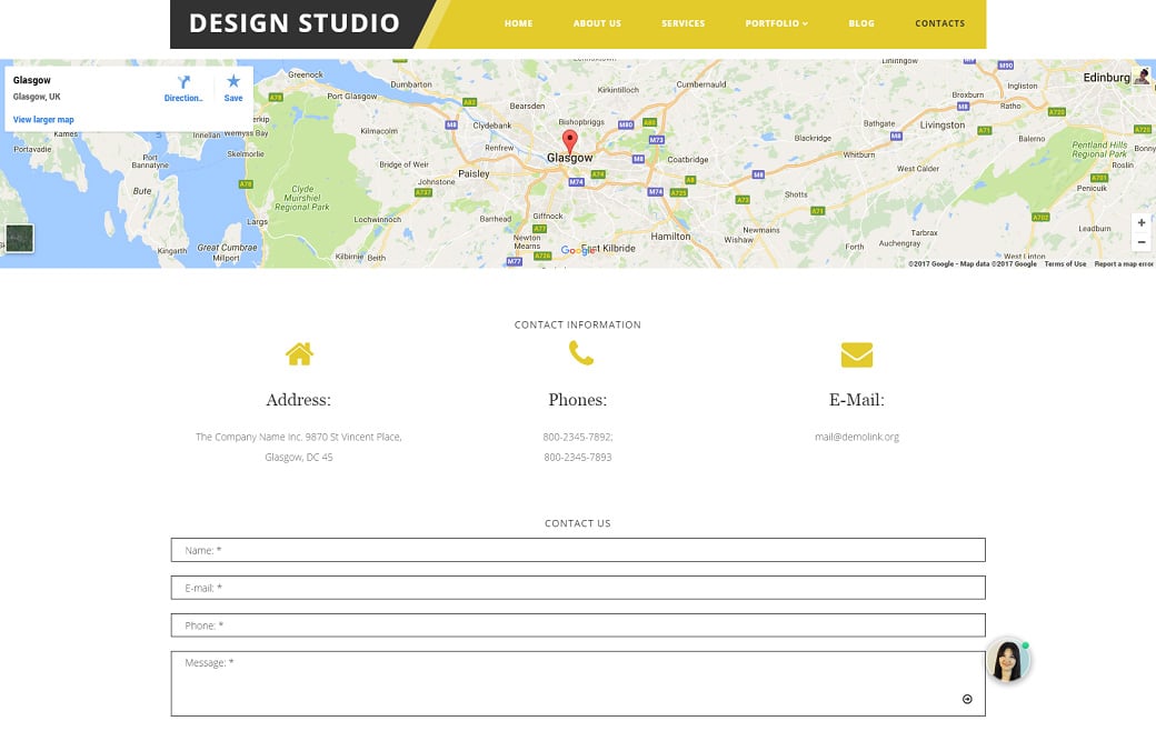
Your contact information should always be easily found on your homepage. If your website doesn’t make it clear enough how to get in touch with you, your visitors won’t try very hard to find it out. They will just leave for your competitors.
First of all, you should devote some space in the header or in the footer to tell your visitors how they can reach you. Include your address, email address, and a phone number. Different people prefer different ways of contact, so you should offer at least a couple of them. Call to action “Contact Us” and “Call Us” can also be a good idea.
Make use of a contact form. The contact form is basically a set of questions filled out on the webpage by your visitor that is automatically sent to your email box. It will enable your customers to reach you immediately without unnecessary actions such as leaving your website and opening their email account.
Google Maps on your website are one more thing that will help your customers to find your business. They show the fastest and the easiest route to you. Google Street View may give them the first impression of your business. You will save much time for your visitors if they decide to pay you a visit in real life. Moreover, they are able to provide your website with higher rankings in the web search.
Double Check All Links
Before launching your website carefully test every link to make sure they work properly and take your visitors to the right place. Broken links can have a bad impact both on usability and search rankings. Firstly, they negatively affect user experience redirecting your visitors to error pages. Secondly, they stop search engine website crawlers in their tracks preventing Google, Yahoo, Bing, etc. from indexing the page.

If your website has a lot of links free online link checkers such as Check My Links or Dead Link Checker are the very thing you need. You are just to enter the URL of your website to have it checked effectively and fast. A link checker will crawl through your web pages, find and check all the links and identify the ones that are broken giving you an opportunity for correcting them.
So, don’t shelve a motion and start building your web design website with MotoCMS right now. Benefit from each minute of your online presence and be ahead of your rivals on the way to success.



Leave a Reply