How to Make an Exterior Design Website
Home is a very special place for most people. The old saying claims “My home is my castle”. So why not turn this castle into a beautiful and comfortable dwelling? The majority agree with this point and eagerly spent a lot of time, effort and money making their homes cozy and enjoyable. Moreover, nowadays more and more attention is paid to the exterior design because a number of house owners believe the outlook of their houses to be as important as their interior design. So, there is nothing surprising about the fact that gifted exterior designers are in great demand. That is why in this article we offer several pieces of advice which can help every talented landscape designer make an exterior design website with great appearance really fast.
How to Make an Exterior Design Website
Exterior design is a complicated art that requires a fruitful combination of skill and talent. As a professional exterior designer, you should know a lot not only about design itself but also about growing different vegetation. However, if you are just a beginner in this sphere, all this knowledge won’t guarantee you immediate success. You should work hard looking for the clients. In this case, a website of your own is really valuable. Though, being an awesome exterior designer you may know nothing about web design and coding. Not a problem anymore! You can give all exterior design website templates from MotoCMS a touch of individuality effortlessly due to the possibilities that are given by a user-friendly admin panel.
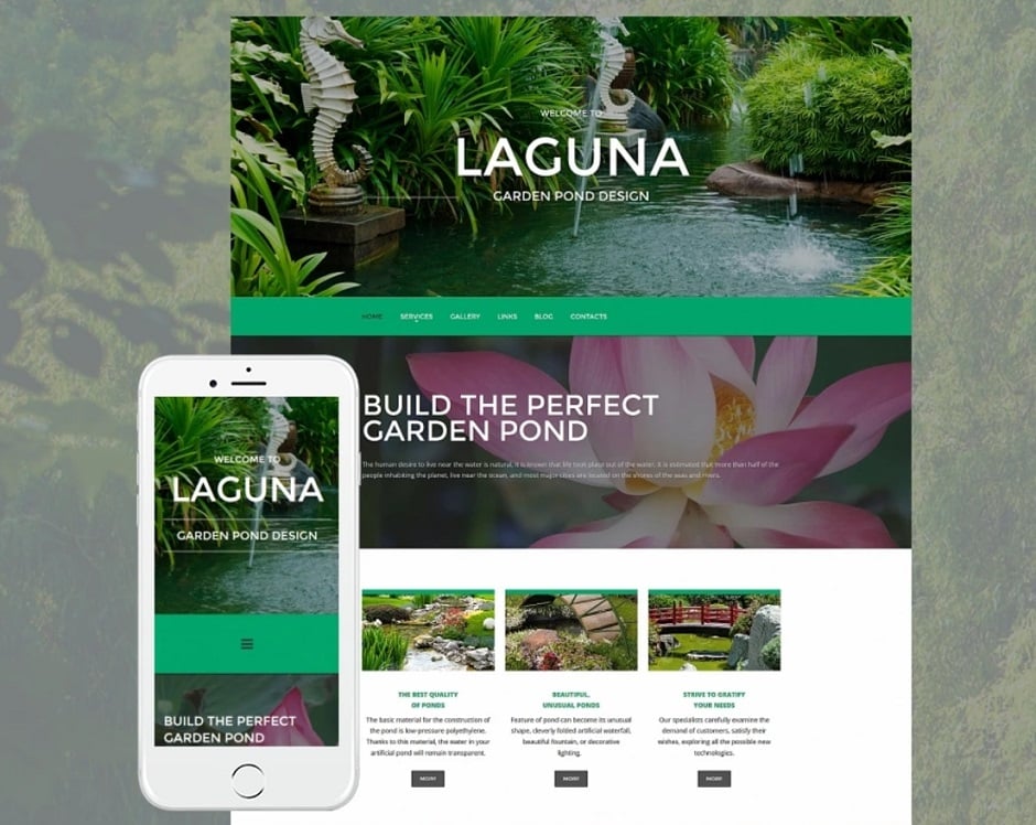
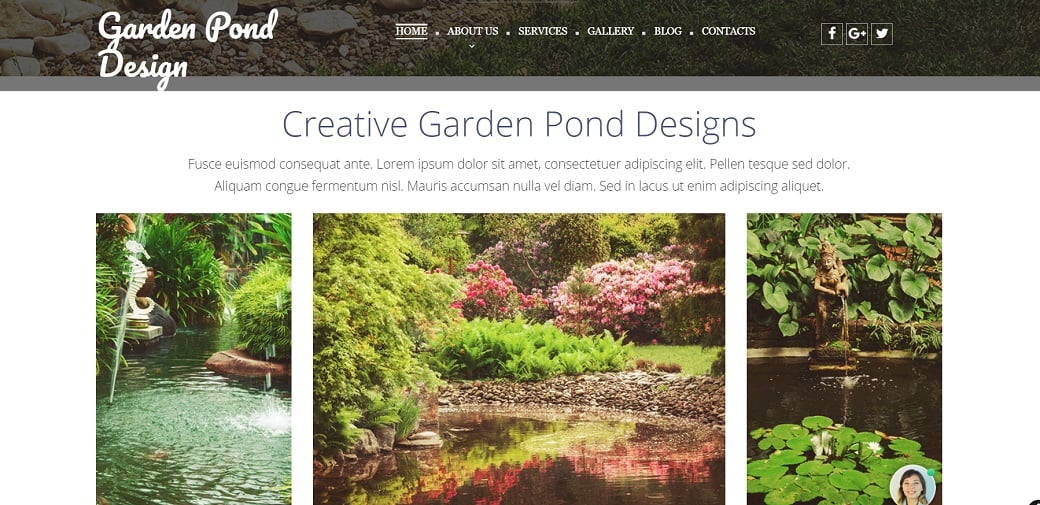
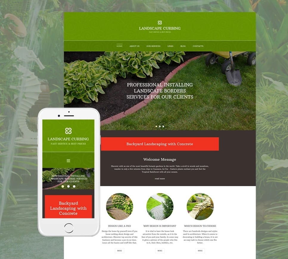
Now it is incredibly easy to make an exterior design website using one of MotoCMS templates like this awesome Responsive Theme for Landscape Design.
A stunning website is one of the best means of advertising your business, that is why its general outlook is of the greatest importance. Your visitors expect to see something really breathtaking on an exterior designer’s website. So, in order to meet the expectations of your prospective clients, you’d better take into consideration the following details.
Keep The Balance
Your chief aim is to hold a user’s interest without overwhelming him or causing distraction away from the important elements. To get this result, you should maintain the balance which is achieved by placing elements in the design evenly. You may choose between symmetrical or asymmetrical balance. Centering is the easiest way to get a symmetrically balanced page.
Moreover, if you want to put a big element on the right side, you have to place a matching element on the left. It is even better to create the balance with different elements – an image on the left and a large block of text to the right of it, for example.
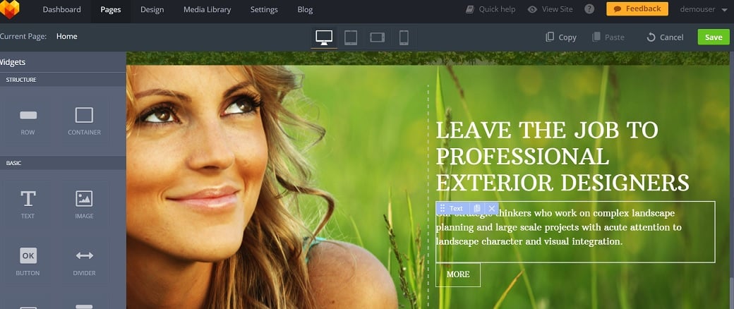
For asymmetrical balance, arrange unlike objects of equal weight on each side of the page. Use color, value, size, shape, and texture as balancing elements.
Place Correct Emphasis
Figure out which element you think to be the most important one on a website page and make it stand out. There may be more than one key element; still, you should understand that by emphasizing several elements at the same time you may slacken the desirable effect. So, to achieve better results, focus on one particular object. Emphasize the principal elements with the help of:
- Typography. Сhange the size of fonts, use bold type or unusual font colors to single out the salient element.
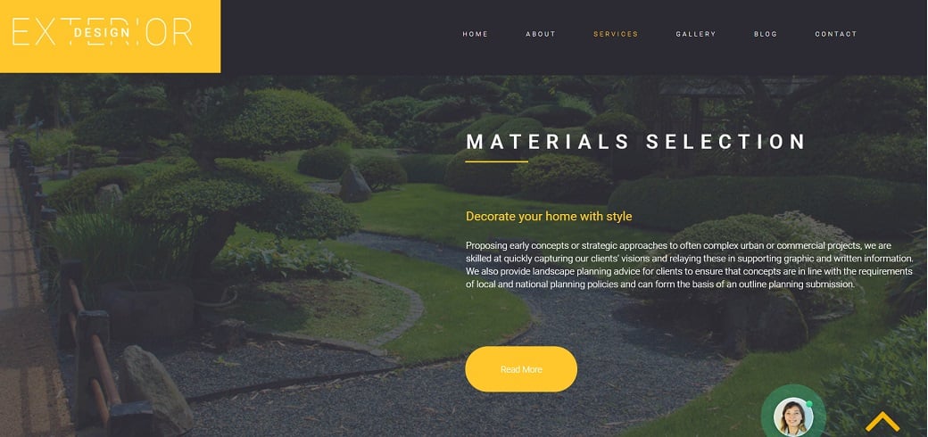
- Images. The background image is the most powerful one, use this influence wisely. Choose a large striking image as your background and add a small piece of text to stress both.
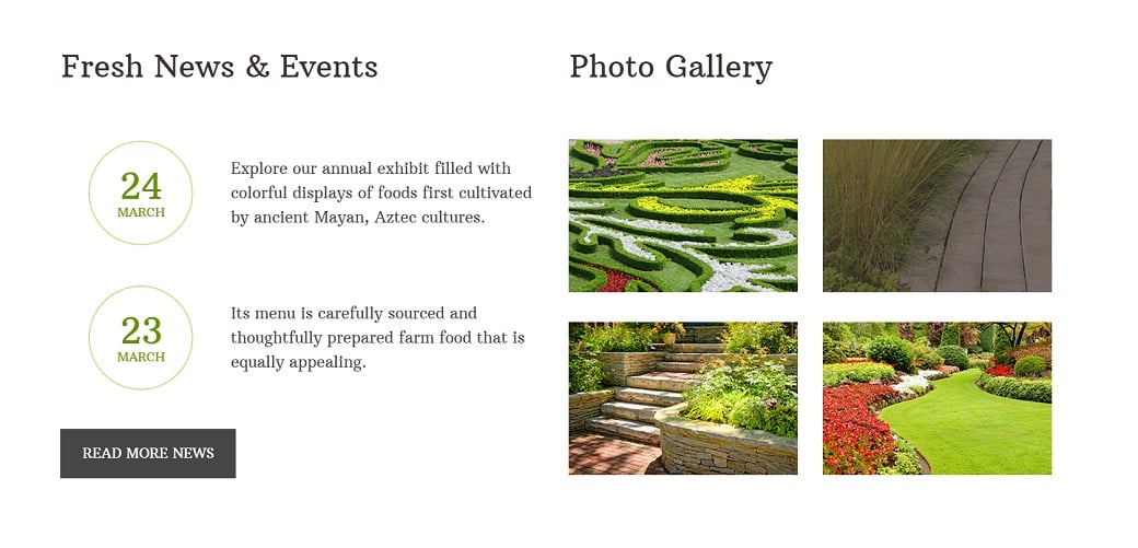
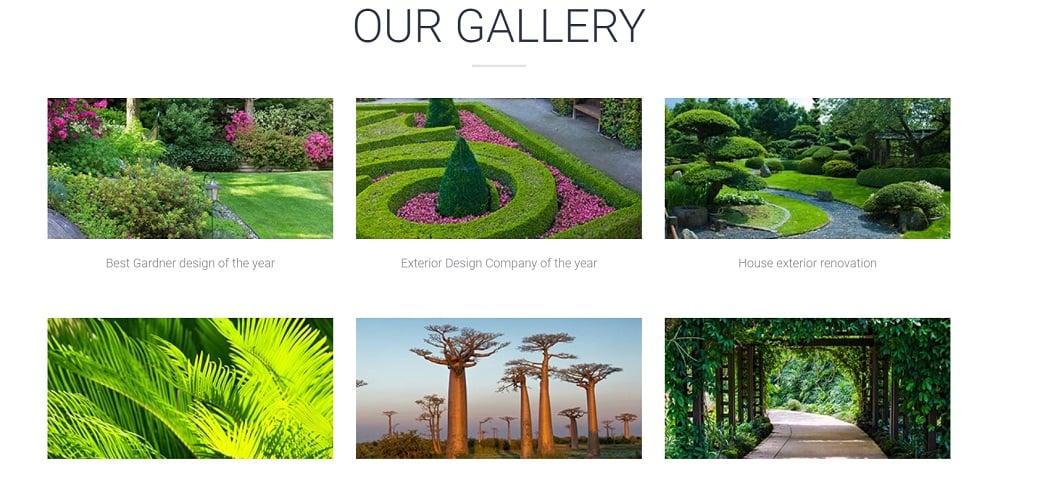
Beautiful pictures organized in galleries may also play their role in impressing the visitors. Uploading the shots of your design works made by a professional photographer is an excellent idea. Thus, you will advertise yourself alongside with creating a spectacular view.
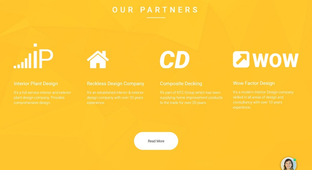
- Bright contrasting colors. This method is very effective when you apply it to the image and background, contrasting one against another. It will work with background and headline as well.
- Sticking shapes. You can place a picture with an unusual shape next to the standard square one to catch the attention. One more variant is to organize the important text in an unusual way in contrast to the ordinary text arrangement.
Do Not Fall Prey to Dissonance
At the same time, you should take care of the whole website looking harmonic. To get this result you need to be consistent with type font, styles for headings, captions, headers and footers throughout the website. Use only one or two font styles for contrast. The same is true about the sizes of your typography – too many options are not good for your website.
Be Careful with Visual Effects
Adding a visual effect for making a website more spectacular may be a wonderful idea. Modern technology offers so many extraordinary ways to do that. The admin panel of MotoCMS lawn care website builder provides you with an excellent opportunity to make your website more attractive with either animation or parallax effect.
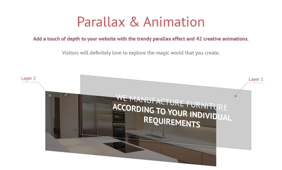
Still, do not overweight your website with visual effects. Too many effects may play a bad joke with you by spooking the customers instead of attracting.
One more thing to beware is auto-play videos. Of course, there is nothing wrong with posting such videos on your website, especially if they are informative or are related to the topic. However, this is not a good idea to play them without the visitor’s’ permission. Allow your clients to choose whether they want to see the video or not, otherwise, you risk that they will quit your website to avoid the irritating staff.
All this may sound a bit complicated, but it is not so in reality. You only need to choose any exterior design template from MotoCMS and register for a free 14 day trial period. That’s how you will certainly realize that with MotoCMS it is simple to make an exterior design website of any complexity.


Leave a Reply