Why Should Templates Follow the “Less is More” Principle?

The art of expression is tough, real tough. In the run to express wholly and more than often, in overwhelming proportions, we make the mistake of over-expressing. How grave is that mistake? No one, better than a website owner with a cluttered website, oozing with information and graphics would understand! That is the reason the dictum of ‘Less is More’ by Ludwig Mies has off late gained strong grounds on the designers’ and developers’ planet. But what factors have led to the widespread popularity of the minimalistic design approach? And why should design templates embrace this approach? Let’s find out!
1. Acknowledging the anti-clutter consumer psychology
As a web marketer, you might feel a bit offended with this statement, but yes, visitors and consumers typically have a bad eye for anything cluttered, anything that resonates the feeling of advertisement. A lot of text, scattered graphics, a cloud of odd colors, a scribble of unnecessary fonts… and more such things have subconsciously come to be interpreted as interference to information curation by the human brain. And kudos! The brain has learned to ignore these things. So chances are, if your website speaks an overwhelming lot, your visitors would dearly ignore your message. Some would make it a point never to come back. Minimalist design eradicates any such possibility. With a minimalist website, your visitors know they are not being riddled with and find a primitive authentication about you.
2. Making use of white space
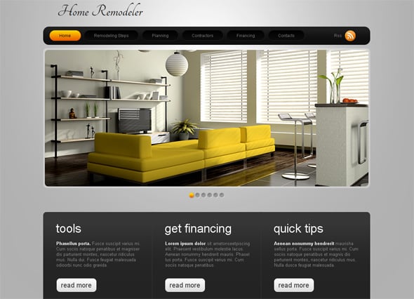
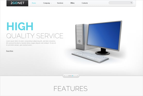
White spaces are terrifically important for websites. Yes, they can be creatively used, but they best be left white. If you have things to write, make sure they are well separated from the white area surrounding images. These spaces work as boundaries without deliberate highlighting. This element practically conveys a sense of smoothness and a fabricated business structure. Remember the time when you came across a red-blue-green-yellow website and your gut wrenched thinking, ‘Eww! That sucks… Poor guys are having a real hard time planning even a good website!’ Without enough plainness and simplicity, your visitors could think the same of you.
3. Magic with fonts
Many designers who swear by minimalism have made typography the center of investment in their websites. Nothing can look better than some big, creative reasonable alphabets, smeared together with a few catchy high definition images. The combination makes a page glow. Besides, it is important that the content catches eyes. If it were the regular ‘sans-serif’ thing, no one would take some special moments out to read what you have written. It takes patience and strain to try reading small fonts in unreasonable colors. Good fonts in good colors contribute a good-big part of a minimalist website.
4. Wisdom of precise content

Do not write much! It is against the religion of minimalism. No one is interested in how you plucked flowers and picked thorns for the successful business set up that you are today! All they are interested in is, what you have to provide them. It makes perfect sense to shrink your content volume to just the bare needful. Tell what they want to hear. It helps.
5. A better fit for responsive
Responsive websites function on fluid grids. Less content and sensible selection of images leaves ample space for the grid system to stay elastic. Your website would not have to be strained to fit all screen sizes. It is easier to build a responsive website if the design is minimal. And yes, that is imperative for you! The share of visitors that is inclining towards internet surfing through mobile devices is stunning. You simply cannot afford to stay off hook! Another statistic, 46% visitors would not come back to your site if it is not opening properly on their devices. Staying minimal is a safe deal as such!
In all MotoCMS designs there is an embedded mobile version that goes with each template and can be customized according to your own wishes and needs.
6. Sensible on loading time
Another aspect that governs the visitor stickiness of your website. If it takes more than 8 seconds for a website to load, chances are, visitors would turn a blind eye to the fanciful graphic that you have put up. A minimalist website typically houses 4-5 pages, and this fact makes website loading a pretty quick affair.
7. Less processable data for the brain

The human brain needs one second to process 400 billion bits of information, out of which only 2000 bits are remembered. When a website has a lot of information, it is a burden to go through the entirety of it and process it. The easy way out for the brain is to ignore any extra piece of information and brush it under carpet. So the result is, you do not stand any chance of business conversion. When the brain has less data to process, it tends to remember the source. Hence, even if you are currently not providing the product or service a visitor is currently looking for, he will come back to your website in the future if he needs you. You stand a chance to do potential business.
8. Less cluttered, hence more focused

Messages are conveyed clearly though uncluttered formations. Don’t make your visitors read between the lines and peep between images. It is just not fair on their time. State your message clearly and it will get delivered clearly. We all like straightforward professional behavior, don’t we?
An ending garnish – Well, let’s keep this part small. The “Less is More” saga in itself is kind of minimalistic. The designing panorama is slowly shifting towards this designing practice, and it is definitely not for no reason. Keeping it simple simplifies things for the website designer, the developer, the owner and the audience. Why go otherwise?


[…] Why Should Templates Should Follow the “Less Is More” Principle? […]