Top 15 Logo Design Trends to Use in 2020
The new decade has started, and unique logo designs are already flooding in! The uniqueness of the logo design trends in 2020 is the mashup of old and new styles. We’ll be seeing designers mold design from the 80s into something creative for 2020. Retro designs are making a comeback!

You can expect to see more of gradients, emblems, typography combined with simplicity. Brands will have a pool of new design techniques to play with, which will help in creating create eye-catching logos to attract customers. Innovation is at its peak, and no one can stop designers from creating the best logo designs. The trends in 2020 will help make simple designs look modern. There are many emerging trends to look out for, to make stunning logos.
The Upcoming Logo Design Trends for 2020
1. Logos in Motion
Generally, logos are still and stationary, but that’s going to change in 2020. An innovative graphic design logo trend that will capture the attention of the masses will be a logo in motion. The trend has already infiltrated the market because it’s become an integral part of visual branding. Brands are pushing their boundaries by switching to logo animations to entice more customers. The integration of 2D and 3D will become mainstream in motion design. Still, logos will go out of fashion because it’s time to evolve. Using a motion logo will increase user engagement and enhance visual advertising. Using 3D motion graphics will make business logos engaging, dynamic, and unique. There are various tools available to create a motion logo within minutes. So, join the bandwagon now!
2. Geometry Is Still in

Did some say geometry has lost its charm? We don’t agree. Geometry will never be out of style and will remain a trend that is widely used. Brands prefer geometrical logos because of its simplicity. They’re beautiful yet readable and recognizable. A traditional geometric logo is rigidly structured; however, in 2020, they’ll be designed with motion and gradients to increase the wow factor. Geometrical logos with sophisticated shapes will never go out of style!
3. Symbolic Shapes and Icons
The use of shapes to design logos is nothing new – this trend is never dying out. In 2020, we expect to see shapes and icons blended into the design seamlessly. Likewise, these symbols and icons can be incorporated in the typography on the logo. The shapes are used to communicate what does the brand does and why they do it. Some examples of shapes are
- Lines
- Squares
- Curves
- Dots
Shapes can be molded to represent a message about the business to its customers. Designers will keep implementing the trend to keep the whole design minimalistic.
4. Keep It Simple
Simple and sophisticated designs can never get old. They’re headed into 2020 with a bang of colors, shapes, typography, and geometry. Designers will continue to remove unnecessary elements for the composition – logos will move to clean and minimal aesthetics. Minimalistic designs are still widely preferred because they’re easy to read. To make a simple logo look modern, designers implement unique colors that make it pop. Brands prefer simple logos with a dynamic design when they rebrand, and some examples are American Express and Uber. The two brands simplified their existing logo instead of creating a new one. So, if you’re skeptical about creating a logo, get a simple and decent logo designed!
5. Use of Unique Fonts
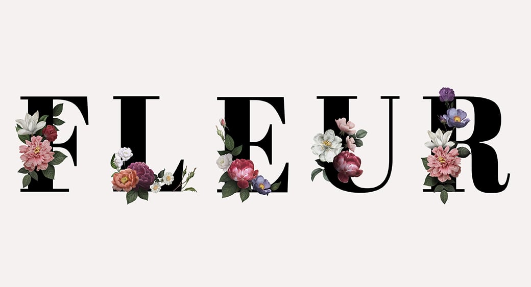
Typography is a current logo design trend that is widely used. To give it a modern touch, designers will mix new and bold fonts with commonly used ones. It’s expected that logos will have daring fonts to represent the brand’s image. The fonts will showcase personalities that complement a brand’s image. Here are some examples of font that will be popular with designers in 2020:
- Ambit
- Helvetica Now
- Plantin
- Untitled Sans
Logo designers will also create custom fonts that have never been seen before. Brands will demand unique fonts to make their business look different from their competitors. It’s easy to use a logo that has a clear font across different carriers. A unique and custom font will help your brand stand out of the pack.
6. Emblems with a Twist
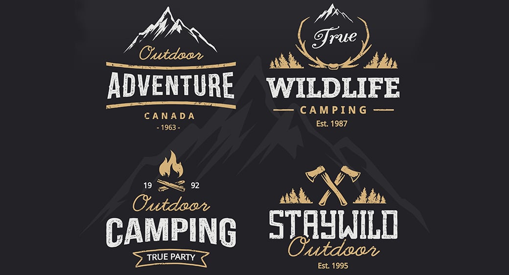
Businesses will continue to use emblems to fit maximum info about their brand, and designers will continue to customize emblems. Though, in 2020, emblems will be influenced by minimalism and lose some sophistication to become more visually friendly. Emblems are a symbol of class that makes a strong statement for the brand, and designers will take these to the next level.
7. One Color Logos
Typically, designers use black or white when they design a single-color logo, but the use of other colors is becoming wildly popular. Have a look at these tips on how to create a logo using a single color:
- Use multiple hues of the color to make it look more dynamic
- Be mindful of the color you choose.
- Don’t overuse the color – a single swatch can have a big impact too.
- Use a color that makes your brand easier to understand.
Here are some colors that will be preferred:
- Mustard – Will replace the color ‘gold. ’
- Mint Green – To add a sense of freshness in the logo
- Lilac – A soft-toned color that’s easy on the eyes
Facebook, Coca Cola, Samsung, Graphic Springs are examples of famous brands that have one color logos. The logos look effortless, but they scream sophistication that is easy on the eyes.
8. Single Image Logo Design Trends

A picture is worth a thousand words. To design a simple logo, some brands eliminate fonts and texts and instead prefer to use an image. Dropbox, Apple, and McDonald’s are examples of brands that have single image logos. Though the logos look unique, they’re a risky business move for startups. For new businesses, this is a logo design trend to avoid because images don’t tell the brand’s story. However, to make it work, entrepreneurs should devise effective marketing strategies to make the brand famous. Image logos grab a small fraction of attention from customers, and the uniqueness can entice the public to inquire more about the brand. The up-and-coming trend is the perfect fit for businesses looking to rebrand!
9. Animated Cartoon Logos
Animated Cartoon logos are popular with brands that have a kid-centric customer base, but in the next few years, that’s about to change. Businesses will turn to cartoon logos because they’re associated with fun. To be accepted by clients, brands will prefer to use animated cartoon logos because they look friendly. A perfectly animated logo has the potential to grasp attention quicker than other kinds of logos. Some popular animated styles will be:
- Outline Cartoon Style – animation with a thick outline, which will look as if outlined with a marker. The broad outline makes the logo pop out and is best suited for small and big sizes.
- Flat Cartoon Style – these logos are designed with simplicity. A ‘flat’ style cartoon is the simplest kind of animation but can be jazzed up if turned into a gif.
- Doodle Cartoon Style – doodle animation resembles a handmade drawing made with a pencil or marker. The logos look like sketches that make them look rustic yet fun.
Reasons for designing cartoon logos:
- The video element holds the viewers’ attention.
- Short logo ‘clips’ easily embed into the viewers’ minds.
- Animated logos can tell a brand’s story
There is no doubt that a motion cartoon logo attracts more customers as compared to emblems or letters.
10. Thin Lines
Under the influence of minimalism, ‘thin line’ logos will evolve and be seen in various ways. A thin line logo associates with the feeling of calm and clarity. The logos have precise and straight contours that speak elegance and class. They are the easiest to create when brands don’t prefer colorful logos. The use of thin lines is versatile because they can be used to create patterns, motifs, or shapes. Expect to see more monochrome logos with thin lines.
11. Eye-Catching Scaling
In addition to animated cartoons, colorful logos, and emblems, scaling is also going to be a top logo design trend. The brand name appears to be in a ‘wave’ by making specific parts or details about the logo thicker and more prominent. Scaling is a trend that can be associated with unusual or custom fonts to make your logo look more exciting and appealing.
12. Use of Gradients
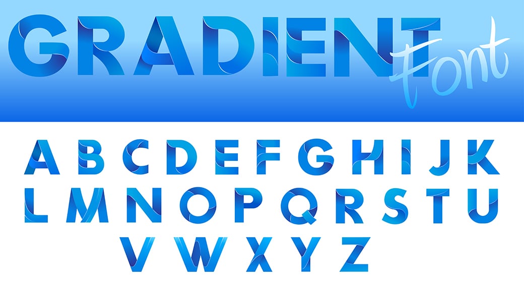
It’s a known fact that people are easily attracted to bright colors, and ‘Gradients’ is how brands will gather attention. In 2020, designers will play around with adjacent colors rather than blending colors to make creative logos. Here is why you should use gradients:
- Gradients can be made with one or multiple colors.
- They’re colorful yet indicate sophistication.
- Gradients are pleasing to the eyes.
- They can add depth to any image.
There are two kinds of gradient styles:
Multicolor Gradients – designers combine bright colors to create beautiful palettes. They make sure to use colors that complement each other. Two famous examples of brands with colorful gradient logos are Mozilla Firefox and Instagram. Analogous Gradients – designers work with only one color or a limited color scheme. They use nuances of a single color to make the logos exciting and eye-catching. Shazam, a music app, is an example that uses blue and its nuances as a gradient logo.
13. Overlapping Logo Design Trends
We talked about gradients, and what works best with a colorful design are the ‘overlapping elements. ’ It is a simple yet effective design trend that will gain popularity. Designers will overlap shapes to create a more complex logo. Overlapping is used to create depth and visual interest for the viewers. The best example of an overlapping logo is PayPal. The brand uses two shades of blue and overlaps the P letter. It’s a basic design, but it’s beautiful and eye-catching. The Tips for Creating an Overlapping Logo Design:
- Only overlap a single element because too much overlapping is challenging to understand.
- The overlap technique helps the logo will pop out with a 3D effect, which gives it depth.
- Choose a palette of bright colors to overlap. The technique is used to create high-color designs.
14. Responsive Logos
Responsive logo design trends are undying. It is a must-use technique to make logos adaptable and scalable to different screen sizes. This year, we will see designers paying extra attention to make responsive logos. Responsive logos shape-shift, change in dimensions and size, complexity, and even shades to fit as needed. The logo has one appearance that fits all!
Learn how to make responsive logos with these five tricks:
- Multiple Versions – To eliminate future problems, create four versions of your logo.
- Number of Elements – Add or remove elements for each size to make it adaptable.
- Be Consistent – Each logo should be consistent and look more or less the same.
- Rearrangement – Don’t focus on big or small sizes; you can also rearrange the elements.
15. Lowercase Lettering & Wordmarks

In the past few years, we’ve witnessed corporations rebranding and using lowercase lettering in their logo. New logo design trends feature unique typography in lowercase letters.
How to make it work?
- Use an attractive font, that’s clean and readable.
- Select a sophisticated color palette.
- Make your lowercase lettered logo pop with thicker strokes.
- Leave whitespace; it builds up visual interest.
- Keep the number of words at a minimum.
- Skip out other elements to avoid a clustered logo.
Uber is an example of a corporation that rebranded and changed its uppercase lettering to lowercase by using a simple font. With this new trend, logos that are all-caps will be long forgotten!
Ready for New Logo Design Trends?
Logo design trends might be quickly changing, but they give businesses a chance to rebrand. Designing new logos in 2020 is all about making the elements work. We’ll be seeing a lot of simple, minimalistic logos that tell a story. The combined use of gradients and animated cartoon will be popular. We’re excited about seeing all the inspiration in 2020. How about you?
Articles Related to Logo Design Trends
- 10+ Free Photoshop Logo Templates
- Top 5 Free Logo Maker Tools
- Graphic Design for Business
- 15 Free Online Font Recognition Tools
- 12 Free Online Graphic Design Tools
- Bold Typography and Thick Fonts
- Web Design Trends
Images by Freepik



Leave a Reply