Metro Design Style 2-Year Evolution – Things Lost and Gained
It has been a few years since Metro style (or Metro design language) appeared and settled in Windows 8 design and many other website layouts. Looking back to the first implementations of this language in design around the Internet we may say that it doesn’t last the same it was back in 2012. The main principles are still in favor and no one will dispute the importance of typography or grid interface in this design language.
However, there are a few changes that were brought to Metro style and now highlight the evolution of the Metro-style design. Let’s look at the Metro design principles then and now.
Metro Design: How It Started
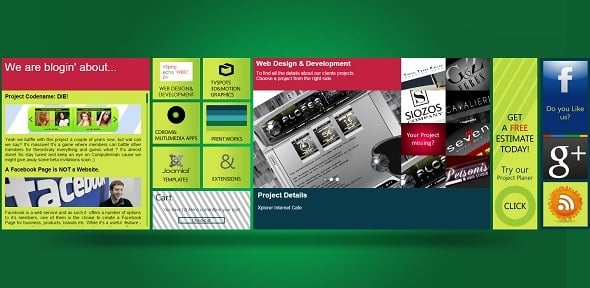
When Windows 8 displayed its design in 2012 it looked as a revolutionary approach. Unlike popular skeuomorphic designs inspired by iOS where all elements looked and acted closely to the real items, Windows’ Metro took a different track. It went completely flat! Its interface looked like a sketch with vibrant blocks, one-dimensional icons and plain typography.
Flat Style
Flat style just found its best expression in Metro style. 3D effects, animations, highlights and gifs were removed to give place to simple structures and literally flat, drawn-like elements. Icons became simple and light, created in minimalist style without overwhelming bells and whistles. They looked like schematic drawings that unambiguously guided a user through the layout.
Computerman
Focus on Typography
The main principle of new design language of Microsoft is its focus on typography and content. Developers put the functionality before form, they called it “typography before chrome”. Due to such approach users can get right to the point without distracting movements.
Was there any predecessor for Metro design language? Yes, it’s a graphic design style found of the XX-th century – Swiss Style. It is known to be a King of Web Design for its heavy use of simple and laconic shapes, airy layout, grid structure and light fonts as well as icons that are well understood and readable by any user.
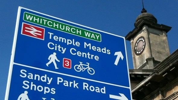
The main concept about Metro style typography is sans-serif fonts use. It was also taken of the Metro forerunner – Swiss style design that relies on fonts that are highly readable and may be interpreted without any misinterpretations. It welcomes as less distractions as possible, so clean and simple lines are perfect for Metro. If you look closer you may notice the same message of readability and intelligibility in most of city signs and markings, airport notifications and, of course, subway markings.
Ward Signs
Navigation Blocks
The idea of simplicity and usability boost found expression in Metro UI layout. Navigation menu system is transformed into a set of large colorful square blocks that took almost all the Start Screen space. The Golden Ratio principle and the Rule of Thirds use found its clearest implementation in Metro style depicting a harmony and balance between all grid elements.
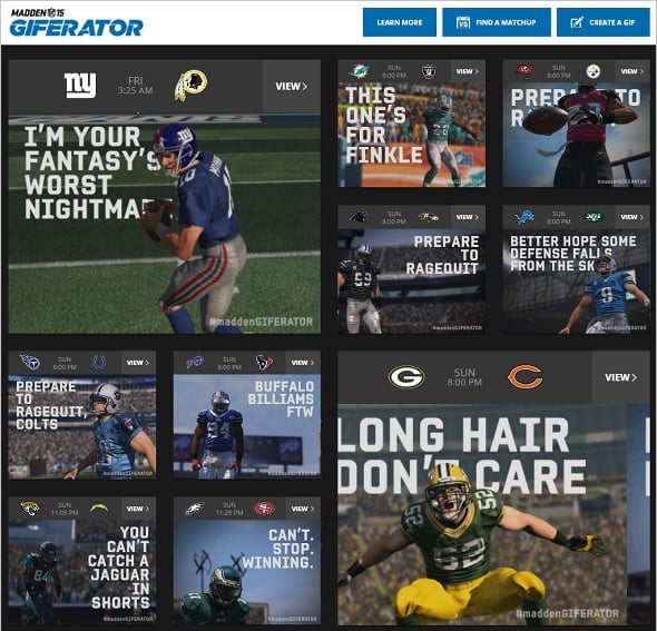
Giferator
Typography in Metro style design allows structuring content easily and making navigation a snap. Data presented on the screen is arranged around typography and its size. The bigger font size is – the more important info it shares. Headlines are traditionally made with the largest font size and attract attention first. It made navigation easier and faster what was one of the essential things for mobile world design. Whimsical logos and icons for apps and programs were replaced with light sketch icons and text logos.
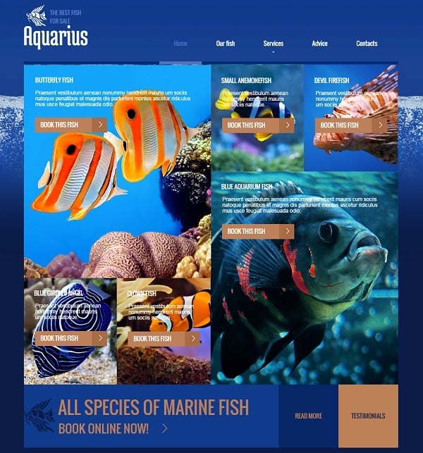
Website Template with Huge Typography
Responsiveness
Responsiveness was another key concept for Metro style. Since it was presented first in Windows Phone interface the idea of fast and fluid navigation with taping and touching the screen came to the forefront. Grid interface was the first and foremost step in that direction. When Metro design language was featured into Windows 8 OS it appeared as a perfect solution to any size and shape of the screen allowing navigation with mouse as well as with touch.
Metro Design Website Template
Metro Style Today: See the Difference
When Metro design language started gaining its backers many web designers tried copying it’s layout, color scheme and UI structure. It resulted in the situation when the Internet was invaded by thousands of twin websites that copied the look and most design principles of the Metro style.
Of course, things are changing and no design language can stay exactly as it was before. To make their projects more prominent on the web without losing trendiness and functionality. Thus, Metro style gained some significant additions that are now closely related to it but haven’t been the focal point of Metro style.
Long Shadows
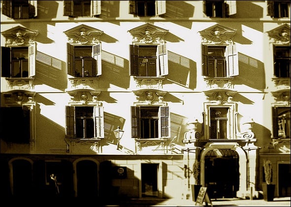
One of the most significant features that Metro style achieved are long shadows effect. This effect is relatively new for web design but you might definitely notice it in photography where the shadows are used to create a stunning dramatic effect.
Wolfgangfoto
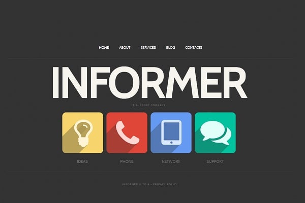
Long shadows in web design were introduced to icons to add more depth maintaining the flat look anyway. Main characteristics of long shadows are the extension of the shadow in around 45 degree angle and a tone of the shadow that is a bit darker or has slightly different hue than the main design element. Another characteristic of long shadow effect is the direction of the shadow towards the bottom right corner. However, these are not strict rules and you may notice shadows that are targeted to the left or upper left corner.
Left-Oriented Long Shadows Website Template
It may seems that long shadows take Metro style a bit off the path of Flat design adding 3-dimensional look to icons and UI elements. I’m not completely sure if that’s true. Long shadows are definitely not a step back to skeuomorphism as they don’t mock-up the real object. The design stays flat with a tiny effect of origami shapes.
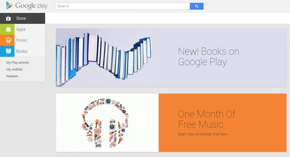
In general, shadows as design effect seem to be clamped solidly in web design for the next few years with the introduction of the Google’s design language – Material Design that makes heavy use of shadows and highlighting for its elements keeping overall layout on flat side. Actually, we may say that Material Design was born of Metro design with innovative approach to design functionality.
Google Play
Less Color
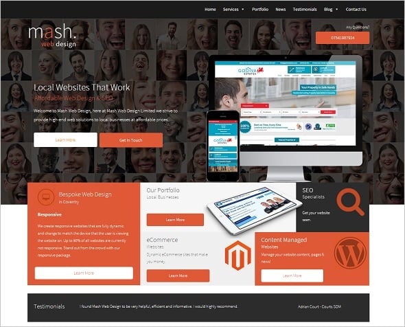
The next thing is colorful blocks that are core elements of the UI design in Metro. Today you may notice the overall trend that such blocks are not that colorful anymore. The trend moves towards use of one-colored set of blocks with white icons. Such tendency may be explained with the popularity of minimalist style that is closely related to flat and Metro-style designs but is more strict with the use of multiple colors and vibrant hues.
Mash Webdesign
Metro Design Minimalist Website Template
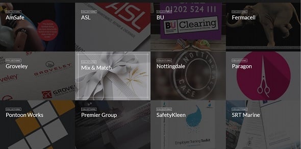
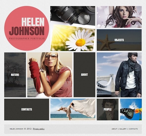
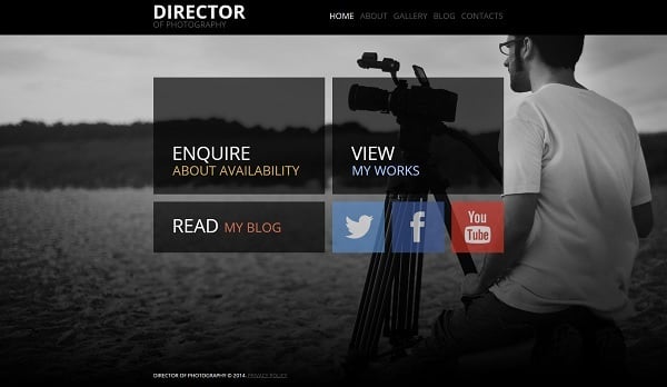
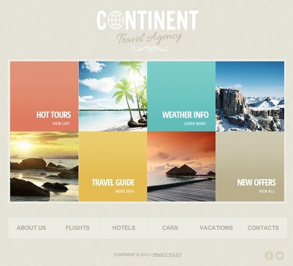
Otherwise, the colorful blocks are today widely replaced by large images, photos and even videos instead of icons, creating a look of collage. Such design is especially noticeable on web designer sites or those ones that wish to present their work in the most prominent and easy-to-perceive manner. One-page websites that use Metro design language principles also make use of similar structured galleries. It doesn’t ruin the style of Metro interface but provides more vivid presentation.
Ellisfaas
Metro Design Website Template with Large Blocks
White Space Use
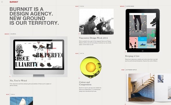
One of the most important principles of Metro design language is the wise use of white space around main elements and important content. Originally, icons inside colorful blocks in Metro design were comparably small and the space around them provided good accent to the message the icons were to deliver. Since today more and more blocks are replaced with other kind of content like photos and images or even text, white space is used differently. In some cases we may notice lack of white space between elements or inside the content blocks. The icons, if they’re used, became larger and may take all room inside the block. Images may be arranged with absolutely no space inbetween. And vice versa – block with large images may be scattered around the Home page providing plenty of white space.
Website Template with Large Photos
Burnkit
Effects for Clickable Elements
Possibly, the most prominent change in Metro-style designs today is a use of effects that highlight or define clickable elements of the design. Those effects are rather used for blocks than for text links. Parallax effect is one of the most popular ones that may be applied to Metro style. Subtle hover effects for image blocks are also welcomed today even in Flat designs.
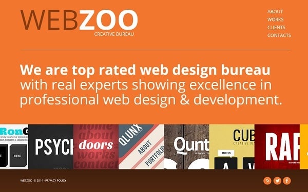
AJA Design Agency
We may notice subtle changes in Metro style during the last two years, but the overall idea of simplicity, functionality and content-oriented structure is the main thing about this style and it still lasts unchanged.



Leave a Reply