MotoCMS 3.0.6. Version: New Design Features and Options
In a previous post we offered you a detailed description of new technical features that appear in a recently released MotoCMS 3.0.6. version. But the improvements aren’t limited to just technical settings and SEO options.
In this post we’ll discuss design features and new options that were released within this update. There are tweaks aimed to make your design stand out among other ones as well as options that should help you improve your future website responsiveness. Let’s keep going and find out what’s cool about these fresh updates.
Parallax, Animation and Sticky Effects
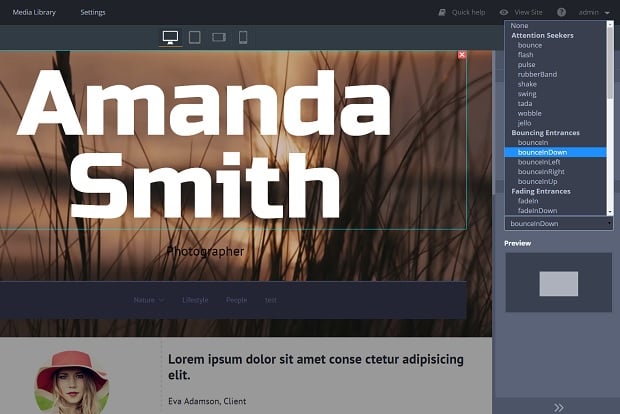
Within a new update MotoCMS users get a perfect opportunity to improve their template’s design with three new features. From now users can add animation effects to various widgets (not just images, but text, buttons etc.). There are 42 animation types structured in categories e.g. “Attention Seekers,” “Bouncing Entrances,” “Zoom Entrances,” and other. With these options you can make your menu slide from left or right, or make your button flash when the page is loaded. It can be used in Slider options too.
Another option that is valid for a Container widget, is Parallax. This cool design feature was introduced to various websites some years ago, raised discussions about its applicability. But the truth is that Parallax is far from dead and can attract users to website and its vital sections.
Applying Parallax for elements in MotoCMS admin panel is extremely easy. Just add an image or text widget to the Container, tick the checkbox for it, and it will appear on a page instantly.
The last but not least in this list is a highly useful “Sticky” option that can also be applied to Container widget. When ticking the checkbox for it you “stick” your menu or other element to the top of the page in order to keep it visible when the page is scrolled down. It is absolutely perfect for single-page websites that rely on heavy scrolling. So the users of such websites won’t get lost when they scroll far down.
Contact From Widget Improvement
Aside from mail settings in admin panel, the Contact Form itself was improved with two new features. From now users can setup different email for messages delivery. If the option is not selected, the messages will go to the default email a user indicated during registration.
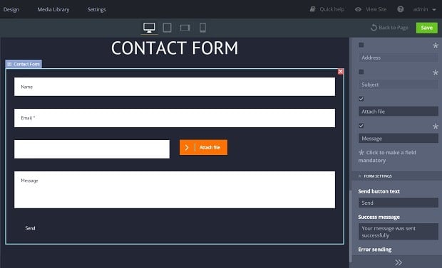
The second feature will please many customers. Contact Form now can include an “Attach File” field. This custom field can be added if you wish to allow your website visitors sending you files, photos and documents through the Contact Form.
Improvements for Responsive Design
There are two cool updates that should help you make your website more adjusted to various devices. First is the opportunity to set up widget alignment within the template depending on the device. There are three main alignment settings: left, center and right. E.g., you can make your menu centered for a desktop and make it set to the left or right for a tablet.
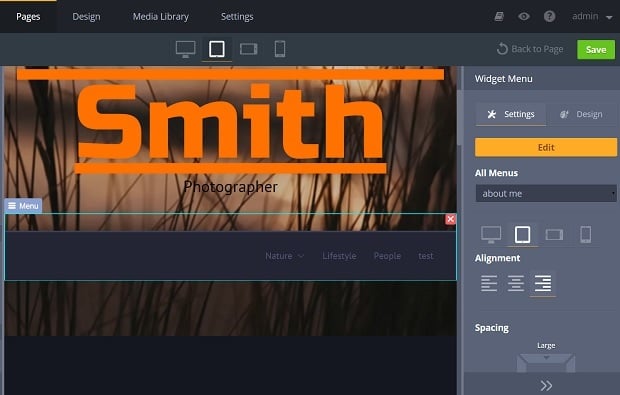
Other helpful widget added to the MotoCMS 3 admin panel is “Spacing.” This is a simple empty container that can be added to make more space between two elements . Thus you can make your website looking more attractive on various devices and improve readability and UX.
Minor MotoCMS 3.0.6 Version Updates
Among other tiny features that should make your website tweaking easier is the elements filter added to the Media Library. Now you can choose what type of media you wish to see by clicking the respective icon on the right panel.
From now you can also set alignment for the “Embed” widget. Thus you can locate your video right center or left according to your needs.
Another cool option for any widget is “Link” that allows setting a larger image to a thumbnail to open it in Lightbox.
Hope, these updates and new options will help you enjoy the process of creating your website more and will make this process more fun. Stay with MotoCMS for more updates and improvements as well as for more cool posts and nice surprises!



Leave a Reply