Pinterest Trends 2017 And Their Influence on Web Design World
According to its creators, Pinterest is a visual discovery, collection and sharing tool that aims at creating a visual catalog of ideas from around the world. Being launched in a small apartment of its founders, Pinterest grew into a huge social network with 175 million monthly active users that are heavily influencing such industries as fashion & beauty, interior design, food industry, etc. No doubt web design was also swept by Pinterest design trends and visual advances. In this post, we want to share with you the Pinterest trends 2017. Because they are pushing web design world into new directions. Ready for the journey? Let’s go!

Pinterest Trends 2017 and Web Design
I bet you know the trick of card design, don’t you? This year it’s even more ubiquitous than ever. Collections, boards? Also present. Let’s explore the way Pinterest trends 2017 change the Web we know.
#1: Image-centric Pinterest Design Invades New Websites
According to Trend Reports, 65 to 85% of all the people around the globe describe themselves as visual learners. Images grab attention and stick in mind better than text. Pinterest design has given rise to the employment of card design – the design that partially eliminates text to let images speak for themselves. You no more need text, if you can just show.
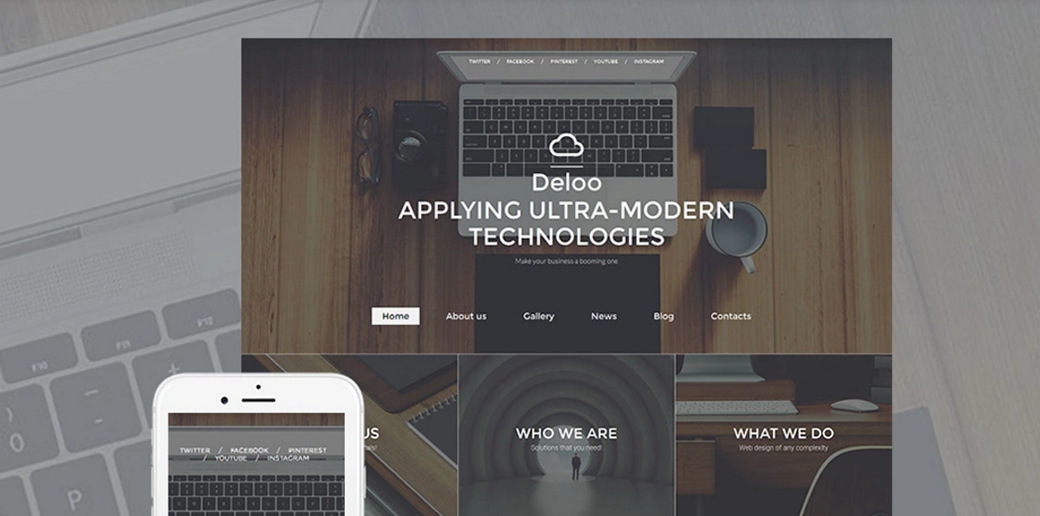
Pinterest-style grids appear to be especially effective for fashion and art blog design, photographer portfolios and design studio online catalogs. And it perfectly illustrates the first one of the Pinterest trends 2017. For instance, one of the Web Design templates by MotoCMS has a homepage that inherits image-driven design of Pinterest. Pay special attention to the banners below the slider and the ’Work Gallery’ section below, and you’ll grasp what I’m talking about:
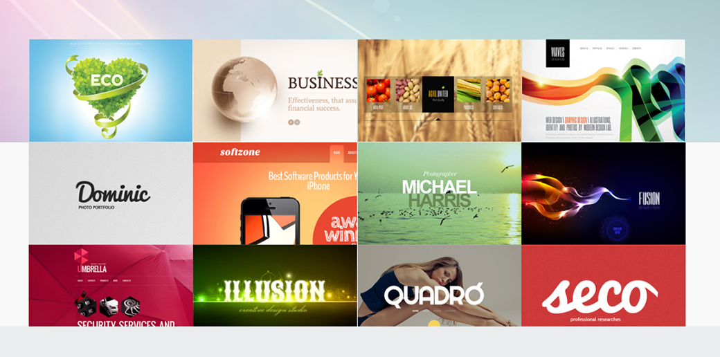
And one more example for you to enjoy:
#2: Boards Leak Into the Web
Pinterest is a social network that pioneered in popularizing boards. Boards are the way to categorize entries in your collection and have them at your fingertips whenever you need them. Quora, one of the popular question-and-answer online services, introduced the boards concept last December. The Quora boards, inspired by Pinterest design, let you categorize the topics you’re interested in and dig into them one-by-one when you have time.
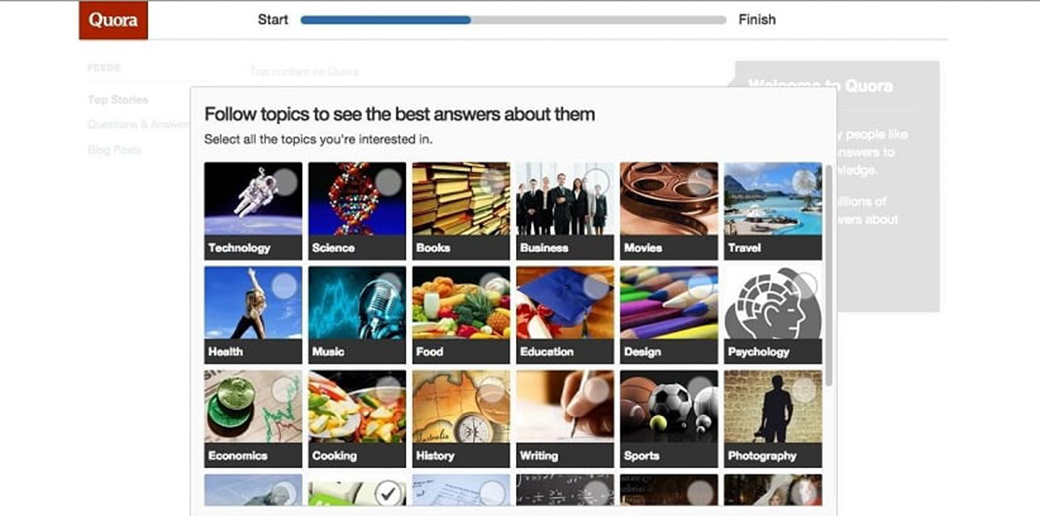
Introduction of boards by popular online services perfectly demonstrates this one of Pinterest trends 2017. Boards were also introduced by such websites that capitalize on the board concept as HootBoard, Moodboard, Polyvore, etc. This or next year, boards leak into mainstream web design, so watch out for the evolution of this blog design trend in future.
#3: Collections Conquer Giants Such As Facebook and Instagram
One more trick of Pinterest design, collections, is already triumphing on the pages of such Internet giants as Facebook and Instagram. Collections, present both in Pinterest app design and on its website, were initially borrowed by the Facebook app, and, then, by the desktop version of this giant of social networking. It’s worth mentioning that Facebook gave the whole ‘collection’ idea a more commercial spin. The network encourages merchants to create the so-called ‘collection ads’ and advertise a bundle of products rather than a single product. Moreover, Facebook collections became an extended version of the well-known ‘wishlist’ concept, thanks to which users can sort the goods they want to purchase into different categories.
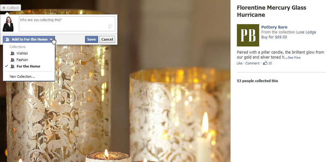
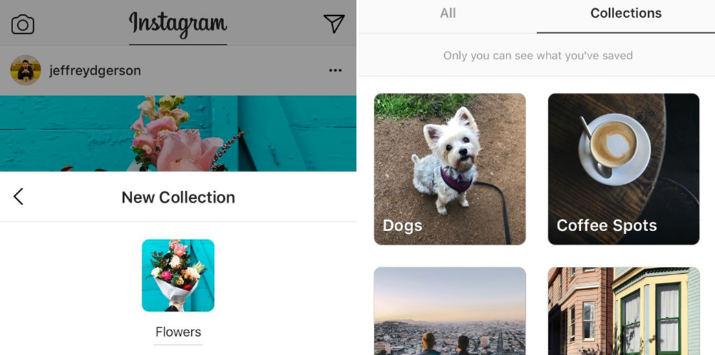
Instagram introduced collections with its 10.7 update (December 2016). Since then, 46% of its users have saved at least one visual post. The difference in the concept is that Pinterest collections are public. Whereas Instagram ones are available only to the user, who created them. Let’s say, you hunt for Pinterest art ideas and save them to the collection named ‘Art’. Anyone from the web can use your collection for their needs. With Instagram, it’s not the case. If you want to share your art insights, you’ll have to send posts to your close ones. To do so you can use Instagram Direct.
#4: Pinterest App Design Impacts Mobile Design
It’s hard to tell how many mobile apps are to this or that extent mimicking Pinterest app design. Endless scroll, restricted screen space, and asymmetric grids are just a few things inspired by Pinterest graphic design on small-screen gadgets. For instance, ‘Get It Now’, an application that lets you purchase food, groceries, and home supplies, made it to the top. Its Pinterest-inspired design lets users finalize a purchase in three touches.
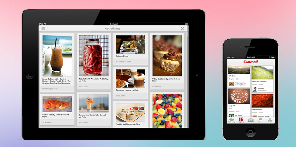
What’s more, Pinterest app design inspires apps and mobile versions of websites to bring users positive experience. Firstly, image-centered designs minimize eye-strain, reducing the amount of text and increasing the font size. Secondly, apps with Pinterest-inspired design take commenting systems and emoji exchange more seriously. Thirdly, they bring e-commerce and exploring interests closer together, creating an all-in-one experience, when small dreams come true in a couple of clicks.
Your Takeaway
Pinterest trends 2017 show you that it’s beneficial to follow the grid structure of this popular visual exchange platform. Moreover, maybe, it’s time for you think of how you can incorporate collections and boards to your website. One more takeaway lesson is that you should prioritize the visual component in the mobile version of your website/app. Moreover, you should engage users in fun scrolling process. Anyway, use Pinterest, love Pinterest, and make the best out of the Pinterest trends 2017 you’ve just learned. I wish you good luck in this!
Stay tuned!
Leave a Reply