Pricing Page Design – Factors to Take Into Consideration
What is the 2nd most important page for a SAAS website after the Contact us page? Of course, it is the Pricing page. It is the Pricing page that eventually makes or breaks the deal. It is the page that decides whether a visitor becomes a customer or not. From the usability and design standpoint, a price page with its multiple pricing tables always throws up multiple challenges to the designer. It needs to have a simple structure and at the same time, it should have a proper structure.
The purpose of this kind of page is to facilitate the conversion process or make it easier for the users to pick the right plan. A small mistake and your website might witness an exodus of potential customers. You certainly can’t let this happen. Here we will look at some factors that can help you create a stunning and conversion-friendly pricing page design.
1. Focus on Differences
If you have multiple plans available for your customers, your pricing page should focus on the differences between them and not on the similarities. This will make it easier for visitors to make a quick decisions. It makes sense to group different features at the top of your pricing table and then show similar ones at the bottom. You can use the cross sign to show unavailable items and the tick sign – those that are available.
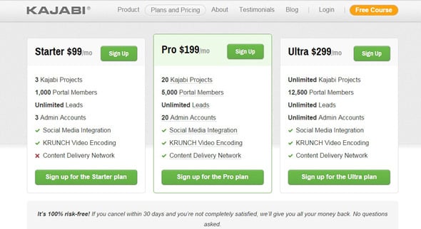
The KajabiApp Pricing page has made it easier for visitors to take the right action by adding multiple design tweaks. It uses bold letters for the most prominent features of each plan. There are also tick and cross signs grouped together. That’s a great way to grab the attention.
2. Use Visuals To Show the Differences
The use of visual elements in pricing page designs is a common practice among web designers. This allows for presenting the difference between plans in an interesting way. Say for example, for the best plan that has the finest set of features, you use a large illustration whereas, for other plans, you use similar illustrations but smaller in size. This will have a dramatic impact on the decision-making process of visitors. Since the best plan has the most significant illustration, it will capture the attention of the audience easily. It will also help people make the right decision about a purchase.
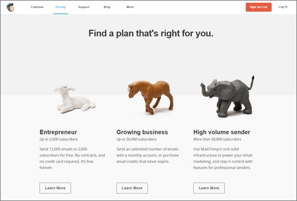
MailChimp has done a great job by adding three different illustrations to represent three different types of businesses. These illustrations, apart from making the page visually attractive, help seize the attention of site visitors and also help them make the right choice.
3. Keep It Short and Sweet
The purpose of the pricing page is to make it easy for the targeted audience to figure out the differences between plans or packages. Therefore, it is essential that you are making the tables and the features look less complicated and less intimidating. Some designers tend to believe that they need to highlight all the plans’ features. However, you need to do precisely just the opposite. It is never a good idea to overwhelm the audience with too much information.
You must strike a perfect balance between offering too much and too little information. You need to understand what the audience is looking for and add only those features.
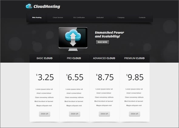
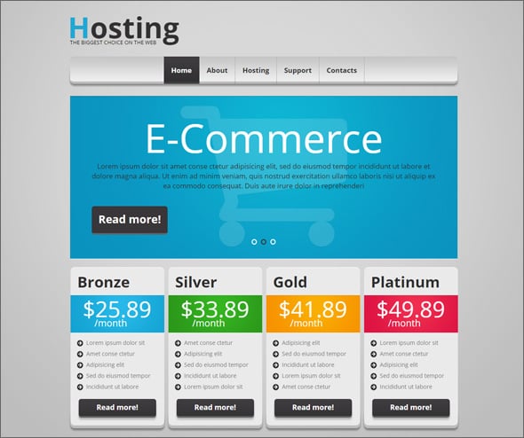
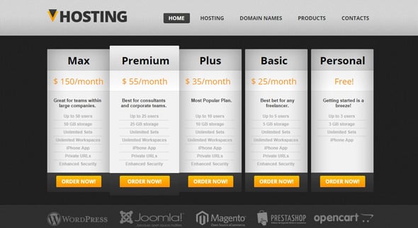
In the above hosting website template, the pricing tables contain only the required information. There is no attempt at all to overload the page with too much info. The page only contains the Price, CTA button, and some features, and that is all.
4. Keep the Focus on Price
Why do people visit pricing pages after all? Well, no prize for guessing. People visit them because they want to know the price! But strangely, there are some pricing pages where you will have to struggle to determine the price of different packages. But this should not be the case with pricing pages at all. You should be trying your level best to show the cost of individual plans prominently. This can be achieved easily by increasing the font size, changing the font color, or by using different font types for the Price section. Appropriate weight should be given to the price so that people can easily find it.
The current template with pricing table has managed to keep the focus on price by using different color combinations and by making changes in the font type and the font size. It offers a distraction-free browsing experience as well.
5. Gain the Trust of the Audience
It is a fact that people hesitate a lot when they have to loosen their purse strings. And we can’t blame them because there are so many cases of scams associated with online transactions. There is no way you are going to win their 100% trust. However, you can eliminate the frictions like doubts, uncertainties, and others by making some minor changes in the pricing page design.
To alleviate the fears of the visitors, you need to mention in no uncertain terms that you are offering – 30 Days Money Back Guarantee, or alternatively, you can show testimonials of clients. Add a link to a Case Study section of your website so that people can read and get an idea of how to get benefited from your product or service.
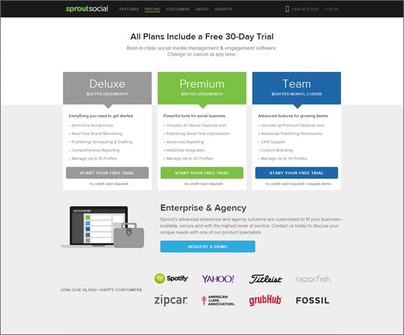
SproutSocial pricing page includes logos of companies past and present customers, and since they are ample brands, it helps instill faith in the customers on the service. It also includes an option for a free demo/free trial that encourages visitors to opt for the service.
6. Simplify Things
People come to зricing pages to compare plans. Often people visit this page once they have decided to opt for the service. Therefore, if you can manage to present information in a simple and intuitive way, you will be able to convert a large number of targeted audiences. Each plan should justify its price by highlighting the features that it offers. Remember one thing most people don’t know precisely what they are looking for, and therefore, you need to highlight the features/benefits in the pricing tablesб so that people feel encouraged to select a plan. It should help and not hinder the process of conversion, and therefore, you need to focus on making the page look simple and straightforward. No need to make things complex by adding too many elements to the page. Keep the page neat and clean as much as possible.
The best thing about the pricing website template is that it has no semblance of complexity at all. CTA buttons are prominent, and prices get their portion of the attention. Overall, this is an excellent example of a simple pricing page.
7. Do Upsell
The goal of the pricing page is to drive more sales and rack up more money. Therefore, you must go all out to make people opt for the most extensive package. You can offer some discount if people choose the bigger amount of services. This is a common tactic applied by almost all web hosting companies. They offer deep discounts if people stay with them for a more extended period of time.
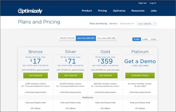
Some other companies, like Optimizely are doing this as well. It offers discounts on packages if people prefer a one or two-year prepayment plan.
8. Offer Help
Since you are going to add multiple plans on the pricing page, you need to make it easy for people to make the right choice. There are excellent ways to make people choose the right plan. You can highlight or emphasize the most expensive [or the best maybe] plan by placing it in the middle. Offer a free trial. However, this model may not be applicable to all business types. So, you need to suggest the plan you feel will suit most visitors. Also, you can offer a trial version of what you produce so that people can taste the quality of your product before making a final decision. You need to incorporate these psychological triggers in a pricing page design to ensure more conversions.
In this hosting web template, the Premium Package grabs the most attention as the designer has made it look like it is placed above all the other plans.
9. Limit Options
It has become a norm among SaaS companies to offer four different pricing plans to their audience. Most people don’t even do A/B testing to determine which version works best for them. Maybe 3 pricing plans are more than enough, or maybe four plans are ideal for your business model. However, unless and until you test, you will never be able to tell which version is better. However, the number of plans should be kept within the logical limit. Cramming a page with ten different plans will only confuse the audience; thus, you must stop doing that.
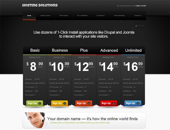
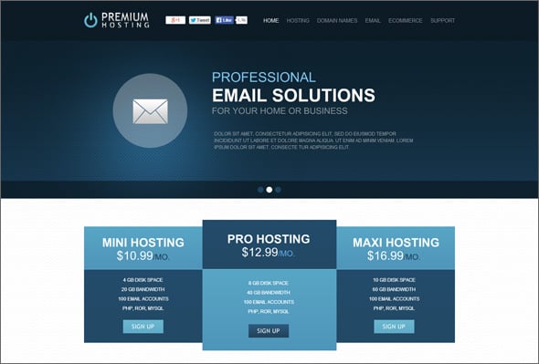
In the above hosting website template, the number of plans has been restricted to 3. The packages also contain a limited number of features.
Conclusion
Finally, don’t stop here. You need to do some testing to add cool call-to-action buttons and to experiment with the color combination. It will definitely help you capture the audience’s attention.

Great post given many pricing pages are boring and uninspiring. Here are my thoughts – http://www.markevans.ca/2014/11/11/pricing-pages/