When we talk about the web design patterns, the user experience is the only thing that matters. If you will not pleasing your viewers, you will let them down. Progress step UI Design Patterns are great for your visitors. They give your audience the navigation they need to fill the contact form. When a contact form has multiple steps, progress step helps the viewer by showing how many levels are there to fill.

It is an efficient way to represent sections rather than a long and tedious form to fill. You can reckon them as breadcrumbs for filling the contact form that helps your audience when you need more information from them.
Progress bars are one thing, and progress steps is another. Here in this post, I will give you design ideas to help you set progress step UI design patterns, which will guide your audience with interactive designs.
Without further ado let’s get you started.
Tip#1: Adding Text & Label
When you are designing progress step UI, you must keep an eye on tags. By keeping an eye, I mean adding them. When you add labels to the progress step UI design patterns, you inform your user about the progress they’ve made in the form.
The text must be in uppercase, bolded (to gain more attention), and well-settled into the web design patterns. Don’t use confused words to explain what the step is. Use simple and direct words that define the purpose of the action of your user interface design.

The labels must convey the users about what the process is all about. When you have a prolix checkout form, you want your audience to stay with you until the end.
There is no silver bullet when adding text and label. You must make your text simple, direct, and of maximum 2-3 words. One word label is estimated to be the best.
Tip#2: Visual Clarity Of Icons
After the text come the icons. If you have some space left that you think must be filled, you can opt for symbols to visually represent the step.
Look at the above progress step user interface design. I like the way they made the use of images here. The pictures are not blurry and express the theme below them. As per the tip#1, the subject must be clear. The same trend followed by the icons as well. They must represent the text. If you fail to convey the meaning, it may lead to confusion which will annoy your visitor, and make them leave the form page.
Another way to introduce icon is by using graphical representation such as tick mark when a user completes that section of the form. Tick marks are not the only option here you have got. However, they are the simplest way to convey the users about the step.
Tip#3: Your Interface Must Be Consistent & Logical
While designing the progress step UI, consistency is a factor no one can ignore at any level. When you want your user to stay consistent throughout the form, you must give them a reason to do that. A uniform layout serves the uniformity to your users.
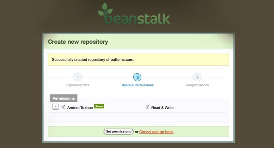
In addition to that, the progress step UI Design should be logical as well. If you are asking to select a campaign then you just not directly ask for card details. You must follow a logical order in that. Have a look at the campaign here.
The way they keep the order of the steps in such a mess is quite remarkable. Also, the design seems to be very consistent throughout the form.
How Can You Design The Progress Step UI Design Patterns?
In this section of the post, we will give you some tricks that will help you in designing the progress step UI in the right way. Without further ado, let us begin.
No Need to Start From Scratch
Most of the time, designer approach from scratch for a unique progress step UI design patterns. What they don’t know is that it is not the requirement every time. There are ample amount of freebies which you can leverage. You might be wondering why are you using the same design layout as others are using but what you don’t know is that you can customize it and make the design unique.
With this approach, you will not make the designing process fast but also interactive & unique. There are many sources which you can Google. It is wiser to choose a PSD layout as it is easy to convert as well.
Use Code Snippets & Plugins to Work on Your Webpage
Remember one thing, free layouts are great, but that is just a start. You need either plugins or code snippets so that these layouts can imprint on your web design patterns.
These are plugins that will help you in the coding phase of progress step UI design patterns.
Conclusive Remarks
In conclusion, progress step UI design patterns are essential for enhancing the user experience on websites, particularly when it comes to filling out contact forms with multiple steps. These patterns provide clear navigation and indicate the progress made by the user. By incorporating text labels in uppercase and well-settled positions, designers can inform users about their progress in a simple and direct manner. Additionally, using visually clear icons that align with the corresponding text helps users understand the purpose of each step and prevents confusion.
Consistency and logic are crucial in progress step UI design, ensuring a uniform layout and a logical order of steps for users to follow. Designers can leverage existing freebies and customize them to create unique and interactive designs. Furthermore, utilizing code snippets and plugins facilitates the implementation of these design patterns into web pages. Ultimately, the success of progress step UI design lies in how users perceive and experience the interface, making it a significant aspect of modern web design.
