Psychology in Web Design: a Brief Look

Most web designers, vast majority of them in fact, tend to believe that Psychology has got nothing to do with the career they have chosen. Of course, we are not asking anyone to get a PhD on Psychology, but knowing the tidbits of human Psychology can help web designers come up with user interfaces that will engage and enthrall the targeted audience.
These Psychological principles are neither too complicated nor unnecessary, but they can make miracles to a website if implemented the right way. By integrating the right kind of psychology in web design, we will be able to create a conductive experience for the visitors and thereby we can influence their decisions in favor of ours to some extent. In other words, we can make them do what we want them to do – by the means of visual aspects alone. We will see a positive and palpable impact on the audience engagement front as well if we as designers manage to assimilate the core concept of Psychology into the web design process.
The Purpose Behind Mixing Psychology with Design
When you are aware of the psychology of your targeted audience, you know exactly what the target audience expects and where you should be placing the Call to Action buttons and other important design elements. By creating a design that automatically adjusts itself to the needs of the targeted audience, you will make your visitors happy and of course, happy visitors will help you see a steady uptick in the number of conversions.
Here we are going to explain how the concepts of Psychology and web design are intermingling and thereby creating a conductive atmosphere for the targeted audience to make quick decisions.
Make Them Feel Like Home
It is okay to add some elements of surprise in your design but those elements shouldn’t trump the feeling of familiarity. Allow me explain it to you.
Whenever we land on a page, we expect to see some elements that we have seen before. For example, we expect to see the Navigation bar, a CTA button, a logo etc – no matter what the website is all about. So, if you are using some complex navigation that few people have ever seen before, or if you’re trying something weird like positioning the logo at the bottom of the page, you need to reconsider because in most cases people will find your website somewhat alien.
Moreover, topical relevance also plays a crucial role here. For example, if your website is about animals, it definitely does not make any sense to use images of something random like a beach or a corporate office. It will be a hard guess for the visitors to understand what the website is about. You have to realize the fact that people in general do expect some familiar elements on the website as it keeps assuring them that they are not lost.
Trust Value
“Honesty is a very expensive gift, don’t expect it from cheap people”.
Warren Buffett.
Honestly in this age of scams, phishing attacks, malware etc, you simply cannot expect that people will put their trust on you without any apparent reason. Things get even more complicated for new when they ask their visitors to share personal information like phone no. or email id with them. People have reasons to feel suspicious whenever they are asked to share their personal information given the number of ads and spammy mails they are bombarded with everyday.
To make the visitors feel comfortable and to gain their trust, you can place some trust signs like VeriSign, McAfee Secure, Norton Secured etc at the top or at some other prominent place of the design.
The design itself has to be simple and professional so that average visitors wouldn’t hesitate while sharing their personal information.
Use of Powerful Images
Ever heard the term eye tracking? It is a technology that enables you to figure out which section of your website is grabbing the most attention visually (not the most clicks, but rather most sights).
As a designer, you need to make sure that the visitors are focusing on the product and the message that you want to send across and the concept of eye tracking plays a critical role here. Check the below image to understand how placement of images can impact your marketing initiative.
As you can see, only a small section of the visitors actually notice the product. Now, in the 2nd image posted below, the model focuses on the product rather than staring directly at the viewers and the result is surprisingly different.
This small change has a profound impact on the overall outcome. More people are noticing the product now thanks to this small change.
So, stop using abstract image that conveys no meaning.
White Space
Don’t cram the web page with loads of designing elements because it just confuses the visitors. Give them a room to breathe by adding white space in the design. Cluttered interface rarely helps audience focus on things and therefore, as a designer, you need to make sure that you are not ruining the interface by adding as many elements as imaginable.
Add some room and white space in the design which will ensure that the visitors concentrate on things that you want them to look at and by incorporating this approach, you can encourage them to take desired action.
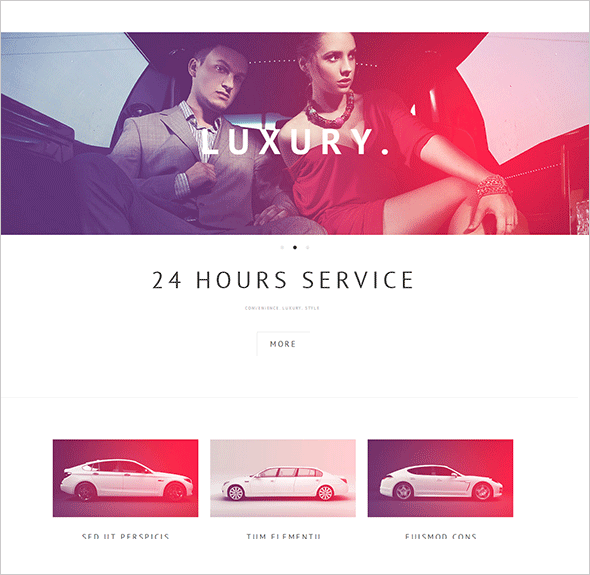
The above limousine template shows the clever use of white space by the designer. The focus is on simplicity and the bare-bones structure of the website adds to its impressiveness.
Color Psychology
There are some color combinations that trigger emotional reactions. The use of color can have a profound impact on how your website is perceived by your visitors. Color should act as encouragement and not as deterrent in the path to conversion. But sometimes, it just happens that people choose the wrong color combination and it leads to a design disaster. Here we are trying to give you an idea how different colors are related with different emotions –
Yellow – Happiness
Orange – warmth & vitality
Red – Passion
Green – Fresh & Renewal
Blue – Cool & Corporate
Gray – Neutrality
White – Purity and Calm
Black – Sophisticated & Polished
This are only the basics or colors science, in case you’re interested you can learn more about color theory and combination practices from one of our earlier entries.
So, hopefully now we have a fair understanding of how psychology is impacting our design decisions and how we can incorporate psychological principles to offer better browsing experience.


Leave a Reply