What Real Estate Web Design Trends Will Rule in 2015?
If you’re running a real estate business, it’s more important than ever for you to have a strong online presence. Almost 90% of buyers use the web to search for their ideal property, with nearly 50% of them finding the home they purchased this way. With so many real estate companies out there it can be hard to get a feel for the market and the latest trends, so we’ve done it for you looking at 5 real estate web design trends you need to know about.
Real Estate Web Design Trends
It’s a massive market too, with 539,000 family homes sold in 2014 in the USA – a double-digit rise as compared to previous years. Competition in the market is strong. You can check out how some of the most popular real estate sites in the States build their online presence.
Over the previous years’ online real estate websites have changed, with retailers moving using almost identical ‘off-the-shelf’ CMS systems to bespoke and stylish sites that include sophisticated, responsive design, full of many impressive features. So, follow these trends to create a real estate website that will bring real profits to your business.
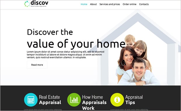
Flat Design
Flat design is about investing in something that’s simple and classic. Rather than throwing everything at your site, it’s about simplifying things for your users.
Colorful icons break up the site, making it clear to the user what you are offering. Simple menus ensure trouble-free navigation, with a clear approach working well on mobiles and tablets.
Trulia.com is a popular Australian real-estate website that uses flat design to guide the user easily through the company’s market offering. The page also cleverly uses ghost buttons (we’ll come to those later) animations and photographs.
You can get this feeling with a simple template, offering a similarly subdivided page layout. As well as strong usage of icons and images, the scrolling site is solidly on trend, with the linear gallery as a popular feature.
And if you’re building the page yourself with a rental property website builder, you can use one of the many free icon resources online to find the right icon for you. You can increase awareness by using icons offline too.
Ghost Buttons
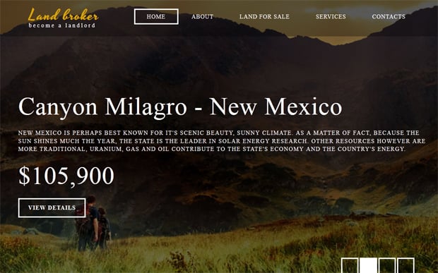
A new vacation rental website design trend that has increased in popularity over the last few years is that of the ghost button. The obvious benefit of ghost buttons is that they can be placed over photography without obscuring the underlying image.
Ghost buttons work particularly well for the kind of bold, photo-dependent websites that are currently so on-trend.
You can choose from circular, square or rectangular boxes with a narrow outline, placed on top of a web image. The most popular color for ghost buttons is white, but be careful when choosing an underlying image as it’s easy for the text to be lost. You can see how the effect works on this real estate website template, with the changing image and ghost button.
Award-winning Quality
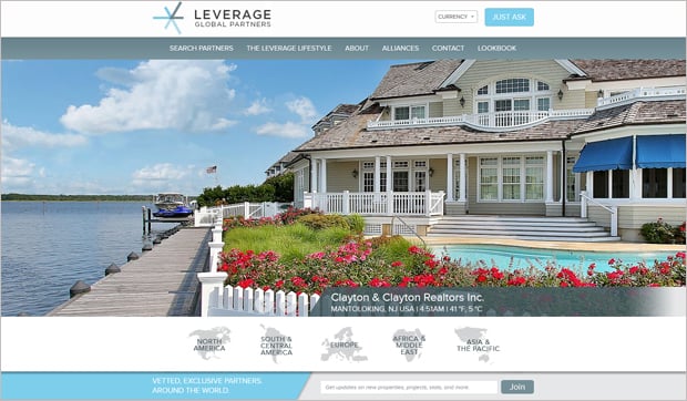
The award-winning Leverage.com relies on the power of its images to sell its range of beautiful properties. The rapidly changing photography on this flash-based page shows off a snapshot of the special properties on offer.
It’s a design that works particularly well for boutique or unique properties that you want to showcase, bringing them to the front of your site.
Sites like this often cost a huge amount of money to develop, but you can get the same effect using a website template with an impressive photo gallery.
Bold Typography
Business owners spend hours choosing an appropriate font for their logo, but when it comes to websites, it’s often not top of the list. The new breeds of property management websites are bringing strong and bold typography to the fore. It becomes a vital part of web design due to the rise in ghost buttons and text overlaid onto images or solid backgrounds. The typeface comes more clearly into view because of that. The contrast between the solid background and white text much is more striking than simple black on white.
People are also much more aware of the power of typography, with your chosen typeface having a genuine impact on your visitor and their perception of you.
When it comes to choosing typography, it can sometimes be hard, which is why a great number of new sites with examples and guidelines are springing up to help.
A growing trend is for big, bold typography filling the screen. It looks great and is certainly contemporary. But when you’re selling something it’s important that it can be viewed by as many visitors as possible – so be careful to balance style with accessibility.
Full-screen Photography
Animation or scrolling around a solid, central image is a really on-trend look for websites. Real estate sites – particularly those in the boutique sector – increasingly rely on powerful images to sell, reducing the actual site content to a minimum.
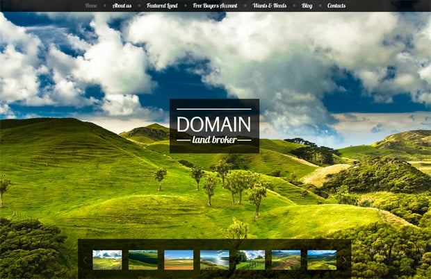
This cool web template for real estate agencies employs a lot of the on-trend features. It uses a bold full-screen image, ghost buttons and quirky typography.
The central image remains static, with the various screens popping up over the top of the image. Users can select from a choice of images at the bottom of the page, offering variety.
The layout isn’t going to suit every real-estate agent, and you’re going to need some pretty strong images to make it work, but sometimes you need to make a bold statement and this could help you to do it. It does for one of London’s top estate agents, Domusnova.
Conclusion
The real estate web design trends featured here are just some of the ways the online aesthetic is changing. Coupled with the rise in social media is the need to ensure all sites are responsive with mobile-browsing no longer a trend, but more likely – in the long run – to actually become more popular than desktop browsing.
Social media integration and the ability to share pages and images is becoming more and more important, with buyers taking to Twitter and even Facebook in the search for the ideal property.
What these real estate trends show is that spending time on everything from the photography to the typography can make a massive difference to the appeal of your site.
When choosing a design for your site it’s great to stay on trend, but it has to be balanced with the requirements of your users and an understanding of your position in the marketplace.




Really good article Lawrence and well worth a mention.
Good article about design trends for real estate websites but I think you have missed responsiveness that is one of the most important factor in 2015 in web design, With the help of responsive design our website can be open at any type of screen like desktop, note, cell phone etc.
Great share. These are the necessary points which are really helpful for real estate sector.