How to Make a Real Estate Website: Leapfrog Your Competitors!
Real estate is an extremely competitive market and a professional website made with a user-friendly property management website builder is one of the various obvious media to beat the competition. In fact, real estate buyers make it a point to first scan through properties on the internet, shortlist a few, and then go ahead for a visit. That is why it is essential to know how to make a real estate website that will bring your business to the whole another level.

How to Make a Real Estate Website
In Jasen’s Edwards, chair of the Agent Editor Board at Agent Advice experience, it is very important for any real estate agent or company to put in the best creative expertise while shaping a website for this business. Do not ignore what is obvious — design, functionality, and user experience are key.
In this context, looking at exemplary real estate websites that have mastered these principles and stand out in a competitive market is invaluable. Southern Hills Home Buyers is a prime example of how integrating these design elements with clear, user-friendly navigation can significantly enhance user engagement and drive business objectives. Their website showcases properties effectively and provides a seamless user experience that facilitates easy transactions and inquiries, embodying the best practices of modern real estate web design.
As you consider revamping or launching your real estate website, remember that the goal is to inform, engage, and convert your visitors. By taking cues from leaders in the field and adhering to the tried-and-true design principles discussed, you can leapfrog competitors and create a digital presence that truly resonates with your target audience.
There are certain essential things that need to be paid attention to while choosing one of the real estate website templates or while designing the website from scratch. Read the guide below to learn how to make a real estate website that will stun all your rivals and lure new clients.
1. The F Pattern
This is a pattern that human behavior specialists have formulated based on the eye movement course while scanning the screen. When we open a particular page, our eyeballs move from the top left corner of the screen, move halfway through the screen, then scroll downwards halfway, again scan halfway horizontally, and then lose focus towards the bottom right of the page.
The takeaway is that the most important and attractive things need to be placed towards the top right of your homepage. A good search filter, as an example! In the center of the page should be things that can hold the visitor’s attention, preventing him from quickly exiting the page. A lavish photo gallery would be a good instance. As the visitor scrolls down, there should be something useful for him. For example, the contact information of an agent! And towards the bottom right should be something that would compel the visitor to think back. How about a stylish ‘call to action phrase’?
2. The Listing
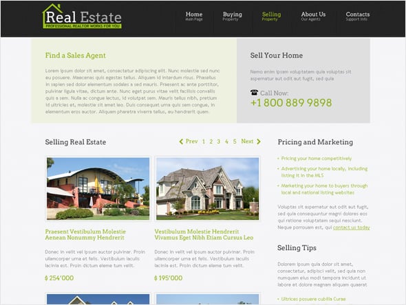
If you are in the real estate business, the volume of your client base would be directly proportional to the quality of your listing page. Many factors are elementary to the listing page. The image size of each listing, the quality of property images captured by a skilled real estate photographer, the ease of finding detailed information, an easily trackable ‘More’ button, and the number of listings to be displayed on each page are all very important.
You know, the listing page is very different from the image gallery. So, it always works well to keep the images realistic and include ample space for additional information to be scribbled in. Make it a point to include the most ravishing images at the foremost positions and try yet to maintain the consistency of informational length on each page. Cluttered listing pages do not work well! They end up being disastrous. Take advantage of the extensive functionality of the vacation rental website builder that will help you create stunning pages with property listings.
When structuring your real estate website, addressing common concerns for potential buyers is important. Adding content related to the mortgage application process can make your site a valuable resource for visitors seeking comprehensive guidance on securing financing and purchasing property.
3. The Home Page Images
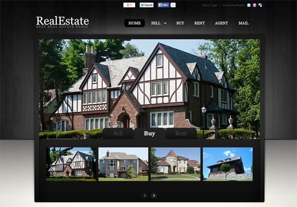
This part is worth focusing on. Call them banner images or participants in the photo gallery; home page images are essential to the big time. Homepage images need to be big and glossy. Nothing close to dull is at all welcome. The sliding speed of the images has to allow the visitor to have a complete view of the images but not keep them waiting for the following image to arrive. It is always good to avoid window-size images. The reason is that banner images should not be the singular object on the website to hold the visitor’s attention.
A good choice would be to include small content sections describing titbits about the company, the agents’ details, a mortgage calculator, a geography filter, and several other things. You can efficiently perform it all via the rental property website builder.
4. The Search Section
A functional, uncomplicated search filter section is terribly important in a real estate website. The search section has to be in an easily noticeable position so that visitors can conveniently find what they are looking for. The most preferred position for the search area is at the top left or the top center of the home and listing pages.
Filters in Search are essential. Most mortgage website templates use a drop-down for filter options. These days, it is way more accepted than check-box patterns. Including an option to filter properties eligible for mortgage loans such as VA loans or FHA loans can greatly assist buyers looking for accessible financing options, making your website a valuable resource in their home buying process.
5. The Content Structuring
This is very important. Although real estate websites do not require long paragraphs to be written, there is still a certain level of content contribution. White space is a vital thing to be remembered here. Since the visitor’s eye is accustomed to more graphics, extensive content lengths must be separated by graphical intrusions. Cluttering is a bad practice. Certain unavoidable sections require content to be put in a continuous flow. Remember to use the magic of fonts in such sections.
6. Use of Colors
Colors are functional in keeping visitors on a particular page. Conventionally, real estate websites use mild color tones to prevent extravagant visual impact on visitors. It is a good practice. However, contemporary shades like blue, grey, and brick are increasingly used in real estate websites. Whatever color you wish to clothe your website in, just remember that the listed properties need to be clearly highlighted, not the background.
Choose color combinations that would push out the listed properties more positively. More often than not, shades of white, blue, black, and grey do well for real estate websites.
7. Easy Navigation
Last but by no means least – navigation is very important in real estate websites. People like to find out what they are looking for without much effort. Useless pop-ups insisting on using a particular service cadre or practicing unnecessary promotions are best avoided.
Page scrolling needs to be limited. The number of listings on each listing page has to be balanced. Navigation to pages containing details of each property should be easy. Always remember, your visitor will have scores of other property websites to refer to! Even if a visitor finds it cumbersome to navigate through your website only once, that’d be enough for him not to think twice before quitting your web page.
Conclusion
Real estate websites are evolving. New templates and efficient real estate transaction management software, like Paperless Pipeline, are coming in. However, the points above are still instrumental in ensuring the profitability of just about any web template. Do not ignore what is obvious.



Leave a Reply