Web design has undergone an evolution over the last decade with its focus moving to more realistic interfaces that web users can relate to and interact with. Technological advances and the introduction of devices have put the web in the end user’s hands, making it increasingly important to add a touch of realism in website templates. In this post, we’ll look at some examples of realistic web design that you should consider when creating your personal or commercial website.
To begin with, it’s important to note that realistic design encompasses many varied aspects. Try as much as possible to align your design esthetic with your company vision or the type of product that you have on offer.
[th_ft count=”4″ title=”Pick a Design for Your New Website!” cat=”” type=”36″ keyword=””]
1. Depth of Field
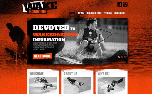
This is a web design style that’s used to create an air of vibrancy. For example, using a web design template featuring a water skier splashing water across the website’s main page gives the page some excitement and intrigue, putting the viewer in the scene and making them want to be part of the sport. At the same time, depth of field is great for drawing attention to detail. This technique can be pivotal for companies selling apartments, home interiors items and online gaming websites.
2. Textures
Using varying degrees of textural content will appeal to the tactile senses of the end user, making them to want to reach out and touch the screen. This helps you create identification in the end user’s brain that leaves a lasting impression. One great thing about texture is that it can be conveyed via different media such as typography, illustrations, digital backgrounds and UI/UX elements. It’s important however to use this style sparingly since it can make your website look outdated and messy if overdone.
3. Letterpress/Inset Text
You can use this technique in various parts of the website sparingly to give letters an embossed feel and look. This basically means that the letters will appear slightly raised on the page, giving it that realistic angle, as if the letters were slowly rising out of the screen. What’s great about this style is that it makes headings stand out, pulling the attention of the reader towards content in the website.
4. Folded Ribbon/3D
The folded ribbon style in realistic web design is something that’s become a craze lately, taking over numerous websites targeting trendy individuals. This style gives the end user the illusion that elements wrap behind others, creating a 3D effect that is as realistic as it is beautiful. This style is great for gifting and e-commerce websites.
5. 1 Px Lines
1 pixel lines are great for communicating simplicity and elegance. The average computer screen is capable of showing millions of pixels these days. It takes a certain level of skill to take one pixel and make it the centerpiece for your design esthetic. However, if properly executed, it’s possible to create a website that stands out by creating depth, adding light and make buttons stand out.
6. Shadows
If you want to create drama and depth with light, shadows are a great way to do that. However, it’s important that you use this concept subtly to ensure that it doesn’t look contrived. The idea here is to give certain objects a certain lift, making them come alive.
7. Photorealism
This basically means the inclusion of images that stand out from the background. These images may be 3D in nature and include a lot of attention to detail. For example, a travel website may decide to use oil paintings of scenery and destinations on offer, complete with bubbling brooks and individually painted on leaves and sea shells in shimmery golden sand. Photorealistic images may also be interactive to give the end user a richer experience, making them want to explore other aspects of the website.
Conclusion
At the end of the day, you really want a design aspect that makes your website stand out without looking too gaudy. In realistic web design (as with all other aspects of web design), less is certainly more. You can find various tutorials online to help you master these techniques. Please leave a comment below if you have any questions about realistic web design. You can also choose some of our many templates that incorporate some of the realistic web design styles that we’ve covered in this post. Thanks for choosing MotoCMS!
This is the second post from the series of web design styles. Please take a look at the previous article “How to Create a Wonderful Clean Website Design“.


