Single-Page vs. Multi-Page Design: What’s Better for You
One-page designs have become really trendy in recent years. Mostly used for landing pages, this kind of design is now used for various kinds of small-business, restaurant and cafe, portfolio, service providers and other websites.
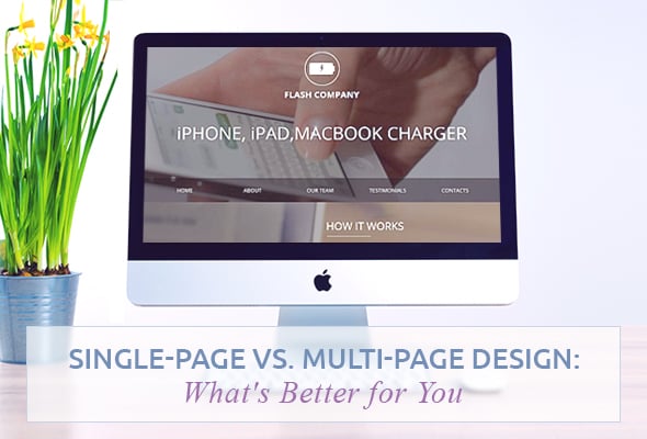
The overall tendency to simplicity and ease-of-use makes single-page designs a cool solution for smaller websites that don’t require complex navigation structure. Since this kind of design relies on heavy scrolling, single-page websites suit mobile devices perfectly. People don’t mind scrolling a bit while clicking around a multi-page website may be overwhelming and sometimes frustrating. Thus, most website owners today face a tough choice: single-page vs. multi-page design.
Of course, single-page website is not a one-size-fits-all solution. There are many reasons to avoid this kind of design when you create a website with loads of content, e.g. blog posts, product descriptions etc. But when you rely on storytelling or wish to present the info to your users in an easy-to-digest manner, one-page website is a nice option for you.
Advantages of a Single-Page Over Multi-Page Design
Single page designs have many advantages in terms of use and interaction with visitors. Despite there are still no deep researches concerning single-page website conversions, there is a survey on a landing page that got increased conversion rates at 37,5% compared to the previous multi-page version. There are some reasons for that.
Simple Navigation Path
There is no way to get lost on a one-page website since there is no other way to get info like scrolling down the page. With a single-page website you don’t have to wrestle with a problem of organizing parental and child categories, or setting up huge menus. Add navigation links and “To the Top” button to ease the process for users. Everything that improves UX will work.
La Maddalena
No Issues with Bandwidth
Multi-page website takes more time to load. Since it’s not always a hosting issues, it still affects user experience. With limited bandwidth users have problems with website loading what makes many of them leave a website. Single-page websites need less amount of bandwidth that multi-page ones.
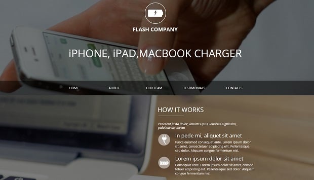
Website Template for Device Repair Services
Another frustrating moment with multi-page websites is that a user should wait for a page to load when jumping from one to another. On single-page website additional content is already on the page or is loaded via Ajax.
Improved Mobile-Friendliness
It takes a lot of efforts to create a mobile version of a multi-page website. Of course, responsive websites are not limited in number of pages. But it’s harder to make complex websites work perfectly on smaller screens. Single-page websites are much easier to transform into fast loading responsive websites since it simply requires less time. No complex navigation or additional bells and whistles make this task an easy thing.
Consulting Company Web Template
Many researches display that modern Internet users are more likely to scroll than to click. Today mobile devices use touch gestures to navigate the screen and swiping along with tapping is the most common gesture for mobile users. Moreover, when people scroll down/up the page they usually keep up with their reading flow. Clicking and jumping from one page to another breaks that flow and leaves users with chunks of info instead of providing them with the whole website idea.
Solid Design
It’s usually harder to keep up with one design concept through multi-page website. Sometimes we can spot different categories and even pages designed in different styles. With one-page website is much easier to keep up a solid design to the end of a page.
Storytelling
One of the huge advantages of a single-page design is an opportunity to create a cool story that will keep users on your website. Storytelling has plenty of benefits for a website from structuring the data and making it easier to perceive to raising emotions and persuading users better than bare facts.
What About SEO?
As for SEO, there is still no clear-cut opinion on whether a single-page website is good or bad for search engine crawlers. One of the benefits is that the process of link building becomes much easier for you. Since you have only one URL to link to, it brings all focus to it and makes your website more valuable for search engines.
Single-Page Websites’ Drawbacks
Despite advantages, mentioned above, vital SEO aspects seem to be not the strongest part of a single-page design. Here we will check out other drawbacks single-page designs have compared to multi-page ones.
SEO Issues
Since single-page designs have only one page, it’s hard to target more than one keyword for such websites. This might be not a problem for renowned brands like Adidas or Apple, but small business who should take a lot of care about SEO may suffer from poor optimization.
In one of its videos Google has stated that its has got better in handling JavaScript and jQuery processes, so single-page websites might work well for search. However, the company still recommends running a few tests to see how a one-page website performs on search engines.
Loading Speed Issues
Despite the fact single-page websites don’t require you to wait until the next page with content loads, they still can be heavy and take some time to load. Depending on a content type, the average file size of a single-page website can be too large for many Internet providers.
Of course, there are a lot of ways to make your content lighter. Thus, the use of SVG files instead of heavy photos can improve website loading speed greatly. The use of various compression tools helps add lightweight photos without affecting their quality.
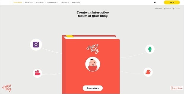
Hell-O-Baby
Content Linking Issues
It’s not the worst problem about a single-page website but it still can cause some UX issues you should cope with. Since you have all your content on one page, you should carefully think about how a user will browse through the content, how it can jump from one section to another or return to the top of the page. Proper linking to various parts of the content will also benefit to your users.
Use of Animation and Other Effects
Many one-page designs use animation and parallax effects to add some style to the website. It’s not an easy question – whether you should use parallax for your single-page design. Some websites may really benefit from the use of parallax effects. For others it will be a trite overused solution that will worsen user experience. Parallax is a great effect that pays a lot to storytelling and establishing emotional connection with a user in case it doesn’t overloads a website and doesn’t impact its loading speed.
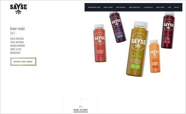
Savse Smoothies
Who May Benefit from Single-Page Website
As I already mentioned at the beginning, single-page design is not an all-purpose solution for all website types. E.g., such large websites like Amazon or eBay will not be able to fit all their content onto a single page. Multi-page design will still stay a priority for most business and Ecommerce websites that need to showcase lots of products. However, there are many categories of website owners that can use single-page designs with no qualms.
Of course, the main types of websites that use single-page designs are landing pages or promotional sites for one product or service. These types are the easiest to organize all content on one page.
Blossomtype
Improvement of Ajax, CSS3 and JavaScript processing today allows creating a single page designs for Ecommerce websites with a small amount of products. Thus, if you offer your visitors no more than a couple of products, you can use a single-page website where all info about a products as well as the checkout process will load in modal windows.
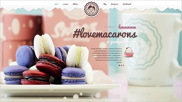
Sweez
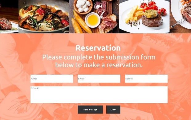
Small local cafe or restaurant can also use a single-page website for their promotion. It’s easy to showcase menu and separate dishes on one page as well as drive visitors to a reservation form without distracting their attention.
Steak House Website Template
Tips for Using a Single-Page Design
If you decide to choose a single-page website for your business or other services, you should consider the same practices that are normally used for multi-page websites. There are several peculiarities though.
Create Simple but Challenging Design
Simplicity and the ease of use are the main requirements for all modern websites today. In case of single-page designs you should keep it simple but attractive. One-page design requires more creative approach since you have to keep it consistent but not boring. Additions of unobtrusive animations and other effects help making clean design more attractive and catchy.
CSS3 and Javascript offer multiple opportunities to add extra decorations, various transitions and parallax effects to your one-page website. The main restrictions here are not overdoing it with too many bells and whistles.
Keep Design Consistent
One of the advantages of a single-page website I mentioned here was a solid design. One-page website can’t ‘play’ with styles and different approaches. Solid design throughout the entire website adds to storytelling and helps to establish emotional engagement.
Most one-page designs tend to have full-screen backgrounds that can be a great way to keep the design solid. To avoid boring users, split background into colorful sections that will show various portions of content still keeping it consistent.
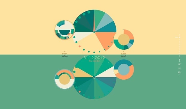
Like There Is No Tomorrow
Break Content into Digestible Portions
While keeping your design consistent, you shouldn’t do the same with your content. Offering content in one huge piece is boring and may scare users away. Split your content into smaller sections and offer it users in small portions. Thus, it will be easier to perceive the info, no matter how much data you offer.
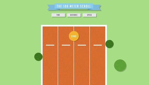
You should have smooth and logical transitions between all the content sections. When you offer a story within your website, it should follow the natural reading flow and keep users’ interest till the end. You can offer some kid of challenge to make visitors want to reach the end of your website, like on 100 Meter Scroll website.
The 100 Meter Scroll
Improve Website Navigation
Despite single-page designs rely heavily on scrolling, you have to include navigation links to your website. Navigation menu makes users sure that no matter how far your website goes, they will be able to easily come back to the point they need.
Adding navigation links makes your content easier to share since you can add a link to exact section on the website. Adding a traditional navigation bar also improves UX. Make it sticky on the top of the page to make users sure they will find a way back quickly. And don’t forget about “Back to Top” button that is usually placed in right bottom corner of a website and allows people quickly returning to the beginning of the site.
Conclusion
Single-page design can be a really cool option for various types of websites, if you use it wisely. Provide several A/B tests to make a good choice and create a website that will not only be trendy but will provide the best possible user experience and content presentation.







Leave a Reply