Photoshop seems to no longer be a king of a web and graphic design field. More and more these days we can spot huge discussions on using Sketch app instead of Adobe’s most popular project. It seems to be the most prominent face-off between web designer tools in 2016.

Photoshop wasn’t intentionally created for web designers. Well, it’s called PHOTOshop after all. But within years it has become the most used tool for web designers, graphic creators and website builders. It’s not a tool for photo and image manipulations anymore – its UI, heavily loaded with multiple options and features, inspires many designers to create website pages inside Photoshop.
But the times are changin (Bob Dylan said so ;)), and Photoshop should move a bit to give way to the younger and stronger fellow. Sketch app from Bohemian Coding seems to be more flexible, function-loaded and easy-to-use. Seems to be… it’s a key word here. Because there are huge debates on whether Sketch can fully replace Adobe’s products for web designers.
The truth is – there’s no easy choice between Photoshop and Sketch. Sketch is great in some things, but for some others you’ll definitely be more likely to use Photoshop. Let’s check out why.
What Photoshop Is Good and What is Bad for
Photoshop is a familiar tool for 99% of web designers. That’s why it is so popular. Most of designers are lazy bones and changing their habits, learning the workflow with a new tool may not be too much fun for them. When you’re getting used to a software it’s much faster to perform a certain action in it than learning new shortcuts and features.
Photoshop can be used with Windows or iOS what makes it very accessible for many users. Since Adobe introduced its Photoshop Mix and Photoshop Fix apps for iPad, you can edit your images or create mockups on the go.
However, Adobe’s price policy lowers your chances of using it. Since the Adobe’s team turned their pricing offers into monthly subscription plans (guess you all know about Creative Cloud), many designers either discarded Photoshop tools for more affordable software or stopped upgrading their CS6 versions.
There is a good thing about Photoshop CC that makes many web designers still stick to using Adobe’s software. Creative Cloud Libraries allow keeping all your assets safe and make it easy to access them across multiple devices and various Adobe’s products like Illustrator, InDesign etc.
The Sketch’s breakthrough forced Adobe to look closer to its products and think of providing improvements to keep pace with its rivals. Following the user’s expectations, Photoshop has recently added an export feature, the one that was highly praised by Sketch users. You can export all your files, elements, create additional extension for the images and objects with a few clicks.
Photoshop now has added Artboards – things that are familiar to those using Illustrator and Sketch too. This creative element allows you having multiple “canvases” within one document what save you time in opening different docs to transform objects and exchange elements. Similar functions you could spot within Smart Objects that has been in Photoshop for a while.
Along Came Sketch
Sketch is here for a few years and has already won a great audience of loyal fans. You can find multiple discussions on Quora with thousands of comments that advocate Sketch. Professional web designers share their experience about totally discarding Photoshop and switching to Sketch.
It’s no wonder, since Sketch gives them a few things Photoshop can’t. It’s a lightweight app that doesn’t consume a lot of RAM. Unlike Photoshop, Sketch app offers less cluttered menu with plenty of tool at the toolbar. They may seem a bit tucked at first glance, but once you’re getting used to them – it’s a handy choice.
Sketch offers built-in grids that allow you tweaking your design elements faster and more smoothly. Along with a great number of template presets and presets in Artboards, the process of designing becomes an amazing game.
Of course, many designers note that with Sketch you don’t have the entire range of tools you have had in Photoshop. Photoshop actions are one of the most amazing inventions that saves you time for creating various effects. To extend the Sketch functionality – you need to install various plugins instead. But plugins are a chest of treasures once you’ve got them. They add to the tool amazing features you can’t find in Photoshop. At least for now – as I already mentioned above, Sketch inspired Photoshop to create its own version of Artboards, and who knows…
A Few Major Features of Sketch
Letch check out in what areas Sketch beats Photoshop, and what features and plugins you can benefit from.
Focus on Vector
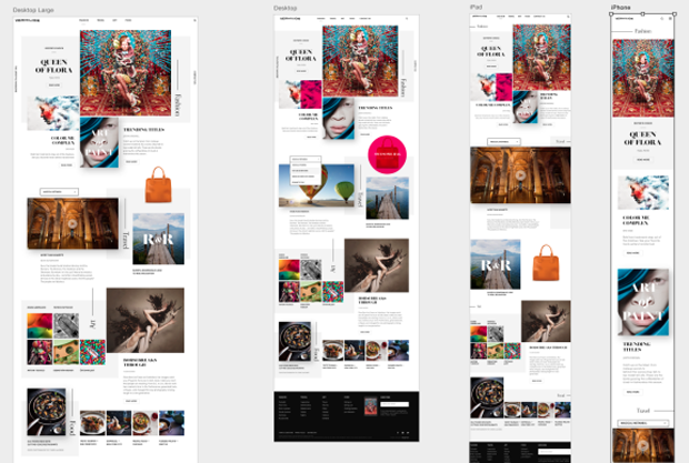
Sketch has reacted to the one of the most popular web design trends of recent time – it is focused on vector design. These lightweight files come in reply to the rise of responsive design and the growing use of high-definition screens (yes, Sketch is perfectly made for using it within Apple’s Retina displays).
Creating mockups for different screen sizes has always been a tedious process that consumed a great amount of time. Sketch offers multiple tools that allow you resizing elements freely and easily. Its Mirror Plugin makes it easy to understand how the objects will look on screen of the iPhone or iPad. No more blurry lines, every pixel is taken into account.
CSS Logic
It’s a real wonder how Sketch makes use of CSS styles. This app incorporates the logic of CSS and allows you creating designs that can later be easily converted into CSS elements. It almost blurs the line between web design and development. You create a button and with a right clicks of a mouse can copy CSS styles – ready to use within a layout.
In addition, you can convert the created element into a symbol that can be used across the entire design. What are Symbols? It’s the next Sketch feature I’d like to point out.
Sketch with Symbols & Dynamic Buttons
With the use of these two plugins you can improving your design experience and taking it to higher levels of development. Thus, you can convert a group of elements into a symbol. Within this group you can play with color, size, typeface, images etc. And then, when you’re ready, you can use this symbol across the entire website. It means, you can literally create a universal look of the entire website layout. When you apply changes to one of the elements in a symbol group – it will appear across all such elements on every page or blog post listing etc. You don’t need to manually render each element on each page.
Dynamic buttons plugin does the same thing for all buttons in your project. If you have to work on pages with multiple buttons on them, this plugin is a real saviour to you. It automatically creates a symbol for your button, adds a padding around it. When you add your text, the button will adjust to its length.
Text Styles and Colors Managing in Sketch
Sketch allows you easily managing your typography and colors within project. For typography, you can create various text styles for inline elements such as headings or text blocks. Then those texts are applied to all the elements of the same kind in your project. Making changes to text styles is as easy as ABC. If you decide to discard the H2 typeface and replace it with more suitable, you change it once – Sketch does all the rest. Changes will be applied automatically to all H2s in your project.
Color tweaking works similarly. You can create the entire website color palette on the Moodboard (a great addition to Artboards that allows you storing your files and elements within a mouse click). Colors you rely the most in your designs will be stored on Moodboards and you will be able to easily use any of them for your next project. Moreover, Sketch since allows you to access all your files in one Artboard, you can easily copy and paste any element’s style, including its color characteristics and styles to any other object you choose.
What You Can Do with One App that You Can’t with Another?
I guess, you are already impressed with all the opportunities Sketch gives you. But hold off on throwing away your PC for buying Mac and starting using Sketch. Perhaps, you have to just look first at what Sketch can’t do to your projects and what Photoshop can?
- Image editing. Since Photoshop was created for editing photos, it allows perfect tweaking for this kind of files. Its image editing tools and features also outdo the Sketch capabilities making Photoshop still the king in this area.
- Color Management. In case of color management, Photoshop wins the battle again. It makes a great use of all available colors in any variations. Sketch has less flexibility about colorizing your elements.
- Ease of Use. Photoshop has plenty of shortcuts to make a workflow more smooth. However, Sketch is keeping pace with it due to its flexible admin panel you can adjust to your needs and make working with it more suitable to you.
- Web Design Potential. With all that said above, Sketch is just and amazing app for creating UI. It has everything a UI designer would need: vector elements, responsiveness from scratch, lightweight files, grids etc.
The Bottom Line
Which tool to choose? It’s the main question that you might be asking while reading this article. Well, honestly, it’s been always up to you to decide. I just deliver a brief comparison and a close-up data about both.
Photoshop is heavier, more complicated and pricier (if you should use a Creative Cloud). Sketch is lightweight, seems to be a bit easier in use and costs only $99 for now. But you still have to learn how to use it anyway. It’s not a tool you can download and start designing from scratch like a pro. And don’t forget: you need to have a Mac to use Sketch. These limitations are a bit frustrating.
If you are a happy Apple device owner, familiar to website design area and focused on creating designs for web (not for print) – simply try Sketch. It gives you freedom in many ways. It eases your workflow in creating responsive designs, it allows you prototyping website layouts with hands behind your back, tweaking and adjusting them, and even exporting CSS code within a few clicks.
I don’t know will Sketch kill Photoshop in the nearest future, but for web and UI designs (not photo and image editing) it’s definitely an app you should get a better look at.

