Spring Color Forecast: Highlighting The Hottest Web Design Color Trends 2018
Are you fond of colors? Do you think that colors are an indispensable part of your life? Are you inevitably falling in love with a certain color now and then? If you answered ‘Yes’ to some of these questions, you pass the muster and make your small (yet important) contribution to mass color preferences. These preferences distill into the governing color trends of the period and manifest themselves in anything from home décor to web design. Today, we’re here to talk about colors and take a closer look at web design color trends 2018 and the spring color forecast, in particular.
To start the ball rolling, we’ll drop by the acclaimed New York and London fashion weeks and enjoy an accurate, expertize-based Pantone spring colors 2018 breakdown. We won’t pass on fall colors 2018 semiannual prediction as well. Then, we’ll zoom out scope-wise and identify the governing web design color trends 2018.
By reading this article, you’ll learn what’re the colors, shades, and hues that you should populate your website with this year. Absorb and internalize the roster of color trends 2018, and your forward-looking website UI will get sizeable traction and supplant the washed-out and obsolescent competition.
Pantone Color Forecast 2018
When it comes to accurate and highly professional color forecast 2018, there’s hardly a better color expert to turn to than Pantone Color Institute. This U.S.-based corporation is one of the major influencers in the printing industry, as well as in the manufacturing of fabric, plastic and colored paint.
From 2014 on, experts of Pantone compile semi-annual color trend reports that serve as a staple for the design industry. Within the reports, the experts predict a number of call-out and classic shades that’ll rule the catwalks of New York and London fashion weeks. However, their predictions prove applicable not only to the fashion industry. As a matter of fact, expect to see the featured hues disseminating all over the web and predetermining the color landscape of the new-fashioned web.
If you drop by Pantone website, you’ll see that the spring and fall colors reports are already up. What’s more, for 2018, we have even more shades to choose from as New York and London fashion weeks have their own color trends 2018 reports.
Pantone Spring Colors 2018
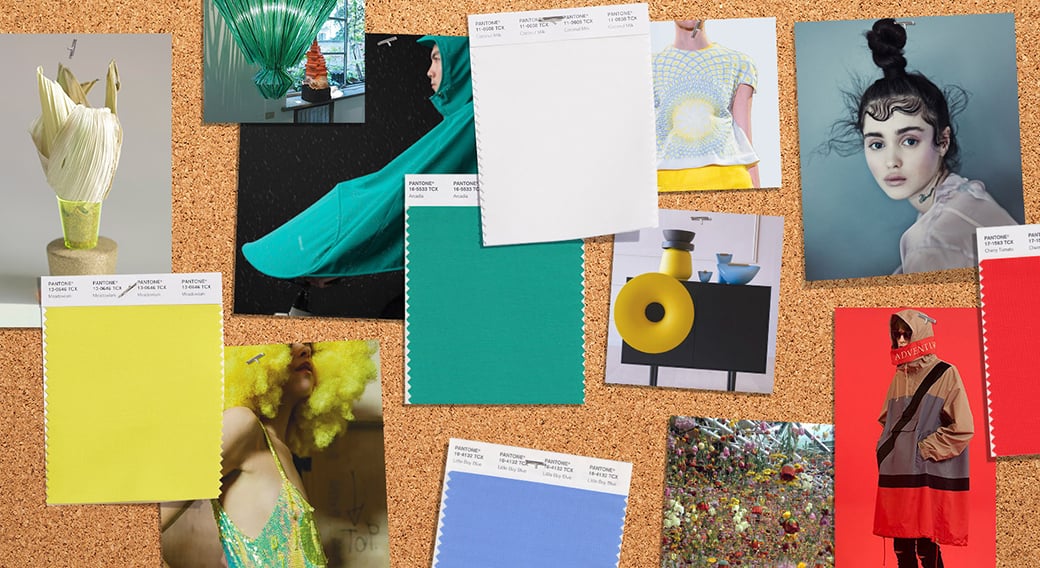
This spring brings us the shades that drive a fresh flux of energy to 2018 fashion. The springtime colors 2018 are highly energetic, sophisticated and serene. The majority of them are bouncy and cheerful. In fact, these are the fresh shades, optimal for mixing and matching up to user’s desire. On the other hand, the shades foster the feel of intricacy and idiosyncrasy, providing for a wide range of possible color combinations that wary in contrast from mild to dramatic.
The colors that made it to London FW set of Pantone Spring Report are the following:
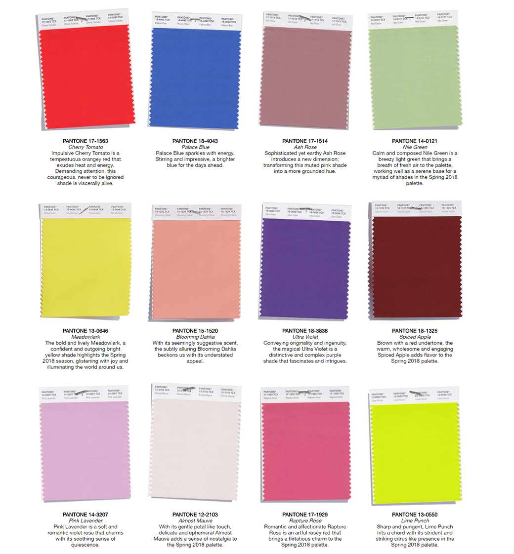
The New York FW palette features the following items:
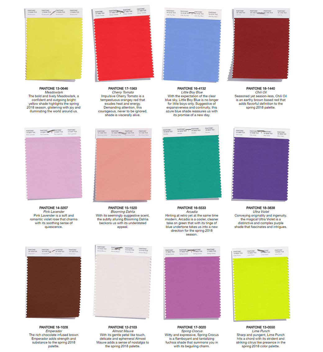
As you can see, some of the colors represented on both sets are the same (e.g. Meadowlark, Cherry Tomato, etc.) Others are the competing shades that have similar tint and impact (e.g. Chili Oil vs. Spiced Apple). So, if dealing with 24 Pantone spring colors 2018 is too much for you, you can skim them down to 12 statement-making staple shades. See them below:
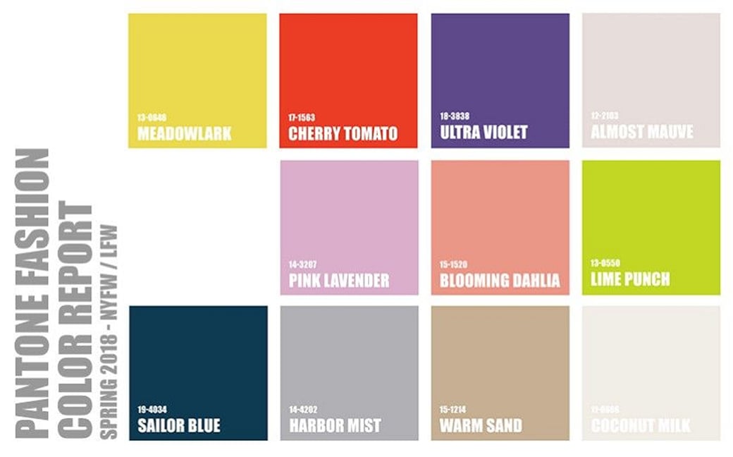
It’s a common practice to combine the stand-out colors featured above with the more neutral and straightforward classic colors. According to Pantone, the classic shades that make it to the top this spring are the following:
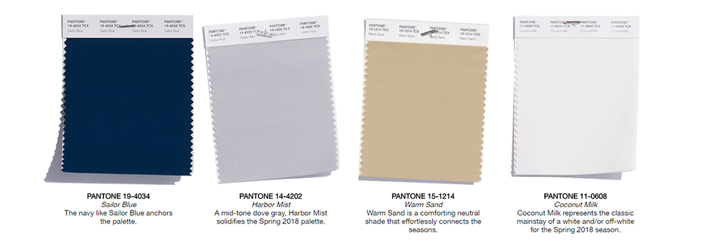
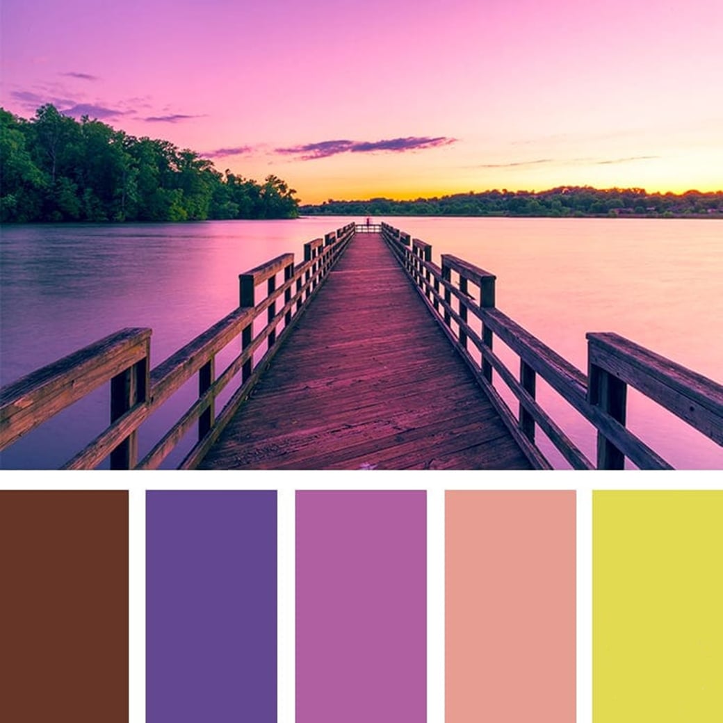
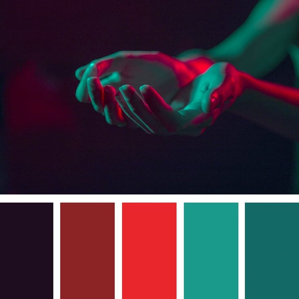
The colors you’ve just seen above reign supreme not only when it comes to fashion, but also when it comes to web design. You can experiment with combining the highlight and staple shades, as well as with adding other matching colors to provide an ample color choice on your website. See a couple of all-the-rage sample color palettes, each featuring two or more Pantone Spring Report shades:
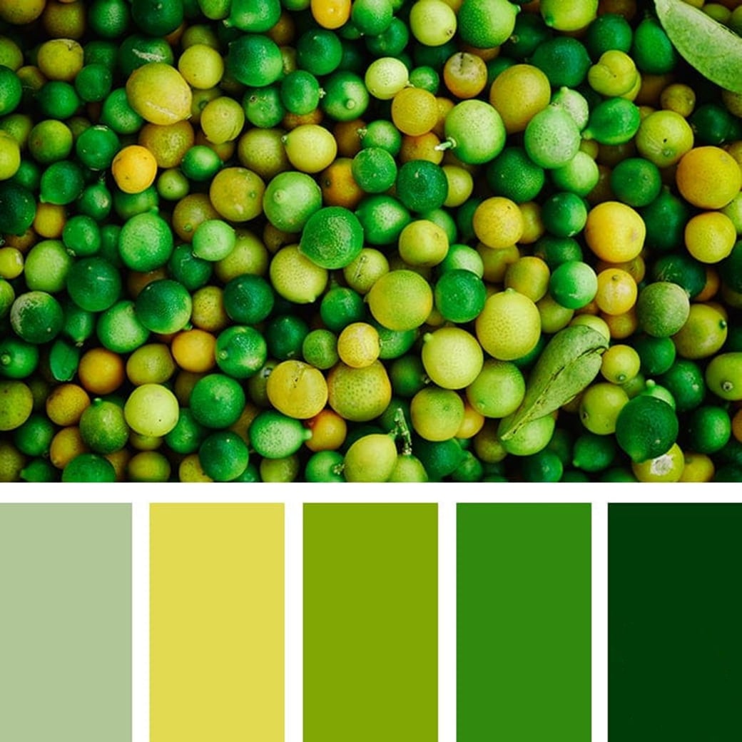
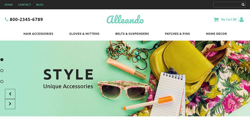
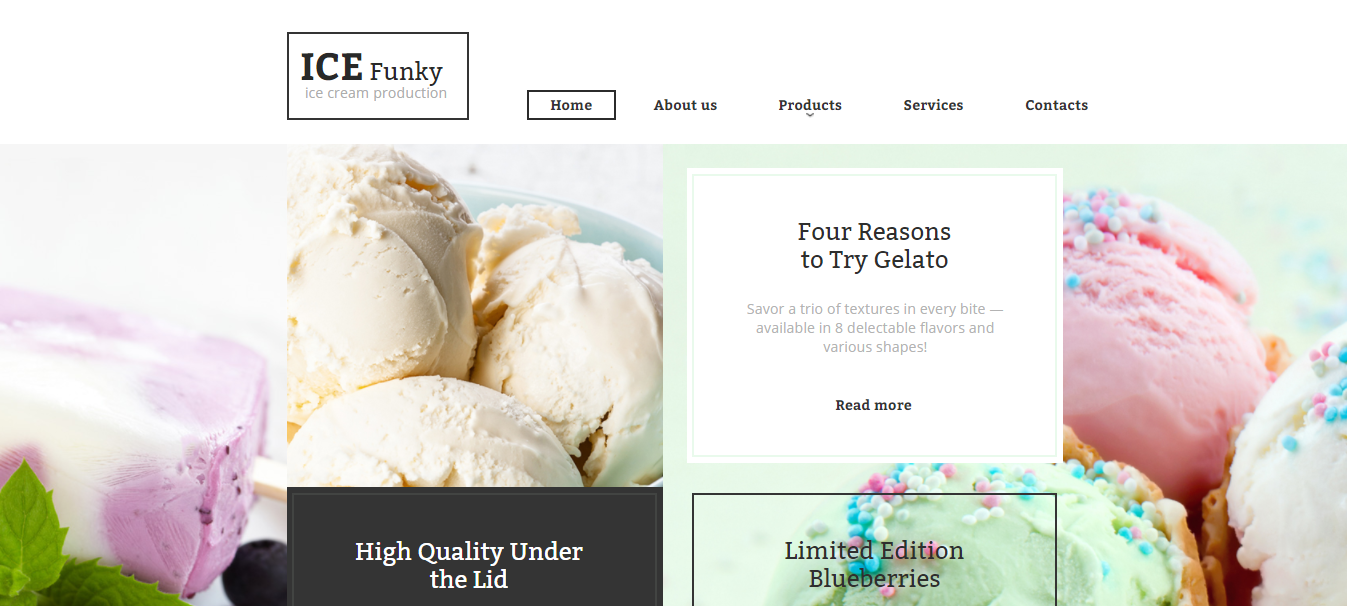
Want to see the spring color forecast 2018 in action? MotoCMS designers have introduced a bunch of shades into the newly released feminine website templates. Here’s a couple of items that breathe with a gentle and warm spring breeze:
Alleando Ecommerce Website Template
MoonFlower HTML Website Template
ICE Funky HTML Website Template
Pantone Fall Colors 2018
If you’re after a more saturated website design, look to the future and embrace the Fall/Winter Pantone Color Trend Report. In fact, less than a month has passed since the report was published. So, jumping on fall/winter color gems early on gives you the first-mover advantage and a luscious, intense color palette for your site. Quite surprisingly, the trendsetting fall/winter palette is not uniform. On top of the classy autumnal shades, it brings you the lighter refreshing tones (e.g. Crocus Petal and Limelight). This provides for a new distinguished feel and rich, unconventional combinability.
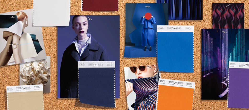
Similarly to Pantone spring colors forecast 2018, the fall/winter trend report brings you two state-of-the-art sets Fall Colors Palettes. Once again, you’re likely to spot one of the sets at London Fashion Week and the other at the New York’s one. Besides, Pantone Fall Report features 5 classical core shades.
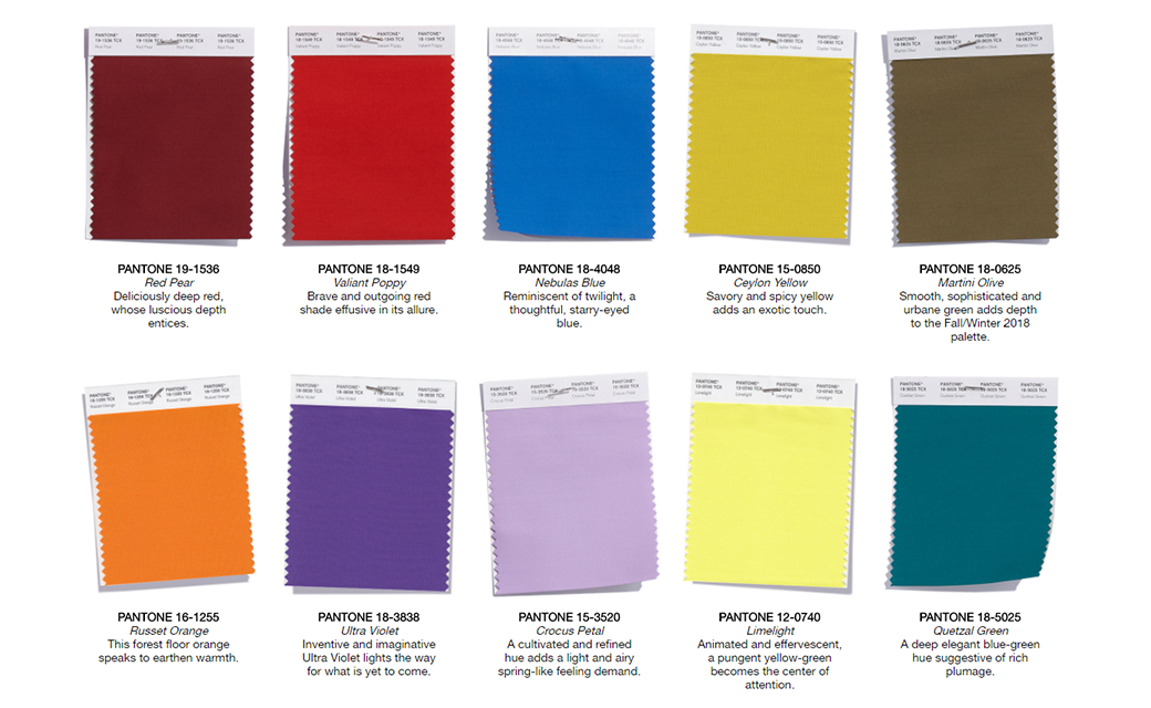
So, meet the top 10 colors that will shape the look of fall/winter New York FW:
At the same time, the London FW is expected to bring the next 12 shades to the foreground:
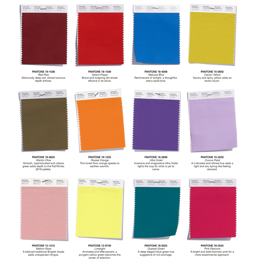
Among the five classical color shades, the first four are just the slight variations of the spring staples. The fifth one, Meerkat is a fit-it-all neutral yet warm brownish shade that’s a valuable entry to the set.

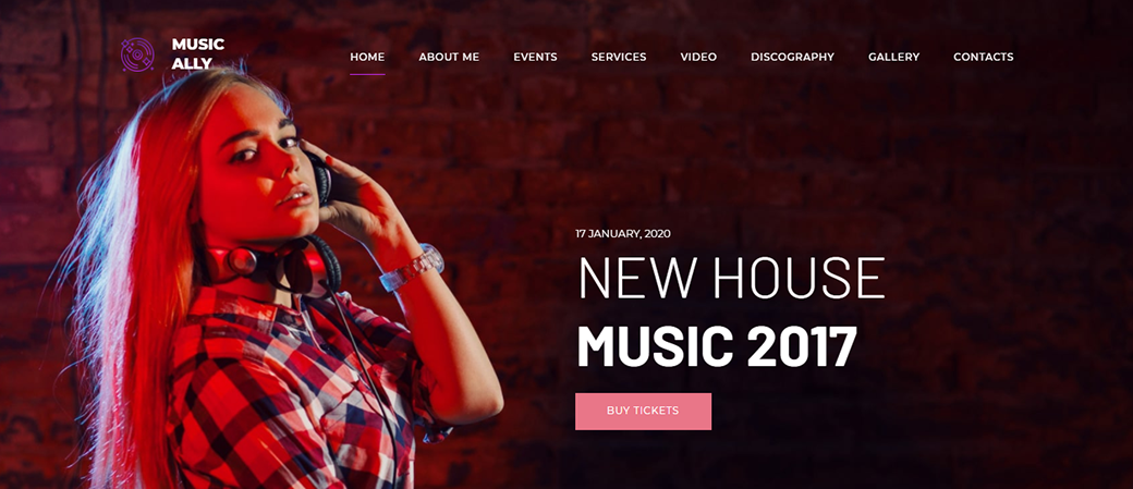
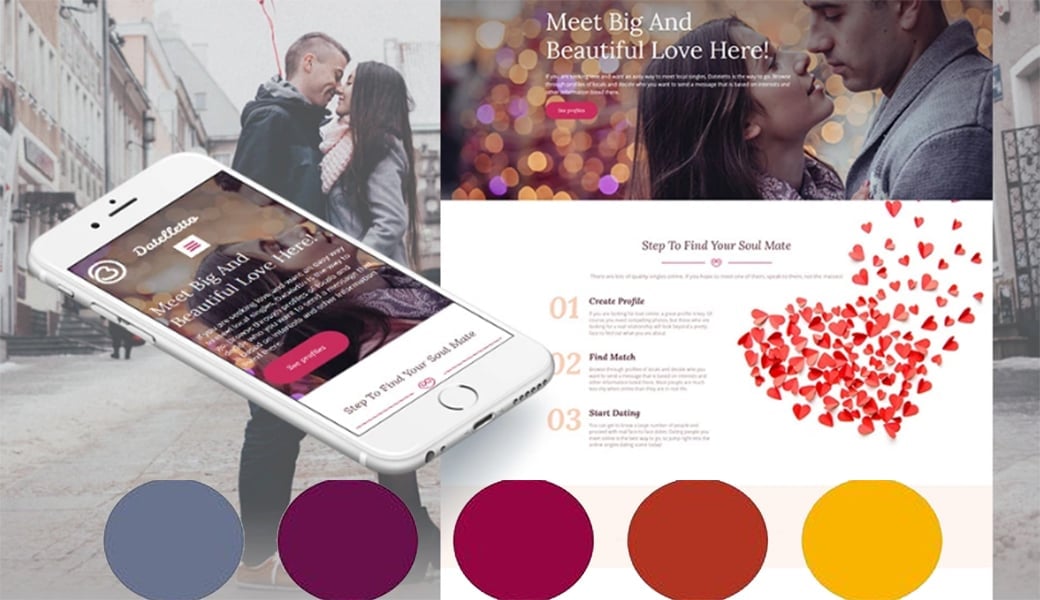
The themes that incorporate fall/winter 2018 hues start to get traction. They deliver you more contrast, depth and immersion. To get a pre-taste of the upcoming fall colors in action, check out the website builder templates below:
MusicAlly DJ Website Template
Datelletto Responsive Website Template
Life Coach HTML Template
Top 5 Hottest Web Design Color Trends 2018
To state that web design color trends 2018 fully mirror the fashion color trends would be an oversimplification. No doubt, web design industry has its own history and peculiarities. That’s why, we can’t pass on digging into the latest color trends that are not derivative but incepted within the web design niche. So, let’s see the groundbreaking ways color finds its creative implementation on the web and pushes its limits.
#1: Ultra Violet Space Odyssey
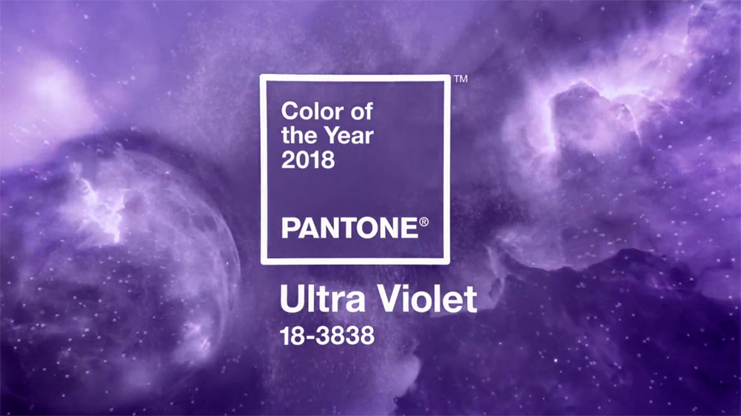
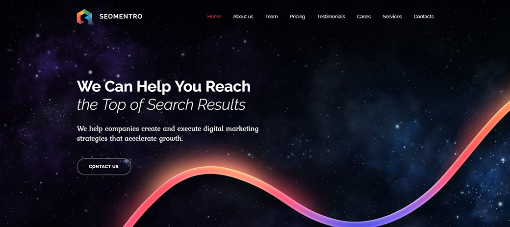
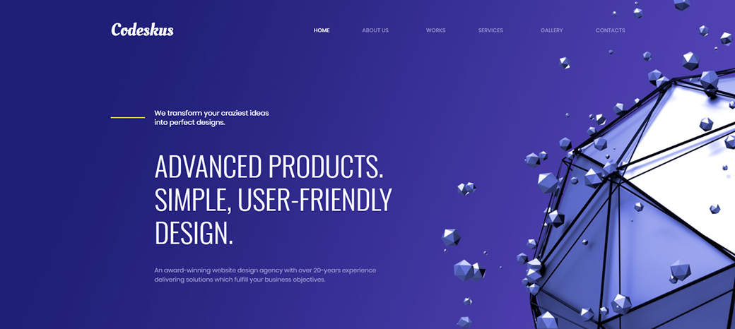
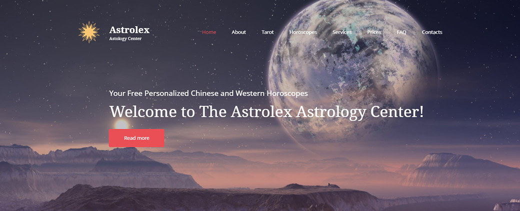
The first of web design color trends that we discuss has been also predicted by Pantone experts. This trend venerates the Ultra Violet hue that epitomizes eternity and the far reaches of the universe. 2018 is the year of cosmos-centered website UIs, with space-inspired backgrounds and design elements representing the advance of modern technology.
The ‘space quest’ of 2018 web design falls in line with Pantone proclaiming Ultra Violet ‘The Color of the Year 2018’. Pantone experts characterize this particular shade as “dramatically provocative and thoughtful” and embrace it for its universal, multi-facet character.
Let’s see a couple of examples of how cosmic designs and violet shades shape some of the most progressive website designs:
Seomentro Responsive Website Template
Web Design Agency Premium Template
Astrology Center Website Template
#2: The Reign of Pink
Pink is one of the colors that’s staying on top for the last couple of years. It was Tumblr that jumpstarted the pink’s rise with their invention of the so-called ‘Tumblr Pink’. This shade quickly got traction and reached an unseen mainstream adoration.
Back in 2016, pink was predicted to peak, with Pantone Color Institute naming the shades, such as Rose Quartz and Serenity the colors of the year. However, pink didn’t just peak and fade away. It secured its place for the years to come and turned into what’s known today as ‘Millennial Pink’. This neutral shade is not associated with a particular fashion trend or year, but rather with the modern generation in general.
This year, pink continues to be one of the most fancy colors on the web and makes it to web design color trends 2018. Moreover, this year, the winning potential of pink is not restricted to any particular shades. The saturated, bubble-gum hues of pink are widely adopted to make a statement (e.g. think of the new Instagram icon). At the same time, the ashy, ambient shades of pink have lost their gender-related connotations and turned into the widely-adopted ‘new neutrals’.
Some pink web design inspiration also comes along with recent MotoCMS themes that employ pink both as an accent and a background color:
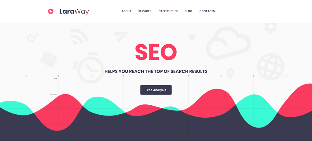
LaraWay – SEO & Digital Marketing Agency Website Template
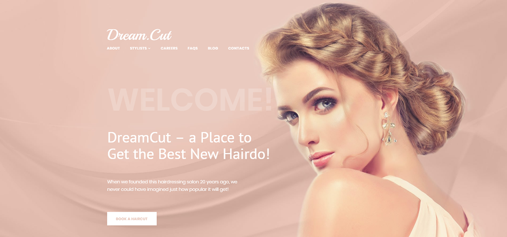
DreamCut – Hair Salon Website Template
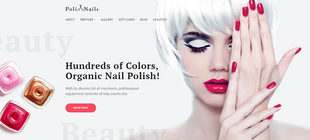
Nail Salon Website Template
#3: Multidimensional Blackness
Black is the classic color that outperforms all the other neutrals. It stands for luxury, sophistication, mystery, and minimalism. It contains everything, every possible meaning and matter, as well as fades perfectly into the background. Black works well with every modern web design style and trend. Moreover, it’s a great choice both for making a statement and for providing for a neutral environment.
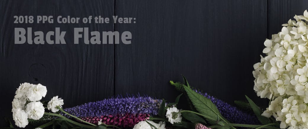
This year, the prevalence of black is undeniable. Although Pantone didn’t root for it as being #1, many other color design authorities voted for it and proclaimed it The Color of the Year. The proponents of black include PPG, Olympic, and Glidden, some of the world’s largest paint suppliers. The shades that they root for represent the substantial deep black that incorporates the overtones of indigo, charcoal or steel.
Review the sample black-colored website designs below:
Entertainment MotoCMS 3 Responsive Website Template
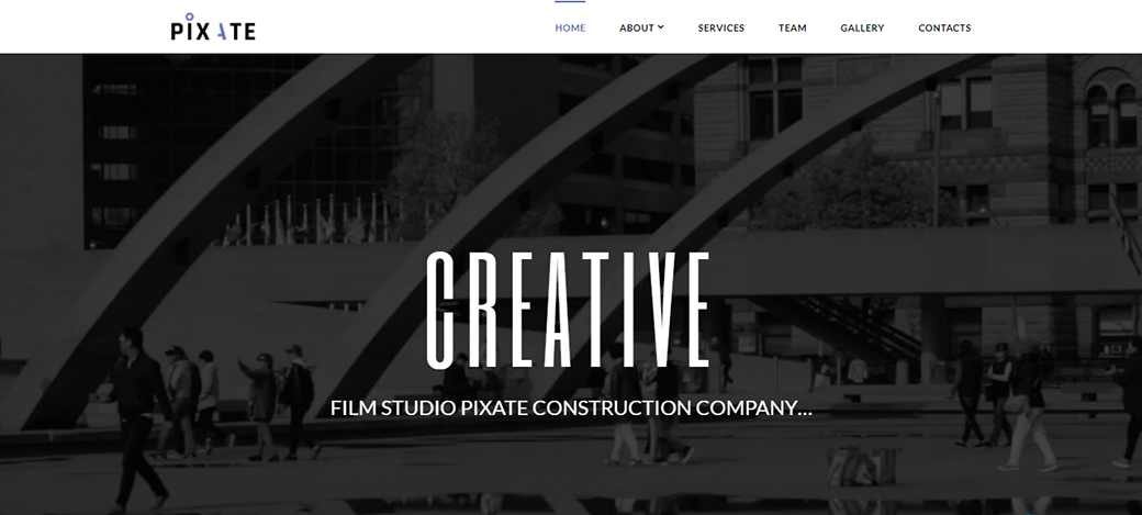
Pixate – Movie Studio Website Template
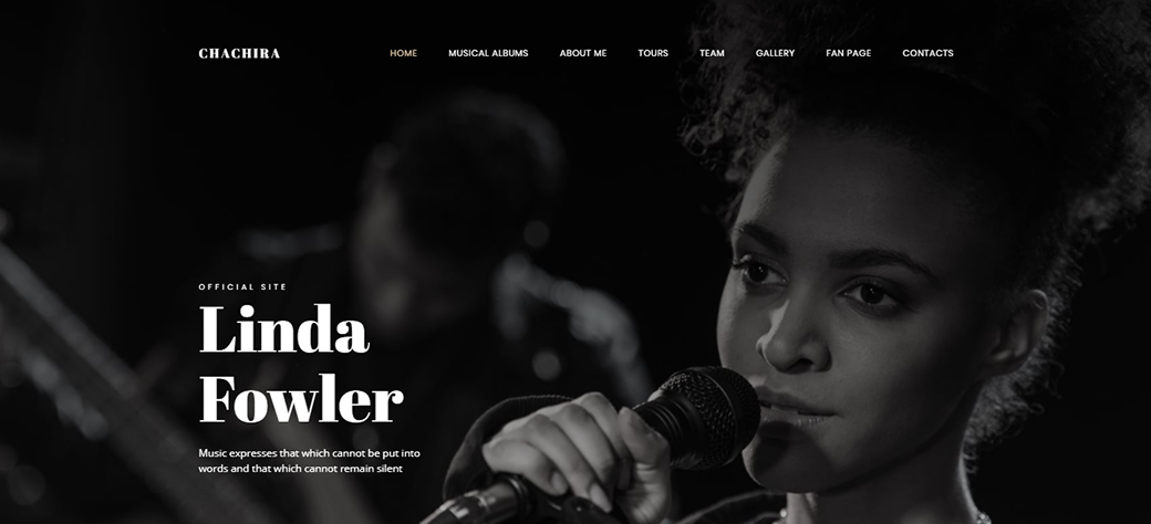
Chachira Songwriter Website Template
#4: New-Fashioned Gradients
The next position in the web design color trends 2018 list is occupied not by a single color but by a method of using colors. It stands for gradients that are making their new-gen comeback in line with semi-flat, or the so-called ‘Flat 2.0’, design resurgence. The new-semi flat builds upon the advanced simplicity of flat design, further improving its usability with additional visual enhancements, such as the use of shadows and gradients to convey depth and multidimensionality.
This year, modern gradients see their comeback on iOS screens and are employed by such popular platforms as Instagram, Stripe, and Spotify. In line with this, designers actively employ gradients to color UI elements, backgrounds, overlays, as well as brand identities.
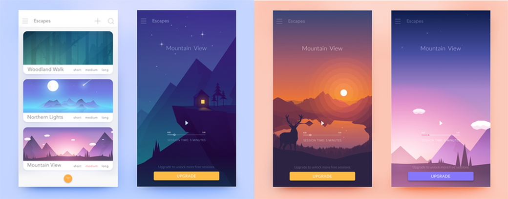
Modern gradients range from atmospheric two-color sprays to bright rainbow-like juicy combinations. These’re the gradients that allow designers to incorporate the whole plethora of colors to their impeccable creations. To learn more about the use of gradients and colors in the new Flat design, check out the Flat UI Colors in Web Design article.
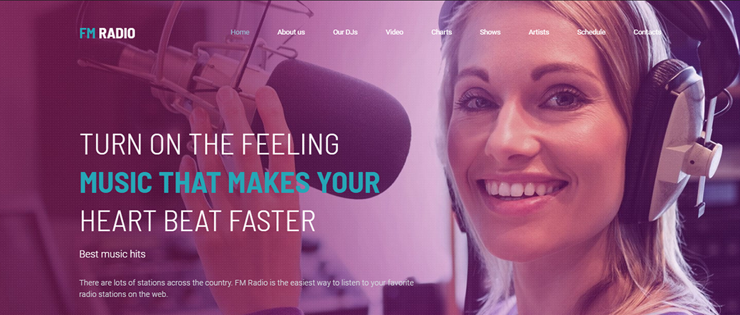
Radio Station Premium Template
Healtro Responsive Website Template
#5: Ambient Pastels
Some of the characteristics of hipster culture are minimalism and veneration of nature. Ambient pastels come into being when hipster counterculture mixes with Scandinavian style with its rich set of shades of white. The hipster aesthetics led pastels to peak in 2018 web design, underpinning minimalist, ultra-modern websites with milky, misted shades.
According to the color forecast 2018, sandy, sage, taupe and pink pastels will replace the pure-white aesthetics of minimalist websites of the former generation. They provide for a more comforting, uplifting and well-liked atmosphere of minimalist websites. Do not hesitate to use ambient pastels for your personal blog color combination
set or portfolio website design.
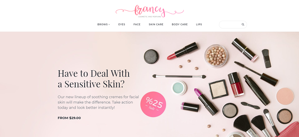
Beauty Responsive Ecommerce Template
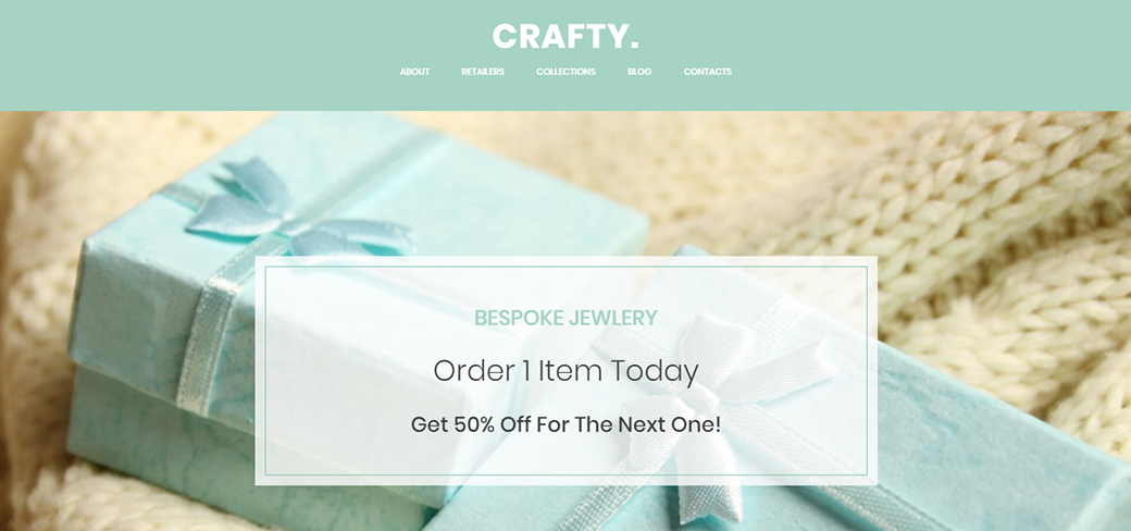
Handmade Jewelry Artist Website Template
Video Production Studio Premium Template
Wrapping Up
This spring is the time to incorporate freshness, experimentation, and ambiance to your online presence. Get soaked with Pantone spring colors and mix them with the latest web design color trends 2018.
No matter what are the color trends you favor, we wish you good luck in making your website design a colorful masterpiece!
Stay tuned for more!







Leave a Reply